CiM Venus - as I suspected, turns silver foil to a golden hue. Actually - more of a rose gold or a bright copper appearance. As with encasing silver foil - do your best to keep the encasing cool and keep the silver foil out of the flame until it is completely covered.
Very pretty.
Tuesday, October 31, 2017
Tuesday, October 24, 2017
CiM 911 Venus
CiM Venus reminds me exactly of Effetre 068 - a pale transparent pink that comes out a salmony rosaline after heating.
The Effetre is famous for it's ability to turn silver foil into a rich gold colour when encasing it, so the first thing I would suggest is to try that.
You can see here, there is a significant difference in colour from the rod and the worked glass.
The Effetre is famous for it's ability to turn silver foil into a rich gold colour when encasing it, so the first thing I would suggest is to try that.
You can see here, there is a significant difference in colour from the rod and the worked glass.
I did notice it forming small bubbles too, although not as pronounced as Siren.
Definitely need to try it over silver foil.
Sunday, October 22, 2017
CiM 627 Rapunzel
Some people are reporting colour shift in different types of lighting, but I'm not seeing anything significant.
From the left, Rapunzel, Crocus, and Gelly's Sty on top. With maybe a blob of something else. Yes - the old, wonderful Gelly's Sty. Gorgeous, n'est pas?
Friday, October 20, 2017
Comparison: CiM Siren, Apple Pie, Juniper, Turtle Power
Here are the latest greens from CiM, side by side.
From the left, Siren; Apple Pie; Juniper; and Turtle Power.
Wednesday, October 18, 2017
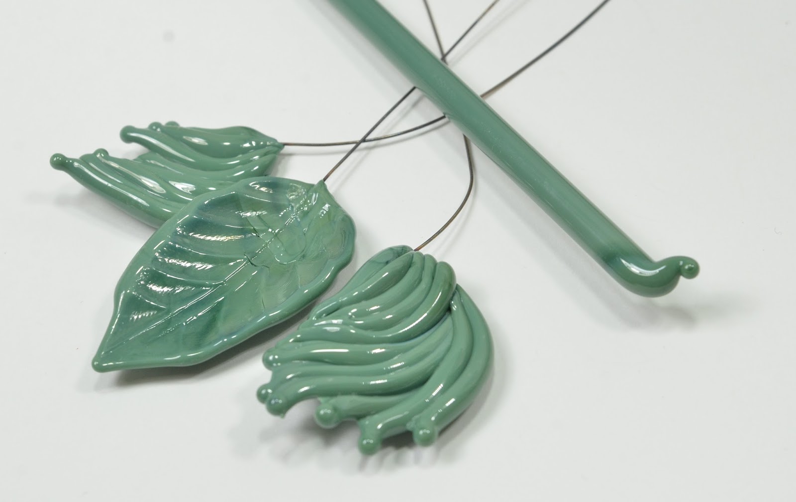
CiM 460 Turtle Power
It's possible that the entire batch is not all like this - in fact - other testers had no problem at all - and say it is a dead ringer for Split Pea.
However, if you are having shocking problems, I would suggest you treat it like Celadon*, and put the rods in the kiln to pre-heat. I usually put three rods in the kiln at a time, with about a third of the rod sticking out of the door. I pick them up in a rod holder, wipe the kiln dust off with a folded paper towel, and use them from there.
My verdict is - "Splinter" has too much influence on this Turtle Power. ;-)
*Also good for EDP - if you have any.
Monday, October 16, 2017
CiM 459 Juniper
It is a well-behaved, somewhat streaky green with no overtones of yellow - in the bluer sage family of greens. It doesn't remind me of anything, so it may be a unique color to the glass palette. It doesn't seem as dark as it shows on the CiM green palette page, though.
Saturday, October 14, 2017
CiM 728 Canoe
I tried working this at different temperatures, and I have to say - across the board, I got pretty consistent results.
This little unicorn horn was worked quite cool - just warm enough to twist.
This pressed starburst - I worked it very hot - this glass goes clear when very hot, then white, and back to brown as it cools. This was heated to clear, and then stamped with a graphite press tool, on a a graphite marver, which cooled it very rapidly.
There is some variation in colour - I didn't get it quite as hot at the wire end when firepolishing it, but for a streaky glass - this compared to the other pieces are pretty consistent.
I'm looking forward to experimenting with this one some more!
Thursday, October 12, 2017
CiM 315 Buttermilk
I didn't care for the recent CiM Bone as much, because while it is a nice cream neutral - I like the warmer shade of the Effetre Ivory. In fact, I adore Effetre Ivory - it is one of my faves. And the CiM Bone can look similar if you reduce it, but otherwise - it seems to be a rather cool colour.
However, the Buttermilk might be right on the money. It not overtly coloured, but it has a slight hint of warmth to it. But, if you read the other tester's reactions on the CiM site, you will see there is a certain amount of variation of opinion.
CiM classifies this with the yellows, but for me - it is in the neutral family.
And it really hasn't reacted with the turquoise. That is a flat dot with a raised dot - so that is not extreme bleeding.
Tuesday, October 10, 2017
CiM 458 Apple Pie
Why oh Why
Is an opaque green
labeled "Apple Pie"
Honestly - I don't have an answer for that.
I do know that Apple Pie is a light green opaque in the family with Mint Chip, Primavera, It Ain't Easy Being, Sherbert, Cardamom, Sprout. I highly recommend the CiM page for comparisons, because I don't have any of those with labels on!
Overall - I found it easy to work and trouble free.
There are quite a number of greens in this latest batch - so stay tuned! Posts come every other day or so, or if you subscribe to my facebook page - you can see them there!
Sunday, October 08, 2017
CiM 463 Siren
The Siren call of the sea, or the Sirens of the Sea. This is a sea-green. It is supposed to be a re-make of CiM Aloe Juice (422) - but as I have no reliably labeled Aloe Juice, I can't speak to that. Other testers do report that it is a dead ringer though.
However, like Aloe Juice, I did have problems with it boiling and scumming a little. I tried working it cooler and slower, and it helped a little.
You can see from this close-up - quite a lot of bubbling at the edges.
Whether you can use this to your advantage in your designs, i.e. a trail of bubbles from a fish in an aquarium bead, or if it will just make you crazy - that is up to you.
However, like Aloe Juice, I did have problems with it boiling and scumming a little. I tried working it cooler and slower, and it helped a little.
You can see from this close-up - quite a lot of bubbling at the edges.
Whether you can use this to your advantage in your designs, i.e. a trail of bubbles from a fish in an aquarium bead, or if it will just make you crazy - that is up to you.
Friday, September 29, 2017
Dichro on Color Glass - from Riley Designs
Once upon a time, I got my hands on some dichroic glass that was on coloured glass, instead of just clear or black. I loved it, but sadly - soon it was all gone.
But now - Riley Dichro has made some - and it is gorgeous!
Now, some people have said to me - what is the point? You can just make a bead in whatever colour and then put the dichro on clear on top. Well - yes - but it doesn't look the same. For one thing, there is a layer of clear in between. Or you put the colour on top, but that changes the dichro. Or you flip the dichro over, but that gives you a clear on the outside. It means bigger, more layers, less intensity. And completely eliminates some shapes because of having to build the layers and the encasing.
Oh, just try it and see what I mean.
But now - Riley Dichro has made some - and it is gorgeous!
Now, some people have said to me - what is the point? You can just make a bead in whatever colour and then put the dichro on clear on top. Well - yes - but it doesn't look the same. For one thing, there is a layer of clear in between. Or you put the colour on top, but that changes the dichro. Or you flip the dichro over, but that gives you a clear on the outside. It means bigger, more layers, less intensity. And completely eliminates some shapes because of having to build the layers and the encasing.
Oh, just try it and see what I mean.
Wednesday, September 27, 2017
Monday, September 25, 2017
Double Helix Keto revisited
Remember that I was somewhat disappointed with the Keto when it came out of the kiln? Well - yes, once again it was the result of my kiln "eating" the reduction.
Because this is what they looked like when I tried it again with the kiln at BeadFX.
For comparison - the two on the left were annealed in my studio kiln, and the rest in the BeadFX studio kiln.
I'm going to try fiddling with the temperature I have my kiln set at. This is ridiculous.
Anyway - the Keto really is stunning, isn't it?
Accidentally snapped one, but you can see the inside - the colour is still the same, right down to the white speckles. The reduction is sitting on the surface.
Because this is what they looked like when I tried it again with the kiln at BeadFX.
For comparison - the two on the left were annealed in my studio kiln, and the rest in the BeadFX studio kiln.
I'm going to try fiddling with the temperature I have my kiln set at. This is ridiculous.
Anyway - the Keto really is stunning, isn't it?
Accidentally snapped one, but you can see the inside - the colour is still the same, right down to the white speckles. The reduction is sitting on the surface.
The Double Helix site shows Keto reduced and encased, so I thought I would try that too.
A spacer, encased in Zephyr.
And a focal, Keto, reduced, encased with Zephyr, and the encasing textured with a blade.
Saturday, September 23, 2017
CiM 626 Enchanted
I can say, however, that it has a definite colour-shift - depending on the lighting. IMHO - it is most beautiful in sunlight. Check out the videos to see the effect.
Just wandering around my studio - from the photography area - over to my desk, from expensive highly tuned compact fluorescents to LEDs to whatever.
And to outdoors in the sunlight - which I think is the loveliest.
I did see some scumming/small bubbles, but as I worked further down the rod, it seemed to be less of a problem, but you can see the results here.
Thursday, September 21, 2017
CiM 217 Harvest
Your mileage may vary - as you can see from the link to the other testers, they find it to be an even and consistent colour - so you need to remember that we all have our own variables and our own way of working. If you don't get the same results as someone else - it doesn't mean there is something wrong with you!
Below, for comparison, we have Harvest on the left, waves and rod, wave and rod of Monarch in the centre, and mermaid tail and rod of Creamsicle on the right. With the strong studio lighting - Monarch and Creamsicle appear closer in colour than they are in real life.
Harvest is a nice organic orange, not a fluorescent or bright neon orange, and good for fruit and pumpkins and flowers, I think.
Tuesday, September 19, 2017
CiM 825 Spooky
However, what I got was ... well - more like an Amber Opal.
I started with two beads - self-coloured spacers, and I was working hot - on the big torch (Mid-range). Right away, I noticed streaks and trails of colour - but at that temperature, I wasn't sure what was going on, or if I had just burned the glass.
I switched to the Mega, and made my wave on a wire. It showed zero signs of streaks or color, and went into the kiln almost water clear. It was lovely.
For comparison, I did a mermaid tail on wire in Cirrus - on the right in the photo above.
Same glass - on a grey background to show it off better - Spooky on the left, Cirrus on the right.
I'm thinking it struck in the kiln. The leading edge of the wave always gets more heat, and there is more colour concentrated there, but there was no hint of colour when I kilned it. Maybe I just worked hotter than the other testers, and possibly my kiln runs hotter (maybe that's why I keep losing the metallic reduction on glasses like Thallo and Keto in my kiln?)
So - the Amber is in there - you just have to figure out how to coax it out of there.
Sunday, September 17, 2017
CiM 462 Chrysalis
The goal was for Chrysalis to be an opaque version of Kryptonite, in fact, and while it is more opaque - it is lighter in saturation and hue too.
It gets quite a bit lighter too went worked, and goes more opaque. It's not as translucent as the opals (i.e. Kryptonite), and mostly - it will function as an opaque if it is used, say, as the base of a bead. But if you use it thin, or so that light can shine through it, like a thin leaf or wing - then you can see the light shining through. So I'm not sure how it will fair as, say, small dots on a strongly coloured background. You might need to back it with white then.
This photo show Chrysalis at the top, and Kryptonite below.
Friday, September 15, 2017
CiM 216 Monarch
CiM Monarch - named for the butterfly (presumably) - is a streaky, variable orange that is perfect for autumn. It is a little less saturated in hue and so not so much the tropical mango orange - more of a natural colour. You can see from the end of the rod - that it changes a bit as it heats, and the over all effect is of streaky variability, which, of course, I like.
For comparison, on the left is Monarch, and on the right is Creamsicle - which is a brighter, more orangey orange. If it is close to any other colour - I would say that it is more like Effetre 408 - the confusingly named Medium Lemon Yellow.
Subscribe to:
Posts (Atom)