Y'all might want to read this posting from Frantz Art Glass on the Perfect Clear. They are suggesting pickling the glass to get it really clean.
Haven't tried this yet, but it's an interesting thought. I have noticed that the formula in household glass cleaners has changed in the past year, making them so that they actually make the glass worse. I think it'd the swithch to the "green" cleaning ingredients.
Could it be that simple? Will resellers offer pre-pickled glass?
Would just soaking in vinegar do it?
Worth trying anyway. Hmmm - now to chase down some pickle.
Thursday, December 30, 2010
Wednesday, December 22, 2010
In search of Greatness

Meh - I thought I was onto something great - and then it fizzled.
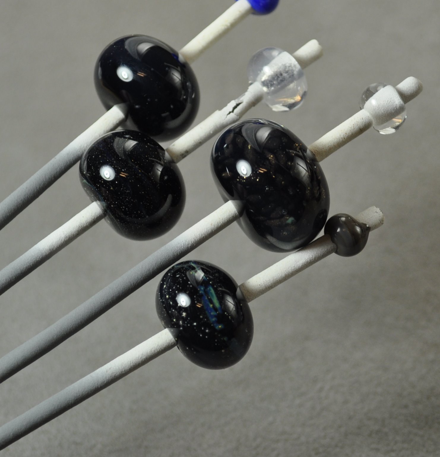
I really liked the look of this when it was hot, but like so many beads - when it came out of the kiln - meh - not so much. Now it just seems busy and overworked. And where the heck did that scum come from? Bleh.
I was so taken with that misty part - that I made a bunch of follow up test beads to confirm the colours and make sure it worked with other colours.
And what did I get? Well - if you put on Murphy's hat and guessed "nothing," you'd be dead right.
 Mostly nothing, anyway.
What gave me the misty look in the big bead was black, with a layer of silver foil melted in, then a layer of CiM Cirrus, and encased. There were some stringers of Kronos and Terra Nova, encased, in the mix too, and little goldstone. But it was the Cirrus that looked misty, and that makes sense - that's what it does.
So this test bead is black + silver foiled melted in + Cirrus encased. Might as well be clear.
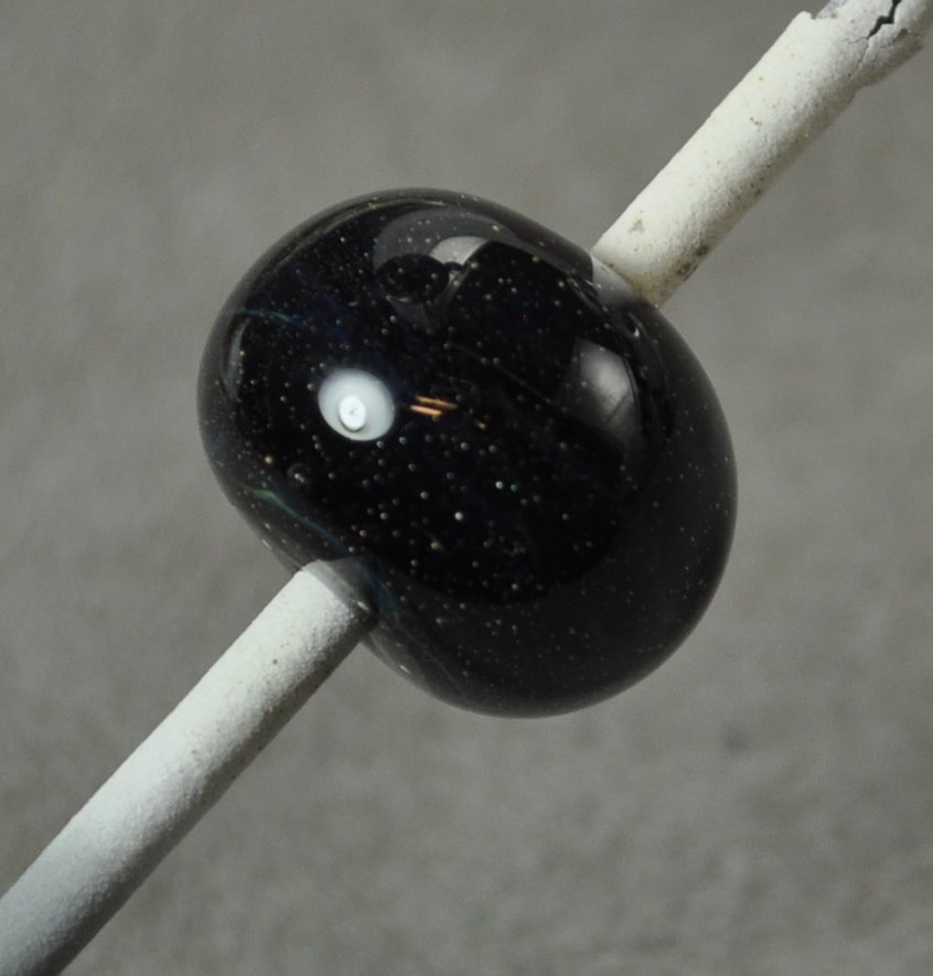 Same again. There is a nice little strip of colour in the middle, but I think the bead or the rod or something got contaminated with a bit of the Kronos/Terra Nova stringer.
This is just Cirrus, over black.

So where did my mistiness go? Either the Cirrus needs critical mass - i.e. a thin encasement just doesn't show any colour, like a very pale transparent, or a lot of working, heating and cooling, emphasizes it's mistiness.
Or maybe the scraps and trails of string play a bigger part - in that it reflects the colours internally and takes on the colours of the stuff around it.
What ever it was, matching spacers did not happen.
Disappointing. Oh well - try something else.
Thursday, December 16, 2010
Effetre 730: Chocolate Noir
 Effetre 730 - Chocolate Noir. More Noir than Chocolate - these creamy, opaque slate colour is hugely fun to use!
This is a dark grey slate - reminds me of CiM Admantium actually - and you can see the layers in the cross section.

It works out to be a rich, dark streaky slate colour with a hint of warmth to it.
 A simple wound bead doesn't show the streakiness much.
 But beads made using the "full gather" method show much more streakiness - almost as good as using a cane or twisty.
This bead is a base of Chocolate Noir, with ivory dots, and more Chocolate Noir on top. The Chocolate Noir is breaking up and spreading in a most satisfactory manner.

This bead is:
- clear base (more stable)
- encased in ivory
- trails of Chocolate Noir
- heated significantly
- mashed
 Definitely looking forward to using this more!
Tuesday, December 14, 2010
Vetro 903: Striking Rainbow Red
Vetro Striking Rainbow Red - an odd-lot glass. This is a transparent red - the rods are translucent, but it I think this might be called "Rainbow" because you can get quite a large range of colours out of it by selectively striking it.
Here we see a pair of beads. The one on the left was struck before kilning, the one on the right was not - it came out of the kiln looking exactly the way it went in - so this red does not appear to kiln-strike - giving you lots of control.
 The unheated rods look very different in fluorescent light, although the finished beads are not too different. In this photo, they are seen in my photography set up lighting - the background is it's correct neutral grey. The rods are a rather dark and murky colour.
 Under a 60 watt incandescent bulb, the unworked rod is a much livelier colour. (In both cases, ignore the mandrel with the apparently black bead on it. It's from a different test set - not the same colour actually.)
 You can see quite a bit of colour range in the red over white dots in the bead on the left.
 And finally - this heart - red over clear over dichro - cracked - although I suspect that was just me, letting one of the lobes get too cool. (Yeah - these are crappy photos. Thank you. I know that.)
Like a lot of transparent reds, this one looks like it will go cloudy if worked a lot, but I do like a red that can be struck with a lot of control. However - this one doesn't seem to bring anything particularly new to the table.
Sunday, December 12, 2010
Double Helix: Olympia Rain
The problem with testing the silver saturated "special colours," like that glass from Double Helix, is that some of them just don't shine as a colour just by themselves. It's when you start using them as part of an over all scheme that some of them are truly stunning. And often, the variables there are so complex that you can be hard pressed to say just exactly which caused what.
Here we have Olympia Rain. Double Helix notes on their website that they improved this colour and created Aion - but have made a batch of Olympia Rain due to popular demand. With the caveat to not whine about seed bubbles and over striking, because that's why they made Aion. Fair enough.
By itself, it's a fairly nice misty amber colour. I kind of like the seed bubbles - seems to me that you could do a nice 3-d sculptural piece and nail the look of amber.
The colour seemed to develop with striking. The darker bead on the top mandrel was struck and reduced - not convinced that the reducing made it darker - I suspect it was just a longer striking process.
 However, here, it developed a wonderful blue iridescence that ripples and glows as the bead is moved. You can actually see it in this photo.
This bead was:
- base of clear (stiffer, easier to control, uses up odds and ends)
- encase w black
- encase Olympia Rain
- mashed it
- noticed it was getting sort of muddy coloured in the middle. Guess that is the over striking.
- Added the stringer decoration - left over from the dragon eyes - so this is ... who knows what. Nyx or Kronos encased in clear is my best guess
- reduced
- encased in clear.
- Mashed really thin. The muddy effect is not nearly as pronounced now.
You know - it really pays to take notes. If this blog has taught me anything, it is that the steps that seem obvious when I do them will have blended into the background noise by morning.
Tuesday, December 07, 2010
EFF-653: Red Flint
Effetre (Moretti) 653 - Red Flint. A streaky, dark red - you'd think I'd be more excited about this one. I mean - just look at this in cross section - looks yummy, yes?

It does come out streaky. Pretty dark, but streaky. I like streaky, mostly.
 Unfortunately - this is one of those red glasses that looks brownish in fluorescent light. I've been meaning to take another pic to show it in incandescent light, but haven't been able to get it done.
 So, you may find yourself frustrated by trying to get accurate photos of your work. If you sell at indoor shows, then lighting becomes an issue.
So showing this to it's best advantage could be a problem.
Monday, December 06, 2010
Comparison: Vetro 058 Transparent Intense Dark Blue and Effetre 057 Transparent Intense Blue
 I decided to compare Vetro 058 Transparent Intense Dark Blue and Effetre 057 Transparent Intense Blue - even though the numbers are one different - they look the same.
And, in fact, the short answer is - they are the same. I can't find a difference. At all. Call 'em functionally the same.
The two rods in front, the one in the very front is the Effetre. The one behind is the Vetro.

Leftmost/Top - Vetro. Bottommost/Right - Effetre.

Vetro on the left, Effetre on the right.

Same thing, base of Vetro on the left, Effetre on the right. White dots - Effetre dots on the left, Vetro on the right.

That said - I think it is one of the most beautiful colours. Ever. I love this colour - this is the perfect transparent blue, as far as I'm concerned. Cobalt is generally too dark, Eff 054 Med Blue a little wishy-washy, and 056 not much better, and frequently, not much different. Hmm - maybe I need to blog that to prove the point.
This is an awesome rockin' color - feel free to buy the Eff or Vetro version - whichever is cheaper.
Sunday, November 28, 2010
Odds and Ends - the Using Up Thereof.

After you've been lampworking for any length of time, you start to wonder - what do I do with all these leftover ends? You try using them, but then they aren't the colour you want right now - or you find you've made truly hideous beads because you were trying to use up the ends.
You try sticking them together, end to end, but they are shocky and if you aren't using them right away, it doesn't really seem to buy you anything.
And the rod grabber tool is great for using up ends, but still - they keep accumulating.
One thing you can do to make these ends more usable is to re-anneal them. Part of the bummer about trying to use them is that they keep shocking and dropping a tip off the end. A half-inch falling off a 4 inch rod is more annoying than falling off a 13 inch rod.
In particular - I accumulate a lot of ends of clear and black. They are very reusable, but the shocking is annoying, so every once in a while, I will pile them in the kiln, and run an annealing cycle - same cycle I use for beads (and if I don't have quite as much as this, I might do it when I am going to make beads.) I don't care if a few of them shock and break, so I don't worry about a slow ramp-up. I just put them in, and ramp up at the usual speed.
When they come out, they are significantly less shocky - and my black and clear ends go and stand in a nice little can for re-use. Punties, bases for more expensive-glass beads, encasing stringer, twisties - lots of uses.
I find they do better on the floor of the kiln. Occasionally I have annealed a shocky batch of full-size rods, and I have to put them on an angle on the rod rest to make them fit. In that case, they tend to come out with a distinctive bend in them. At least then, I can tell which ones have been annealed!
Friday, November 26, 2010
Making Multiple Beads on a Mandrel
 You may have noticed this particular picture the other day, and wondered about making multiple beads on a mandrel. The advantages to making multiple beads on a mandrel is that it is easier to make a matching pair, because the first one is right there to compare, and it can be a time saver for making multiples, as you can let one bead cool down a bit while you work on the next one. It saves dipping time and trips to the kiln. An hour of beadmaking like this can leave you with a pretty daunting pile of beads to pull and clean, however.
Two tips will help you fill up the mandrel with beads and have you start looking for taller bottles for your bead release. (I have mine in a small orange juice bottle - so I can get a nice long dip. For production work, I can get 6-8 on a mandrel)
Sorry, three tips.
1. Make them close together. Seriously. Like in the picture. Overlapping heat from making the next bead helps to keep the previous ones warm. This is anti-intuitive, and a little scary - you worry about losing control and sticking them together. Trust me - making them close together really helps.
2. Keep them all warm - doh. But - never have more than one warm enough to move at a time. You can't balance and round out two moving-hot beads at the same time. Make a bead. Balance and round. Keep rotating - let it cool to solid, make the next, balance and centre, let cool. Rewarm the first. Make the third now that #2 is solid and #1 is warm. While #3 is cooling - make sure #1 and #2 are warmed up - but keep the rolling rhythm of the mandrel tuned to the still soft #3 bead. When it is solid, start on #4, - etc.
and the 3rd tip. If you are trying to get them all the same size - which - looking at the pic above, I wasn't, but if you are - make your decision about the size of the bead and if it needs more glass while both beads of the pair are the same temperature. If one is glowing and one is not, wait for it to cool down, or warm the other one up.
Whether this is because the warm one is expanded with heat (I personally doubt this is a big enough phenom to see) or the optical illusion of a glowing object looking larger (my favored theory), you can't get them the same size if you keep adding glass to them when they are not the same temperature. You'll add glass to the smaller-looking cool bead, and when you have melted the trail of extra glass in, it will now look bigger than the other, now cool bead. So you will add more glass to that one, and ad nauseum. Your earring pair just turned into matched book ends. Or curling rocks.
Once you get the hang of it - you'll be whipping out long mandrels of matching beads.
Wednesday, November 24, 2010
Double Helix Clio
Clio - the pale, pinky transparent rod doesn't really give you any indication of what you are going to get!
But super easy to use! These 5 spacers were reduced, all at once, after making them. The second from the left is a little more gold than the silvery of the other ones, and I'm not sure why. I'd like to play with this and try for more of the gold tones.

When held up to a strong light, you can just barely see the glass colour under all the metallic surface. It appears to be a rich red or brown. The base colour of the glass strikes and goes much deeper than the rod colour.
 This is Clio over black. A black cone, encased with Clio - and a black stripe on top. I'm quite pleased with the blues and greens. I did reduce it, but then stuck it back in a neutral flame and unreduced it.
 This is Clio, at the bottom, the middle of the bead started with a base of something light that I ran out of, I was trying for white, but I'm not sure that it wasn't actually a piece of CiM Desert Pink. I ran out, and filled in the rest with Ivory. The silver from the Clio has reacted with the ivory in a very pleasing way. The Clio has struck to a rich, dark toffee. I mashed it into a lentil, and gave it a big swirl in the middle, and remashed to reshape.

So far - very easy to get nice results from. I didn't make any attempt to consciously strike the colour - it just happened while I was working on the bead, in the course of keeping it warm. I am looking forward to playing with this one a lot more!
But super easy to use! These 5 spacers were reduced, all at once, after making them. The second from the left is a little more gold than the silvery of the other ones, and I'm not sure why. I'd like to play with this and try for more of the gold tones.

When held up to a strong light, you can just barely see the glass colour under all the metallic surface. It appears to be a rich red or brown. The base colour of the glass strikes and goes much deeper than the rod colour.
 This is Clio over black. A black cone, encased with Clio - and a black stripe on top. I'm quite pleased with the blues and greens. I did reduce it, but then stuck it back in a neutral flame and unreduced it.
 This is Clio, at the bottom, the middle of the bead started with a base of something light that I ran out of, I was trying for white, but I'm not sure that it wasn't actually a piece of CiM Desert Pink. I ran out, and filled in the rest with Ivory. The silver from the Clio has reacted with the ivory in a very pleasing way. The Clio has struck to a rich, dark toffee. I mashed it into a lentil, and gave it a big swirl in the middle, and remashed to reshape.
So far - very easy to get nice results from. I didn't make any attempt to consciously strike the colour - it just happened while I was working on the bead, in the course of keeping it warm. I am looking forward to playing with this one a lot more!
Saturday, November 20, 2010
Val Cox Frit: Forest Nymph
Forest Nymph - A Val Cox frit blend. A nice happy blend of blues and greens. Think I can screw this one up? You betcha.
 The working notes say:
btw - it really does say Forrest Nymph in the notes. Whether Forrest Nymph is related to Forrest Gump is anyone's guess. Forrest, the Forest Nymph - was forced to forage for the rest.
Stands out against warm opaques - I read this and interpreted it to mean that it would look good on a warm coloured opaque, like an orange. Ok, I'll try that.
So, on a reddish orange - here is the Forest Nymph. Ew. Big splotches of brown where the transparent greens turn to mud on a red background. Yuck.

How about on black? Well - that's much nicer. Yeah - I could have done a better job with the firepolishing out of the chill marks. Bite me. This mashing thing seems to be working. BTW - for all of these, I made the 4 spacers, heated them and fritted them all at the same time. Melted the frit in, and then, while all four are glowing, mashed all four at once. Not perhaps as much control as mashing one by one - but it guarantees all the same thicknesses, and is a little more fun.
 The black wasn't too hideous - let's try on white. And that came out too. Not bad. I think this would look nice on a light opaque COOL colour - like an aqua or blue or light green. But a warm colour. Not with those transparents in there!

 The working notes say:
Forrest (sic) Nymph: Blend- Opaque/Transparent
A no-fuss blend, this lively and fresh transparent green-toned frit blends (sic) stands out against a backdrop of warm opaques in this beautiful all-seasons blend.
btw - it really does say Forrest Nymph in the notes. Whether Forrest Nymph is related to Forrest Gump is anyone's guess. Forrest, the Forest Nymph - was forced to forage for the rest.
Stands out against warm opaques - I read this and interpreted it to mean that it would look good on a warm coloured opaque, like an orange. Ok, I'll try that.
So, on a reddish orange - here is the Forest Nymph. Ew. Big splotches of brown where the transparent greens turn to mud on a red background. Yuck.

How about on black? Well - that's much nicer. Yeah - I could have done a better job with the firepolishing out of the chill marks. Bite me. This mashing thing seems to be working. BTW - for all of these, I made the 4 spacers, heated them and fritted them all at the same time. Melted the frit in, and then, while all four are glowing, mashed all four at once. Not perhaps as much control as mashing one by one - but it guarantees all the same thicknesses, and is a little more fun.
 The black wasn't too hideous - let's try on white. And that came out too. Not bad. I think this would look nice on a light opaque COOL colour - like an aqua or blue or light green. But a warm colour. Not with those transparents in there!
Wednesday, November 17, 2010
Implosions: Some Tips
A reader asked - Do you have any tips for implosions? As a matter of fact, I do. I don't pretend to be deeply awesome at them. But - these little implosions are now fairly easy to do and I can whip one off with one hand and then stick it on the bead I'm keeping warm with the other hand.
The key, I believe, is volume. Volume of glass. More glass = better effect.
Most of the implosion instructions I have seen tell you to put a pattern of dots on the disk, and to implode that. I found I got much better results after I started jamming the disk into the frit. Many more "dots" and lots of glass to move.
Some of these photos are utterly ghastly - I apologize - but to illustrate my point.
Start with a rod of clear, and create a disk on the end. You can let the end get hot and push down, or build up like making a disk. Or a bit of both. It helps if it is centered - it's easier if it is, but don't worry too much if it's a little off.
See - not completely centered. Definitely out of focus. Try shooting pics with one hand while keeping a bead warm.
 Key to remember - you are working on the back of the implosion most of the time, the top will be on the side of the clear rod in your hand.
 With the surface hot - glop on some frit. Do a couple of layers. It can be two different colours even.
 And melt it it. You can marver it to melt it in faster and smoother.
 That's my "assistant" in the background, by the way - the rod warmer - doing it's rod-warming thang.
So - now the frit is melted in.
 Rotate and heat on one side. The idea is to direct the heat where the arrows are pointing, from the center out to the side.
 Rotate the disk constantly, and hold at a bit of an angle, so that the glass will start to flow down. First it will form a cup shape. You have to rotate it to keep it on center.
 Note the angle of the rod in relation to the flame. The flame is hitting the far side of the disk, and only about 1/3 of it.
 See how the center is still dished in?
 Then it will dome over as it continues to flow.
 And you keep going, and it will turn into a gather, with the implosion inside. It's hot ...
 And now it has cooled. You can flatten the back side a little, and add a big dot of colour and flatten out to form a base.
 And cooler.
 And the finished implosion - as a bead. I stuck it on a mandrel, and looped the clear around to make the rest of the bead.

More dots make a more dramatic effect - and bigger volume dots of strong colours will show better. Don't be stingy with the disk either. And if you need a bigger dome - melt more onto the top from the rod end.
Be gently flattening the bottom - you don't want to loose your definition in your implosion.
Hope that helps!
The key, I believe, is volume. Volume of glass. More glass = better effect.
Most of the implosion instructions I have seen tell you to put a pattern of dots on the disk, and to implode that. I found I got much better results after I started jamming the disk into the frit. Many more "dots" and lots of glass to move.
Some of these photos are utterly ghastly - I apologize - but to illustrate my point.
Start with a rod of clear, and create a disk on the end. You can let the end get hot and push down, or build up like making a disk. Or a bit of both. It helps if it is centered - it's easier if it is, but don't worry too much if it's a little off.
See - not completely centered. Definitely out of focus. Try shooting pics with one hand while keeping a bead warm.
 Key to remember - you are working on the back of the implosion most of the time, the top will be on the side of the clear rod in your hand.
 With the surface hot - glop on some frit. Do a couple of layers. It can be two different colours even.
 And melt it it. You can marver it to melt it in faster and smoother.
 That's my "assistant" in the background, by the way - the rod warmer - doing it's rod-warming thang.
So - now the frit is melted in.
 Rotate and heat on one side. The idea is to direct the heat where the arrows are pointing, from the center out to the side.
 Rotate the disk constantly, and hold at a bit of an angle, so that the glass will start to flow down. First it will form a cup shape. You have to rotate it to keep it on center.
 Note the angle of the rod in relation to the flame. The flame is hitting the far side of the disk, and only about 1/3 of it.
 See how the center is still dished in?
 Then it will dome over as it continues to flow.
 And you keep going, and it will turn into a gather, with the implosion inside. It's hot ...
 And now it has cooled. You can flatten the back side a little, and add a big dot of colour and flatten out to form a base.
 And cooler.
 And the finished implosion - as a bead. I stuck it on a mandrel, and looped the clear around to make the rest of the bead.
More dots make a more dramatic effect - and bigger volume dots of strong colours will show better. Don't be stingy with the disk either. And if you need a bigger dome - melt more onto the top from the rod end.
Be gently flattening the bottom - you don't want to loose your definition in your implosion.
Hope that helps!
Subscribe to:
Posts (Atom)