Monday, December 10, 2018

Pulling beads

When I learned to make beads, I was taught to pull them holding the mandrel with pair of pliers.
But this is much easier on the wrists.


A good quality vice, mounted on a sturdy table that is attached to the wall. 

  • open the vice, 
  • clamp the mandrel, close to the bead
  • twist the bead off
  • release the mandrel and repeat
The bead release ends up falling on the floor, and is easy to sweep up, but you could set up so there is a pan to catch the bits.

If you are pulling beads that might break or have rough edges, I suggest holding them with a cloth.

You can soak the beads in water if you want to keep the dust down. It might help lubricate stuck beads, but improving your technique and buying good bead release will probably help more.


Cheers!

Wednesday, December 05, 2018

Comparison: Double Helix Lotis vs Effetre Veiled Rubino

Effetre Veiled Rubino is a light version of Rubino, made lighter by mixing clear into the rod - you can see it if you look down the end of the rod. (Actually Rubino has a clear core too, as it is so dense, it does not show well by itself. Which is why, if you are trying to be frugal, and doing tiny little dots pulled from the center of the rod - they come out clear and won't strike, because you are pulling out clear glass. Anyhoo ... )

Comparing the colours of Double Helix's Lotis (a light version of Rhea) and Effetre's Veiled Rubino (a light version of Rubino) ... the Lotis is on the left - over dichro, with some clear in a dots (mostly to fill in the shape). Veiled Rubino is on the right, self-coloured spacers and a cube over dichro. The Lotis is lighter and pinker, the Rubino is more ruby and smidge more raspberry.


Both are pretty. Just different.

Friday, November 30, 2018

Double Helix Lotis

Double Helix Lotis - Double Helix calls it a "A pink version of Rhea. A lead free gold pink that plays well with silver colors and survives a reduction flame without discolorations."

Lotis was a nymph in Greek mythology, just in case you were questioning the spelling.

As I considered Rhea to be pink, I'm guessing that this is a lighter version of Rhea. I think the rods might be slightly less intensely coloured.

 I find that the colour shifts a little depending on the light source - hard to quantify.


These spacers, on the right, over white, are clearly and obviously pink. The self coloured spacers on the left are a lovely colour but less in the pink category and more in the ... claret? Sherry?

This is a big hole bead, base of white, silver foil* applied to half, encased Lotis.

Here, a base of clear (I think it was Zephyr), rolled in silver foil, burnished and encased in Lotis. You can see that I got a significant amount of fuming from the silver foil which has resulted in a lot of the glass/foil combo appearing to be gold.

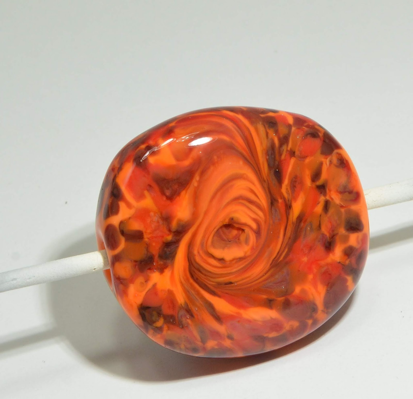
This one was a base of Effetre clear, silver foil, and encased in Lotis. Again, significant fuming - but I was using the Nortel Arrow, which delivers significantly more heat for the amount of oxygen used than the Mid-Range, so it is possible that not using a clear base and working cooler might get you less of the gold effect.


Regardless - the gold is very pretty.

Lotis does, in fact, play well with silver foil. Anyone who has ever directly encased silver foil with Effetre Rubino Oro will be delighted with Lotis.   ;-)

*For those of you new to lampworking, you should know that all references to silver foil mean pure silver, 99.9%, not sterling silver, which will just go black in the flame as the copper in the sterling instantly reacts to the flame. It also does not mean the mylar films that are silver coloured that you might have considered purchasing from the local craft store.  They just burn.


Wednesday, October 31, 2018

CiM Substitutions - Equivalent colours

Run out of a colour and you are stuck? Try this substitution list for a reasonable facsimile. Remember, the list works in both directions too - it all depends on what you have on hand.

CiM Substitutions List


Name
Closest 104 compatible replacement
511109
Bordello
121 Garnet or 122 Maroon
511128
Sangre
123 Hemoglobin, 120 Ladybug, or Effetre transparent red
511204
Peachy Keen
214 Nectar
511241
Creamsicle
216 Monarch or 217 Harvest
511351
Stone Ground
313 Painted Hills or 312 Yellow Brick Road
511422
Aloe Juice
463 Siren
511441
Dragon
435 Ogre
511443
Spearmint
462 Chrysalis
511448
Dirty Martini
440 Pistachio Ice Cream
511450
Chartreuse
461 Jelly Bean
511451
Inchworm
461 Jelly Bean or 478 Oz
511475
Commando
455 Troll, 464 Camouflage, 466 Amphibian
511476
Olive
436 Leaf Men
511483
Slytherin
456 Eel Grass for hue, 432 Loch Ness for density
511508
Leaky Pen
527 Anchor
511550
Chalcedony
589 Zachary or 509 Poseidon
511562
Ming
571 Cornflower, 542 Blue Arrow Frog, or 555 Sacre Bleu
511570
Grumpy Bear
589 Zachary or Effetre dark periwinkle
511590
Great Bluedini
534 Aegean for hue or 548 Barrier Reef for density
511653
Larkspur
652 Count von Count, 626 Enchanted, or Effetre dark lavender
511660
Crocus
645 Heffalump
511701
Ginger
703 Butter Pecan
511815
French Grey
816 Nimbus
511820
Hades
Effetre intense black
511834
Clear
Effetre clear
511835
Peace
817 Foam or Effetre white
511872
Tuxedo
Effetre regular black
511885
Gunmetal
Effetre metallic black
511907
Rose Quartz
904 Gelly's Sty or 910 Paris
511915
Pink Champagne
911 Venus
511921
Blush
909 Charlotte, 910 Paris or 908 Tutu
 

Wednesday, September 19, 2018

Effetre 258 Tongue Pink

I have used Effetre 258 Tongue Pink in the past, and never been able to get any strike out of it at all.

The story goes, and this may be completely wrong - but what I heard was that Tongue Pink started as a contaminated batch of white, that some people liked, and so it was re-branded. Is it true? I don't know for sure.

Anyway - it finally occurred to me that it might do interesting things when worked in a dragon - due to the lengthy working time and repeated heatings and coolings. And worst case scenario - I had a white dragon.

And, in fact - it did strike - it came out quite nice.


For comparison, here is the Powder Pink dragon (on the right) with the Tongue Pink dragon (on the left). Really - you can't call either of them pink - the Tongue pink is a shaded vanilla and salmon, and the Powder Pink is a milk chocolate with cream - but if you ignore the disappointment at neither of them being actual pink - the colours are quite nice and useful in an earthtone palette.


Monday, September 17, 2018

Effetre 262 Powder Pink

Powder Pink is one of those variable colours that you use for how it interacts with other colours, not so much for it's inherent colour. It's earthy, not "pretty."

So here it is in a sculptural use, where you get a lot of heating and cooling going on.

And in this use, it is very nice. The variations in colour make for very nice shading and highlighting.


Saturday, September 15, 2018

NanoGems

I heard about the new "nanogems" for firing and including in Metal Clay. Cubic Zirconias that are "fire in place" can be used in lampwork (assuming they are small enough) - and you know - emailing the company and asking what the COE of the item is - that's a lost cause. First you have to explain what COE is. Then you aren't going to get an answer anyway.

So - I just bought some and tried it.

Verdict is: Nope. Encased or not. The bead doesn't survive and neither does the nanogem.

Oh well - it was worth a shot.

Well - doesn't work with 104 COE glass. Maybe I should try with boro?


Thursday, August 09, 2018

Effetre 238 Navy Blue

I reviewed this before - and totally forgot about it. As before - I don't really consider this to be "Navy Blue," more of a Confederate Blue.

And, as before, it tends to get a metallic dull grey sheen on it.

However, unlike before, this time I etched it ...


And what I got was a lovely slate blue-grey.


This is definitely a colour that responds well to etching.

I like it a lot better now. ;-)

Tuesday, August 07, 2018

Desert Adventures

Jean at Nortel has been putting together CiM sample packs, new colours, or coordinated colourways, so that you can try different colours without committing to a full pack of each.

She put one together (at my insistence) that is called Desert Adventures. It looks like a pack of brownish neutrals - hence the desert part of the name, but is made up of CiM colours that can do tricksy or interesting things. Primarily - I wanted to be able to test the different colours - so there might have been a wee bit of self interest in my urging. ;-)

If you want to explore a pack of neutrals/browns/naturals/earthtones for animals, landscapes, or just earthy inspired images - this is a great way to go.

Here be dragons:

Top row, from the left:  CiM 722 Canyon de Chelly - etched, with dots of Effetre 238 Navy blue. Next, CiM 313 Painted Hills - turned out surprisingly light. Next, CiM 719 Moccasin, with turquoise in the base bead, and last in the top row, CiM Canoe, etched. This is my new favourite colour.

Bottom row, from the left, CiM Phoenix. What a great dragon colour! and finally, CiM 727 Van Dyke Brown.

There are more colours in the Desert Adventures, but as you can imagine, making a dragon is non-trivial and takes a lot longer than a simple spacer. ;-) And I wanted to let you know about this colour pack, cuz I think it's cool.

Sunday, August 05, 2018

Val Cox Frit: Viola Blue

Another new frit colour from Val Cox - this is Viola Blue. I was drawn to the blues and purples in the mix, and it does not disappoint.

Again, one of the colours makes pits in the glass, so you will not get a mirror smooth finish unless you encase it.

This is over a base of black, with a couple of streaks of white, and then rolled in the frit, melted in, and mashed. 

 This is just over a base of white. Both are very nice. I think I see the face of a baby donkey in the frit in the bead above (in the top left corner.)

Friday, August 03, 2018

Val Cox Frit: Jellyfish

Picked up some new Val Cox Frits - from her collection of new colours. This is Jellyfish, and it's pretty cool.

This little square tab is a core of clear, and Jellyfish on top. 


This larger focal is a core of white, with an opaque dark grey at each end, and jellyfish all over. 
One of the colours in there definitely makes pits in the glass, so you won't get an all-over smooth finish. I think I like the clear base one better, but that could be because I happened to get a nice blobby swirl of turquoise and purple.

Wednesday, July 11, 2018

Double Helix Skiron

This is my first run at the new Double Helix Skiron, and again, I don't think I did it justice.

Double Helix says:

Skiron is our new, sliver-striking, rainbow glass.  A major improvement over Luna 3 and Khaos, it resists over striking to khaki.  Skiron works best when reset, cooled, and struck. Cooling and striking times will vary based on bead size, flame temperature, and...

Not sure if I defied the "resists over striking" or just didn't strike it enough.  Above is a single round and 4 spacers with a base of Double Helix Oracle, and Skiron applied. The spacers just show a faint smear of blue. Not sure where the Skiron went.

 This is two sides of the same bead. Clearly more experimenting is required, as I am not getting the full range of colours.
 I am thinking I did not strike it enough. Oh well - I will try again.

Monday, July 09, 2018

Double Helix Pheobe

This is my first run at the new Pheobe - and I don't think I did it justice.

The disk is reduced, and the square is reduced and encased.

Double Helix calls it a "peachy super luster" and I think I might have missed that a bit. It is very nice though and I think I have to try again.

Saturday, July 07, 2018

Comparison: Reichenbach Pearl Beige vs Mystic Beige

As we have just seen - these offerings from Reichenbach in their 104 CoE line do slightly different things.


The top rod and three spacers is the Mystic Beige, and the bottom rod and  four spacers is the Pearl Beige. The Mystic starts clear and gets a streaky opacity, and the Pearl starts translucent and has a pearly shimmer, if you don't over heat it.


Thursday, July 05, 2018

Reichenbach 104: 0701 Mystic Beige

Reichenbach 104 - a 104 CoE glass - this is Mystic Beige.

Although the rod is clear, the beads come out with clouds. It develops a pleasant streaky opacity.

Tuesday, July 03, 2018

Reichenbach 104 L7015 Pearl Beige

Reichenbach 104 - 104 CoE glass from Reichenbach. This is Pearl Beige, a glass that looks like shampoo glass. Shampoo glass has a translucent shimmer - like - Hey! Shampoo! - that will disappear to clear if you overheat it, i.e. partially seen in the top mandrel, right bead. The rod doesn't resemble shampoo glass - so this was a bit of a surprise for me.

The colour is a warm dilute honey - so beige isn't the term I would have used, but meh - it gets the job done.

Sunday, July 01, 2018

CiM 215: Butternut

CiM Butternut - a juicy, squashy orange that lives up to its name absolutely. If you want an earthy or happy orange - this is your colour.


 Three self-coloured spacers.

The one on the right has some frit melted in.
This is a base of Butternut, with the Val Cox Frit - Astarte - as shown last week.
To get that hurricane twist with an eye in the middle - twist with a clear stringer or rod, and then melt off and melt in the stub.
This is a base of butternut, with the Val Cox Frit Purple Rose, also as shown last week.

Saturday, June 30, 2018

Val Cox Frit: Purple Rose

Purple Rose - not a new blend by any stretch of the imagination.

Val Cox describes it as:

Beautiful variegation between purple and blue violet. For best results, use an oxygen rich flame and cool slowly.

I, of course, did not read that until after using it, so just used it the way I would use any glass, and it came out pretty fine anyway. 
 There is chunks of blue, which can separate and show a little green in them, ...

 And chunks of purple, which display a colour very similar to the old Effetre EDP at its best, with spackles of blue.
I got the #2 grind - which is fairly large chunks. I really do find that the fine-ness of the size makes a difference in the end look.

Thursday, June 28, 2018

Val Cox Frit: Iron Oxide

Here's another fun new frit from Val Cox. Iron Oxide. Val calls it:

Reactive blend, includes second generation raku and rich garnet among others. Heat well and cool, then repeat for color effects, or use normally for different tones.

 I certainly got some interesting colours out of it!

This one was far and away the most exciting.
the other side. I admit to being more excited by blue and purple than the earthier tones.
I have found that the raku family of glass - if you know what I mean - looks really spectacular on a base of opaque grey.


And this one was special because it on clear, but ...
only one side - so the other side is a window onto the clear - or like super thick encasing.


Monday, June 25, 2018

Val Cox Frit: Astarte

Synchronicity - you never hear of anything, and then it's everywhere. I chose this fiery frit from Val Cox called Astarte without really paying too much attention to the name. Then someone handed me an article on archeology regarding a discovery in Spain, and the article mentions the goddess Astarte!


And a fiery frit it is - this will pump the colour of hot embers into your bead. 


And with a bit of a swirl. The base colour here is  CiM 215 Butternut.