Wednesday, April 18, 2018

CiM 912 Lilac

CiM Lilac - a soft pinky purple - or possibly a purpley pink. It's not the colour I usually think of with the word Lilac - but I'm pretty locked in to the big, old-fashioned purple lilac blooms that fill the air with scent.

This isn't that colour. This is more like the newer pinky lilacs. ;-)

Other flameworkers report that it is a new colour to the 104 palette, being a little more purple than the other pinks out there. 


This pink pony - is definitely pink. The base is Effetre Periwinkle, for reference. I see a little discolouration in the photo below - on the neck and nose, and I'm not sure what that is - it's not really that visible in real life. It might be a little fuming from the silver frit on the periwinkle base.


This piece - well - I burned it - so you do have to watch the oxygen in the flame and make sure you don't smoke it with a bad ratio.

Tuesday, April 17, 2018

Effetre 255 Silver Pink

Effetre Silver Pink - while it is possible to get a pink blush from this, don't be expecting Pepto pink. ;-)

Mostly it is an ivory colour, and is used more for the interesting things it can do, more like Opal Yellow.

I got a bit of the pink blush on his face. It's very easy to loose the pinkish tone, and harder to get on smaller beads. Getting a glow in the glass makes it go away and you have to work so cool that I am having conniptions about it not cracking.


For this one, the base is Silver Pink as well.

And the back has dots and trails of intense black - which breaks up very nicely on the silver pink provided you keep them thin enough.  You can see a little of the subtle pink on the sides, and more of a deep cream further in.

Sunday, April 15, 2018

CiM 464 Camouflage

My first thought was that CiM Camouflage was just a shade darker than CiM Amphibian, but it turns out to be much more like Effetre Copper Green in nature.

For starters, there was no trace of the "greying" or metallic effect on the glass when I put it into the kiln - that has developed in the kiln, much like on the darker turquoises. (And presumably, like those, it would remove by soaking in a bath of CLR. And the first person to suggest soaking beads in Coke will be sent to the back of the bus.)

 View of the end of the rod.
 And the heated end.
 Not to the extreme degree of Effetre Copper Green, but definitely some stuff going on here.
 The effect is more pronounced here, and works quite well in the context. I have to stop using frit in background that blends with the subject. Sigh.


 For comparison - the Camouflage is the top bead and rod, and Amphibian is the bottom rod and bead.
 Where it really gets exciting is once you put it on ivory. Here - it behaves more like Intense Black, forming interesting webbing effects. This is a base of Camouflage, a dot of light ivory, and a dot of Camouflage in the center.

Thin trails of Camouflage over light ivory. In some places, it broke up more than others, not sure why.

 And the other side.
Would be fun to put this in twisties with light ivory, I think. Dark Ivory - test that first in case you get a really extreme reaction. I mean just look at that - how awesome is that reaction? That's like all the stuff they are doing with paint and silicone oil and pours and stuff.

Camouflage might make some really interesting frit too, to use with ivory. Hmmm.

Friday, April 13, 2018

CiM 466 Amphibian

CiM Amphibian - just a little lighter than the new Cim Camoflage. Amphibian is an opaque medium green - suitable for frogs, lizards, dragons, and other amphibians.


Heating the rod hints at some streakiness and possible range of colours. 
 Although the end result is not hugely streaky.
 The base is black, with assorted frit, the dragon is Amphibian, with accents in probably Painted Hills and definitely Kronos, which has fumed the Amphibian a little.


Wednesday, April 11, 2018

CiM 557 Serenity

Well Hello - here's a colour that will walk right into your heart! Serenity is a Dark Aqua with a smidgen of green, but not enough to push it into Teal territory. It is a colour that is usually called Blue Zircon in the commercial bead biz. (Compare to this photo of Swarovski Blue Zircon.) You don't see it nearly often enough, in my humble opinion - as it is a truly beautiful colour.


As you can see from this photo - there is no shift in colour from heating - what you see is what you get.


For comparison's sake, from the BOTTOM, Serenity, Effetre's light and dark teal - just a bit greener, and CiM 508 Leaky Pen - quite a bit darker.


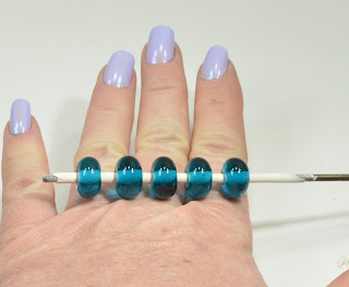
 Five pretty spacers, all in row.

 And up close, because this colour is just fun to look at. I can see a smattering of bubbles in the one on the left - I didn't notice them however until I looked this close.

I love this colour. It's not my favouritest colour in the whole world, but I wouldn't kick it out of bed for eating crackers. ;-)

Monday, April 09, 2018

CiM 729 Serengeti

CiM Serengeti - CiM describes this as an earthy brown with red undertones, but I have to say - the those red undertones, or orange overtones, as I would have described them - become less apparent the longer you work the glass.


The cut end reveals many rings in differing shades,


and the colour changes at the end of the heated rod speak to the colour possibilities one might expect ... 
 The shape on the wire, is made quickly and without a lot of re-heating ...
 And even here, the bead on the right got less re-heating than the one on the left.
 This however, with the lengthy heating/cooling and re-heating cycles, has mellowed substantially in it's colour. It's not a bad choice for, say, a palomino, if I had put a lighter mane on him. The base, btw, is CiM 448 Dirty Martini.

Either way - it's nice colour - I found it to be very, very soft - which can be a blessing and a curse with the sculptural beads. A blessing in that you have longer working time to move the glass, and a curse in that it is harder to keep the details from melting away.

Saturday, April 07, 2018

CiM 316 Banana Cream

BTW - Trunk Show at BeadFX today - come on down and see these in person!

CiM Banana Cream, non-streaky, non-reactive light ivory.

CiM calls is a pale yellow, and it does have a creamy overtone, but that fades with long working times.

 It looks like Dark Ivory in the unworked rod, but gets lighter when heated.
 This - worked fairly fast, retains a bananary creaminess.
 But the longer working time here - washes most of it out. You can see that it was not quite opaque enough to hide a scar of black on his neck.
 The base, btw, is Eff 411 Apple Blush - which I have reviewed before. Apparently - the longer working time for this bead has an effect on this glass too
 Here, from the left, Dark Turq with Banana Cream, Banana Cream with Dark Turq, and Light Ivory with Banana Cream dots.
 You can hardly see the dots on the bead on the right.

 Very nice - I like this glass a lot.

And now that we have the perfect well-behaved ivory - I need someone to reproduce the crazy reactive streaky ivory that Effetre isn't going to be making anymore ... ;-)

Friday, April 06, 2018

CiM 554 Cotswold - more

I said there was something interesting going on with Cotswold. I said that it bubbled - big bubbles rising through it, not the fireworks sparkle like turquoise, and not the big bubbles of not sufficiently dried bead release. Just bubbles forming and rising to the surface and popping.

And check this out - this greenish (by comparison) smear of Cotswold on the turquoise melange of background - did some interesting things.

So I don't know if I got an anomalous rod, or there is something interesting going on - more testing is required!

The base under the Cotswold was a blend of probably Marvo Turquoise and Dark Turquoise.

Thursday, April 05, 2018

CiM 554 Cotswold

I believe that CiM Cotswold is a colour that we have not seen in the 104 glass colour palette before. Oh, there are colours that might be a little darker or lighter, there is a translucent colour that is similar - but this hue of a rich, opaque greenish turquoise seems to me to be new.

It is definitely greener than the turquoise and sky blue family, but not so far over into the yellow to be green. You might call it a teal.

It is lightly streaky, and it had an odd boily aspect while working it - forming the occasional biggish bubble - almost like it was melting unevenly - but I don't see any pitting or artifact of that in the end result - and I was right at the end of the tank of propane, so I am reserving judgement on that until I see further evidence of it.


Slightly streaky.


It is mildly reactive with ivory - light ivory here.
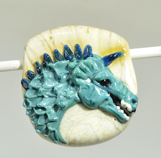
 Nice dragon colour. You can see the swirly streakiness here. The base is Eff 296 Avorio Pervinca, and the spine ridge is Kronos - which has fumed the base.
If you want to expand your colour palette with a new colour - here you go. I'm quite excited to do more with it!

Tuesday, April 03, 2018

Vetro 986 Lichen

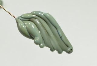
Another old glass - from an old stash. Vetro Lichen. The rods are a translucent greenish grey with a black core, but come out a swirly grey.


 The end result is opaque - and quite a different colour than you might expect.

 I have to say - it plays very well with the multi/raku type frits.