 Just a couple more quickies with the 2nd batch Adobe from CiM - gosh - I hope they decide to convert this to a regular edition colour.
First pic, Adobe 2 on Effetre Dark Sky Blue.
Second pic - Adobe 2 on EDP. Way cool!
 Just a couple more quickies with the 2nd batch Adobe from CiM - gosh - I hope they decide to convert this to a regular edition colour.
 But put it with ivory and you get some crazy stuff happen'!
 And, after heating, Unique at the bottom, Original on top.
 Bead on the right is Unique 3, bead on the left is half and half.
 Two beads of Unique 3 on the left, and one with turquoise dots on the right.
 If you are looking for a pale grey - CiM 701-3 Ginger Unique is your glass. It's a "mice" shade of grey. ;-)
 This is the Persimmon - I've left the marker bead showing so that I am sure of which picture is which. (The coloured wrap of glass - the marker bead - is how I confirm which is what when I take it out of the kiln. My notes say - Periwinkle marker was Persimmon. etc. )
 This is the La Mesa Special. Bead on left has dots of turquoise, and the solid bead on the right is quite streaky.
 Head to head - the La Mesa on the top and the Persimmon on the bottom, the La Mesa is streakier, and a little less vibrant in colour. The difference in more subtle in real life. I think if you had a bowl full of beads made of both of these, you'd have your work cut out for you if you wanted to sort them out.


 Both the Soylent and the EDP separate, and in the case of the dots of the EDP on the Soylent - they come out a markedly different shade of purple.

 So I tried again. Sometimes these silver glasses work well on black. So - Helios, on black, reduced (using a Dragon's Breath flame - big bushy flame, no oxy at all)
 Harumph. You'll have to take my word for it that there is some on there - cuz you can't see it.
 Same beads - incandescent lighting. (A regular light bulb).
 PC-1 on the left, and CiM Appletini on the right, over white - fluorescent lighting.
 And same bead again, under a regular light bulb.
 This is the sort of thing that has you checking your notes over and over.


 This is Ming, with Clio over wrap as above, but melted in, and not reduced. The Ming has stayed the same colour, the Clio appears black, but with some interesting separation effects.
 Just for reference - this is Chalcedony.


 The bead on the left is over white, and the two on the right are solid, self-coloured.
 And this little guy got reduced, which, as you can see, did absolutely nothing to change him.
 Another keeper, I think!
 Here you can see Electric Avenue (top) next to Atlantis. The Atlantis is a little greener and a little denser.
 And here we see Rainforest - posed with some Swarovski crystals in Palace Green Opal. The centre bead - with is Rainforest over white, is a pretty good match for this colour. The self-coloured bead on the right, however, shows quite different.
 And, just for reference, this is Azure next to CiM Electric Avenue.
 Here we have, from left to right, over clear, over white, and two solid beads. Azure is a dense colour - the Azure over clear is closer to the colour of the unworked rod, while the two self-coloured beads are a little darker.
 This is Azure on Ivory. Note the fairly strong reaction with the ivory, and the shift to green. There is also some subtle streakiness that shows against the ivory in the dots.
 This little self-coloured spacer was reduced, which brought up a rainbow sheen. Unfortunately, it has since cracked, but I suspect that had to do with letting it get too cool while messing around reducing it.
 All three of these are solid colour, the smaller one on the left was made last and probably got these least amount of heating and cooling - it is darker, and more translucent. This is a very dark translucent colour - not like CiM Cirrus - which takes quite a bit of build up to make it opaque - this can easily function as an opaque.
 On the left, over white. On the right - over clear. Kind of a cool streaky pattern going on there.
 This is on ivory - where it has had an extreme reaction - forming frothy bubbley patterns.
 This is a solid coloured bead - reduced. It is very dark, and has the barest hint of reddish splotches from the copper as it was reduced. They are hard to see in person, and did not want to show up on camera.
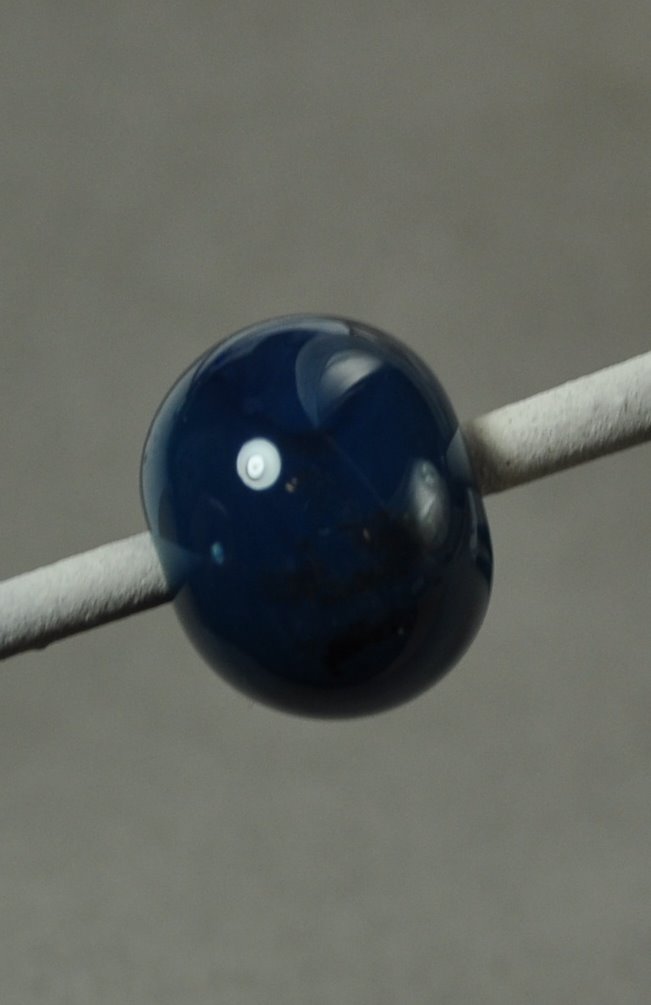 Definitely a keeper!