Friday, March 30, 2018

Vetro 963 Green Tapenade

Feeling a little conflicted on this colour - not because of the colour - but because of the name. Maybe if I cooked and was into Italian foods - this might not be a surprise, but the gulf between the unworked rods and the end results - well - it can be a bit of a shock, let's say.

 What appears to be a smokey amber brown ...


And is still brownish while hot ...

 resolves to be ... a streaky warm grey!
 A very warm grey, but nevertheless ...
 It's well behaved
 And looked a lot streakier going into the kiln.
 The background is Green Tapenade, with a smattering of frit and powder, and the horse is Green Tapanade.
 Again - the dark brown and blut dots are the frit and powder combo.

It's actually a pretty good organic colour for sculptural stuff, but it was just a bit of a shock compared to the rods!

Wednesday, March 28, 2018

Vetro 808 Swamp Moss

Swamp Moss - you'd think it would be more of an icky green - but what do I know about swamp moss - not so swampy here.


 Swamp Moss is actually a translucent honey colour - a streaky buttery caramel amber colour. Hmm - I wonder what it would look like if you "embedded a bug" in it (a glass bug, that is ... ).


 Really - a surprisingly pretty colour.


 When hot - it is more of a dark topaz ...


And it is distinctly streaky. The base is Swamp Moss with Psyche frit. 

This one, the base is Cobalt Night (Vetro) with frit - and you can see the translucence of the Swamp Moss has made the thinner parts of the horse (on the neck) darker.


This is another of the old Vetro colours - they are 104 CoE compatible - and listen - if you are looking for old Vetro colours - you need to talk to Jean at Nortel - because she has these colours - lots of some, not so much of others, but if you have used these and want more - or - if you are trying to set yourself out from the crowd by using colours that no one else has ...

Monday, March 26, 2018

CiM 556 Merryweather

CiM Merryweather is a pretty aqua opal. I've squashed it pretty thin - so it is bordering on transparent, but used thicker, I think you will get more of the translucent quality of the opal.

It's a super pretty aqua, and of course, the Effetre colours don't really have much in the way of opals/translucents.


Saturday, March 24, 2018

Top 10 Reasons Why You Will Never See That Bead ...

Not every bead is a winner. Or even in the running! Quality control is why you will never see every bead a lampworker makes.

For those of you who don't make beads - you probably have no idea how many beads that the typical lampworker has had to throw out or discard (or hide in a drawer or jar or box pretending that there is some other use from them at some point in the future) in order to present you with the selection you are seeing.

So I present to you - the top ten reasons that you will never see that bead. 

  1. Interruptions - the phone rang, the doorbell rang, the dog needed to go out, one of the kids threw up -  and the bead got abandoned, tossed in the kiln unfinished, dunked in the water pot, or generally just put aside. You don't go back to them and continue. Generally. (There's exceptions - but it's not trivial.)
  2. It cracked. Cracking can be massive, or so subtle you don't see it until you take the photo. Sometimes there is a streak in the glass and you run your nail over it feeling for the break; "Dammit - is that a crack?" There are lots of causing for cracking - but that's another article.
  3. Chipped while cleaning. For the love of gawd, somebody please make an affordable, decent bead-cleaning bit. Do not get me started on this.
  4. Bead release broke, bead started spinning on the mandrel, and bead release stuck to outside of the bead. You can sometimes save these - if you are near the end of the bead - you build little bridges of glass to anchor the bead - but sometimes - it's not worth the effort.
     
  5. Permanently stuck on the mandrel. Failure of the bead release that you did not see, deep under the bead. Now you have a cake tester, plant sticker, hair stick, garden ornament ... or several hundred of them. Sometimes there was a bend in the mandrel. Same end result. We all have piles of them.  (Spotting a trend here, are we?)
  6. Used the wrong colours. We torch with tinted glasses on, plus the glass looks different when it is hot. Sometimes you just pick up the wrong rod. Sometimes it's a happy accident, but sometimes, it just doesn't work.
  7. It was a test - and it didn't work. It was experimental - but ... no. We won't show that one to anyone.
  8. It was part of the learning curve. I have two months worth of mutant horse beads that would make a dandy boat anchor.
     
  9. It was one of those days when everything you made was crap. We all have those days. Sometimes, you can put them away in a drawer, and take them out two months later, and they are not as bad as you thought. But sometimes - they are worse. 
  10. and the number one reason ... it's ugly. It's a disappointment. It falls short of expectations. Maybe it has a flaw, a sharp end, a line of scum in the glass, an unfortunately placed air bubble, an unattractive colour reaction.  When we make beads, we fall somewhere on the spectrum between craftperson, using our hard-won skills to make beautiful but fairly prosaic, functional beads to be incorporated into a finished piece of jewelry - all the way up to genius artists making wonderful little pieces of standalone art that will endure the centuries.

    But no matter where we are on that spectrum at any given moment in time - we take pride in our work, and balance the cost of the effort and materials with the end result. And if the end result falls flat - if we wouldn't buy it - we discard it. You never get to see it.
So when you are polling through that tray of beads - give a thought to the ones you never see - because the ones you do see are pre-selected by the artist - it's all part of the experience. ;-)


Thursday, March 22, 2018

Effetre 279 Marmo Viola - Violet Marble

Marmo, as we learned earlier - much earlier - is "marble." This is a streaky violet purple and white. There is also some brownish hue in there - which at first I thought was the purple discolouring a little, in the way that the opaque violets do - but now, I'm not so sure.


When swirled around a lot - it is very interesting and very cool. 
 I was going to make one of the big horse beads, but the bead release broke, and so, instead, it is a discard. Time and glass to be discarded. The patterns are great tho, aren't they?
 These big hole beads are just wound off nice and tidy, so the patterns aren't quite so interesting.
 From the side, you can see the layers better.
So, from your streaky glasses - if you want more drama - you have to stir them up and swirl them around more.

This Marmo Viola is very cool - I would use it.

Tuesday, March 20, 2018

Comparison Effetre 039 Dark Violet, 041 Light Violet, 058 Ink Blue

Finding a blue purple - like a tanzanite colour -  in the world of soft glass is a rare thing. Red purple like amethyst - no problem - a dime a dozen. Blue purple, not so much.

I wanted to compare 039 Dark Violet, 041 Light Violet, and 058 Ink Blue. The verdict? Dark and Light Violet are in the red purple category, and Ink Blue is a ... well - you can argue that is it a blue, or a slightly warmed up blue.


Black base, white dots  - then from the left, 039, a row of 041, and 058 on the right. Then mashed.

 And the other side.
 Ink Blue 058
 and 041 Light Violet
 039 Dark Violet.
All pretty.

Ink Blue is just a little warmer, just a hint travelling towards purple, than a true blue, but is doesn't really hit the mark of tanzanite.

I think the violets are prettier than, say Effetre 042 or 044 transparent purple, but I may have a pre-existing bias about those colours.  ;-)

Monday, March 19, 2018

Sunday, March 18, 2018

Effetre 286 Avorio Verde Petrolio

Avorio Verde Petrolio - Ivory + Petroleum Green. The name pretty much says it all. Of course, ivory reacts with petroleum green like it does with any other copper-based colour - like turquoise - to create a grey demarcation line between the colours - an effect which can get a little out of hand with this glass if you really swirl it around and scumble it up.

 There is a lot of  variety in the rods, and if you look at the ends - that's pretty cool too. Hey - maybe slice up a rod for murrini?


Not so happy with this horse but you can definitely see the glass.

 Definitely a lot of that grey reaction thing happening.

Friday, March 16, 2018

Vetro 975 Cobalt Night Transparent

If I had to guess - I would say that this is a mis-melt of black. Hey - it happens. You make a big batch of chili, but something happens and it comes out different. It's still good, but doesn't really hit the mark of chili, so you call it Festive Beef Surprise, and serve it anyway. Thus, a new favorite is born. As you may remember - vetro black - pulled very thin, was a dark blue - vs the Effetre black which is a dark purple.

Cobalt Night is a blue so dark it is as near to black as dammit is to swearing.

It would probably be excellent in applications like stringers and murrini, or shards. I bet it would rock in shards!

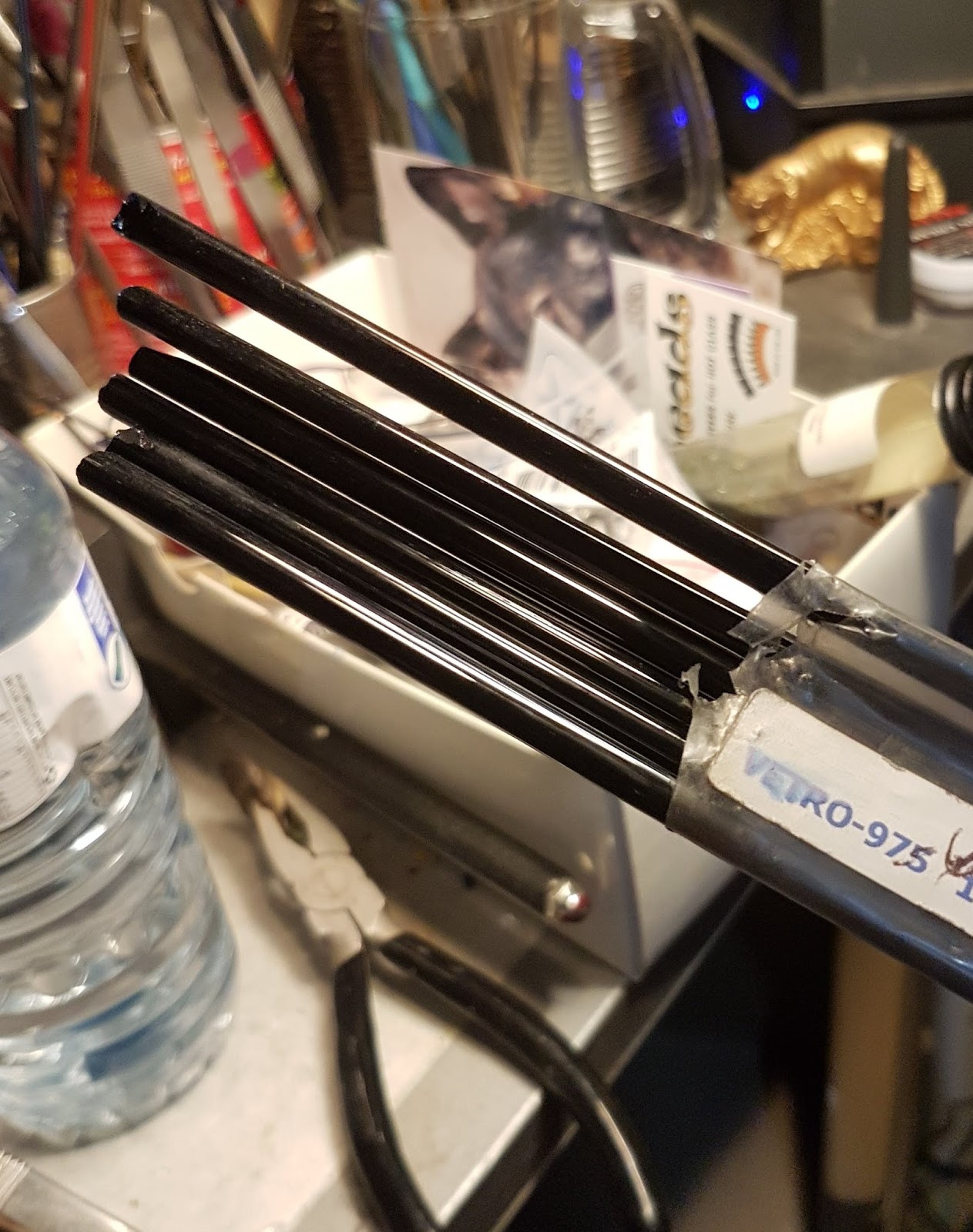
 The rods only show the barest hint of blue right at an angle held up to very strong light - otherwise - they are convincingly black.
 This is a gravity wave bead - horizontal stripes on a base, and melt while slowly rotating until the stripes travel all the way around the bead.
 This will test the darkest glass!
 This is a core of Cobalt Night - rolled in psyche frit and reduced. Not really what I was expecting ...
 and some leaves ... which are pretty thin - and strongly illuminated.
 This one, a close up from the top - developed this colour mark after mashing - couple of them did this.

Same piece - severely overexposed to show the detail. 
 Pieces strongly backlit.
I think this would function pretty well as an alternate to black, have good possibilities for blowing or shards, and I think that reaction with the psyche deserves further investigation. ;-)

Wednesday, March 14, 2018

CiM 465 Oobleck

Oobleck - you may remember - Dr. Seuss - Bartholomew and the Oobleck - was a sticky green substance falling from the sky because the regular weather got too boring. Clearly - they were not subjected to Canadian weather, where, if you don't like the weather you can wait 10 minutes, and it will be different.

Oobleck is an opaque chartreuse - a fine complement to CiM Jelly Bean (and Chartreuse - if you have any). It is a real spring green shoot colour - lighter and yellower than Eff 212 Pea Green.

This is definitely a colour that is not in the current soft glass palette. This is a gorgeous addition to out colour choices - I'm really happy to see it! 


I am definitely looking forward to using this!

BTW - Oobleck is also a category of non-Newtonian fluid - that changes viscosity under pressure. It is a liquid when at rest but becomes a solid when subjected to pressure. Check out this Mythbusters segment ...