Tuesday, September 21, 2010

CiM 957 -1 and -2: Desert Pink Uniques


CiM Desert Pink is a soft dainty pink, a very pretty pink.

-1 Unique is, for all practical purposes, appears almost indistinguishable from the original color.

-2 Unique has a brownish cast to it, just enough to push it out of the realm of being pink. Although it's a subtle difference, in the world of pretty pinks, it's enough to turn it into a more of a tan or a taupe colour.

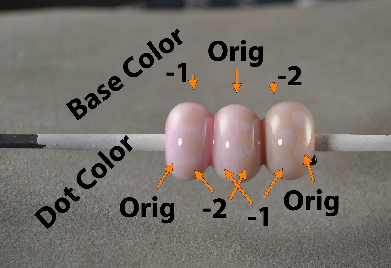
This segmented bead is, from left to right, a base of

  • -1
  • original
  • -2
Each segment has two rows of dots, which are, from left to right
  • original
  • -2
  • -1
  • -2
  • -1
  • original
If that seems confusing - try this:


The -1 dots on the original base, and the original dots on the -1 base are virtually invisible. The -2 dots show up on the -1 and original base. And the -1 and original dots show on the -2 base.

The -2 probably has it's own uses as a soft, fleshy tan colour.

I notice that the distinction between the -2 and the original seems really subtle on this monitor - and less so on my other monitor - so if they seem very close here - the difference is more obvious in real life.

Monday, September 20, 2010

CiM 874-1: Unique Admantium


Isn't this bee-you-ti-ful? Ok - ignore all the reflections and reflect on this - this is only 2 colours of glass.

This is Admantium Unique 1, on the base on the left, and the dots on the right, with the original as the base on the right, and the dots on the left.

Don't they go beautifully together? I really hope that CiM keeps this variant around - they work so well together.

The Admantium -1 stays much more the color of the rod - while the original get's substantially darker. And it is a wonderful warm grey brown, and really lovely neutral.

And a little streaky too.

This is a strong buy, in my recommendation. ;-)

Sunday, September 19, 2010

CiM 703 -4 and -5: Butter Pecan Unique 4, 5


This is Butter Pecan Unique -4 and -5. It's something of a disappointment to me, as it is, well, grey. It's not an un-useful colour - and would make a lovely neutral, especially for someone whose work is define by those quiet, tasteful sets of beads, beautifully matched and with intricate patterns - the kind I can admire, but can not do. Oh, I suppose if you put a gun to my head, I could pull it off, but really - I'm more of a wild and woolly type.


This is BP-4 on the base on the left, with Original base on the right, and the dots reversed. (Above)

This is BP-5 on the base on the left, with Original base on the right, and the dots reversed. (Above)

I can't really tell the two uniques apart - and to demonstrate that they are not the same bead and I didn't mix them up - here you can see the identifying marker dots that I put on them. Unique 4 may be slightly lighter.

Anyhoo - they are grey. Which, if you've been using Butter Pecan for say, Angels, skip the uniques 4 and 5 - unless you are going to make stone angels. Or weeping angels.

In which case, don't blink. Whatever you do - Don't Blink!

Saturday, September 18, 2010

CiM 402-2 Celadon Unique


Another variation on Celedon, this is Unique 2.

Shown here, Unique 2 is the base on the left side, and the dots on the right, with the base on the right and the dots on the left being the original Celedon.

The Unique 2 is lighter, and less of a blue green, more of an apple green.

It is nicely streaky. It's a nice leafy green. Ribbon cane made out of the two together would probably make nice leaves. Or maybe not dramatic enough.

Still - I would say it's a nice, useful green.

Thursday, September 16, 2010

CiM742-2: Sepia - the "Blue Variant"


Wow - talk about not getting the same results!

This is CiM Sepia Unique-2 - the so-called "Blue Sepia" - see Beads by Laura.

Well - I sure didn't get Blue.

In fact - this is the only glass I've ever had from CiM that I have actively disliked.

Maybe it came from a different batch or a different part of the pull.

Maybe I burned the snot out of it - but I didn't work it any differently from any other CiM glass.

As you can see - it went grey, (normally Sepia is a pale brown)

This variant boiled - like an alabastro. Actually - worse - I could not get it to stop boiling. I switched to the smaller torch mid-bead - I kept trying less and less heat - just endless bubbling. You can see the result in the finished bead.

It certainly looks burned - but I couldn't get it cool enough to not burn.

No idea what happened.

Wednesday, September 15, 2010

CiM 586-1: Mermaid Unique


Mermaid -1 Unique - quite a bit bluer than the original Mermaid. The original mermaid is a truly nice colour - filling in a gap in the 104 colour palette.

Mermaid-1 is also a very nice colour - and I think maybe worthy of keeping. It is a very streaky teal.

You can see here, the left side of the bicone is the unique for the base, with dots of the original, and the right side is the reverse - the original on the base, etc.

There appears to be a reaction between the two as well - nicely defining the dots.

I may have to stock up on this one too.

Tuesday, September 14, 2010

CiM 795: Adobe Limited Run


This is a promising color. This is Adobe, and it is a limited run - which means it is deemed too similar to another colour to put into production.

Not sure what that colour is - Ginger, maybe. I'll have to find some and compare.

I rather like it - it is a nice warm brown, a very comfortable dark flesh colour. I think I'd like to try some sculptural figures in this one.

It did have a lot of surface air bubbles in the rod when I used it - I could see them popping as the rod melted. However - there is no trace of them in the beads, and the rods were not at all shocky.

Wednesday, September 08, 2010

Devardi Metallic Coppery Black


Couldn't do it. Couldn't get it to work.

This is Devardi Metallic Coppery Black - which is supposed to go a rich metallic copper.

Now - fair enough - Devardi states on their website that you need to use a non-oxygen torch to get this to work - like a hot-head or similar.

They have added that some of their customers have been able to get it to work with gas/oxy torches, and give instructions. I suggest reading it, and watching their video. (Go here, and scroll about a third of the way down. Or hit control+f and search for coppery.)

I did read those instructions, and tried to follow them - but just could not get it to go coppery. All I got was the red that they caution you that you will get using a gas/oxy torch.

Like this.


Otherwise, all I got was black.


Not to say it doesn't work - but I couldn't get it to go. Now - one thing I saw in the video that they didn't mention and I didn't do - is the rapid cooling of marvering or mashing. That might make the difference.

While I do have a Hot Head around here someplace - I'm not motivated enough to dig it out for this. Or any reason, I think.

Saturday, September 04, 2010

Leonardo Tools: Featherbone Mashers


When I saw Karen Leonardo's tools online - it was lust at first site. Gotta get me those.

But which ones? There were different tools, and different sizes? Which ones would be best? So I solved that problem in my usual manner. I bought all of them.

She has a number of tools, but two main types caught my attention. Both are mashers, but one is shaped - called a petal puller - and the other is intended to leave a pattern - the fishbone mashers. The leave a raised pattern on the glass that is reminiscent of a fishbone - you know, the cartoony spine and ribs - or a leaf vein pattern. She must have then decided it would be good to have the same thing oriented in the other direction, like a feather instead of a fish bone. These are called, logically enough - featherbone.


Shown here are the featherbone mashers. They come in Large, medium, and fine.


I personally like these for making leaves, as it works with the way I make leaves, which is to make a gather, mash, and that rounded bottom end of the gather is now the top of the leaf, and the part that pulls out to a point and is still attached to the rod - that is the point of the leaf. I seem to be doing it the reverse of everyone else - but that would be normal for me.

How to Use 'em

Karen Leonardo has videos of how to use them on her website - www.justleonardo.com. Whatever you do - do NOT go to this website using Firefox. MSIE works - Firefox and Chrome do not. The videos just won't play in Chrome, but in Firefox - they all load automatically and start to play - so there are a half dozen versions all talking to you at once. It is quite frightening. ;-)

They are useful to watch, however.

Karen suggests using a small amount of beeswax as a lubricant on the tools. Small amount that is - and I have no idea about small. Let me just say - I have bee's wax on my graphite marver, the torch marver, the torch, and some of the glass - oh and it burns quite nicely.

To use these - make a gather of glass, and let it stretch a little. In her video's Karen mashes with the tool, and then pulls off the leaf from the rod and drops onto a hot plate.

When I make them, I let the gather droop, flatten it first with flat mashers, pulling it slightly to elongate, then reheat and press with the pattern mashers. At that point - it is still attached by a narrow piece of glass to the rod. I heat the rounded end and a rod of glass and make the loop, and then warm a pair of tweezers to hold them with while I melt through and disconnect from the rod.

I'm sure that there are many different approaches to using these, and they all work better or worse depending on your own personal style. I did find that if I did not pre-flatten - while I got a deeper and more dramatic pattern - I had to let the glass and the tools cool significantly before the would release from each other. And with the fine tool - it just took too long - the glass either would not release or was breaking. With the fine tool - eventually I had to give up straight mashing and pre-mash. I believe I am working larger than she shows in the video however. What a surprise!

You can see how the three sizes look comparatively from the photo.


I think the medium and large sizes are the best for my own working style.


I did notice some quality control issues. Most of them come together flat like this, but


one set had mis-aligned plates like this. I'm not sure that it is a big deal and makes much difference. By the time you have squished the glass - I'm not sure that you will actually notice any irregularity in the pattern. Still - it's not really the sort of thing you want to notice when the tools arrive.


Here's another observation on the way the tools come together - and again, it may be completely irrelevant. The paddles are welded onto tweezers for handles. They are fairly flexible, and, as you've probably observed by now - anything that uses this approach is only ever parallel in one place in the squeezing process. Hence the appeal of the "Truly Parallel Mashers."


It occurs to me to wonder if, when mashing the glass deeply - as the glass moves up into the gaps that make up the pattern, if there is some bending of the glass (to accommodate the changing arc of the mashers) that is making it hard to get the glass off the mashers after it cools and stiffens.

Or, if the scale of it is all just too small to make any difference.

Maybe I'm over squeezing. Anyhow - I have more success with the medium and larger ones. And I do like them - They make lovely leaves in next to no time.


Monday, August 23, 2010

follow up on the brass face mold

It is a Carlo Dona tool - of course.

They are referred to as "stamps" on his site - You can see them here. His tools have a reputation, well deserved, for being very, very well made. And, ahem, priced accordingly. The rest of his tools are on the products page.

I would suggest avoiding the "home" page of his website as it launches the quick-time player and a very large download that starts music playing. Unless you like that sort of thing.

Saturday, August 21, 2010

Brass Mold - onna a stick


Well here's an interesting tool - this is a brass push mold on a handle.

I have it on good authority that this is an Italian tool used actually by glass blowers - for ornamenting large vessels. The idea would be to add a large glob of glass to the side of the vessel, perhaps in the centre of a medallion, or maybe at the base of a handle, and then push this down over the top, shaping it. You could get a classic cameo look. You would then ornament as you saw fit.


Of course, as a flame worker - you know I'm going to approach it the other way, make a gather of glass and push it into the mold.

It actually works quite well - I'm impressed.

It make a face, a rather classical and passive face - which you can then dress up with some hair, or maybe tweak the features a little. It's easy to melt out the lips and it is worth it to deepen them a little with a razor tool.

The key is that you have to let the glass cool and shrink away from the tool, in order to get it out. At first, it seems stuck, like it is never going to come out, but just wait a little longer, and it will come right out.


Here is a face in ivory (with a random piece of detrius stuck to the side. Ignore that please.)

Here is one in the that ghastly fish pink - you know the colour that looks pink until heat it, and then it turns grey. Ugh. It has a smear of something across the nose, possibly some random frit from having to retrieve the gather of glass off the bench. I stroked on some ivory hair.

Here's one in clear - and I surprised at how well it photographed. I added some hair, and her pony tail is actually the loop to hang her by as a pendant.


It's a nice, useful face, and I think you can do a lot with it. The mold cavity, and consequently the face too, is about an inch long - sizable, but not outrageous. Definitely useful as a jumping off place.

I definitely like that it is on a handle, as opposed to a mold that sits flat on the table.


Sunday, August 15, 2010

Frit Secrets - Condensed - by Valerie Cox

The second edition of Val Cox's book on Frit is a condensed and edited version. It is a little thinner, and consequently, costs a little less too.

However, there is nothing fundamental missing from this version. I re-read this with a great deal of pleasure - much like catching up with an old friend. Little nuggets of information, half-remembered, or out-right forgotten. New emphasis, and yes, a little new information where items need to be updated. (For instance, the Zimmerman line of frits is no long in production.)

Lots of good solid info and helpful suggestions.

If you already have the first book - I see no need to buy this one, just go re-read the one you have.

If, however, you are contemplating purchasing one or the other - I would suggest this version. It lacks nothing and is a little tighter in the presentation.

And, if you are just trying to figure out what to do with your frit to make it look awesome, well - that is the whole point of the book, and it does it well!

The author says, "If there is one idea to take away from this book, it is to use less frit." Less is more, and so it is with this version.

Wednesday, August 11, 2010

CiM 891: Hippo

On the topic of Greys - here is another grey - an opaque grey from CiM. Hippo - what a perfect name. Mind you - I haven't spent a lot of time with hippos - I understand that they are quite dangerous for one thing, far more so than lions and tigers - but I suppose that anything that lives in crocodile-infested waters needs to be a fairly mean mother... . Anyway - where I was going with that is that I am not intimately familiar with the colour(s) of hippos - but I imagine them being this colour. Rhinos too, for that matter. In my head - hippopotamuses and rhinoceroses are intrinsically linked together - like Jeeps and Hummers - one being the more squarish and slab-sided version.

Elephants too - I see elephants as grey too. Never pink.

And this is a medium, opaque, slightly streaky grey.

From left to right, with Double Helix Triton, which has been raked and reduced. Notice the fuming from the silver in the Triton on the grey has shifted it more to a Khaki colour. (Let's not start the Khaki colour debate again!) In the centre and on the right are two self-coloured beads.


Hippo is not a unique, but it is a limited run. I'm not entirely clear on what that means - whether there is just less of it, or it will only be made again if there is a demand for it.

Hippo - a nice "large-African-wild-animal" colour. Suitable for sculptural hippos, rhinos, elephants, and possibly Jeeps and Humvees too.

Tuesday, August 10, 2010

Effetre 084 - Light Steel Grey


Lately, I've been on a bit of grey kick. Odd - as colour - deep, rich, super-saturated colour is usually what does it for me.

But watching Lucio work with a lot of grey gave me a new appreciation for it. Unfortunately - as I am not familiar with the greys, I didn't really pay attention to which one it was. So I was surprised to find that Effetre has three! transparent greys. I thought there were just the two.

This is 084 - Light Steel Grey, and it is not a completely neutral grey. In life, it is actually more of a soft blue green/grey - a sagey kind of grey. Although, it is showing a little on the aqua side on my monitor right now. Actually, it shows closer to it's actual colour on the IBM monitor on the left side than it does on the Samsung monitor on the right side. I have two monitors - so I can get more "real estate" for all the programs I have open at one time.

From left to right, over light ivory, over white, and by itself.


It's surprisingly attractive - and far more complex than just a simple, neutral grey. Quite a sophisticated grey.

I like it!

Wednesday, August 04, 2010

Essential Tools: Graphite Stump Shaper


And - one more "don't leave home without it" tool. I have quite the kit of tools that I routinely schlep about, actually.

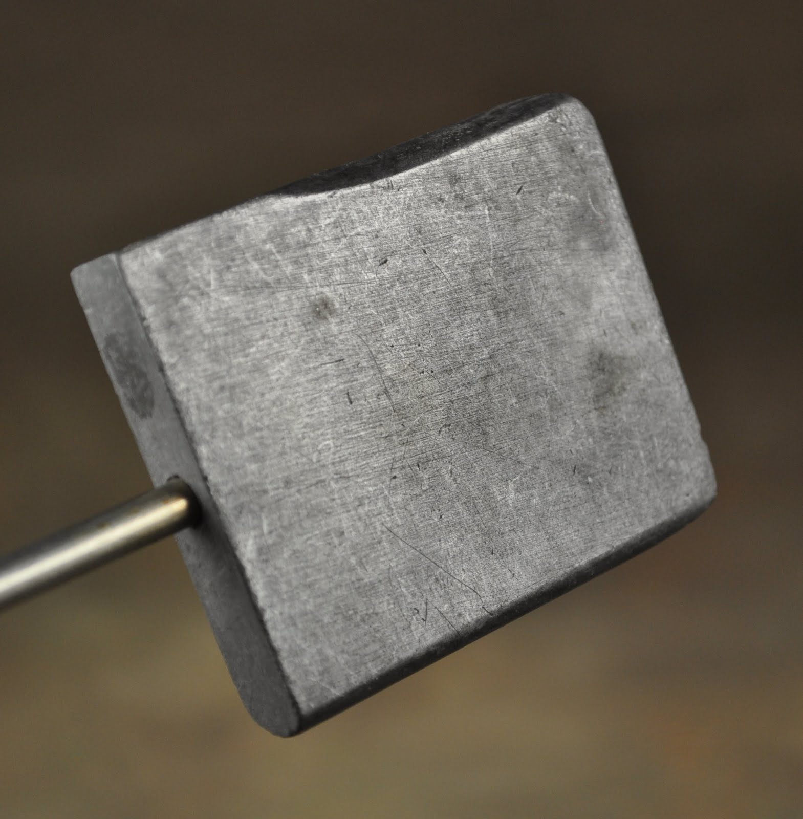
This is the Graphite Stump Shaper. For this, as it is lighter than the brass stump shaper, I prefer the larger size. This is the 2 x 2.5 inch size. I appreciate that the handle is wood+metal. I have to admit - the rubber handle of the brass stump shaper can definitely smell of much-too-hot rubber if you let the head get too warm.

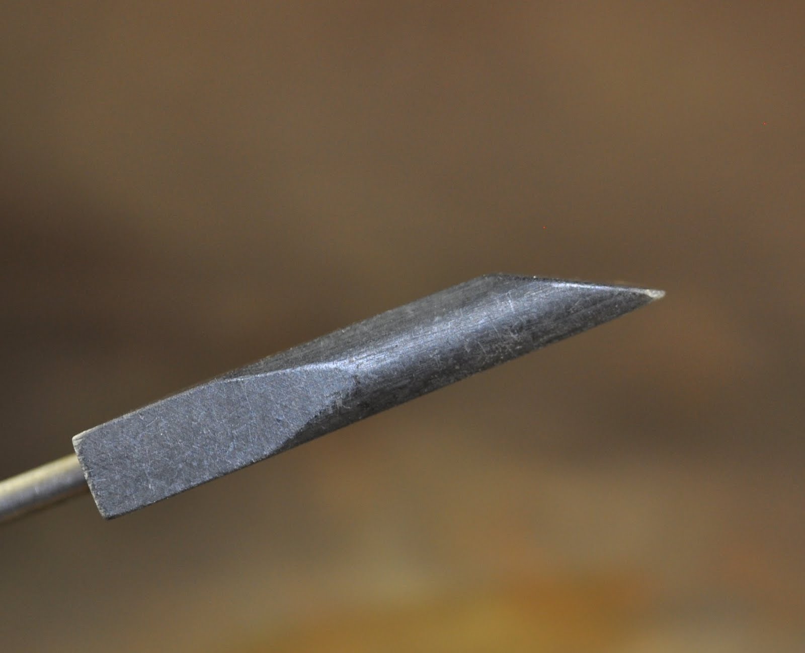
Here is the head, from various angles, so you can see the planes and curves and etc.


The beveled plane at the end is particularly nice for shaping bicones.


So - why do I have both a brass Stump shaper and a graphite one? Well - I find brass and graphite move the glass in very different ways.

Because graphite is slipperier, it slides more over the glass. The brass is a little "grabbier." So - if I am putting on dots, and flattening them with a tool - instead of just melting them in by themselves, if I want to "steer" them into position - i.e. I'm doing something that requires more precision (as unlikely as that seems!) - then the brass tool is better, as I can tweak the dot into the best position as I flatten it with the brass dot - by sliding in one direction or another. With the graphite tool - it's just going to flatten it.

And, as subtle as that distinction sounds - it's enough to justify both tools.

Also - I don't use the graphite tools for the heavy duty cutting and separating that I use the brass Stump shaper for.

The graphite Stump shaper is also large enough, and being flat on one side, to function as a flat paddle for marvering. If you are just starting out, I would suggest skipping the flat paddle and going for this instead, as it is more versatile.


Monday, August 02, 2010

Val Cox Frit: Straw Fire


Well - here we go again - a new selection of frits. By now - you know about me and frits and my questionable relationship with them. But I am starting to get somewhere - and lord knows, just because I'm bad at something - doesn't stop me from doing it.

Unless it is parachuting. I realized that being bad at that could kill me - so I stopped after the first jump and only a broken ankle. But that is another story.

The working notes for this blend say:

Opaque: Firey tones of red, orange and earth ignite this blend of frits. A hint of some cool tones gives it complexity and depth. Don't pair with silver foil or dark rimming will occur.

So, here we have it on white. It was shades of pink when it was hot. But, orange and red it said, and orange and red, and yellow and a grey violet is what we get.


From the left we have: 1) clear gather, dip and wind. 2) On Hades. 3) And on Hades, and encased. Apparently, that one could have used more frit and less heat. I've swirled the frit into total obscurity on that one.

Then I tried two implosion flowers. I was quite pleased with these, but then - I noticed that they both cracked.

Big, honking cracks through the clear. I used Lauscha clear for this. I was pretty disappointed. But I suspected that the fault was mine - not the frit or the clear.

I went back and tried again. Much better. For what it's worth, this is a much flatter profile, more like a button than a snow globe, and I like it a lot better. And no cracking. I've bashed this and whacked it a few times too - so I think it would have cracked if it was a compatibility issue. Hey - maybe I should look at these under the polariscope! (Update: I did - inasmuchas it's hard to see on the side - it looks fine.)


This is a nice, happy blend of summery colours. The light mauve stops it from being too over the top and adds a little sophistication.

Saturday, July 31, 2010

Awesome Tutorial in Flow Magazine

And a big thank you to Christian Arnold for his Dragon's Eye tutorial in Flow Magazine. Even though the tutorial is for boro - I did it in soft glass.

Check out my first attempt!


How cool is that? Yeah - I got the iris all swirly - but in the context of a dragon's eye - it works. The first person to bring me a live dragon that has different eyes can complain. Besides, if any of you read any Anne McCaffery's Dragon Rider series - you may remember the description of the dragons where it would say "so and so's eye whirled angrily ... " - well maybe this was what that looked like.

I used Double Helix Nyx for the stringer for the iris. Hades black for the pupil and base, and Lauscha clear for the lens. There is a layer of light ivory around the the very small white of the eye, and skin and eyelid are CiM Gunmetal.

For the actual tutorial, you'll have to get your own copy of Flow Magazine. It's the Summer 2010 issue. You can get it from their site.

And while you are there - subscribe. It's an awesome magazine!

PS
just as a follow up - I've continued to make more of these. You can see them here on my webshots album. They make great wallpaper too.

Thursday, July 29, 2010

CiM 717 Khaki


Well - who knew? Here's a colour of CiM I haven't tried! Not even a new colour, but an old one. This is CiM Khaki.

I went looking for a grey for a horse bead, and I was wishing I had more of the CiM African Grey, but I know I am out of that. I was hunting through my CiM stash - "Oo, that looks like a grey," sez I to myself. "But it says Khaki. Better go look it up on the blog, before I make a green horse." And lo - it's not there. Ok, better try it out.

When I think "Khaki" - I think of a greener colour - although, now that I google it, Wiki has a very nice entry on the general confusion surrounding the colour. My experience with it would have come from home and my mother, who was an officer in the British Army and the British military uses a greener colour.

So - in common experience in North America - apparently Khaki is thought of more grey-like or beigey. Fair enough - no one said my experience of the world was common!

On the left, a self coloured bead, a little streaky. On the right, rolled in white frit (Effetre frit).

Here - with a stringer of Hades. Nice feathering.

And here, with a stringer of Triton, and reduced. Nice fuming effect on the Khaki. Kind of makes it ... Khaki-coloured. ;-)


Anyhoo - I think it will do nicely for the horse bead.