Wednesday, May 11, 2011

Graphite Shaping Tool - Finally - One I Understand!


Finally - A graphite shaping tool that instantly makes sense to me!

No ends - so it doesn't matter how long you make the bead! Which tends to be my problem with molds and shaped marvers - too much glass - spilling out the ends, and then knocking the bead release and breaking it, and then it all goes downhill from there.

"Aha" sez I when seeing this one! This is a shaper for me!

And, in fact - it works really well. I really like using this tool!

And with two sizes of grooves - you have some choices of sizes.

If you've been making, on planning on making, bead handles for the bead accessories, like bead pens, letter openers, cutlery and other stuff, this is a great shaping tool. It is a whisker wider than the letter openers need - which is longer than the pens and some of the other items. But, you can make a reference mark on the graphite with a Sharpie, and use it to check the length as you work.

Did you know you can write on graphite with a Sharpie(tm) brand permanent marker and, in defiance of all odds, it shows up on the graphite, and does not burn off. Sharpies are amazing. I have no idea what is in them.

Here, you can see the profile of the two grooves in the tool. The back is flat, which is also handy for straight marvering.

Here you can see a bead in the slot - obviously I don't hold it this way in the flame - I just have a shortage of hands when it comes to operating the camera.


And the larger slot. The handle gets noticeably warm after a lot of marvering - but the squidgy rubber coating keeps it handle-able.


To use this - start small - I started with a very thin wrap of glass in the center - and marvered it out on a flat marver - then went to the grooved marver. I added glass in the center, and melted it and mavered it in, to get the size - and extending the length. When I had the size correct in the middle, I built up the ends to match.


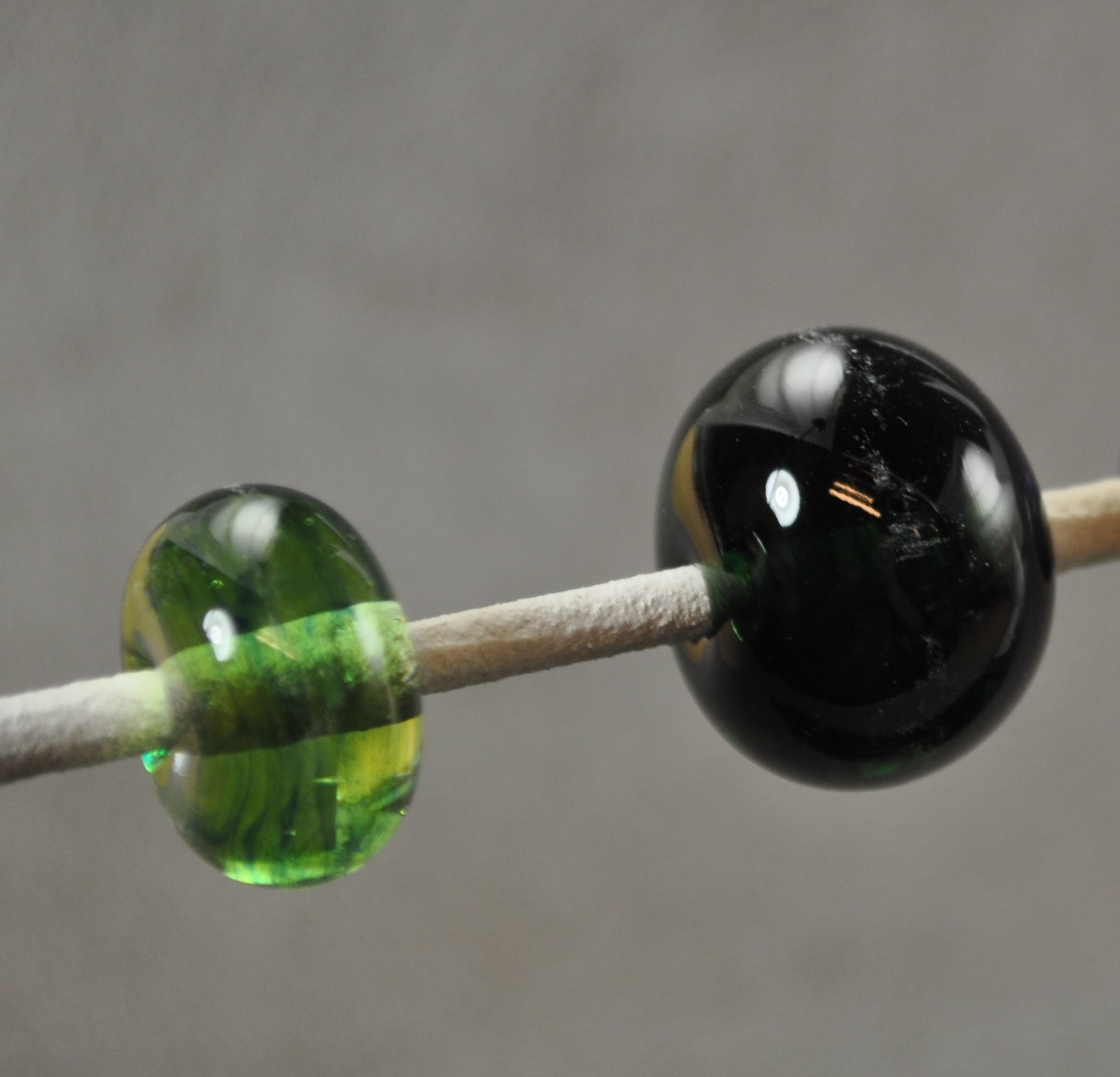
Beads above are Raku Jitterbug frit on Hades. Bead below is Ghee + Ivory and reduced + Psyche, raked, and then reduced again.

Monday, May 09, 2011

Effetre 729: Lizard


Effetre 729 Lizard. All I can think of is the old Taco Bell commercials with the Chihuahua with the box trap chanting "Heeeeere, Leezerd, Leezerd, Leezerd." That was back when the Godzilla remake came out.

Leezerd is a streaky brown and grey - a coffee and slate combo


Here - this spacer is made only from Lizard, and you can see the wide range of colour possibilities.


This is Lizard with ivory.
This is Lizard encased. The streakiness and colour variation is much less pronounced here.
This is Lizard with Double Helix Terra Nova. They have played together very nicely. There was no appreciable reaction with the ivory (see above) but a strong reaction with the Terra Nova. Nice combo. Wonder how it would react with silver foil?


There was no appreciable reaction with the ivory (see above) but a strong reaction with the Terra Nova. Nice combo. Wonder how it would react with silver foil?

Saturday, May 07, 2011

Lampworkers Trunk Show at BeadFX next week


Next Saturday (May 14) - beadFX is hosting a Lampworks' Trunk Show (10 - 5pm) at their Scarborough store.

This is a small, informal, one-day show where artists can get their feet wet doing a show in a safe, friendly environment. There will be some veteran lampworkers there too - and it's a nice low-key opportunity for them - without the pressure of a big show. Demo's go on all day in the attached studio - which is great for customers who come in and want to know more about how the beads are made. Customers can also shop for beads and findings to go with the lampwork.

If you're in the area - you might enjoy dropping in. I personally have another commitment, and won't be there for more than a few hours in the morning, if that - but I'm sure you'll find looking at everyone's work really inspiring.

And if you are not - perhaps you'd like to approach your own local bead store and see if they would like to partner with you on something similar. All it takes is a few lampworkers, some tables and a few tableclothes. Even if they don't have studio space, you could run videos of lampwork on a laptop so that people can see how it's done. It's good for the store, as it brings extra people and inspires them to shop. It's good for the lampworkers - they get to sell some beads and meet some potential clients.

Cheers!

Friday, May 06, 2011

Effetre 717: Green Dreamz


Effetre 717 Green Dreamz. With a z. This is a very dark glass - but when you dilute it enough - really cool streaks emerge.

The rods don't look so dark, - darkish - but not dark, dark.

They certainly don't look like they are going to go "so dark it might as well be black."


Bead on the right is self-coloured - the bead on the left is over clear - note the cool streaky dreamy underwater seaweed thing it has going on.

And over white! Awesome. Totally looks like you spent hours pulling sophisticated ribbon cane.


I haven't tried encasing it yet - so I don't know if it's ok with that - but this definitely looks like it wants to be in an aquarium bead!

Sunday, May 01, 2011

Success with Frit

I think I may have ended my long-running hate-affair with frit and finally found a way to make it work for me.

Those of you who read this blog regularly will have noticed that I have tried a number of frits and been less than enchanted with the end results.

And then it struck me - it was a matter of scale! It's not that I don't like the random patterns of frit - it's that they just don't have enough room to play on your regular sized spacer!

So - I tried going bigger. This bead is 2 inches across. The base is Vetro 960, with trails of EDP and black, with the frit Mood Swings, with clear ridges built up.


This is also 2 inches across. Same colours, with out the textural clear.


This is a little smaller - about 1.5 inches across. A custom blend of frits that I had laying around.


I like a bead with heft - that you could lob throw a window. Without opening it first. ;-)

So - frit. Go big or go home. For me, anyway.

Friday, April 29, 2011

Vetro 960 Light Pink Pastel vs Vetro 956 Dark Pink Pastel


These two Vetro odd-lots are named Dark and Light Pastel Pink - but the difference between the two is subtle, subtle, subtle.

However, it is a very pretty light rose - so it really doesn't matter which one you grab!

The unworked is a rather dull and uninspiring pale mauve - and looks like it might be somewhat greyish.


Here you can see the beads lined up with their respective rods. The 960 is the bead/rod toward the top of the pic, the bottom/left is the 956.
Here they are again - 960 Light Pink on the left (although - if I had to say - I'd say the 960 is darker) - and the 956 Dark Pink on the right.
Here is a bead with the base of 960 on the left side of the bead, and and 956 on the right. The dots are EDP. Interesting separation.

Nice shade of pale pink and significantly prettier than the rods look like it will be. Odd lots are limited in quantity - so snap it up if you love it!

Wednesday, April 27, 2011

CiM 109: Bordello


Another colour I seem to have missed in testing - CiM Bordello, a very dark, very intense red.

By itself - it is so dark - it can read as almost as an opaque.

I did not have a problem with it going brown and livery - although others have reported this.


On the left, Bordello thinly layered over clear. On the right, self-coloured.

And over white. It really pops like this.
This was a thin core of Bordello, with Double Helix Kronos, and heavily encased. It might as well be black.

Here it is in a sculptural piece. You can really see a lot of colour variation, due to it's striking. Areas that are re-heated are darkest, areas that are not - stay shades of light red and amber.


For making twisties and stringers and cored canes - where you need a really dark, intense colour - this would be an excellent choice. Otherwise, you may have to dilute it by using it is over clear or white.

Monday, April 25, 2011

CiM 402: Celadon


I just decided to double check the Creation is Messy (CiM) colours to make sure that I had them all. This is a far less daunting task than, say, cross checking all the Effetre colours, as I started reviewing when CiM was fairly young, and have kept up with it.

So, of course - it's some of the older colours that I have missed.

CiM Celadon - a greenish turquoise - reacts strongly with ivory.


This is Celadon, self-coloured. Slightly streaky.

Here, with Light Ivory dots (Effetre I think, but not sure). Very strong reaction. A bit much for my taste, not quite as over the top as the Lauscha Turquoise.
Here is it with dots of CiM Fremen - which is a blue-turquoise.

Celadon is really pretty colour - a must have in my glass palette - adds a really nice green in a hole left by the other glasses.

Saturday, April 23, 2011

CiM 482 Mojito vs Effetre 073 Transparent Pale Green Apple


In the rod - CiM's Mojito and Effetre's Transparent Pale Green Apple look similar - the Pale Green Apple being a slightly lighter colour.

In the pic, Mojito on the top, (obviously,) Pale Green Apple on the bottom.

Once worked - that distinction remains, with the Mojito being just a little darker. In some applications - you'd be hard pressed to tell the difference. In others - you could use it to good effect to create a subtle shaded effect.


Pale Green Apple on the left, Mojito on the right. Both are a pretty, pale, yellow-green.

Friday, April 15, 2011

How to Make Sparkling Dichroic Beads: Tutorial by Patricia Frantz.


This tutorial starts with the introduction:

"So many beadmakers have told me over the years that they find dichroic glass scary and difficult to use. I have written this tutorial ... to show how I work with the remarkable glass and make it sparkle."

I have also found this to be true - and so many of my students are so intimidated by it, and by the price! - that they buy a tiny scrap and hoard it for years, never working up the courage to use it. Or they try it, aren't happy with the results, and never try again.

Well - for those of you with dichro-phobia - you should definitely turn to Patricia's tutorial. It is a series of projects, starting with a simple spacer - and working your way up to more complex projects.

She takes you through the process step by step, and has some truly excellent tips on getting good results - especially getting a smooth look without a line at the end of the dichro strip. Actually - even though I've been working with dichro for years with what I like to think of as a reasonable degree of success - (ha ha) - there were some tips in here that I found valuable and have adopted.

Recommended if you are scared of dichro, or even if you aren't.

Ms Frantz sells the tutorial on http://patfrantztutorials.com/

Wednesday, April 13, 2011

Another crack at Helios


OK - so I have one of the beads I made with Double Helix Helios sitting on my keyboard - and while they are not as metallic as I had hoped (see post) - I guess it is growing on me - so I thought I would take another swing at it.

This time - the glass worked quite differently - developing an overall, opaque haze when I reduced it. I didn't much like the look of the haze, and so I turned the oxygen back up and burned it off - and re-reduced them - so of these beads, I had to repeat these steps a number of times - to try and get them without an opaque haze on them. They have all come out with a richer colour and a more varied surface colour. A sort of smoked honey effect. I think I like them better this time around.

Variable rewards - that what the exotic glasses are all about - variable rewards!

Sunday, April 10, 2011

Effetre Copper Green

Effetre Copper Green - well known for being one of the more "reactive" glasses. However, a recent introduction to a certain gecko got me thinking about using it for it's natural colour. It matches very nicely to a rather handsome gecko that I just met, (no really - I have friends w a houseful of lizards).

I thought I'd better get a handle on the colour, the reactions, and oh yeah, as I remember - it reduces in the kiln.

This is a self-coloured spacer - Copper Green. It comes out of the kiln with a dull, grey layer - quite unappealing.


As with the turquoise glasses - when they do this, I soaked the beads in CLR. I was a little short of it, so I actually used a solution of about 50% CLR and 50% water. Generally - I only have to soak beads for an hour or so - this diluted solution (and maybe the layer on the copper green is tougher?) took longer - I let them soak for about 2-3 days. I could see improvement after the first 3 hours - but I wanted more - so I left them longer.


Above, this is the same bead, post CLR'ing. (CLR is a cleaning solution for removing Calcium Lime and Rust. It is now also a brand for other cleaning products. You want the original. I've tried cheaper brands - they don't work as well.)

The colour is very close to what I had in mind - a soft, pale green.

Next - also a solid Copper Green bead - this one was deliberated reduced. Note the large patch of red that it has developed.

And, here is the same bead, post-CLR. The red patch is much more vivid and vibrant. I like the hue much better.
This is a base of copper green, with EDP (Effetre Purple) dots.

And below - post CLR. I actually like it less now - less character.
This is a base of EDP, with copper green dots. Note the truly magnificant separation effect - making the single copper green dots look like a dot on dot effect.


Post CLR, again, I think it has lost some character.

Ivory base, with Copper Green dots, and ivory dots again.

Post CLR - the copper green is brighter, but I think I liked the first version better.


So - an extended soak in CLR will take off the dull, metallic haze - which is what I wanted to know.


Tuesday, April 05, 2011

Effetre Goldstone Filigrana


I've talked in the past about Goldstone/Aventurine ribbon - but goldstone also comes as filigrana. (It also comes as frit and chunks, for that matter - but that's another topic.)

In fact - prior to the ribbon - the filigrana was the easiest way to use it - but not necessarily the most satisfactory.

It's a little on the thin side, in terms of the amount of actual goldstone stuffed into the middle of it. The end result of that is, that it's not a very intense effect when used.


You can see here, in this close up of the rod - that it is not that intense.
And consequently - beads just wound out of the rod - come out a little wispy. Not that wispy is bad . . . unless you wanted intense.

This really comes to light when you put it down over another colour, like the turquoise here. Instead of a dramatic effect - you get a subtle brindle effect.
I like brindle - but not so much on my beads.

Easy to use - rods look great - but if you want intense glitter - go for the ribbon. Course - subtle might be what you are all about - in that case - go for it!

Sunday, April 03, 2011

CiM Crocus and DH Triton

Have to admit - I did not expect such a radical colour change in the Crocus!

The top mandrel is CiM Crocus - a truly lovely reddish lavender purple.

The bottom mandrel is the same color - with a trail of Double Helix Triton, and reduced. The effect of the Triton reducing on the Crocus is quite dramatic! The crocus now looks much more pinky.

Veddy interesting.