Wednesday, August 31, 2011

Another Yellow Comparison


Orangey yellows - or yellowy oranges. CiM Marigold vs Eff 408 Med Lemon Yellow. Both look very similar as rods.

On the left, Eff 408, on the right, CiM Marigold. The 408 is definitely orangier and a little streakier. The Marigold is a beautiful egg yolk colour - the 408 is more like butter with some marmalade stuck to it.


Monday, August 29, 2011

CiM Unique vs Ltd Run

Some of you are a little confused by Creation is Messy's use of the term "Uniques" vs "Limited Runs." I've gleaned this from their website and from emails.

CiM is discontinuing using the term "Uniques" - as nobody really understood what it meant. They are now using the designation "Limited Run" - which opens the door to new possibilities in terms of making one-off runs of a colour for a specific need. Uniques sound like the colour was made by accident, and Limited Runs sound deliberate - so I think that it is a very smart move on their part.

The CiM colour palette currently stands at over 60 colours (woohoo - I remember when it was about 5!). They can add colours ad nauseum - but some colours are more in demand than others, and not everyone wants every colour. (I like to collect the whole set - but we know I'm crazy and obsessed.)

Limited Runs can be made to accommodate requests for a specific colour, and can be made again in the future, but will also let you know that it is outside the regular colour palette - so if you love it, buy a lot of it or request that it be added to the regular colour line-up. (Which they might well do!)

They have also discontinued some slow sellers, colours that are really close to other colours in either the CiM line up or duplicate a Effetre/Vetro colour, and/or pricier or just plain hard-to-make-consistently colours.

These are the discontinued colours:

140 Lipstick

223 Pumpkin

479 Soylent

505 French Blue

512 Halong Bay (OK - I know I will be buying up every stick of this I can find!)

571 Cornflower

652 Count von Count

653 Larkspur

703 Butter Pecan - will probably continue to be available occasionally as a Ltd Run.

717 Khaki

ALL stringers with the exception of Hades, Tuxedo, Clear, & Peace.


So now you know. ;-)

Saturday, August 27, 2011

CiM 803 Twilight


If there is a Midnight - stands to reason there is a Twilight.

CiM Twilight is a darkish grey - it looks very neutral - and it builds up intensity fast as it gets thicker.

On the left, white with Twilight dots - very pale. But in the center and on the right, these two self-coloured spacers are quite dark.


I find it hard to get excited about grey for it's own sake - but I've come to appreciate a nice grey - it can really make the other colours sing.

Thursday, August 25, 2011

CiM 501: Caribbean Ltd Run


CiM 501 - Caribbean - What a pretty shade of blue!

Oh yeah - this is a must have. This is a denim blue - that smokey Montana Blue Sapphire colour that has been missing from the colour palette.

It looks like medium sapphire in these photo to me, on my monitor - so I'm not sure what it will look like to you, but in real life, it looks darker and more muted - like denim!


On the left, over white (I let the bead get off centre, and in heating it up enough to round it and get it back on centre, it when from blue over white to blue and white swirled). On the right, self-coloured spacer.
Blue, over a core of white.


If you are a fan of blue - you'll love this colour!

Monday, August 22, 2011

Cim 502: Midnight Ltd Run


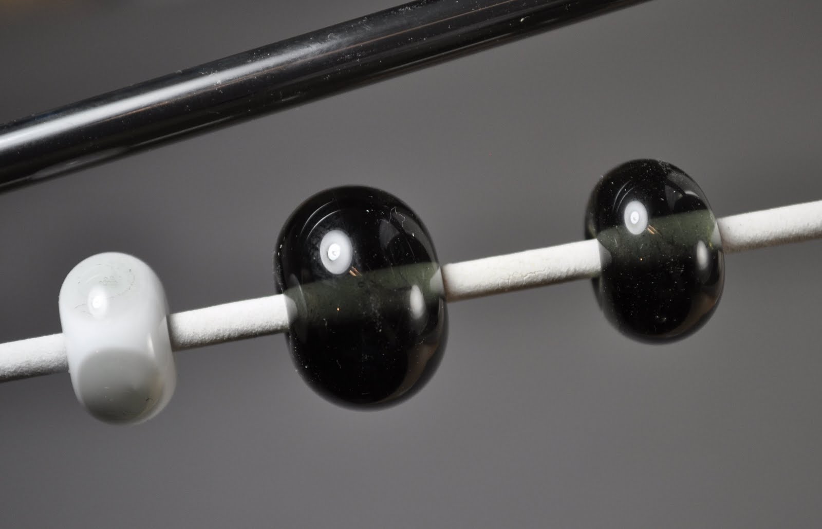
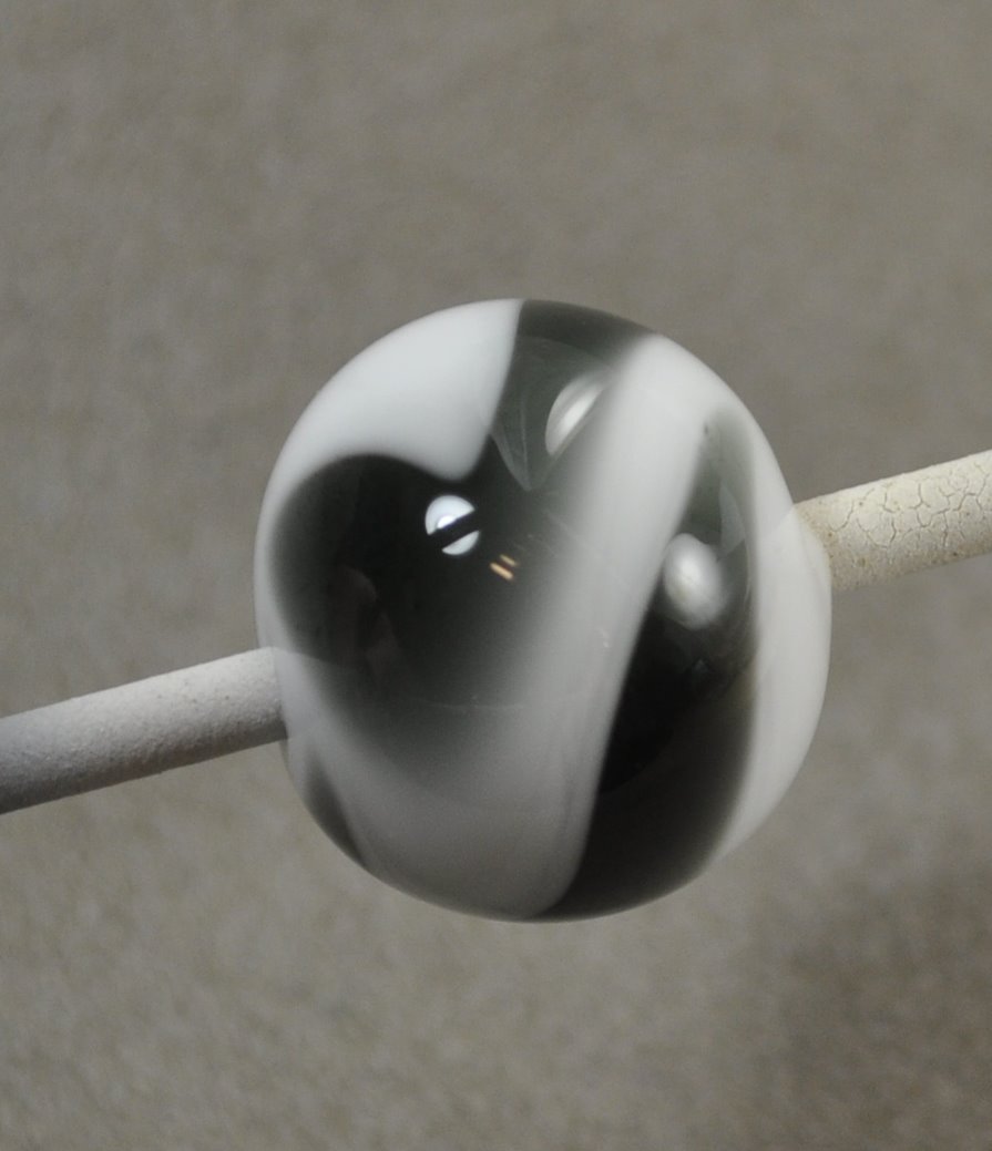
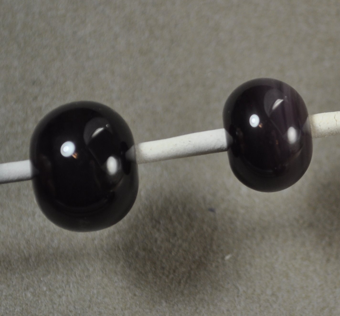
This is CiM Midnight - a very, very, very dark transparent grey.

You can, if you hold it up to a light, see that it is dark grey, but just laying around on the desk - it looks like a black.


Here, on the left, is a clear bead with very thin trails of Midnight, melted in - and it has come out as a very pale grey. On the right, a self-coloured spacer.

This was horizontal stripes, heated and allowed to flow over the white. Where is has stretched out thin, it looks grey - but where it is thicker, it looks black.


Which does open some interesting possibilities. I wonder if it is reactive? It might be another way to get a true black as opposed to a purple- or blue-black. Hmmm.

Interestingly enough - the CiM website says that this colour shifts between Navy Blue and Purple - depending on the lighting. I don't see any of this at all. Curious.

Saturday, August 20, 2011

CiM 601: Mulberry Ltd Run


CiM Mulberry. Well - this was a bit of a disappointment - although, really it shouldn't be.

The beads are darker than the rod colour - almost black - but that wasn't the shock. It was just such a pretty colour when it was hot, and I had such high hopes for it!


These two self-coloured spacers - dark, opaque plum colour. But when they were hot and went into the kiln they were yummy! Blues and purples!


Although - this bead with ivory - there appears to be some separation in the ivory that could be interesting.

Same bead, other side, some swirliness appears to indicate that this colour could be more interesting if diluted.


Really - I'm only disappointed in this because of how I hoped it would turn out, based on how it looked hot.

Wednesday, August 10, 2011

BD 03: Black Diamond

Belladonna Black Diamond is designed to be a true black that can be stretched thin and retain it's blackness with no shades of purple or blue, but without the webbing, crawling effect that some blacks have when superheated.

And does it live up to this lofty goal? By crikey - it does!

A word of explanation here for those new to working glass. Glass can be opaque (you can't see through it) or transparent - transmits light - not necessarily clear, and sometimes, so dark you can't see through it at all except with a really strong light behind it - but it's still a "transparent." That distinction is important to you as you develop your glass working skills - as opaques are softer, they melt faster, stay moving longer, melt at lower temperatures - while transparents are stiffer, need more heat to melt, and stiffen faster. Transparent dots on an opaque bead tend to "sink" into the opaque base when melted in. The difference becomes especially important if you get into making sculptural beads, as some things are much easier to do with a stiff transparent than a soft opaque, and vice versa.

Black is a transparent - and traditionally - i.e. Effetre - it was a really, really, really dark purple. And you could see that it was purple if you melted the glass and let it flow, or did small dots and melted them in a lot. So then there was Intense Black - which has a lot more of the stuff that makes it black, making it significantly more expensive. It stays black, but it also does all sorts of interesting things when super heated. So, there's a trade-off. Anyway - I'll revisit black on another day.


This is a white bead with black dots. No traces of colour at the edge.


Meh, you say. Big deal. Oh yeah? Check this out.


How's that grab you? White bead - 3 horizontal lines - heat the snot out of it, keep rolling it and keep it balanced, letting the black stretch and swirl around. See where the black has gone really thin. It's - well - black + white gives you ... grey.

And another shot of the same bead. It's black, it's white, it's grey. When making this bead - I had the sense of discovering something new, of being on uncharted ground. You just don't usually see this happen.


For comparison - this is Effetre Black on white, worked the same way. Notice the streaks of purple.


And again.

So - how about on Ivory? This is a base of Effetre Dark Ivory on the left, worked as above - and then more ivory added on the right, and Black Diamond "blobbed" on top and melted in. This side also got a lot of heat. No trace of the webbing and crawling and break up that Intense Black will do in these same conditions - especially on ivory.


How does it compare for stiffness? Well - it comes as stringers, so it's really hard to say.

This may seem like a really simple thing, especially if you are new to glass and are still struggling to get the beads round, but a true black that just behaves itself is a really significant thing.

Not to say that I don't LOVE the bizarre effects that Intense Black can give you - because I do. And I have had a lot of success with Vetro Black and CiM Tuxedo - both of them stay reasonably true (Well - sometimes the Vetro goes more of a blue grey.) The CiM Hades is great - but behaves more like the Intense Black.

That this ships as a stringer is interesting - it is designed to be worked thin, and to be not-reactive. So it fills a need in between regular black and intense black. And opens some new design possibilities.

Anyway - I think that Belladonna Black Diamond (Belladonna is the new line of Boutique Glass from Arrow Springs) is a game changer - a significant new addition to the glass working palette. Pretty strong recommendation - but I'm pretty impressed with it. It will be exciting to see what new things come of it.

Monday, August 08, 2011

CiM 802: Journey Ltd Run


CiM Journey - take a little trip with me.

Journey looks like a transparent grey - at an angle or just handling it, most of the time - but stick a sheet of white paper behind it, and it's "Huh? I have a rod of transparent light purple?"

However, it works up to be a warm, smokey grey with a brownish overtone.


It also really, really wants to boil. I thought it might be the result of the cut end of the rod - so I picked the scum off and tried again.


Nah - it just wants to boil. This bead (below) has retained a smidgeon of the purplish character, actually. It's possible I adjusted the flame - so maybe the degree of brownness vs purplishness is a matter of flame chemistry.
This has white dots, with Journey over the top of them.
However, if you work it cool - I switched to the Mega (from the midrange) and keep the glass moving - so that you don't get a hot spot on the front! - it IS possible to work it without it boiling. This is a nice clear spacer, but there is a tendril of brown in there - not sure what that means.


In that case - it's actually a pretty nice colour. Like a smokey quartz colour.

Saturday, August 06, 2011

CiM Yellow Comparison

In case this past week of "yellow journalism" has left you confused as to which yellow is which, here is a comparison, head to head.

The top mandrel is self coloured spacers, and the bottom mandrel has turquoise (maybe Eff. Light Sky Blue) dots.

From the left we have:
302: Submarine
301: Canary
201: Marigold
202: Hollandaise


The Marigold and Hollandaise are true opaques - the Canary and Submarine are streaky transparent/opaque. All react with turquoise (so presumably with all copper-based colours, greens, turquoises, etc.). The Canary is the purest yellow, the Submarine slightly warmish, and the Marigold being distinctly on the warm side, and the Hollandaise being a more muted shade of the Marigold.

Yay for yellow! There are lots of choices now!

Friday, August 05, 2011

CiM 202: Hollandaise Ltd Run

This is CiM 202 Hollandaise. A very saucy colour!

This is a more muted, earthy yellow, looking like Marigold with some grey added to tone it down a little. I think you could get some nice subtle shaded effects if you used this with Marigold. Maybe something to do with leaves, a leaf half and half Marigold and Hollandaise ... .


As you can see - it also reacts with Turquoise.

This is also a completely opaque colour.

Thursday, August 04, 2011

CiM 201: Marigold Ltd Run


This is CiM 201 - Marigold. This is a great shade of yellow - just a little on the warm/reddish side - a corn yellow, a hot summer yellow, an autumn leaf yellow.

The rods I tried were a little shocky, which is surprising for a CiM glass.

This is a completely opaque colour, unlike the Canary and Submarine, which are transparent/opaque.

You can see from the pic that it reacts a little with turquoise.

I really like this colour.

One of the things that is really impressing me with these new hot colours from CiM is that they really stay true to the rod colour. I've included the rod in the photo so that you can see that the annealed bead is the same colour as the unworked rod.

Wednesday, August 03, 2011

CiM 301 Canary Ltd Run


CiM 301 Canary Ltd Run. Tweet this! I taught I taw a tweety bird. This yellow is a Yellow's yellow. This is a bright, happy yellow. It also looks opaque in the rod, but comes out a little transparent/opaque streaky.

It reacts with turquoise too.

This is the purest yellow color of the new yellows from CiM - a real "highlighter" yellow.

This colour did "boil" a little in the flame. Working cooler might be in order.

Tuesday, August 02, 2011

CiM 302 Submarine Ltd Run


After reviewing and comparing a bunch of yellows, not too long ago, I find myself with a wealth of new yellows from Creation is Messy.

This is CiM 302 Submarine. Of course, Yellow Submarine!

Link
This starts as an opaque rod, but comes out streaky transparent and opaque yellow. Not sure if working it longer would have it go all opaque again. It reacts with the turquoise, and the transparency of it makes the dots appear to float, which is quite nice.

Because of the streakiness, at first glance, it looks like it is a little on the orangey side of yellow, but if you look at it for awhile, you start to question if that is true. Sort of an optical illusion, maybe.

Saturday, July 30, 2011

CiM 801 Marble Ltd Run

This is CiM 801 Marble Ltd Run.

Marble is a translucent milky white in the rod - that looks pretty much like 806 Cirrus - but goes opaque white in the kiln - much like the Lauscha Milky Way.


It really does look like Cirrus when unworked - the lower bead on the left is Cirrus - but it annealed as white. I think it may be stiffer than an opaque white - so there may be some beads that this works better for - if you find that regular whites are losing their shape - i.e. sculptural beads.

Friday, July 29, 2011

CiM 403: Army Men Ltd Run

Green army guys! Beloved of destructive small boys every where! Well - according to "Toy Story," anyway.

This is CiM 403 Army Men, and I'd say that the colour seems like a good match - although I don't have any around here for reference, and I'm not entirely clear if I actually, personally had any as a kid. I think I might have - but you know - memory can be a slippery thing, sometimes.

It is a sagey grey-green, and - what I really like - seems very streaky!
This bead has light ivory dots on it. I'm liking the nice reaction/separation line around the ivory, for sure.

Not a super exotic or in your face colour - but a really nice one, nevertheless.

Thursday, July 28, 2011

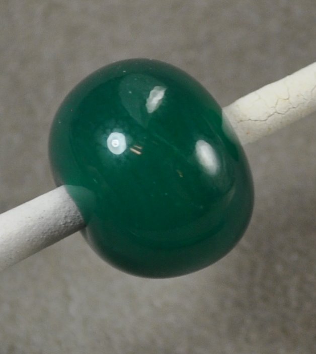
CiM 404: Jade Palace Ltd Run

This is CiM 404 Jade Palace. I can't see the number "404" without first thinking of the "404 Page not found" error message - and then, the highway that divides Toronto into two halves. However, Jade Palace is a lovely green and nothing to do with either one.


This is a solid spacer, and came out more opaque, but lighter in shade than the next bead. I have noticed that some translucents tend to opacify if you repeatedly heat and cool them - and, as the first spacer on the mandrel - this got quite a bit of reheating - so I think - *think* - that is what is going on here, but I haven't tested it for sure yet.

This next one is also a solid spacer - and you can see that it is a deeper, richer, colour. It is also a bigger bead.


This is a thin layer encased over clear - you can see that this one cracked, but I think that was my technique - not the fault of the glass. I wanted to see if it would stand up to being thinned out, and it did, just fine.


Really liking this colour - but it's green and a translucent - so my liking it was pretty much a given!

Wednesday, July 27, 2011

CiM 401: Seafoam Limited Run

Bunch of pretty new colours from CiM to play with!

This is CiM Seafoam Ltd Run. Seafoam is a translucent oceany, beach-glassy green. It's really pretty and I really, really like it! Yum.

These are both self-coloured Seafoam - the one on the right is a little lighter in colour - not sure if that is because it is smaller (so - less density of colour) or because it got more heating and cooling cycles (made first.) It seems a little more opaque - so I'm leaning towards the latter - but more testing should make that more obvious.


I thought it looked like it might be close to Effetre 516 Nile Green Opalino - but in fact - Nile Green Opalino is a yellowier-green.

In this pic - the top bead and rod is Seafoam, and the bottom is Nile Opalino.


Seafoam - love it! This is the sort of colour I would have planned!

Wednesday, July 13, 2011

Vetro 817-P Extremely Pale Light Olive

Geez - calling this green in any form, even "extremely pale light" is stretching the definition. You know when you go to the paint store and they have 9 million shades of white? This is one of those colours.

It's an off-white - and I'll grant you that you might want to argue it's a vaguely greenish white. Polar Green Tea. Artic Lettuce. Early Frost. You could argue it being vaguely bluish too, depending on the light.


It reacts with the turquoise too. I think there is a use for it, surely. A reactive white? A near-white ivory? Has possibilities!

Monday, July 11, 2011

Effetre 731 Cinnamon Chocolotta

Mmm - want some Cinnamon on your Mocha Latte? Effetre Cinnamon Chocolotta is a nice, streaky red-brown with dark brown streaks - giving it something of a wood grain look!

Here is a single colour spacer.


Here, I tried various dot colours. The CiM Fremen has a nice little reactive border. The Cin. Chocolotta on top of the ivory has separated in an interesting way.

The EDP (Effetre 254) looks like someone barfed on the bead.

In case you weren't impressed with the ugliness of that - here's a close up of the other side. Like I said, barfy.

Interesting glass - has potential. Don't put EDP on it. ;-)

Sunday, July 10, 2011

Task Lighting and Studio Set up thoughts

When setting up your torch and work bench, you need to pay particular attention to lighting. I do know people with their studio set up in brilliantly-lit rooms in strong sunlight, and for the life of me, I have no idea how they can read the heat in the glass. I wound up torching somewhere once with full sunlight shining right on the torch - and I couldn't even see the flame, much less figure out if the glass was going to melt. It was a fairly hellish experience. To each, their own, I guess.

I prefer the torch itself to be fairly dark, so that I can easily read the heat base in the glass as I work, and a bright light nearby so I can tell what colour rod I'm using, and to wash out the effect of the heat in the glass, so I can check and see what the bead will (more or less), look like when it's cool.

Here - you see a 3-light standard lamp - one light shining down on the table to illuminate the glass, and handy to hold beads in progress up to, to check the colours. The second light bounces off the wall, and the third is aimed straight up, to bounce off the ceiling, for diffuse, indirect, ambient light.


Nothing to do with lighting, but my "assistant" - the glass rod rack - stands behind the torch, lined up, so that the protruding rods receive heat from the flame. I can adjust the heat they get by sliding the rods to the right, out of the flame, or left, into the flame. The first (lowest) three positions get the most heat (slot 2 and 3 will line up right in the flame, and slot one gets a little less heat, it clears the flame. The other 4 hold glass and keep it handy - also good for drying big mandrels. Or regular ones. The assistant is great for big rods, shocky glass, and for seriously speeding up production work! I adore it and consider it to be seriously useful.


And here's another idea. My dipped mandrels (they are stuck in a piece of floral foam - Oasis - by the way) - they sit on a lazy susan (from Ikea) - so that I can rotate it to get at the big, thin, long, fat, or dry ones, as the case demands.


There you go - some food for thought. The task lighting is really important, though, I think. You will do better work if you can "see" the heat in the glass easily, but some patterns and colour combos, you just don't know what you are getting if you don't look at it under a strong, direct light.

Gives you more control over the end result!