Monday, March 29, 2010

Val Cox Frit: Champagne Rain


Love the sound of this name - Champagne Rain - I want to pronounce it Chaaaaam-paaaaaaain- Raaaaaain - like a motorcycle shifting gears on a loooooong mountain highway. (Anyone old enough and west coast enough to remember the old Rainier Beer commercials will know exactly what I mean!)

The Val Cox website says this about it:

A luxurious blend of opaques and sparklingly gold tones--perfect for when you want to play dress-up.

Melt slowly and avoid getting it too hot.

but the insert from the package says this:


Blend - Opaque/Transparent

Rich, complex and gorgeous neutral tones of highlighted with goldstone. (sic) Work in a neutral flame, with or without silver foil.


And you can see the flakes of goldstone when you look at it.

I did not see the advice about "melting slowly" - so I worked at my usual breakneck speed.

First up, on white, on the right, and on the left, a white base bead with clear, then rolled in the frit. I wondered as I made it if it was going to strike and go a bit darker - I was wondering about the lighter spots. But - it looks like I just missed getting frit on them.


Next - the old dip-the-gather and wind technique. This is a pretty handsome bead.


This cone is a ivory base, rolled in silver foil and melted in, rolled in frit, and a few daubs of Double Helix Psyche, and marvered into shape. I think this one is pretty cool - but where the heck did all those holes come from? They were there when I put it in - and I don't remember seeing it boil. Not sure if that is from not heating the bead release enough or if it is a reaction. Or maybe it was the "should have heated it slowly" thought. Hmmm - that seems most likely.


This bead is the same idea, white base on the left and ivory on the right, foil, melt in, frit, melt in.

I like this one too.


Same again, on Opal Yellow. Foil, melt in. Frit, daubs of Psyche, melt in. Shape, mash. I reduced this one, decided I didn't like it, and unreduced it.


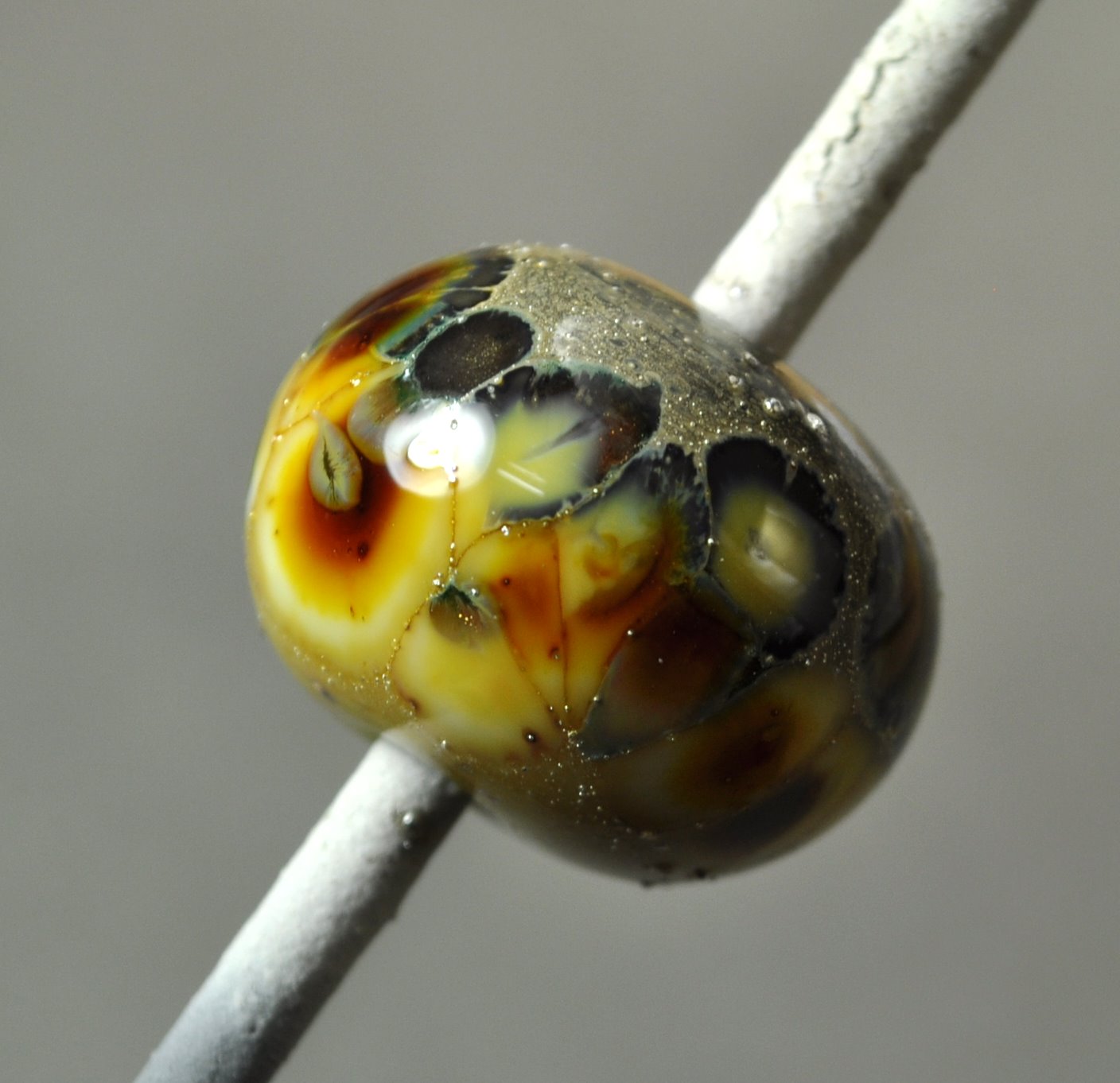
This is a white base, built as a disk, roll in frit, melt slightly, wind on clear, and melt down - distorting the frit. I like this one so much that I have two photos - as it looks quite different on different sides. The goldstone shows very nicely.


This is on Psyche, and reduced. Ick. Don't do this one.


Got some nice effects with this one. Next time I use it - I'll have to remember to be more gentle with it and melt it more slowly.

Saturday, March 20, 2010

Val Cox Frit: Mood Swings


I picked up a jar of "Mood Swings" - well - because I couldn't resist the name. I mean, really. My life in a jar. Crushed.

Ah well.

I'm off again for a couple of days, this time, to a Swarovski conference. How cool is that? A busman's holiday to be sure, but still. Others go to soak up the warm light from the sun - I go to soak up the highly reflected light from Austrian Crystal.


Mood Swings. A pretty blend that reminds me a little of a softer version of Gypsy Skirt.

The blurb from the Val Cox Frit site says:

A classic favorite that's full of surprises. There is a ruby kiln-strike color in the blend so the true red/pink aspects don't fully emerge until your beads come out of the kiln.

Use this sparingly because the colors are intense and it can become dark. Wonderful with silver.


Which I guessed as much - but didn't actually read until after I had used it. Use s.p.a.r.i.n.g.l.y. You know what folks, I need a frit that the instructions say "Use LOTS of this. Lots and Lots. More is better. You shouldn't even see the glass underneath." Either that, or make bigger test beads. Or use a less efficient method of getting the frit on the bead.

First up, rolled in clear. That striking in the kiln thing? Yep. These are waaaay darker than they looked when I put them in.


And, over white. Dark. Not hideous, but not glowing little gem-like jewels of dazzling colour.


On the left, on turquoise. Like the separation that happened in the turquoise. On the right, on white and encased smearyly. Which would be encasing without trying to keep the dots clean. But not trying to blend. Lazy encasing, if you like. This one is pretty nice, actually.
This pair is on Copper Green. Figuring the separation was pretty cool on the turquoise, it would be cool on the Copper Green. And it is. The one on the right, just too much frit, however.

And, on Nyx. I figured this frit would react with silver, so I used a silver glass. Interesting, but waaaay too dark.

And finally, on turquoise, encased and distorted. Interesting, but ... .


Now I have an entire jar of this to figure out what to do with. Should probably stick to the sample packs.

Friday, March 12, 2010

More on Clio

I'm back! - I know, I know, "You went somewhere?" Well, nevermind, I was away, and away from the torch too.

However, I'm back, and I warmed up by making a few more beads with Clio.

This time, knowing that Clio develops colour, I actually made a point of striking it. And very rewarding it was too. This time, I got a deep marachino red with a steel metallic lustre.

Strong backlighting shows the colour better.


As an encasing layer, you could probably get this lighter so that you can see more of the colour.

Definitely will be getting more of this!

Thursday, February 25, 2010

fyi - short break

Just fyi - I haven't dropped off the face of the planet. I'll be away from the torch and my own computer for a bit - off visiting.

We'll return to regular testing and blogging when I'm back.

Monday, February 22, 2010

Double Helix Clio


I got my first look at a new colour from Double Helix, called Clio. Clio is a striking colour, but it is also a colour-shift, changing colours depending on the light. It also reduces. It is in the Blue/Pink family of colour shifts.

On the left, the struck end of a rod, in cool, fluorescent lighting - the rod appears blue, with the end having a golden hue. On the right, under warm, incandescent lighting the rod appears to be a light pink/mauve - with the struck end appearing to be a warmer, richer tone of gold.

Here we have three beads, made of Clio. The one on the left was reduced, while the two on the right are not. They went into the kiln considerably lighter, and seem to have struck in the kiln.

Of the two, the one on the right has a distinctly purpley, slightly metallic lustre that I really like. The other one doesn't show it. The rightmost bead reminds me of Ekho, actually - another Double Helix glass.

The reduced bead is sort of murky and I don't really care for it. These are shot in cool light.


And here are the same three beads, shot in warm light. I don't see a lot of difference. I think that is a result of the kiln-struck colour being strong enough to overwhelm the rather delicate colour of the glass - as the unstruck rods have a quite distinct colour shift.


And here is Clio dots on black spacers. These were reduced. Here, the reduction is much nicer. I would say, off hand, when reducing this glass, less is more. Less glass, less reduction.

Clio bears further investigation, I think.

Wednesday, February 17, 2010

CiM 701 Ginger and CiM 703 Butter Pecan


In a more politically incorrect day, these two might have been called "Flesh."

They are certainly a close match for my lily-white winter pallor, but hey - that's just easy-to-sunburn me!

So I can definitely see using these for all the angels and mermaids and fairy beads that you might want to make.

In the unworked rods, the Butter Pecan looks a little lighter, and the Ginger is a smidge darker and a little pinkier.

First up, Ginger. Not the ginger of the spice, but the pale pink of sliced, fresh ginger. A little streaky - and seriously - an excellent match for skin colour.

This is with Raku frit - a gather dipped in frit and wound. This is specifically Lauscha Raku frit.


And this is with turquoise dots.

Next up, Butter Pecan. A paler shade. A sort of warm ivory. Not as obviously streaky.


Again, with turquoise.

And, with Raku frit again, same as above. The colours don't seem quite as intense, but maybe there just wasn't as much raku on the gather.

And finally, in a head-to-head comparison. This is a Ginger base on the left (with the black dot) and a Butter Pecan base on the right, with dots, Butter Pecan on the left and Ginger on the right. When hot - it is really difficult to tell them apart, but once melted, they are quite distinctive.


I've been using the Butter Pecan for horse beads for sometime, but I think I will try the Ginger. I like the richer colour.

Monday, February 15, 2010

New Lampwork Finding


I'm always excited about a new way to wear and display beads! This is a new ring finding - designed for lampwork beads.

It is an adjustable design, but not the cheezy overlap-at-the-back style, but the elegant open wrap around style instead.

It has a post, with a screw on top, and includes a rubber washer - which is really invaluable. I put rubber O rings on all the pens and stuff that I put lampwork beads on, because the screw loosens off, and you tighten it, and inevitably, you over tighten and crack the bead and chip a small piece off the end.

The real challenge is making a bead narrow enough to fit on the post and leave room for the screw top. The base of the bead needs to be no more than about 4 mm.

I suppose that you could cold-work the back of the bead to make it fit.

I know the bead shown isn't particularly amazing, but it is more of a proof of concept, and I can make a better one next. I left it textured and bumpy on the top, and the screw cap fits down into the texture bumps - which I think is pretty cool. A flower design would look very cool this way.

It does stick up a fair ways, but it seems pretty comfortable, and the ends are all smooth and curvy, so it's not bugging me and so far, I haven't snagged it on anything.

Tres kewel!


Friday, February 12, 2010

Turquoises


Needed to reproduce a bead I made some time about - a couple of years ago. Right - like I'm going to be able to do that. Not exactly anyway.

However, one of the characteristics of it is the use of different turquoises.

This is a base of Lauscha Turquoise - which I like a lot because it doesn't tend to reduce and get that dull, grey layer in the kiln during annealing. These are streaked with intense black and Effetre Light Sky Blue. Notice the Light Sky Blue has reacted with the Lauscha Turquoise and made dark lines.


However - where the Intense black has interacted with the Light Sky Blue - check out the really fabulous silver effect. Not the reduction grey - but a really awesome, shiny silver.

I've seen this reaction before - but never been quite sure which glass it was that was doing the reacting.

That's awesome. I'll have to try some more with that.


Wednesday, February 10, 2010

CiM 505 French Blue

What a wonderful colour. A blue amongst blues. A truly devine blue.

But d4mn, is it sensitive to reduction!


This is what it looks like, ideally. Ideal IMHO, as I am partial to the pure blue. Folks on the CiM website report that it can be streaky, and I do see some of that (see first pic, front mandrel, left bead.)

But here, the bead on the right was made in a slightly reducing flame, and the one on the left, in a neutral flame.

Now - it's not the nastiest reduction I've seen - and I could even maybe see a use for blue-black beads. You don't seem to be able to get it to go away though - once it's there - it's there for good.

These four beads were made from right to left, turning down the gas with each one.


On the upside, you can use this glass to check your flame chemistry!

Now these beads - these were a big, fat disappointment. The dots are CiM Pumpkin, which I blogged the other day. Oh sadness! I was expecting happy, vibrant blue and orange beads. Apparently - the Pumpkin - remember I noted that it had a sort of translucency? Well - it wasn't opaque enough for this!

I guess if I wanted green dots - I'd be happy. Note to self - Pumpkin and French Blue - not as vibrant as you thought it would be. Guess it needed a white dot underneath.

Monday, February 08, 2010

Copper Ruby Frit


As I start to learn more about using frit, and really making it do something - I start to have more successes. Imagine! What-a-concept.

Not that I'd call these stunning successes - but I'm starting to get some sense of what is happening, or isn't.


These bead is a white base, with silver foil wrapped on one end, and melted in. Then a Copper Ruby stringer is scribbled on it.

On the silver - it has done some interesting things. Noting that, ...
I tried the frit directly on Aion - a double helix silver colour.

Still too dark - but it looked better hot.

And again, on Aion, and then encased. Hmm - definitely more interesting.

Saturday, February 06, 2010

CiM 140 - Lipstick


I'm an idiot. I have blogged this colour before. I whined about how it was hard to get the colour to show accurately on the monitor. I'm an idiot.

It's a freakin' colour change glass. (Sound of head smacking on wall) Doh!

This first pic - in my little photography set up - and I'm looking at this going - "No one would call this 'Lipstick' - but it would make a great horse colour."

And then I thinks to meself - go get the rods and photo them to show how much the colour changes after working. And lo - the rods are the same colour as the bead. The light dawned.

And here it is - under a hot, incandescent light. Brick Red.

Brown.

(More banging of head on wall.)

Strong like ox. Smart like streetcar.


Ivory dots, no apparent reaction.

And, 4th pic, from the left,

  • self coloured with intense black dots. Note silver rim on dots
  • encased with distorted dots
  • and far right, spacer with thin layer encasing. Makes it look lighter.


I had encountered some coffee-bean-shaped beads that were this colour - colour shift. And, at the time, I wondered if there was a glass that did that too. Apparently yes, the answer was - wait for it ... under my nose.

:-P