Friday, July 08, 2016

Hat Pins

I just found some hat pins over on BeadFX that you can lampwork onto!

They look like stainless steel - although the description says nickel silver. In any case - they held up fine in the flame - although, admittedly - I wasn't blasting away on the mid-range - just using a smallish flame on the mega - because I was trying to keep the end decoration small.

The metal darkens in the anneal, but a quick swipe with super fine sandpaper brightened it back up. It doesn't seem to darken as much as a mandrel - so maybe it is nickel silver.

Anyway - you could do this your self with fine mandrels if you have a grinding wheel and wanted to point the ends up, and then source the clutch that goes on the pointed end - but you know me - I'd rather melt glass.

Monday, July 04, 2016

Effetre 263 Mou - revisited

I reviewed this back in 2011, and it was completely different. Then it was a transparent golden amber that reduces to a metallic.

Now - for one thing - it is almost stringer width - and two, it is like a kissing cousin to EDP and other similar glasses.

It devits. Like crazy.

And goes wild sunset colours.

I don't know if this is mis-labeled, or just a wildly different batch. Anyway - it's very interesting.  Very interesting indeed.


Saturday, July 02, 2016

Blue Aventurine Frit on ...

Blue Aventurine (Goldstone) frit - well - this frit is so fine that it practically a powder. Can't begin to remember how long I've had it - and only just found something cool to do with it.


 Blue Aventurine frit over silvered ivory

  Blue Aventurine frit over ivory - too dark.
  Blue Aventurine frit over Effetre turquoise. Nice!

Thursday, June 23, 2016

Double Helix Euros

Euros - looks white, turns gold.

The Double Helix site suggests that it will strike and reduce, but apparently - I could not do it delicately enough, and I had no luck striking it. Reduced it instead.


Self coloured, flattened. Attempted to strike - well - maybe got a little strike, there is kind of a blush on the end, and reduced to a deep, rich honey colour.


Next one, added a trail of ivory, and reduced. Par-tay! 
 Is that not cool the way the ivory has reacted?

Again with the ivory and reduced and encased in this one, and the spiral pressed in. 

Must do more with this one. I think this will be a sleeper - people will be unexcited by the white colour, not realizing what fun they will have with it.


Tuesday, June 21, 2016

Building dots on dots

Apropos of nothing at all - I just thought this was cool.

And why I'm currently dissatisfied with making beads for jewelry - because as a pendant, this would snap the first time you banged it on something.

But how cool is that? Like honey dripping into a bee shape. Except for the colour, of course.


Sunday, June 19, 2016

Kronos, Triton, Clio

Double helix. Gotta love it. NTSCT - Never the same colour twice.

Krono - reduces - appears to be a transparent cobalt.  Here it is on black, reduced, and encased.


This leaf is not encased. 


Triton - looks black, when held to the light, you can see it is cobalt blue. Reduced and encased. Pearlescent effect when encased. 


These Mermaid tails are also Triton, just reduced, no encasing. Pretty darn impressive.


And Clio - the carnival of glass - reduced and struck.


Friday, June 17, 2016

Brass Wire Makes Bubbles

 So I heard about this thing where if you put brass wire in the bead and encase it  - you get bubbles.

So, I figured I'd try that. I had to dig around to find uncoated brass wire - because a lot of the craft and jewelry wire has nylon coating to prevent tarnishing. That may create bubbles, but would also probably create soot and noxious smells, so let's just avoid that, shall we?

This cabochon is Aurae, with a spiral of brass, and encased. How this manages to be Aurae is beyond me, but that's what my notes say.

And bubble it does. Can't say that I love it, but it does do it.

This cabochon has a layer of silver, and then a twisted, spiraled and flattened piece of brass wire, that created a pocket of bubbles at the side.

Weirdly, it appears to have a finger print in the glass, but I assure you, I did not touch the glass with my fingers. Perhaps I got a fingerprint on the silver foil and it got retained under the glass when the silver was melted off? What an episode of CSI that would make, eh?

Here's the big side bubbles. Not so attractive. 

I've seen some really awesome beads done with this technique, with the brass wire inclusions, and they are either better at it, or cleverer photographers than I am - both of which are possible.

I should maybe go back and try that Aurae again. I'm really not sure that I believe my own notes. ;-)

Wednesday, June 15, 2016

CiM 720 Autumn

It's a brown streak, or a streak of brown colours. Here we have CiM 720 - Autumn. I found Autumn to be a bit shocky - and other testers agree.

(The leaf shape on the wire does have streaks of some other colour on top - but I apparently did not record what they were. )

Like CiM Moccasin, it comes out a little lighter than the rod, and you can see from this  close-up that the end of the rod is ragged and striated where it has shocked off.


 It's a pretty, peachy brown, from the left - two self-coloured spacers, and on the right, Ivory dots and Autumn dots on top, and it has bled like crazy. So not so desirable for super precision work, but yummy for organic blendy styles. A twisty of ivory and autumn would be fun.


Monday, June 13, 2016

CiM 719 Moccasin

Seems to me that I got lighter, gingerier results than the other testers of CiM Moccasin did. It came out palers than the rod, and is just a nice, well-behaved light tan colour. Suitable for organics and animals. Not terribly exciting in the quest for the perfect purple, red, pink, blue, or whatever your particular passion is.


But we need those solid, hard-working every day colours in order to make the other colours pop!


This is two self-coloured spacers, and one with black dots (and a white marker bead.)


Same two again. Pretty,. nice shine. Like I said - well behaved. Useful.

Saturday, June 11, 2016

Shine-On Glow-in-the-Dark Glass 104 COE

I got my hands on some of the new Shine-on Glow in the Dark glass - 104 CoE from Brent Graber. I have tried glow in the dark powder in the past, and it has been something of a challenge to use, as the glass didn't stick to it, and you had to roll the bead in the powder and then encase like mad all over it to make sure that it stayed there - much like working with mica powder. Unsatisfying as a way to work, although the glow results were good. Still - kind of a one-trick pony - especially as I'm not really about making beads that need to glow in the dark.

But everything old is new again, and apparently glowing-in-the-dark is a hot trend again. Toho, a Japanese seedbead manufacturer has just launched a line of glowing beads in different colours, and different glows, with big splashy ads promoting, of all things, beaded, glowing wedding gowns. Because when the lights go down, the party starts. Or something like that.

So what is this new Shine-On glass like?

Well - it really does glow.  These are the handful of beads,


And these are the beads in the dark. For the technically inclined,  this is a 10 second exposure at ISO 800, f 7.1. In pretty much complete darkness.

They glow like crazy.

Now for the bad news. The glass is as shocky as hell. You pretty much have to pre-warm it in or on the kiln. And once you work down through the warmed part - it goes back to shocking like crazy.

But - it does come as a frit, and while the frit does actually shock - you roll the bead in the frit and listen to it snap, crackle and pop - it doesn't really matter so much.

I didn't have any problems with it with regard to heat and burning out, you can encase it or not. I'm told that some colours are not so good for encasing because they will block the specific wavelengths that "charge" the glass, and if you encase it with something too dark - same story - the glass won't charge and glow.

It is a significant improvement over the old glow powders - and because you don't really work it the same as you would other colours - you wouldn't want to get a gather and build a base bead with it, I think that the shockiness is something you can live with. It certainly is manageable with pre-heating - unlike some air-laden glass that it doesn't matter what you do - it still shocks.

It comes in a variety of pale colours, and apparently they don't all glow the same, although I was mixing the frits for these beads, so I can't say which was which. The rods themselves have a grainy texture, so you won't get them mixed up with the other stuff. These beads are mostly a core of clear and med aqua, rolled in frit and encased.

It's easy enough to work, has a really strong glow, and I would say, if you are looking for make glow in the dark beads, this is an excellent solution.

And if you want to stand out at a rave or at a nightclub, or just at cosmic bowling - anywhere that has the "black" or UV lighting - these will freaking knock your socks off. Because they are bright. Like wearing the full moon. Blue moon.

Totally trippy, Dude.

(I currently only see the 90CoE on the site - but it must be somewhere. If all else fails, call Jean at Nortel and she will track it down for you.)

Friday, May 20, 2016

CiM 433 Limelight

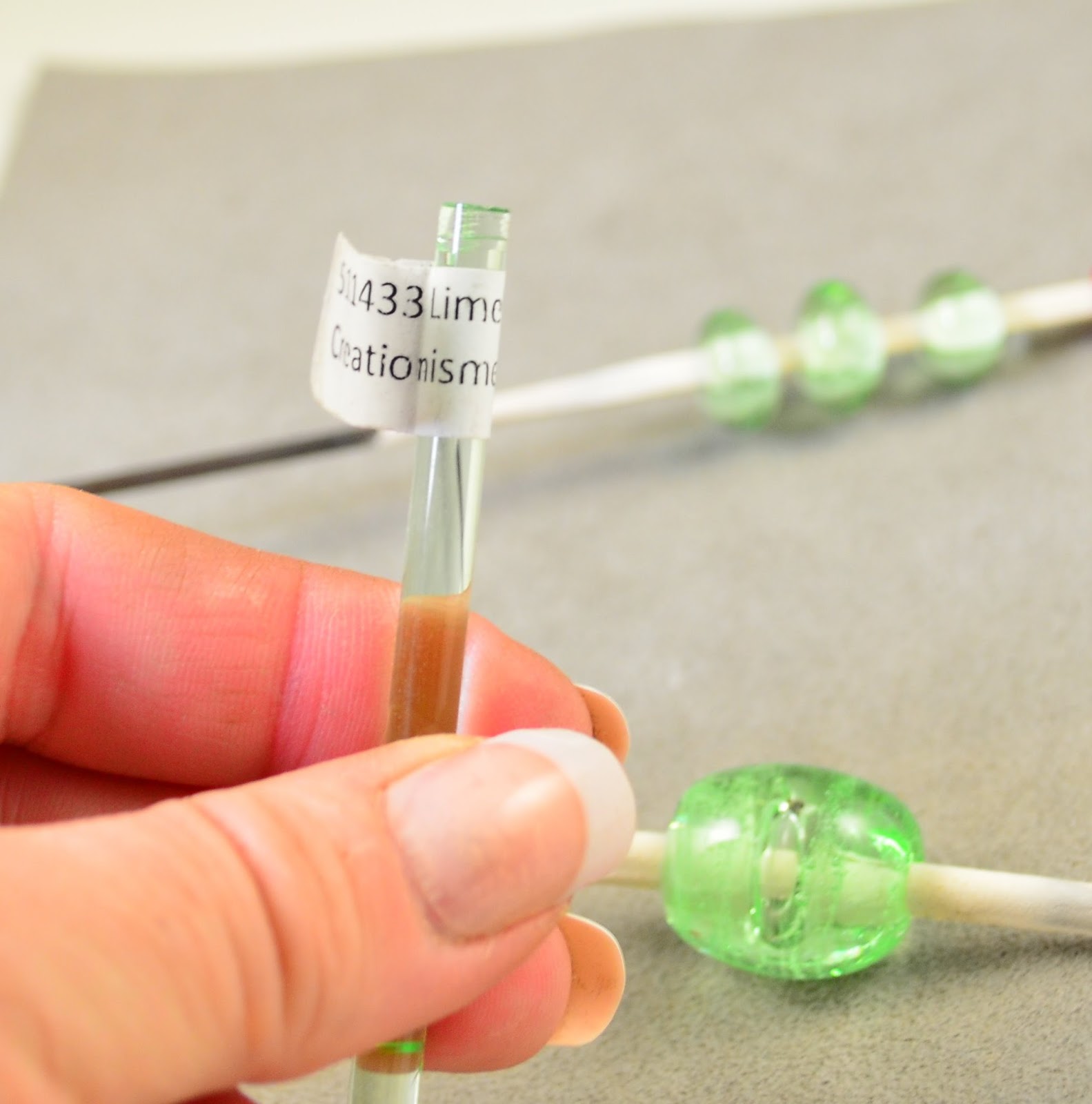
CiM Limelight is a very, very pale transparent green, very pale and ethereal. A very fresh green, and light enough to encase with. I'd like to try it over silver foil.


Three self coloured spacers.


And a large barrel shaped hollow. It really should have been more hollow than this - but it's still got an air bubble. 


CiM's site leads me to think that it would etch well too.

Wednesday, May 18, 2016

Note keeping

Really - this blog is about keeping notes for my sake. You get to benefit too. As a great author once said - the reason people write reference books is so that they know where to look stuff up.

I'm behind on posting, but when I can get a few minutes - I can try and catch up.

But how, you ask, do I remember what I did?


Well - here's the secret. I have a notebook at that torch. I make notes after the bead.

I put a coloured marker on the mandrel - so I can confirm positively which bead goes with which notes. Especially critical when the colours are very similar or strike or otherwise look different.

The next day - when the beads come out of the kiln - I shoot a picture of the page with the notes in the notebook and then pictures of the beads. That's why most of my beads are shot on the mandrels, instead of being all cleaned up.

One of the awesome things about digital photography is that it makes it easy to take photographs as a way of recording things you need to remember. So while I have the notebook and the notes, but taking a picture, when I look at the photos - I have the photo of the page from the notebook to remind me. 


So even weeks later, I can figure out what I was doing. 


Simple, really - when you have a process.

Cheers!

BTW - I do this "photo as reminder" all the time. Photos of the scoreboard. Photos of the catalogue. Photos of a business card or a brochure or a bill or a magazine ad or an empty container to remember to buy more whatever. Instruction manual pages.  My phone is full of photos of serial numbers on equipment. ;-)

Saturday, February 27, 2016

Riley Dichro

BTW - you may be asking yourself - what is this Riley Dichro she is using?

This is dichroic glass from Riley Designs - and these days - it is my favourite dichro. Not all dichro is created equal - because - just think about this for a second. Is it the dichro you are having trouble with ... or the glass that it is mounted on? Because if you are paying for a top-quality clear because you hate the look of a cheap, scummy clear - then why would you buy a dichro layered onto a cheap, scummy clear?

Hmmm?

Anyway - this Crinkle dichro is the bee's knees.

Here we have the bead, (as seen in the previous post. Transparent blue core, dichro, clear.)
Here is the dichro itself - Pink Teal Crinkle. Pink refers to it's transmission colour (backlit - light passing through it), Teal to the reflection colour (although Orange / Cyan would be more descriptive in this case), and Crinkle is the texture. This particular heavy coating, with a very large texture, breaks up into large pieces in the bead - for a very dramatic effect.


Anyway - just so you know. 

One more shot of the same piece of glass. For those of you who may have stumbled across this site and do not know about dichroic glass or are just new to lampworking - these 3 pictures are of the same piece of glass. Dichroic: di meaning "two" and chroic - colour. The glass has a coating that reflects one wave length of colour and transmits another - giving it two opposite colours, depending on how you look at it. 


And here we have another bead - my classic wave bead, also made completely from dichro. Yum. This one is made with Green / Magenta.


Notice how the colours fall on the opposite sides of a colour wheel? Just borrowing a screen shot here of the colour wheel in Painter to help you visualize it. Green / Magenta. Orange / Cyan. Complementary colours.


Thursday, February 25, 2016

CiM 819 Experimental

This looked like a clear to me, and when I check the CiM website, lo and behold, it is a clear - so well done me for figuring that out. (Unlike the time I tried everything I knew to coax colour out of Double Helix Aether ... )


And insofar as I can tell from a single rod - it seemed pretty nice. No obvious scumming or hugely awful defects.


It played well with the dichro.  


This is a core of random transparent blue, dichro (Riley - Pink/Teal Crinkle), and encased in Experimental. 


Hope they keep the name - I kind of like the idea of a permanently experimental colour.

I'll have to be trying a couple of pounds of this before I pass judgement - but given that we are all looking for that perfect clear - so far, it looks promising.