Wednesday, February 14, 2018

Effetre 269 Lilac

Lilac is a word that makes you think of big bushy tree-like shrubs loaded with sweet-smelling purple flowers and buzzing with bees. To that end, lilac should not be used for colours that are vaguely-in-the-purplish family.

The rods initally appear to be a dirty white, not too inspiring, eh? Maybe it is wonderful after heating, you can always hope ...


 After working for awhile, it starts to develop some colour. A little bit of a very light mauve, and some of that browny sheen that most of the light lavenders get. And the occasional smidgen of devit.
 Still hot, you can see there is some hints of colour.
 Once out of the kiln ... this is the back - it has played nicely with the raku and assorted frits. My frit tray sits under my torch and tends to collect shocked bits of whatever, so after awhile, it is kind of a random melange. Means I also have to pick out bits of bead release that has cracked off mandrels and fallen into the frit tray. :-P
 And you can see, there is a slight amber blush to some places, and it is a very pale pink/purple with the occasional streak of quite satisfactory violet.
It takes a while for the colour to develop - and it takes something like 60-90 minutes to make one of these beads, so it has the time to do it ....

Monday, February 12, 2018

Effetre 723 50 Shades of Grey

 50 Shades of Gray - I reviewed this back in 2013 - and wasn't too much impressed then. I like it better now, but I'm using it differently.

I have to say - it's a pretty interesting glass while it is hot ...
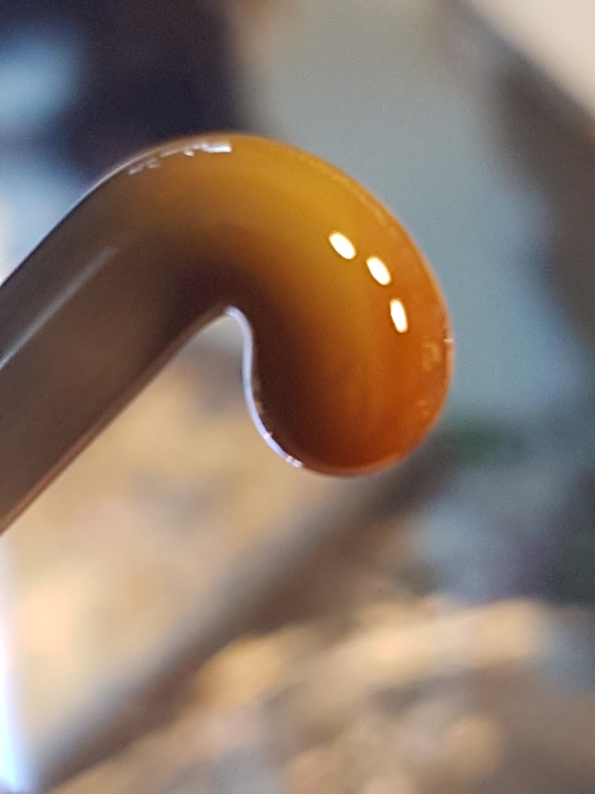
 When you heat it - it goes topazy - warm and caramelly.

 And is wonderfully streaky while working it ...
 but it does settle down and lose that super-streaky desert rock look ...
 And once out of the kiln, it is a slightly streaky, warm grey - mushroom colour. Base and horse is 50 Shades ... there is a little frit on the base, and the mane is ... some brown stringer I had.
 The back - it has retained only a little of it's streakiness.
It's a perfectly good colour for organic animals and stuff.

Saturday, February 10, 2018

Vetro 807 Frog Pond

Vetro 807 Frog Pond - 10 years ago I reviewed it. And that's how long this glass has been lying around, waiting to be used. Feeling a little old, right about now.


Frog Pond appears to be a black cored yellow, or possibly dark blue. The end result is a streaky green. 
Although it looks orange while hot. ;-)


 You can keep the core fairly intact, if that suits you, by working it without making a gather or overheating it - or, I presume, you can get it more scumbled up if you work at it.

 Show here strongly back lit.
An interesting colour. Certainly no one else is making anything like these old cored Vetro colours.

Friday, February 09, 2018

CiM 773 Tamarind

CiM Tamarind - out of production now, so hard to buy, but works really nicely in this application. Tamarind horse on Effetre Sandstone base with Double Helix Oracle Black mane and eye.


Thursday, February 08, 2018

Effetre 705: Okey Dokey Artichokey

Last time I tried Okey Dokey Artichoky - it was killer shocky - but I had no trouble with it at all this time around. I did come out with more colour variation than last time too - so perhaps a different batch?


The end of the rod is quite distinctive, with it's multiple rings, so you should be able to ID those random rods.


 I saw a lot more blue coming up this time around, and ...
 even some dark, almost black lines ...
 of course, maybe I was burning it or got the rod contaminated with a piece of something else.
 Well - no - that wouldn't explain it showing up everywhere. So we can say it is streaky blue and green with hints of darkness, how about that?


Tuesday, February 06, 2018

Effetre 704 Very Cherry

I've reviewed this colour in the past - twice actually (Very Cherry, and Very Cherry Reprise). It is very dark colour - the rod looks red in some lights and browner in others.

It appears translucent in the rod. When heating, it goes through a stage of looking distinctly grey - which is odd.


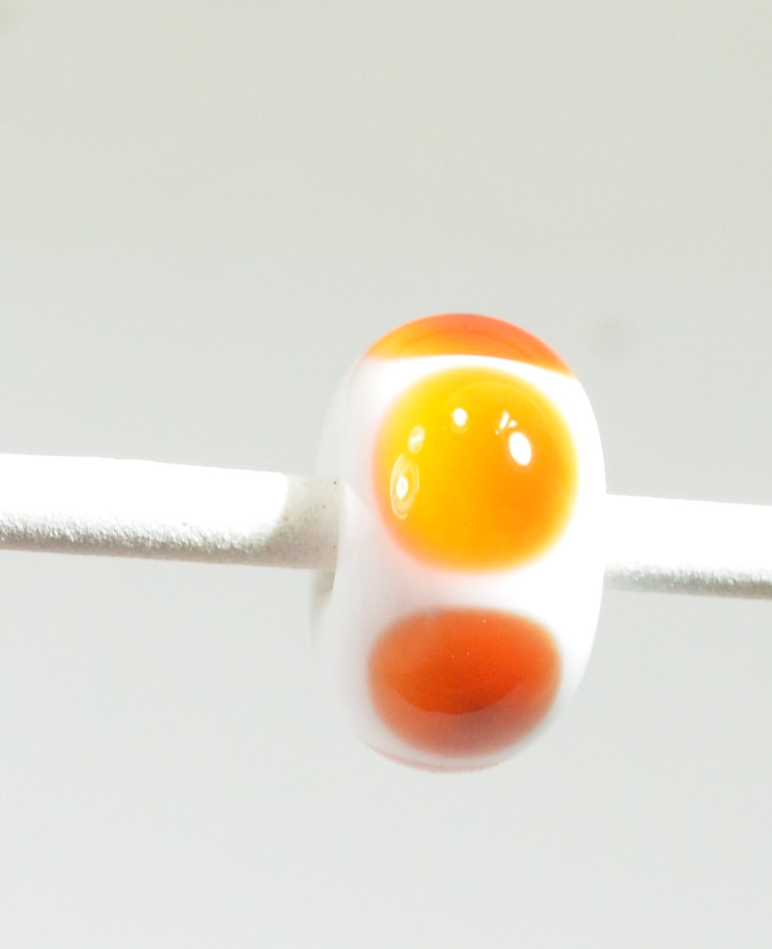
 This is simple dots over white, and the dots have struck to a sort of mandarin orange, with odd little dark spot in the center which shows better in the photo on the right.


Worked up like this, thin, you get a range of intensities.

 and a range of colours, depending on the type of lighting you are using.


Hold them up to the light, and you can see a range too -including hints of that grey that was there when it was hot ...


The base is Very Cherry - where the raku frit is, it reacted very strongly to create heavy black borders. The horse is also rendered in Very Cherry. The Very Cherry, being a transparent, is stiff and worked nicely for the sculptural part. There is some pitting. The lack of contrast makes it rather tough to see the features on the face, so I might etch this one. 


This colour is not going to appeal to everyone. If you are fascinated with colour-shift reds, need a super dark red, or intend to work it thin over white for it's orange aspect, or just love the Vetro price point, it might have appeal for you.

Sunday, February 04, 2018

Vetro 069 Striking Yellow

 Gack - I have so many samples to blog - I hardly know where to start! Ok - this is from a big pile of recently-uncovered glass from Jean at Nortel - this is a big stash of Vetrofond Striking Yellow. You remember how I was whining about the current batch of Effetre 069 is hard to strike and kinda wimpy when it does. Not this! Oh-boy-oh-boy-oh-boy. This glass is the colour of  a lemon cough drop - vibrant and glowing yellow. Juicy!


 Now that's some yellow!

 These are over white - and in the one on the right - it got away from me, so it swirled with white.
 This is a base of white, turquoise ends, encased with Striking Yellow.
 Self coloured spacers.
 and some waves and a leave on wire.

Like many of the striking colours - it does tend to opacify (get streaky clouds inside) but it's not too overwhelming, and the colour - oh my - the colour.

Yellow makes a heck of an accent - yellow is under-rated, IMHO. And I'm going to stock up on this - because once it's gone - it's gone!

Friday, February 02, 2018

Effetre 755 Woodie

Effetre Woodie - a real sleeper - this one. Woodie looks like an unassuming grey - but watch out - it does some really wonderful things when you work it!

The base and the horse are Woodie. The streaky brown grey that Woodie goes is really lovely in the horse, and gives it a painterly quality.
 The streakiness in the base bead was also attractive, but I rolled it in some frit - a large portion of which was Raku Jitterbug, and the result seems pretty spectacular. I think the Woodie may have enhanced the reactive properties of the frit.

 Here's the horse again. The streakiness really is quite wonderful.


In the rod - Woodie doesn't looke that exciting, but it sometimes really pays to try those boring looking colours!

Update: I wanted to add some images of the rods and the ends of the rods - with all these piles of grey laying around - it is useful to be able to positively ID them.

 From this perspective, you can see why it comes out so streaky.