 I've reviewed this colour in the past - twice actually (Very Cherry, and Very Cherry Reprise). It is very dark colour - the rod looks red in some lights and browner in others.
 It appears translucent in the rod. When heating, it goes through a stage of looking distinctly grey - which is odd.


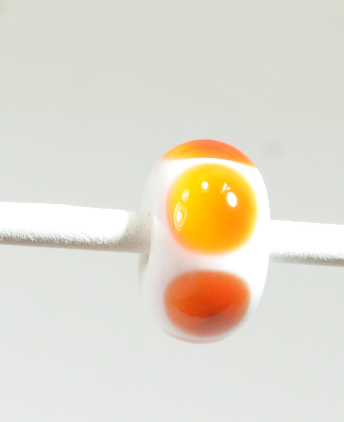 This is simple dots over white, and the dots have struck to a sort of mandarin orange, with odd little dark spot in the center which shows better in the photo on the right.
Worked up like this, thin, you get a range of intensities.


Hold them up to the light, and you can see a range too -including hints of that grey that was there when it was hot ...

The base is Very Cherry - where the raku frit is, it reacted very strongly to create heavy black borders. The horse is also rendered in Very Cherry. The Very Cherry, being a transparent, is stiff and worked nicely for the sculptural part. There is some pitting. The lack of contrast makes it rather tough to see the features on the face, so I might etch this one.

This colour is not going to appeal to everyone. If you are fascinated with colour-shift reds, need a super dark red, or intend to work it thin over white for it's orange aspect, or just love the Vetro price point, it might have appeal for you.
No comments:
Post a Comment