Friday, January 15, 2016

Eye Candy

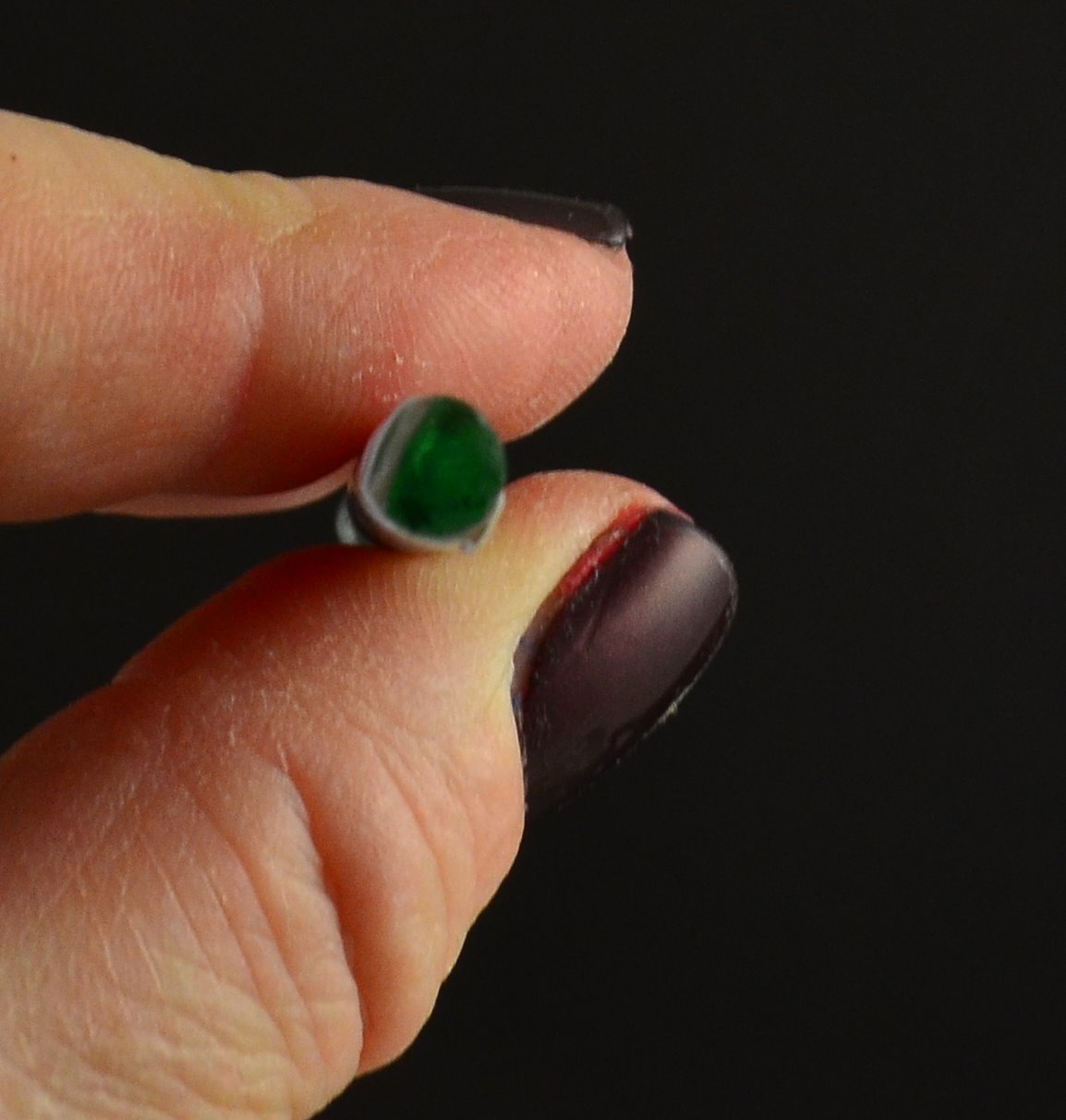
Cabochons - I'm continuing to work on these.


I'm rather liking these two.

Sunday, January 10, 2016

CiM 536 Moonlight

If you follow the links to the CiM website that I post - you will see that the information I post is sometimes quite different from the results that other testers get. This is "your mileage will vary" in action. We have different working styles, different set-ups, and different approaches - so you might get results more like mine, or more like someone else's. It would be a sorry old world if we all got the same results all the time. Well - actually - it would be repeatable science - but gawd knows - what we are doing is art! Never the same twice!

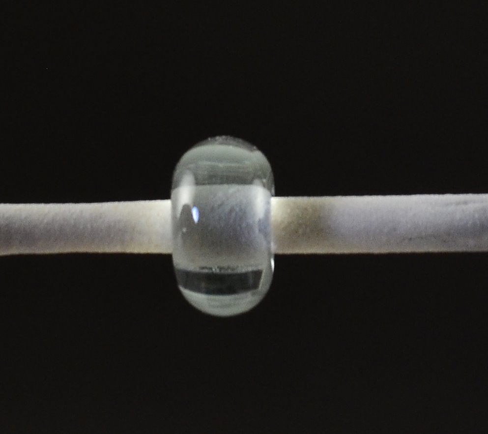
CiM puts Moonlight in with the blues and says that it was a response to requests for a very pale tint. I personally thought it had more of a greenish tint, but it was just a hint of a tint.

Anyway - what I get in the moonlight was lots of tiny bubbles.


Thinking maybe I was overheating it - I slowed down and switched to the smaller torch - which did eliminate most of them - but not all. 
  You can see I also had some cracking. I've been having quite a bit lately - and all along that ridge I got in the bead release. Must try and dip the next batch to be more smooth.
 See - slightly greenish.

 I thought I'd try it over silver foil, and see if it was any easier to keep the silver looking silver, but it wasn't really any different. Too much heat and the silver foil reacts and looks gold.


Anyway - the boiled bubbly effect is kind of cool and I can see that you could make some nifty beads with that look - assuming it is reproducible. And not just me.

Friday, January 08, 2016

CiM 621 Emperor

CiM Emperor is not a "what you see is what you get" glass. For starters - the product code gives away that CiM does not consider this to be a pink (as the pinks are all 900 series numbers.)

I actually went looking for it in their browns section, as it is more of a cherry-amber colour to my eye.
CiM calls it a "golden transparent purple."

Just so long as you are not expecting it to stay the pretty pink that it is before you heat it.

 The mandrel on the left, with three beads, is, from the bottom, two self-coloured spacers and the third, at the end, was not struck before it went into the kiln. It went in clear and struck in the kiln to a colour not quite as deep as the other two.


The second mandrel, in the middle shows two selfies, one with ivory dots, and the one at the end - I reduced - to no apparent effect.


You can see from the next set of images that the angle of the light makes a difference to the end result.


It is a pretty enough colour - although something of a disappointment if you were hoping for a light cranberry.

Wednesday, January 06, 2016

CiM 120 Ladybug

CiM Lady bug reminds me very much of CiM Bing - which is one of my favourite reds. It is a vibrant red - technically - I think it is a transparent, which means it is stiffer than an opaque, but you'd have to put it over clear to get it to function as a transparent.
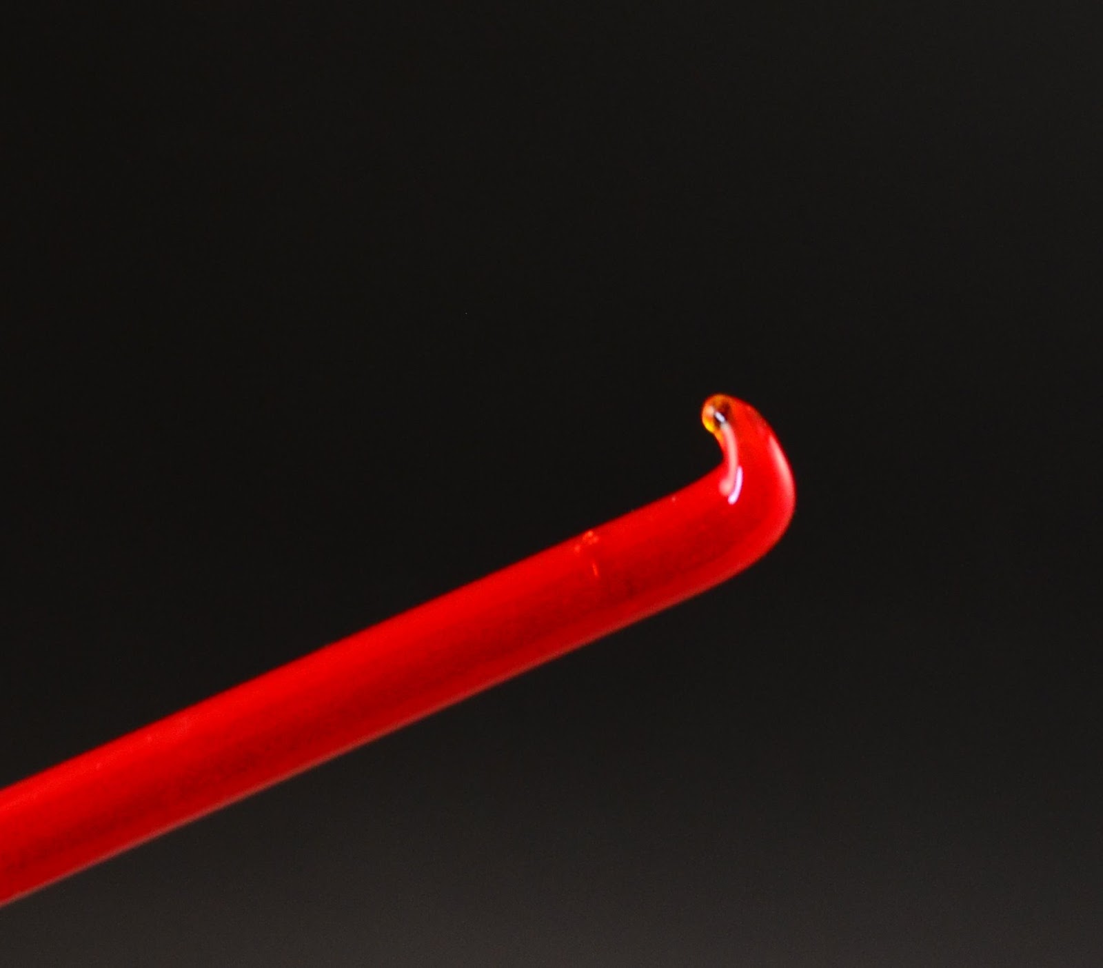


It has, delightfully - no trace of brown or liveriness - which is the thing that makes me happy in a red.  This is a self-coloured spacer.


The top mandrel of beads has a clear overwrap.


 This is what a red should be - vibrant and pure in colour. This is a winner.

Monday, January 04, 2016

CiM 435 Ogre

Creation is Messy has a number of new earth tones out - including 3 opaque greens and 2 opaque browns.

Ogre is the first up in the greens. It goes a pale blue grey when hot, but then strikes back to green as it cools. It is a streaky, and unfortunately - the fattish rods are shocky.


This is three self-coloured beads. 

 And here we have 3 lumpy beads, with globs of clear. You can see under the clear that Ogre looks paler than where it is uncovered.

These beads are not only ogre coloured - they look like ogre snot. CiM Ogre - the choice for making snot and booger beads. ;-)

Wednesday, December 23, 2015

Effetre 440 Red Roof Tile

This was a surprise.

I grabbed a rod of what I thought was a light brown - turns out it was 440 - Red Roof Tile.

Worked on top of Effetre Intense black - I got some really interesting patterns and webbing, and some metallic sheen.

Definitely cool.

So I made a bunch of 'em. ;-)


Sunday, November 22, 2015

Effetre 410 Butternut Lime

Everyone kept saying to me - "oh - that looks like Apple Blush" - and yes - it does share a resemblance to Apple Blush - and is one down in the numbering system Butternut Lime is certainly a shock when it comes out of the kiln!

The wild-lime-green rod strikes up to much more of an orangey colour than I expected.

You can see from the pressed patterns and the sides of the beads that it can stay bright green - or that it can blush to shades of yellow and orange where it it re-heated. Truly - a combo of lime and butternut squash colours.

The spiral beads are made in a bead press - which seems to work very nicely with the multi-colour nature of the glass.


Fun, eh?

Friday, November 13, 2015

I made this - and I have the scars to prove it ...


Don't forget - when people ask you if you really made those beads - you can always say - "I have the scars to prove it!"

Recent cabochon - an aborted and unimpressive attempt as something opaly looking - and a truly impressive blister (now 3 days old) from catching the flame end of the mandrel when it dropped.

Ouch.

Sunday, October 18, 2015

Effetre 296 Avorio Pervincal and Effetre 294 Avorio Viola

Honestly - I can't tell these two apart. Not that every bead comes out the same, but rather - there is a lot of variation in both, and the two seem to average out.


Both are highly streaky ivories with a lot of variation in them.

First up Avorio Pervincal

Cabochon - quite light in colour. 
 Three self coloured spacers - two came out a lot darker.

And here is the Avorio Viola. You might think it looks darker - but notice that light coloured one on the bottom mandrel on the left. What are we to make of that? (Notice the extreme reaction to the turquoise, btw?)

Viola on the top and Pervincal on the bottom. Could it just be a case of how long it is heated as to how dark it gets?

Anyway - until I understand otherwise - I'm going to treat them as interchangeable. That said - I love them - streaky and variable is my kind of ivory! I will be stocking up on these!


Thursday, October 15, 2015

Effetre 284 Dark Avorio Nero

Avorio Nero is very dark - like a streaky tiger eye - but is actually a transparent - in a very dark amber - so if you dilute it - use it thin over clear or white, you get to see the actual colour.


See - these two self coloured spacers might as well be  an opaque brown.
 But over a clear and ivory base - it is lovely! It
 I especially like it over white or ivory - but it might be worth trying over a pale opaque yellow too.


Over  Avorio Perc. and combined with Avorio Dark Lapis.


Tuesday, October 13, 2015

Effetre 292 Avorio Medium Lapis

 
Comparing the Avorio Medium Lapis with the Dark and Light - I have to say - I think the Medium shows more of the Ivory, in addition to being a medium Lapis.

While I like the darker, richer colour of the Av. Dark Lapis better - I definitely like the striations and patterns and interactions here too.

All three variations are winners in my book! 


Saturday, September 26, 2015

Another Look: Avorio ...

Damn. I really like this glass. The blue is the Avorio Dark Lapis, the middle ivory is Avorio Viola or Percinval (sp?) - I can't tell them apart, and the tiger stripe sky is Avorio Nero, over a base of white.

Damn.

The

Thursday, September 24, 2015

Book: The Starving Artist's Lampwork Project Book

I can't recommend this book.


While this book is described as:
The Starving Artist's Lampwork Project Book includes 18 illustrated step-by-step lampworked glass projects for the beginning to intermediate lampworker. Starting with a brief tutorial of basic lampworking methods, the techniques and projects included here were originally created for use in rehabilitation centers for soldiers returning from overseas after World War II. Also known as scientific glassblowing, lampwork is a method of manipulating glass rods and tubes in a gas torch flame to construct a variety of practical and artistic items. No furnace is required, and the necessary tools and materials can be readily obtained at reasonable cost.

You actually get a better sense of the book from the description inside the front cover: 

The Starving Artist's Lampwork Project Book  includes 95 pages, filled with lampwork projects that originally appeared in a series of training manuals that were created during World War II for use in the rehabilitation of veterans returning from military service overseas.

Each project includes a list of all the materials required and detailed, step-by-step illustrated instructions for creating your own lampworked masterpieces.

We've digitized the illustrations from one of those rare, original volumes, enlarged and cleaned them up where necessary, and reset most of the original text. We also updated the contents and added a new section of resources for today's lampworker.


This book is effectively a reproduction of a glass working book from the late 40's, early 50's. And that's exactly what it looks like. And reads like. And while it might have value for scholars who are researching WWII rehabilitation programs - I think those people (both of them) would be better served by tracking down the original copies.


If you have never picked up a glass bead or seen a torch - this book is not going to help. I thought I might find some ideas for projects that have fallen by the way side and could be resurrected, but, no.  If you have, it's still not going to help.

If you must buy it - bear it mind that it is cheaper on the publishers' website than it is on Amazon. But 30 seconds of googling and a trip to youtube are going to get you way better info than you will find here. Give it a miss. Sorry.