Thursday, October 13, 2016

CiM 540 Class M Planet

CiM Class M Planet. Maybe you've been looking for one of these? (Cuz this one seems to have some issues - is the warranty about to run out?)

CiM's website says that this is a "opaque blue laden with silver" - which causes me to wonder what other tricks it might have up it's sleeve?

The rod is an opaque, slatey blue.


From the left - two self coloured spacers and one with dark ivory dots. 
 You can see the greenish tone on the spacers and the dotted spacer. Note also the bleeding/feathering and light reaction at the edge of the ivory dots.

And, a round bead, in honor of the name. 
 Here - however, in a more worked piece, you see this colour start to differentiate itself.
 A greenish blush has formed, apparently relative to cooling and heating.
I suspect this glass will need more playing with to understand it's full potential.

Tuesday, October 11, 2016

CiM 122 Maroon

CiM Maroon - no five, thank you very much - is one of those very dark reds that leaves you wondering if is a transparent or an opaque. CiM describes it as "dense," and dense it is.

It is a dark cherry-jam colour that will function as an opaque, but if you use it very thin - it will reveal itself as a transparent.

Try it over white or clear, in stringers, twisties or filigrana. 

Two self-coloured spacers.

 With the light hitting at just the right angle, you can see some light gleaming through the edge of the bead.

The tips of these doodads are not completely struck out.
 And backlit - you can appreciate the colour.
 And if you get it thin enough - it's a pretty glorious red!

And, of course - it is stiff like a transparent - so if you need that - this might be better than an opaque for you.

As with the CiM reds in general - I see no trace of "livering" - that unpleasant brownish cast that plagues some of the transparent reds.

Sunday, October 09, 2016

Still more Turquoise - Eff 233 Canyon

How can there be colours I still haven't heard of? There I am - wandering down the aisles of my favorite glass place, and there's a turquoise I've never seen before. WTDuck? Effetre Canyon?

This is a med turquoise.

From the left, self-coloured, with ivory dots (strong copper/sulphur reaction) and encased with clear (making it appear lighter.)


So yay - more choices of turquoise. It's all good!

Saturday, October 08, 2016

Speaking of Turquoise Blue - Effetre 298 Marmo Turquoise

A light, streaky turquoise - the Marmo part of the name indicates that it is supposed to be streaky like marmalade. Actually, no - marble.

Marmalade is named for the Marmelo - which is a quince - which is what it was originally made from. I have one growing in the front yard, and let me tell you - there is no way on this green earth that anyone would consider the fruit edible.

But I digress - This is a streaky, light turquoise.

From the left, self coloured, with ivory dots, and encased in clear.

Not that streaky IMHO - streaky, but not super streaky. But it's a turquoise, and a nice subtle one, so it's all good. 

Friday, October 07, 2016

CiM 119 Red Alert

CiM Red Alert - darn - yet another colour that I thought I had reviewed, but apparently not. This wasn't intended to be a sample, but as I know what the red is - I'll share it with you.

Red Alert - an opaque, streaky red.

Clearly - a nice poppy colour.

Too bad I don't know what the center is. I thought it was black, but apparently not.

Thursday, October 06, 2016

Baking Soda

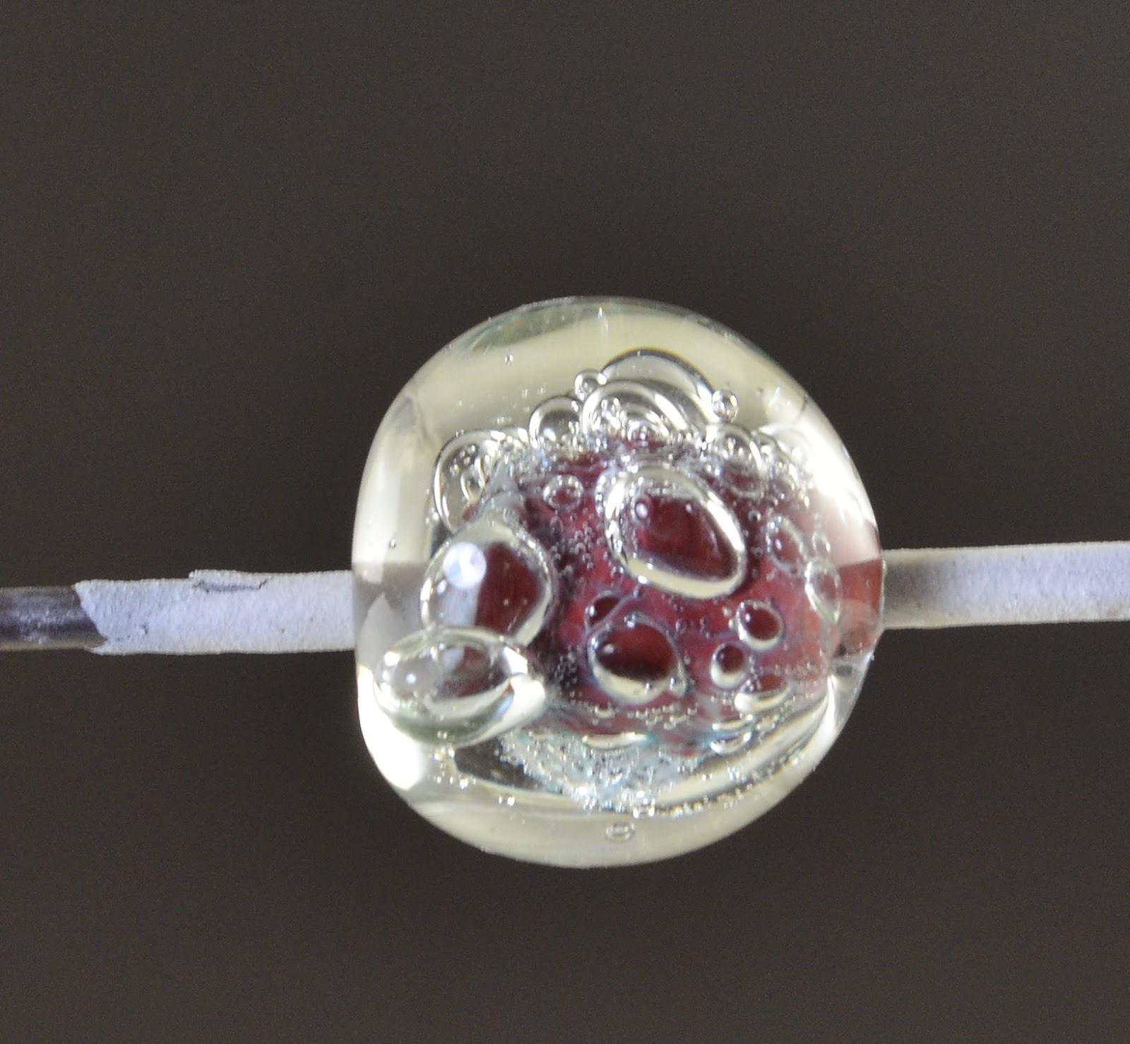
 Baking Soda. Make base bead. Roll in baking soda. Heat gently and cool. Encase. The hotter you get it while encasing, the more extreme the bubble effect.

I dunno. I still can't decide if I like this.


Tuesday, October 04, 2016

CiM 446 Blarney Stone

CiM Blarney Stone - an Irish green if there was one. Scratch this and you'll get Leprechauns, begorrah!


Two self coloured spacers, and one with dark ivory dots. Strong copper/sulphur reaction. 


Deeply encased.  Encased Blarney Stone is slightly lighter than unencased - see next image.

 Floral doodad on left, and encased spirally things on right - showing difference in colour between encasement and not.

A bright, saturated and happy green. Very nice.

Monday, October 03, 2016

Comparison CiM Aloha/Quetzal/Pixie/Spearmint

Head to Head. Or bead to bead.

From the leafy tip, on down, CiM Aloha, Quetzal, Pixie, Spearmint on the bottom.

Sunday, October 02, 2016

CiM 544 Aloha

CiM Aloha - carrying on with the run of turquoisey colours - this is a bright blue turquoise - that bright, delirious burning blue of a hot summer day.


Two self coloured spacers and one with dark ivory dots. Very strong reaction between the ivory and the blue. (Ignore the cat hair stuck to the bead, please.)


I tried a reduction on this bead - quite a dramatic red. 
 From another angle. Again - definitely a strong reduction.

Just the faintest hint of the metallic grey - barely visible here.
 And a little streakiness.
The first half of the rod was very shocky, but then it settled down, so I can't say whether it was that rod, or is a characteristic of this colour.

Anyway - I will have to play with this some more to see how it compares to Eff. Dark Sky Blue. But I'm definitely liking it.

Saturday, October 01, 2016

CiM 443 Spearmint

Ah - a translucent turquoise green. Like a lighter version of Pixie or Celadon, but not fully opaque.


Two self-coloured spacers, and one with trails of dark ivory. While the ivory has some separating - there is no grey/black reaction line - so if you are looking for a green that will give you ivory without the grey line - bingo - here you go.  I


 This is a hollow - I have "plans" for this, to exploit the translucency of it. We'll see how it works.

I've really always wanted a translucent turquoise - I think I'd like a translucent/opal blue turquoise, but in the meantime - this is good!

Thursday, September 29, 2016

CiM 444 Pixie

CiM Pixie. To me - this is almost indistinguishable from Celadon.


It's a little streaky, reacts with dark ivory and is a very pleasant turquoise green colour. Definitely a keeper!


Tuesday, September 27, 2016

CiM Pollen 311

I thought for sure I had already mentioned this one - but apparently not. Unless I grievously misspelled it!

Other testers seem to have gotten a brighter, purer yellow. With this particular piece, which is just heat and cool, and not a lot of re-heating - the glass a really interesting streakiness from transparent to opaque.

It really is very reminiscent of yellow pollen on say, goldenrod. Which is another colour by CiM. Which is more an acidic, pure yellow.

If I had to say, I would say that Goldenrod the glass looks more like Broom the plant, and Pollen the glass resembles Goldenrod the plant. My perspective may have something to do with spending my weekends knee to waist deep in both of them with the dogs.

This colour is not from the yummy new line up I published a teaser of last night, but an older release - I just thought I would share it anyway. 


Monday, September 26, 2016

New CiM

Oooo - new CiM colours to play with!

Results to come!

CiM 546 Quetzal

Here is a lovely colour to get excited about. Turquoise!

Quetzal is a slightly streaky, opaque turquoise blue.  I forgot to try reducing it - so I can't speak to it's behaviour in a reduction flame. You can see that I had no issues with it going grey and leaden however.

It really is a beautiful, classic shade of turquoise.


This is 3 self-coloured spacers and one with Eff. Dark Ivory dots. The turquoise/ivory reaction is quite strong. But this was dark ivory.


Absolutely adding this to my colour palette!

Monday, September 12, 2016

Khaos

Double Helix Khaos. Looking over my past notes - my results have not been too spectacular. However, I found the "Striking Guide" on the Double Helix website, and applied it to the Khaos, even though it is not listed on the guide.

I have to admit - I don't actually remember the rods being this honey/amber colour before.

I remember it as being a dark brown. I could be wrong, or this could be a different batch. 


 However, by following the instructions, I did get much nicer results.


this is Khaos, struck following the instructions. 


This has a little trail of Triton (I think) at the end - the dark blue. 

They do look different depending on the lighting, back lit vs front lit. 
Heat to translucent - not clear
cool to not glowing
strike at the tip to orange glow
fiddle with strike time or glow and strike a second time.

I like the first one with the blue haze better.

Honestly - I think the photos look better than real life though. You can see detail that you just don't notice otherwise.