Saturday, July 04, 2015

CiM 906: Sakura

Sakura is the Japanese Cherry Blossom, and all that it implies. And one of the things it implies is a spring-time rain of snowy pink petals.

And this is pink. A beautiful, sweet, innocent pink. Your challenge will be to keep it a pure and dainty pink.

(Photo to the right here shot on my phone and in bad lighting. Colour is pretty close though.)


Photos below shot in studio lighting - colours more intense, makes it easier to see the differences.


Because, as you work it, it drifts to a richer, more salmony colour.


Here are 4 self-coloured spacers. They have stayed pretty. And pretty close to the rod colour.

Here are 4 more simple spacers, with a core of white, or periwinkle. For retaining that pretty pink, the white core is your best bet. The pink layered over the periwinkle gives you a lovely shade of purple that is hard to get otherwise.
Here are 4 cubes. They are larger, worked a little longer, and manipulated with a marver to get the cubey shape. They are quite a bit deeper in colour, and have taken on an almost coppery aspect.

Lovely. Not as pink, but still lovely.
Those spacers again. Fairly bubbly too.

Side by side

And head to head.  I don't know if encasing the pink in clear would stop the transformation, or if it is a function of the repeated heating and cooling cycle. It's worth a shot.

Sakura does NOT seem to have a problem with reduction and low-oxygen (like the Effetre Rubino). I have no trace of black smudges or grey build up when I turned the oxygen down.

I think this one is a winner. A really pretty pink. And I'm not a "pink" person. 


Thursday, July 02, 2015

CiM 528: Royal


CiM Royal. This.is.THE.colour.  This is it - the blue. The perfect blue. You can all pack up and go home now - it's done. This is the colour.

That perfect shade of blue, like cobalt, but cobalt is sometimes too dark to be useful. This is that perfect shade, and perfect hue.


 You see 5 self-coloured spacers, and one with a layer of ivory, and Royal over the ivory. Too bad they are out of focus. Who cares - they are blooooooooo.


 Bask in the blue-ness.


I can't really add to this - this colour speaks for itself and what it says is: love me, melt me.


Monday, June 29, 2015

CiM 533: Blue-Yah!

CiM Blue-Yah! - a well-behaved, dark transparent aqua. Just an absolutely gorgeous dark aqua, intense enough to be used thin and still be colourful, and not so intense that thick layers of it no longer read as a nice, useful colour.


As you can see from the mostly used rod, what you see is absolutely what you get. 


The colour seems very familiar - like I've seen it somewhere before.

And you know it is hard to photograph aqua and get an accurate colour. Maybe I need something for reference ... .


Wait a minute ... .


 There you go! CiM Blue-Yah! is exactly the colour of Windex.


Now, I don't know if there are regional variations in Windex. I don't know if US Windex is tinted a different colour from Canadian Windex, or if Windex in Sweden is a different colour from Windex in France. 

Hmmm  - according to the S.C. Johnson website - that colour is Liquitint® Sky Blue. How cool is knowing that?

Here they are, back lit.


I'm pretty sure that naming this colour "Windex" would be a major bad idea and rain down lawyers - but having a glass the colour of glass cleaner is a nice little piece of apropos, don't you think?

And if you have ever looked at a bottle of Windex and thought - damn, I wish there was a glass that colour - well - there is. Blue-Yah!


Sunday, June 14, 2015

CiM 214: Nectar

CiM's Nectar is cast in the vein of Eff 068 - a pinkish rod that goes deeper and richer in colour when worked.

I think Nectar goes a little warmer in color and a little less orange - but I'm basing that on memory - so don't rely on it.

The rods are a slightly pinkish colour, but the worked glass is a rich honey coloured amber.


Here you can see the contrast in colours.


It does seem a little prone to air bubbles - possibly working it cooler than I do could stop that. 

Ah - but here's the thing - layer it over silver foil and you get a rich, antique gold look. Effetre's 068 will do this, not quite as dark, as will Effetre 049 Straw Yellow - which will also give you a rich, deep gold effect over silver foil. The schmutz on the bead is kiln dust - it wiped off - after I took the photo, of course.

Other side of the bead. No need to mortgage the house to buy gold leaf - just use silver foil and encase it with Nectar. 

Friday, June 12, 2015

Eff855 Grigio Verde

Another obscure glass from the vaults - this is Effetre's Grigio Verde - which translates to Gray Green. It is a sagey, greenish grey.

 It's a little streaky, as you can see, and photographs very nicely.

It's a very organic colour - and you could use it for frogs and leaves and cactus and making stuff that needs to look natural. Maybe even an elephant.

It's not a colour I would revel in and use just for the gloriousness of it - but hey - it's grey, so there you go.


Sunday, May 24, 2015

Double Helix Iris

There is a lot of variability in the high-silver reduction glasses - and - it takes time to really get the feel for these glasses. But here's a quick look at Double Helix's Iris.
Iris is a reduction glass, and appears to be capable of a whole rainbow of colours and a bright, shiny finish.

Here we have 2 spaces (with a clear core) and a small urn shape, with dots and a lip and tip in Iris. 


I didn't do anything special except reduce them. They are dark, but reduced very easily. You can see that the colours range from green to gold to purple to magenta.

So what are you going to get from them? Try it and find out, because everybody's mileage varies.

Friday, May 22, 2015

CiM 534 Agean

What a pretty colour! What is not to love about this? Agean dances straight down the light between blue and green.

Here you see, on the top, CiM Agean, and for contrast, the lone rod below is Effetre 026 Light Teal.

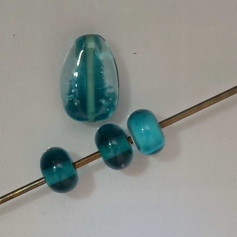
Agean is a dark aqua with a hint of green - not enough to push it over into the teal family, but enough to distinguish it from the aquas. It is the colour of the ocean on the sunny day after the storm, when the water is bright and sparkling, but still a little roiled up from the storm.


Here we have, on the top a shaded focal, and on the bottom, from the left, two self-coloured spacers and one Agean encased over white.
 look - it matches my nails!


And the focal again. 

This is a pretty, pretty colour. Can't go wrong with this!

Wednesday, May 20, 2015

CiM 814 Frozen

Let it go, let it go ... actually - I loved the movie and the endless references to it don't bother me at all.

This is CiM's Frozen, and it is a translucent white, denser than Cirrus.


Here, you can see it next to a rod of Cirrus (on the left)


Presented by itself, as a white spacer, it is just a little off white. It is a well-behaved glass, and not shocky, so if you have been attempting to use Effetre's Anice White and the shockiness of it is making you insane, try this. I haven't tested the reactive properties of it, (compared to Anice) - but I can tell you - the latest batch of Anice I have had access to is pretty much unworkable. I know people who are actually throwing it out.


 Here we have a tube bead, black core, left side is encased with Cirrus, and right side is encased with Frozen. The Frozen is substantially denser, and would need to go down in a much thinner layer to get the same effect.


 So, why work with a translucent white at all, you might be saying? Well, the translucent whites are stiffer than the fully opaque whites, which means that if you are doing something sculptural and it needs to hold it's shape instead of softening into a flat, gooey puddle, choose one of the translucent whites - Anice, Frozen, ... and Laucha has a stiff white that strikes in the kiln.


Monday, May 18, 2015

Effetre 238 Navy Blue

When I think of "Navy Blue" - this is not the colour I think of.

I think of a dark, somber blue that is based on the colours of the British navy uniform. Wiki agrees with me, and has more to say on the subject, but, as with most of the Italian glass names, I suspect something got lost in translation.

What it is, however, is the colour of the ocean on a stormy day, and that is good enough for me.


Effetre Navy Blue is a streaky blue grey.

It is quite nice.


You know, the more I look at these pictures, the more I wonder if the grey isn't some form of layer/coating/reduction, much like develops on turquoise. Hmmm. I'll have to go soak them in some CLR and see what happens. 
 Here's a bead with ivory dots.
 Nice little reaction - so this is a copper-based blue.
More to explore here, I think.

Sunday, May 17, 2015

Effetre 856 Cave Green

Well - isn't this an interesting colour? Cave Green.


The rod is green with a blue core, and you get streaky blue and green beads.

Except - it isn't that simple. This glass strikes from blue grey to green.

Which I have to admit, I have not seen before.

 Ok - here's a rod end. Note the green rod, but the blue end.

 And a selection of beads.


Note the variety of colours.


This bead, the arrows show where I let the bead cool and then hit it with the flame. The edges of those heated spots are  green.

These bead - with ivory dots, also shows the colour variation. Looking at these dots - it almost looks like the ivory reacts more strongly with the glass when it is green, and less so when it stays blue-grey.

Very, very interesting. This glass is not new - but definitely deserves a second or third look!