Wednesday, January 24, 2018

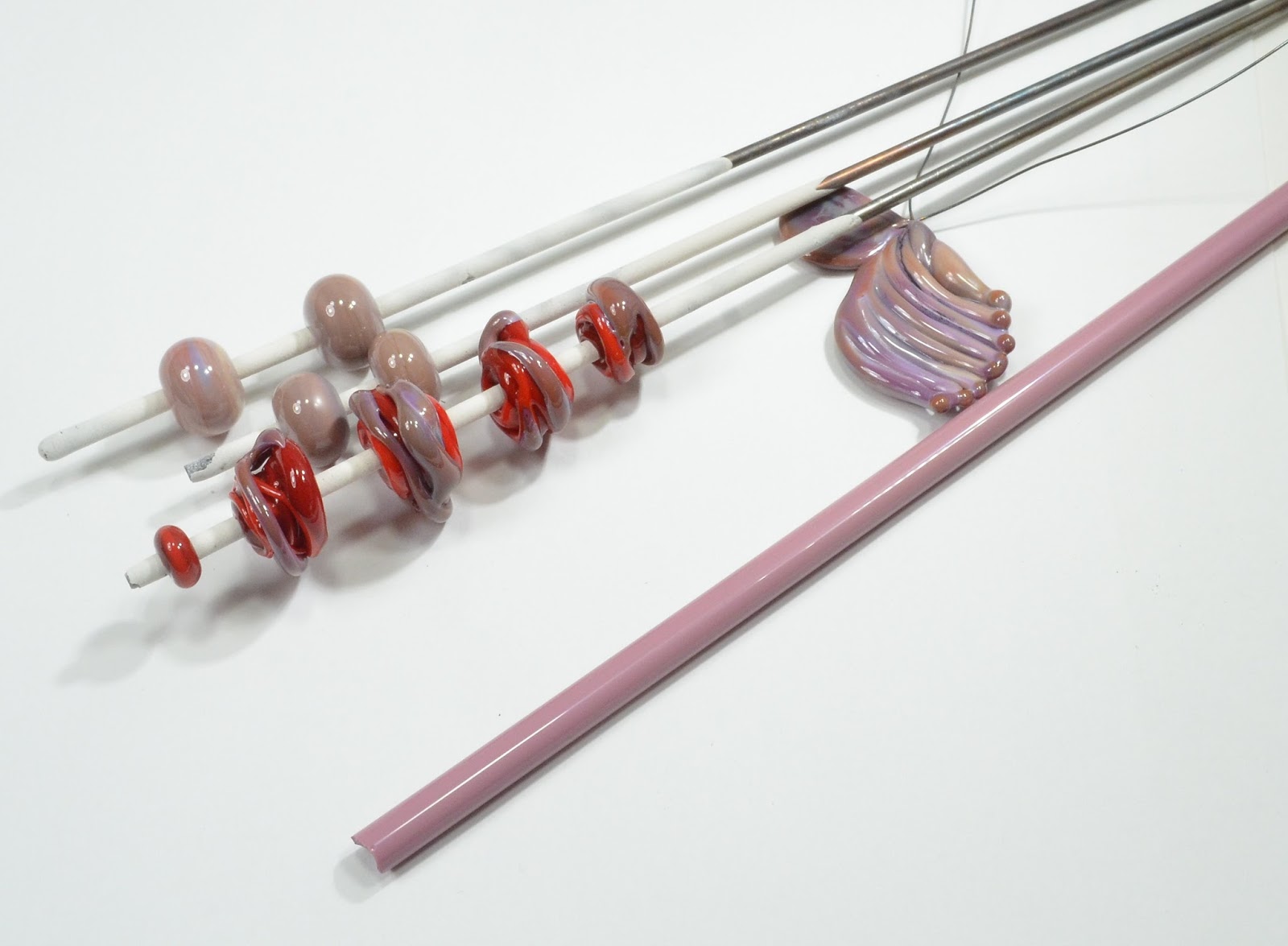
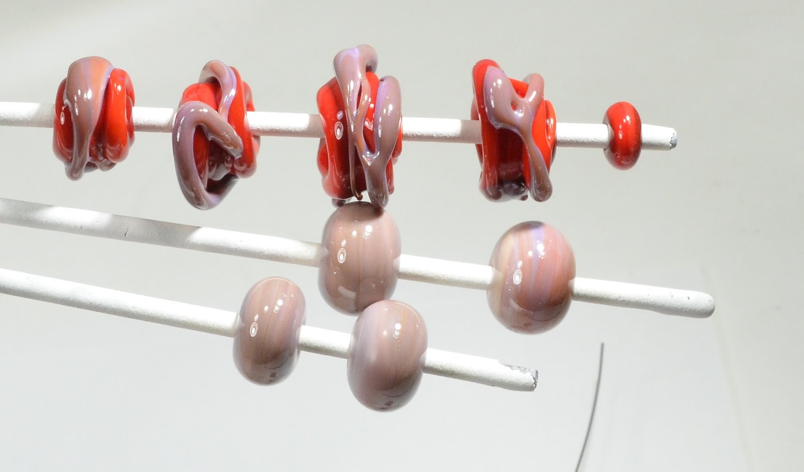
Effetre 712 Whisper

I blogged this a while ago, (2009), and apparently forgot it completely.

I can't say I really have changed my mind on it.

It's a ridiculously pale tint of pink, that requires being worked ridiculously cool.

I'm sure someone out there can make it look good, but lawdy, it ain't me.


This is what happens if you over heat it, and there was no amount of oxygen that would stop this scorching/blackening effect. The only thing that stopped it was moving to a smaller torch with a smaller flame. 

 Maybe you can market it as "Storm Cloud Sunset."
I'm sure I'm missing something, but this one is not a winner in my books.

Please don't confuse this with the CiM Whisper - which is a pale opal pink. Which apparently I scorched too. So maybe it's just me.

Tuesday, January 23, 2018

Comparison - Looking for EDP

As some of you know, Effetre has ceased production of 254 - Purple (Orchid) - commonly referred to as EDP (Evil Devitrifying Purple).

This glorious colour can produce some interesting reactions, and it's tendency to devitrify (lose it's glossy, glassy look and become matte and a little chalky-looking) have made it a love or hate kind of glass.

But with it now being out of production - as changing legislation regarding environmental controls would require a reworking of the production process - for those who do love this colour - well - what's a body to do?

So recently - I had a bit of a search around the 254 numbers in the Effetre colour palette to see if I could find something similar.

My candidates were:

Effetre 256 - Dark Rose
Effetre 706 - Pinky Winky
Effetre 257 - Sedona
Effetre 253 - Striped Pink.

First up - the base line

EDP over Eff 428 Light Red. A particularly dark batch of EDP, and brutally shocky. Stick it in the kiln to pre-warm it - shocky. But great colour.


1. Eff 256 Dark Rose. 

Such a pretty pink - and so nice to work. No shocking, no de-vit, a little streaky, and clearly too light a pink. Super pretty though.


2.  Eff 706 Pinky Winky

Again, super nice to work - no shocking, no de-vit, a light pink, with a smidgeon of a blue ripple streak in it. Very pretty.


3. Eff 257 Sedona. 

My money would have been on this one, but it was not a smart bet. Again - no shocking, no de-vit'ing, and it certainly looked darker going into the the kiln. 

However, coming out of the kiln, it has developed a slightly brownish overtone, that is not working for me in the context of what I am trying to achieve. Not to say I don't like it - in the wave form on a wire, I like the variation a lot, and I think it really does evoke a southwestern sunset, but not what I was going for. 

BTW - this was worked in the exact same flame as the others.


4. Eff 253 Striped Pink

Ding - ding - ding - ding! We have a winner! To my surprise - the closest match is Striped Pink - which is a cored rod (the center is something else - possibly for economic reasons). (Kind of like a reverse filigrana.)

I had no problem with it shocking, it does de-vit a little, like EDP, and if you have any of it lurking in your stash, it will be easy to ID as the transparent core gives the rods a very distinctive look when viewed end on. 

I believe this is actually EDP layered over something else - a light transparent, so that makes it on point for what I want. 


Here we have the head to head comparison - top mandrel is EDP, bottom is Striped Pink. 

And the full set together. From the top - single mandrel with 2 beads - EDP.

Next pair of mandrels - Striped Pink. Then Sedona, and then Pinky Winky and finally, Dark Rose. The Pinky Winky and Dark Rose are  very similar to each other, with the blue-ish bits distinguishing the Pinky Winky. 


So there you have it. And if someone could make a glass to match the nail polish in the pictures above, that would be nice. Please and thank you.  ;-)


Sunday, January 21, 2018

Comparison: Opal Yellow, Stone Ground, Painted Hills

Effetre 266 Opal Yellow, CiM 351 Stone Ground, and CiM 313 Painted Hills.

Opal Yellow has long been known more for its reactions that as a colour to be used in its own right - somewhat unfairly, I feel.

Stone Ground is CiM's variation, and also  is used for the way it interacts with other glass colours. However, you may have noticed that Stone Ground is a bit thin on the ground right now at the distributors, and you might be wondering what is your best bet as an alternate, and how they stack up.

In which case, you might want to have a look at CiM Painted Hills. On the face of it, Painted Hills appears to be much too light to function as an equivalent, but it may actually be closer to Opal Yellow than you think.

The unworked rods, from the top, Opal Yellow, Stone Ground and Painted Hills.


 And from the ends - in the same order.


And here is the bead, still hot, before mashing. From the left, Opal Yellow, Stone Ground, Painted Hills. The dots are Double Helix Aurae


 And after mashing, still hot.


And once out of the kiln. Again, from the left, Opal Yellow, Stone Ground, and Painted Hills. The Stone Ground base between the dots is a much richer, warmer colour, and the two ends are paler, although the Aurae dots are a better match between the Opal Yellow and the Stone Ground.


The reduced dots are so shiny - you can see at the edge of the bead it almost looks encased - that's actually just the shine on the dots.

It really depends on what you want it to do.

Saturday, January 20, 2018

Vetrofond 821 Verde Muschio

 In the annuals of strange glass comes - Verde Muschio - literally Green Moss. This is an old Vetrofond glass - Vetro being now out of business.

On the face of it, it appeared to be a transparent olivey green, so imagine my surprise when it started to opacify and turn a greyish brown as it cooled.


 This was shot while hot - before going in the kiln. You can see part of it is still transparent.
 And, as it cooled further.
 Well - I thought - let's try making a horse with it. This is shot hot, before going into the kiln. The base is the same colour, but with frit and powder added for contrast.

And the next day - out of the kiln. It has cooled to a somewhat greenish grey, it's still a pretty cool, organic kind of colour. 

 Again - while hot, and then popped into the kiln, ...


And what comes out is this ... (bottom mandrel is the same as the one above.)


 Some parts still retain a little transparency, where they don't get a lot of reheating.


 Front,
 and back. Double Helix Powders and frit.

Where to get? Jean at Nortel still has some of this interesting glass if you want to give it a go! (Quite a lot of it, actually.) It works nicely, and the colour is not unpleasant. And it really is a mossy kind of colour ...

Wednesday, January 10, 2018

Sorting the Stash

I spent New Year's Eve (and part of New Year's Day - so yes - it took me 2 years) sorting and organizing my stash of glass. This was highly productive, because I found a number of glasses that I thought I was completely out of and now, I have them!

I have gone from "why do I not have any black/white/clear?" to having pounds of each. I found a bunch of that light minty Lauscha green that I thought was gone. A few rods of EDP, a rod of "Earth." Some of the OLD Rubino. Some old transparent Laucha Pink. Some of the old CiM Cirrus. Pounds of Fossil and even some River Rock.

And I freed up some floor space and shelf space and just generally re-acquainted myself with what I have. And with it all sorted by colour now - I can find a "close-enough" more easily.


Of course - this is bad news for the glass industry, as clearly - I do not need to buy more for a while!

This came about from a quote in a book that I read over the holidays - "Steal Like An Artist - 10 things nobody told you about being creative" - by Austin Kleon. It's actually a really good book and I highly recommend it - it is encouraging without being the sappy, sentimental "just believe in yourself" kind of unhelpful bull-crap that fills the marketplace these days. Anyhoo - one of the comments is "be tidy and organized in your work place, so that you can be wild in your art" - or words to that effect. I think it is a valid point - the tools and materials should be to hand and findable, so that you can produce your vision instead of hunting for the whatever it is you need right now. Knowing you don't have it is also better than hoping you do and taking three days to look for it.

I also really liked the comments about digital and digits - that making things with your hands is a counterpoint, and possible antidote - to our sedentary, digital lives.  

So there you have it. Happy organizing.  Even Happier Creating.