Thursday, February 08, 2018

Effetre 705: Okey Dokey Artichokey

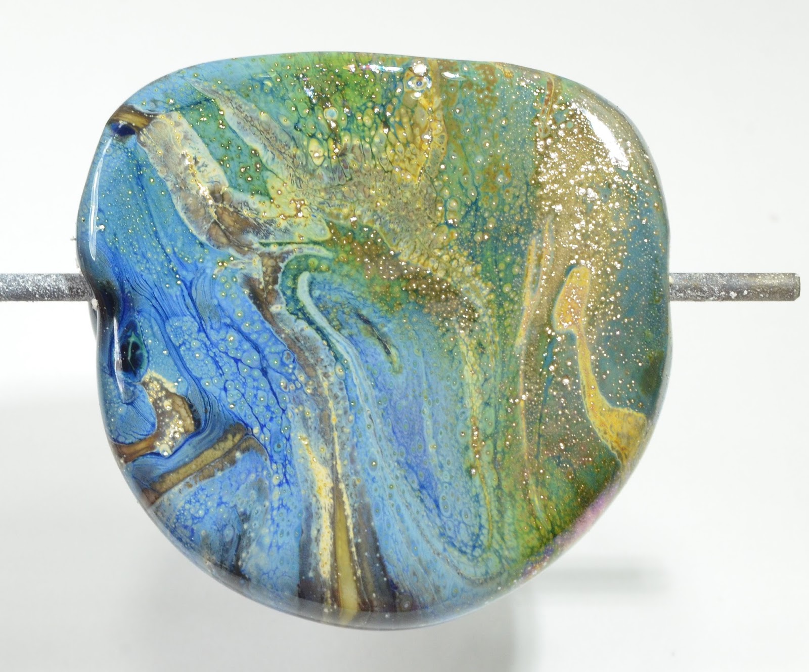
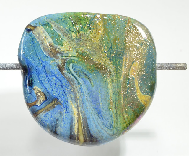
Last time I tried Okey Dokey Artichoky - it was killer shocky - but I had no trouble with it at all this time around. I did come out with more colour variation than last time too - so perhaps a different batch?


The end of the rod is quite distinctive, with it's multiple rings, so you should be able to ID those random rods.


 I saw a lot more blue coming up this time around, and ...
 even some dark, almost black lines ...
 of course, maybe I was burning it or got the rod contaminated with a piece of something else.
 Well - no - that wouldn't explain it showing up everywhere. So we can say it is streaky blue and green with hints of darkness, how about that?


Tuesday, February 06, 2018

Effetre 704 Very Cherry

I've reviewed this colour in the past - twice actually (Very Cherry, and Very Cherry Reprise). It is very dark colour - the rod looks red in some lights and browner in others.

It appears translucent in the rod. When heating, it goes through a stage of looking distinctly grey - which is odd.


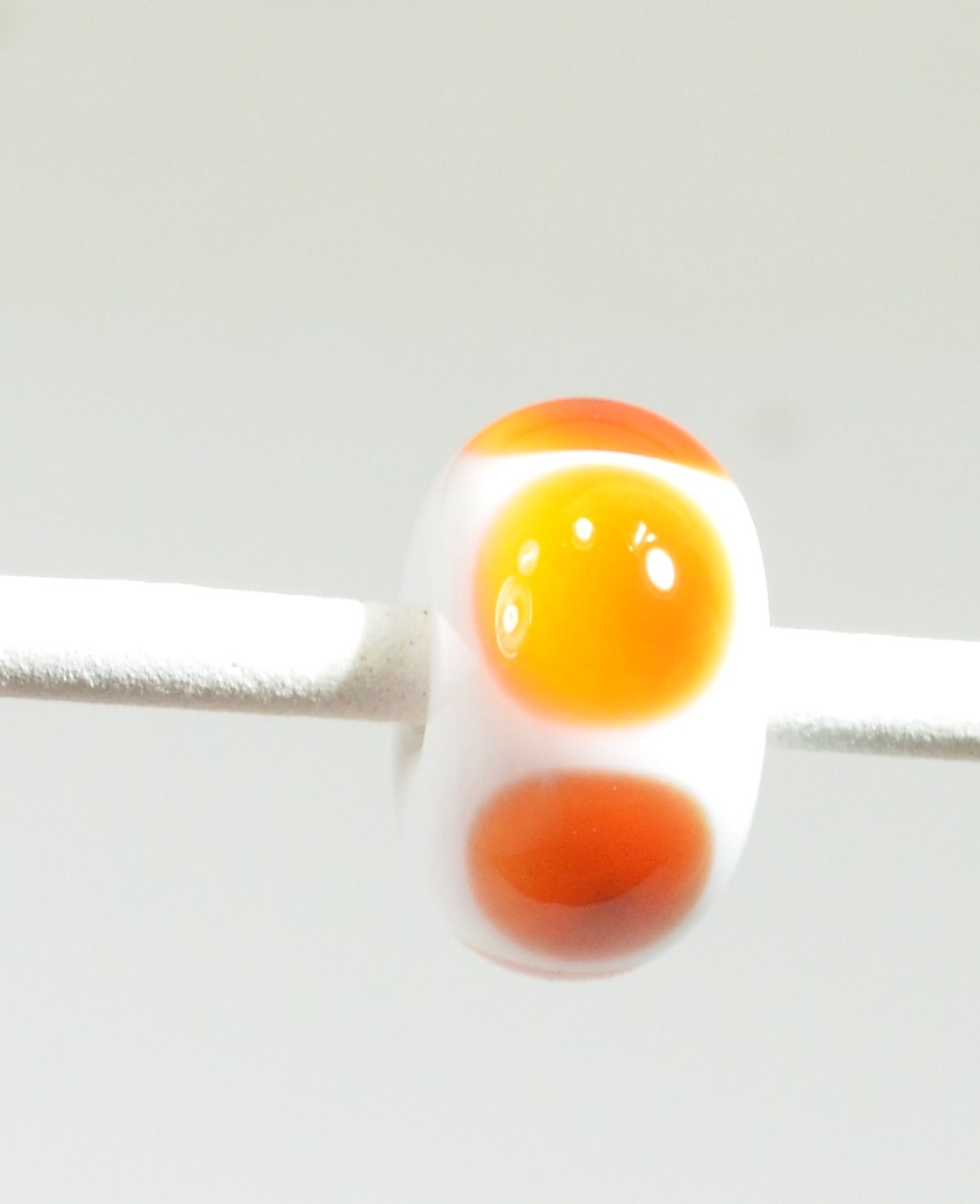
 This is simple dots over white, and the dots have struck to a sort of mandarin orange, with odd little dark spot in the center which shows better in the photo on the right.


Worked up like this, thin, you get a range of intensities.

 and a range of colours, depending on the type of lighting you are using.


Hold them up to the light, and you can see a range too -including hints of that grey that was there when it was hot ...


The base is Very Cherry - where the raku frit is, it reacted very strongly to create heavy black borders. The horse is also rendered in Very Cherry. The Very Cherry, being a transparent, is stiff and worked nicely for the sculptural part. There is some pitting. The lack of contrast makes it rather tough to see the features on the face, so I might etch this one. 


This colour is not going to appeal to everyone. If you are fascinated with colour-shift reds, need a super dark red, or intend to work it thin over white for it's orange aspect, or just love the Vetro price point, it might have appeal for you.

Sunday, February 04, 2018

Vetro 069 Striking Yellow

 Gack - I have so many samples to blog - I hardly know where to start! Ok - this is from a big pile of recently-uncovered glass from Jean at Nortel - this is a big stash of Vetrofond Striking Yellow. You remember how I was whining about the current batch of Effetre 069 is hard to strike and kinda wimpy when it does. Not this! Oh-boy-oh-boy-oh-boy. This glass is the colour of  a lemon cough drop - vibrant and glowing yellow. Juicy!


 Now that's some yellow!

 These are over white - and in the one on the right - it got away from me, so it swirled with white.
 This is a base of white, turquoise ends, encased with Striking Yellow.
 Self coloured spacers.
 and some waves and a leave on wire.

Like many of the striking colours - it does tend to opacify (get streaky clouds inside) but it's not too overwhelming, and the colour - oh my - the colour.

Yellow makes a heck of an accent - yellow is under-rated, IMHO. And I'm going to stock up on this - because once it's gone - it's gone!

Friday, February 02, 2018

Effetre 755 Woodie

Effetre Woodie - a real sleeper - this one. Woodie looks like an unassuming grey - but watch out - it does some really wonderful things when you work it!

The base and the horse are Woodie. The streaky brown grey that Woodie goes is really lovely in the horse, and gives it a painterly quality.
 The streakiness in the base bead was also attractive, but I rolled it in some frit - a large portion of which was Raku Jitterbug, and the result seems pretty spectacular. I think the Woodie may have enhanced the reactive properties of the frit.

 Here's the horse again. The streakiness really is quite wonderful.


In the rod - Woodie doesn't looke that exciting, but it sometimes really pays to try those boring looking colours!

Update: I wanted to add some images of the rods and the ends of the rods - with all these piles of grey laying around - it is useful to be able to positively ID them.

 From this perspective, you can see why it comes out so streaky.

Wednesday, January 31, 2018

Monday, January 29, 2018

You are not going to believe what this colour is ...

Seriously - you are just not going to believe it.


I got my hands on the latest colour from Double Helix ...


Oracle-Black.


Black.


Let me just let that sink in for a bit.

Double Helix has a fine write-up for Oracle-Black, and the thing that grabbed my attention was "... reactive with lusters."

Oh ho, says I - that's gotta be the old silver-foil-turns-the-black-blue thing. I love that thing.

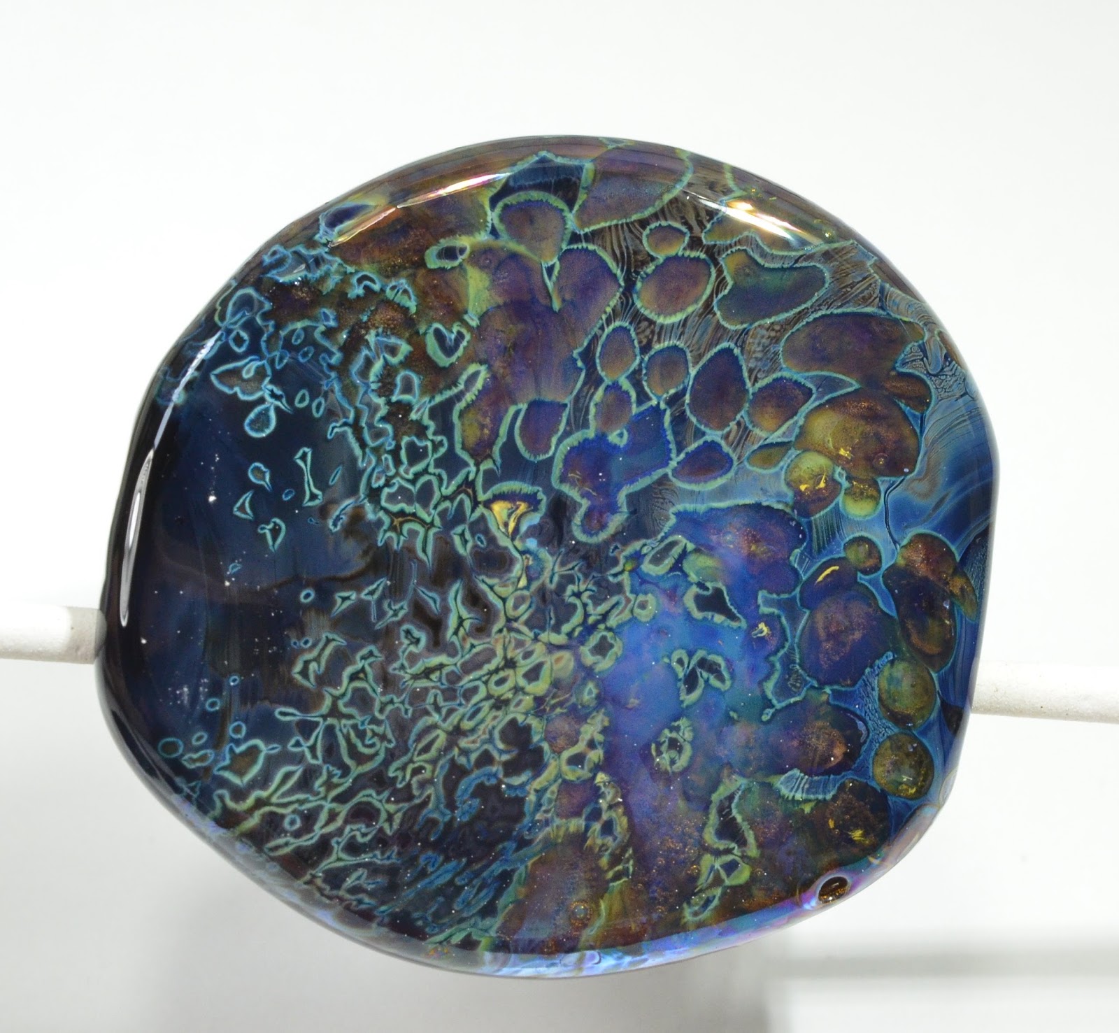
So I get out the silver foil, make a honking big bead in scraps of whatever, encase it in the Oracle-Black, (to make it go further), and then lay down the silver foil, burnishing, and gently apply the flame to melt the silver. A few swipes of ivory, melt, mash, and a little bit of reduction applied to the right hand side. That would be this bead.


Black.

Black that reliably and intensely reacts with silver to create a rich palette of blues. Greens when reduced.

This is a random selection of frits and powders - some Psyche for sure, also probably some Nyx and Kronos2 powders, maybe also some Terra powder, and a little GOK. (When I get low on a frit, I tend to dump them all into one tray.)


What else can I tell you? It is buttery smooth to work, much less stiff than the blacks usual blacks. Really delightful, actually.


Double Helix says that it "will strike, does not spread excessively, and can be worked very hot without boiling."

Here you see a flattened, unannealed  rod tip - and you can see that it shows blue. (This is strongly lit in order to show it).

Of the three "bits" below, the pointed leaf, on the left, went into the kiln still blue - I wanted to see if it would kiln-strike, and it did.

The rounded leaf (on the back of the pile) - I deliberately struck, and it went into the kiln black. The wavey bit just looked black the whole time. 


 Only if you hold it up to very intense light can you see some blue still.


For this bead, I make an ivory bead, put very thin trails of Oracle-Black on it, and then cooked the snot out of it. As you can see - this did not strike in the kiln, but I really did put it on very thin. I rather like the effect. It hasn't really webbed up, like the old intense black used to do, but there is a little something going on. But, like I said, I really tortured it here. And I like it.


 The mane and eye are Oracle-Black, and you can see it functions very nicely as a normal black. ;-)


The buttery smooth working characteristic and the silver reactions alone make this one a keeper in my books. And Double-Helix's policy of making glasses with a mandate of low-toxicity is certainly something to think about.

I'm going to have a lot of fun with this one.

Wednesday, January 24, 2018

Effetre 712 Whisper

I blogged this a while ago, (2009), and apparently forgot it completely.

I can't say I really have changed my mind on it.

It's a ridiculously pale tint of pink, that requires being worked ridiculously cool.

I'm sure someone out there can make it look good, but lawdy, it ain't me.


This is what happens if you over heat it, and there was no amount of oxygen that would stop this scorching/blackening effect. The only thing that stopped it was moving to a smaller torch with a smaller flame. 

 Maybe you can market it as "Storm Cloud Sunset."
I'm sure I'm missing something, but this one is not a winner in my books.

Please don't confuse this with the CiM Whisper - which is a pale opal pink. Which apparently I scorched too. So maybe it's just me.