Monday, November 03, 2014

Effetre 620 Kiwi

 Last time I reviewed Effetre 620 Kiwi was in 2008. You can see - it is a layered cane.

This is a new batch, and it appears pretty similar, but slightly less dense, slightly less streaky, and perhaps a little more acidic in colour.

Above, from left to right, self-coloured, over clear, and over white. 


 On the left, a "bit" made with Kiwi and some clear. On the right made with clear and a rod of what I believe is the old kiwi.
If I was absolutely certain that this was the old Kiwi, I would be less wishy-washy, but I'm going on looks, and not labels.

Saturday, November 01, 2014

Triptych 3: Crone

Crone - there's a term with oodles of negative connotations. Maybe we should reclaim it? After Maiden, (youth, inexperience, enthusiasm, questionable judgement), and Mother (taking care of everyone else) - we have - Crone. The time of being yourself. An explosion of creativity. Experience plus opinions plus perspective. Time to get out there! Be yourself.


Friday, October 31, 2014

Triptych Part 2

This is the 2nd part of "Maiden, Mother, Crone." Motherhood is a time of sacrifice, nurturing, protecting, focus.


Thursday, October 30, 2014

Triptych Part 1

This is part 1 of a triptych I am currently working on, on the ageless theme of Maiden, Mother, Crone.

This is "Maiden" - carefree and chaotic youth, alive and young and vital and exploratory.

Wednesday, October 29, 2014

CiM Bing

 CiM Bing, which I have written about before, is a lovely shade of red. Interestingly, however, here when it is blown out to be paper thin, it is more of a flaming bright orange.

A very intense orange, to be sure. But no longer red.

Monday, October 27, 2014

Gold Accents?

Fun? Gold accents? This is the Krylon 18 kt gold leafing pen - applied after the glass is out of the kiln and cold.

How durable is it? Withstands casual handling - determined effort will scratch it if you really try.

Could be a fun way to add a little gold accent. Why not?  I think this is how a lot of ceramics and commercial stuff get their gold accents.

Thursday, October 23, 2014

Belladonna DragonScales - Follow Up

 Disappointingly, reducing this while the glass was still glowing did not result in a lustre that came out of the kiln (see previous post). Instead, it resulted in a murky greyed out colour with just hints of blue.

This is why I usually let glass cool before reducing. Many of the reduction glasses will take on this muddy effect when reduced while the glass is still glowing hot.

Oh well, will try again.

Tuesday, October 21, 2014

Vetrofond: 987 Dark Lichen

Ha. Bet you would never guess that this:


turns into this!

Yes, that's right - what appears to be a black core with a topaz overlay in the first photo, works up to be a streaky dark ivory with lapis blue stripes.

The topaz lightens and becomes opaque, and the black is apparently a dark blue. The result is striking and definitely not "what you see is what you get." This is stash of Vetro glass - so this is it. You'll not see this again.


 I got mine from Jean at Nortel, and I suggest you don't linger if you want any - because everyone I have shown these to is calling as we speak to order theirs.


Monday, October 20, 2014

Belladonna: Dragon Scales


This is Belladonna "Dragon Scales." Belladonna is a boutique glass from Arrow Springs with a small palette, but some cool stuff.

It is a deep emerald green transparent rod, and reduces easily. However, I had a high degree of metallic lustre on the items going into the kiln, most of which had disappeared when I took it out. The places that looked to be "over-reduced" when I put them into the kiln - with a milky aspect, were the only places that the reduction survived as the blue and aqua swirls, as shown here.

So definitely not what I was expecting - but attractive in their own right. Next time, I will reduce it longer, probably with the glass hotter (still glowing) and over all, more aggresively.


Saturday, October 18, 2014

Bubble Ring

Here's something kind of fun and experimental. This is a bubble ring, or a bunch o' grapes ring ... the bubbles are worked on a wire, and then the wire is coiled (after annealing and cooling), and attached to a cast ring base using jewelry grade epoxy clay.

Kind of fun. Wish I had not grabbed a ring size too small to be wearable by me ... .  ;-)


Friday, October 03, 2014

Eye Candy

Can I look at your jewelry? Why, sure, can it look at you?

 The gear shape in the centre is a reflection of my "ring flash." The wonderful eyelid colour is Terranova 2.1. The iris is a twistie of Triton and Terranova. 


Tuesday, September 30, 2014

CiM 616 Coronation Day

CiM Coronation Day - a royal purple that is lighter and streakier than the rod itself.

The two beads on the left are self coloured, and the one on the right, I applied white dots and then super heated it and swirled them into the purple base.

I'd have to compare it head to head with Evil Queen or Thai Orchid to say which is darker.

Saturday, September 27, 2014

CiM 615 Bubble Bath

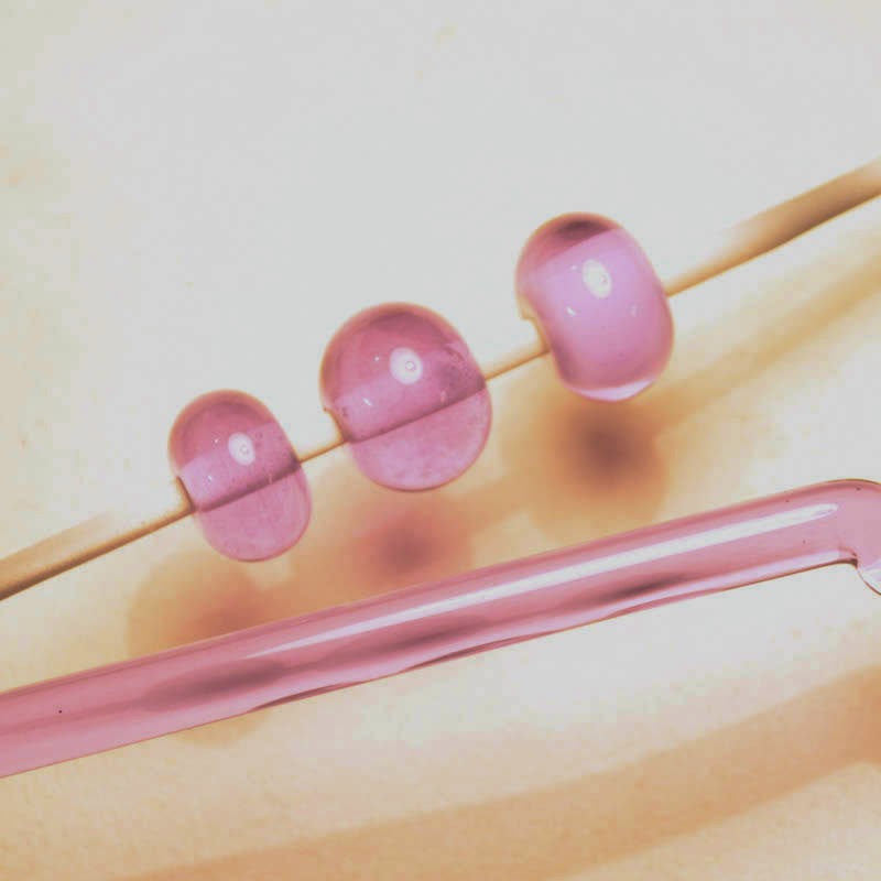
Bubble Bath is a pretty, pale pink translucent moonstone glass.

The two beads on the left are self coloured and the one on the right is over white.

Very ethereal.

Wednesday, September 24, 2014

CiM 526: Ice Floe


CiM Ice Flow is a super pale transparent blue. I mean very, very, very pale. I bet this would be great for aquarium beads. Or try it over silver foil and see how it comes out. Sometimes, the barest wisp of colour is just what you need.

I bet it would etch nicely too. The pale transparents usually do.

Friday, September 12, 2014

Dragon Eye Demo

Last week, at the Glass Gathering, at Sheridan College - I demonstrated making a Dragon's Eye.

Some of you who watched that wanted to see the final version - but it, of course, went into the kiln and who knows what will happen to it next.

Anyway - I made another the next day using the same glasses - and it came out pretty similar.

The iris is a twistie made with Khaos and Triton over ivory.  The dichro is laid down after.

The lids are Terra Nova 2, with dots of something very similar to Triton, but has no label anymore, so that's just my best guess.

I embedded two rings for hanging/attaching - only one is visible in the picture.


Wednesday, September 03, 2014

A New Direction

The Watcher from the Forest Floor. 18 cm long.
Lately - I have had a certain level of dis-satisfaction with my glass creations. A dissatisfaction that I have come to think of as "the tyranny of the bead hole."

I have come to that place where I do not want to make "beads" anymore - beads being uniform, smooth round objects with neat puckered holes and are destined to be strung onto personal adornment items.

It's not that I don't like beads any more - it has more to do with wanting to break free of the restrictions of making it wearable (glass is heavy, glass is sharp, glass can break), and wanting to move out and explore other aspects of the glass.

I recently had a few "aha" moments - that have opened up doors into new worlds of possibilities.

This is the beginning of what I hope will be a brand new exploration. A new direction in personal vision. ;-)


Saturday, August 30, 2014

TAG 104-15 Fire Lotus

The "word on the street" (ha ha) is that Fire Lotus is yummy and easy to use - easier than some of it's cousins.

I think I might have to concur with this as these did come out pretty nice. Some of these striking glasses look very nice when hot, and once they come out of the kiln, they look dark. Oh, if you get enough light on them, they can look ok in a photo, but they just look dark the rest of the time.


The bottom row is, left to right, encased with clear, partially encased, and self-coloured - struck once.

The top row is all three, un-encased, struck once. I like the encased and partially encased ones best. Looks like encasing is the way to go with this one.

Wednesday, August 27, 2014

CiM 813: Cobblestone

 Cobblestone - nice colour for elephants. A nice warm shade of grey, tends to look different depending on the colours around it - see photos. The variability in the photos is not as evident in real life.

I think this would be a really nice colour in sculptural animals - like, elephants! Seals. Whales. Kittens.

Because ...


... all is vanity, all the way;
Twilight follows the brightest day,
And every cat in the twilight’s gray,
Every possible cat. 


Sunday, August 10, 2014

CiM 613 Gypsy

CiM's Gypsy is a dark, dark transparent purple, so dark, in fact, that the rod just looks black. And a bead made with it and nothing else also looks black. (Left-most bead)

But a dot on white reveals it's red-purple berry-juice nature, and the third bead from the left, Gypsy over clear, also shows it's wine-like nature.

Use as dots, in stringer, over clear, whereever you need a deep, intense colour that can stand to be diluted a lot.

Same three beads - strongly back lit.

Friday, August 08, 2014

CiM 614 Jellyfish (Colour Shift)

Meet CiM Jellyfish - a colour shift glass like the colour in commercial beads known as "Alexandrite" - and like the Effetre 081 Dark Lavender.

 This colour of glass looks blue in cool, fluorescent light, and mauve in warm light, like incandescent or sunlight.

This series of photos show the rather remarkable range of colours you will get as you move from one kind of lighting to another.

Pictured to the right, two self coloured beads and Jellyfish encased over white. 


 Quite remarkable, isn't it?

It can be something of a challenge to create with this glass, as you have to coordinate your colours for all types of lighting.

That said - I find it a really nice glass to work. Try it over silver foil sometime.
 This is Jellyfish over EDP (2 on the left) and EDP unencased.

 Those encased EDP beads again.

 Again, the EDP.
Colours that we see are caused by light of specific wavelengths being reflected from the object for us to see. This particular colour reflects light in some very narrow ranges of frequencies. As you move from warm light - with lots of orange in it, to cool light (more blue), there is less of the warm colours available to be reflected, and so the colour of the glass appears to "shift."

It's a neat piece of chemistry.

Wednesday, August 06, 2014

Effetre 420: Coral - Firecracker

Effetre 420 Coral - Firecracker variant.

Maybe someday I will understand why this colour - 420 - Coral - comes out different every time.

I am pleased to see that the sellers are giving it a subname - Firecracker - essentially labeling it as a batch. Because it's deeply annoying to fall in love with a colour, and then not be able to re-order it because - well - there is no way to talk about it. I mean, this is why we have Latin names for plants and things - so we can be certain we are talking about the same thing.


I doubt that this is THAT specific - but it's a step in the right direction. So if an orangey variation of coral that is super streaky and has almost an oriental carpet vibe to it is your cuppa tea - ask for Effetre 420 Coral - Firecracker. 
All four of the beads shown here are self-coloured - no other glass used. So you can see - it is really streaky.

Conversely, if you want a plain, even colour - this is not your glass. ;-)

Sunday, August 03, 2014

Goldstone stringer

 Goldstone stringer.

Here's the case for making your own, versus buying it premade.

Encasing with a colour.

These beads are a base of red, with goldstone stringer handmade with transparent red and clear stripes.

What a handsome effect, yes?


Saturday, July 12, 2014

Bead Recipe: Tidal Pools

I've always wanted to write a "Bead of the Month" column, but the reality is, I just couldn't jam another commitment into my schedule!

However, if I were to write a "Bead of the Month" column - this might be one of them.

I call this design "Tidal Pools" for the sandy texture and the rich blue pools.

Skill Level: Intrepid Beginner to Intermediate. The shape is unimportant, and can be asymmetrical and organic - good for beginners struggling with shape control.

Prerequisite: Know what a reduction flame is. Know how to make a twistie.


You will need

Glass Rods:
Effetre Light Ivory

Effetre Light Dark Sky Blue
Clear

Additional Supplies:
Goldstone frit, fairly small/fine
Silver foil
Some Twisties containing High Silver colours

Tools:
Your favorite marver
Pair of mashers
Plus all the usual equipment to make beads (Mandrels, torch, kiln, glasses). I am presuming you already know how to make beads and know how to make them safely.


 I usually have left over twisties laying around - but if you don't and need to make some fresh - make some using high silver colours, such as Double Helix and TAG. You might alternate stripes of ivory and Terra, or Helios or Clio or Aura. (Avoid the black looking rods - or not, but the look will be quite different.)
Before turning on your torch, tear or cut your silver foil sheet in half or thirds. 

Start by making a base bead in ivory, make it longish, anywhere from 1 - 2 inches, as per your preferences and ability.

Build it up and shape it into a rough oval, footballish shape. The shape isn't too important to the bead, and you can go for an organic shape that will suit this better than an example of perfect Euclidean geometry.

Let it cool and stiffen a little, and apply silver foil to the right half of the bead. (Reverse for left handed flame workers.) Burnish it onto the glass (rub with the marver.)

Apply the flame to the foil and melt it in. While it is still hot and glowing, roll the side you just applied foil to in the gold stone frit. It's not necessary to apply it all the way up to the very edge of where the foil was - leave a buffer zone.

Apply your twistie to the edge, more or less, between the foiled and unfoiled half. Again, this doesn't need to be precise.

Melt the twistie in.

Add two or three large dots of the Light Dark sky blue, one on the unfoiled end of the bead, next to the twistie, and the other on the other side of the twistie, on the opposite side of the bead.

Melt these in partially - flattening them with a marver, but leaving them still raised.

Apply a large dollop of clear directly onto the Light Sky Blue, and marver to the edge of the dot. Then continue to melt them in.

Once the dots are melted in, get the bead evenly heated and ready to mash. If a nice piece of pattern has developed that you can see, you may wish to feature this on the front of the bead, but as a general rule, choose to mash so that the Light Sky Blue dots come out on the sides, not smack in the middle of the front and back.

Mash the bead, tweak the shape if necessary, and firepolish out the chill marks. Turn the flame down to a reducing flame and reduce to bring up the metallics in the twistie. Kiln and anneal as usual.

Notes.

The layer of clear is what keeps the Light Dark Sky Blue bright - without it, it will reduce and react.


Correction: Dark Sky Blue.

The clear makes the blue look lighter, hence my memory error. Light Sky Blue comes out too light.

Wednesday, June 25, 2014

I'm not dead.

I know, I'm sorry - I went from regular posts to - Kablooie. Nothing. Sorry about that.

I've been occupied the last month with a lot of dog stuff, and just falling down exhausted at the end of the day. And there's another week of it to come too.

Hopefully - then I can resume some of the backlog.

I've barely been on the torch - I feel rusty when I sit down. How the heck does this work again?

Anyway - I did get in a few hours the other night. This flame headed dude emerged at the end of the evening.


Cheers all!