Tuesday, February 01, 2011

CiM Grape Ape vs Evil Queen Revisited

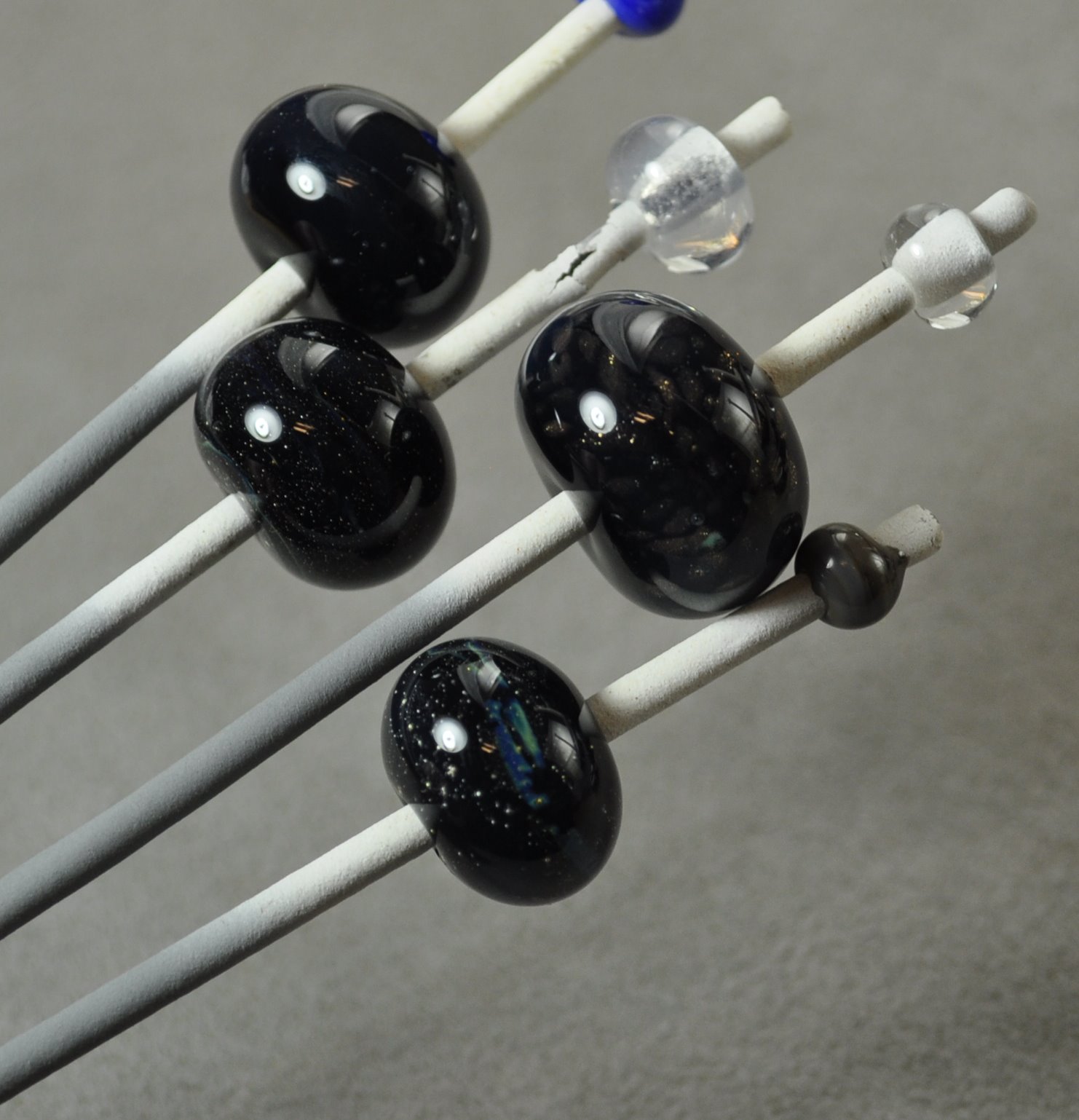
Recently - I ran out of CiM Evil Queen for an order. Could I substitute CiM Grape Ape? I know the colours aren't the same exactly, but really - this is a set of bead with lots of other colours and I have some leeway. Let's just do some testing. Better to test a mandrel of beads than do an hour and decide I have to toss them all.

So, all of these have a base of Evil Queen. I was working from the right, and so I have dots of Grape Ape on the first two, and stripes on the third. Well - isn't that interesting -I'm getting quite a bit of separation between the two.

Do you suppose it will separate with itself? So - the fourth bead, on the bottom, at the left, is Evil Queen dots on an Evil Queen base. And, in defiance of logic, you can still see the dots.

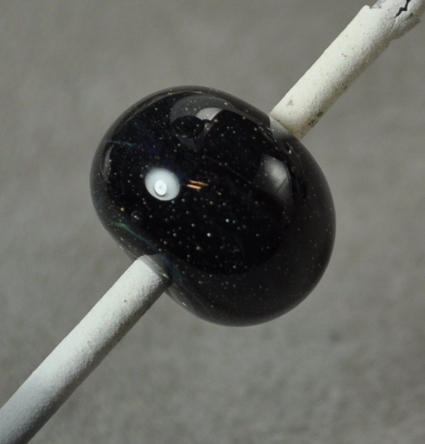
Here's a closer view, although the reflections from the light aren't helping much.
Here's a close up of the Grape Ape dots on Evil Queen. Notice the discolouration of the Grape Ape - the shifting to a warm silvery brown. Hmmm.

Here the base is Grape Ape, and the bead on the right has nice, purple Evil Queen dots. The bead on the left is Grape Ape dots on a Grape Ape base. Whoa - they show up. I wonder if other colours do this?
On the right - Effetre Periwinkle (Good old reliable periwinkle). Check it out - the subtle dot on dot pattern of Periwinkle dots on a Periwinkle base. This isn't a batch difference - it's the same rod of glass.

The white bead, much to my relief, does not show dots. Although, I could make them out while it was hot ... .


Yet another way to add a subtle texture and interest to a bead, and perhaps a way to control and manipulate the streakiness of some glasses. (Think ivory.)

Sunday, January 30, 2011

Effetre 411 Apple Blush


Well - this is one of the most interesting new glasses to come across my bench in a long time. This is Effetre Apple Blush, and if the name "Apple Blush" makes you think of just ripening apples, as they turn from green to red - well - bingo - cuz that's exactly what colour this glass is. Green - with blushes of a warm orangey colour.

You can see here - the ends of the rod show a warm hint of colour.

The warm colour blushes seem more pronounced in places that have received more re-heating. Not necessarily where they have cooled slowly, but where the have cooled and been reheated.

It is quite visible under these large clear dots - showing it is not a reduction effect. If it was - it would not be under the clear, or if I worked the entire bead in a reduction flame, it would have been out side the clear as prominently.


Here is a self-coloured spacer - mostly a yellowy green ...
But, as I rotate it, on spot of colour blush on one side.

This one is with ivory dots. No reaction to the ivory, but definitely more colour.

As the glass heats - it goes a deeper version of the blush colour - so that the hot glass is a dark orange. It was unclear to me if it was going to retain that colour - which I could see developing on the rods - so I was nice to see that it stayed.

It is extremely easy to read the heat in this glass - I would recommend it for sculptural work.

Tuesday, January 18, 2011

Prince Rupert Drops

This is soooo cool. If you are going to do this, make sure that you don't injure yourself with flying shards of glass, and leave dangerous glass dust where it can be breathed in some time in the next couple of centuries.

This first video is from CMOG (Corning Museum of Glass) and really shows how they are made and how strong the bulb end is.


This video is also from CMOG - but really illustrates just how amazingly it blows up. Breaking the tail results in a shock wave of cracks that propagate towards the head of the drop at the astonishing spead of 5.5 Mach, or about 4,200 mph.


Isn't glass just the coolest stuff ever?

Sunday, January 16, 2011

Clio & Fuming


Remember I did Double Helix Clio over Cirrus a few days ago - and it fumed the Cirrus and made it look yellowish.

I tried Clio over the Lauscha Milky Way, and also got a yellowish tint, for the same reason.


And here's the two together, just for comparison. The Cirrus/Clio combo is the top mandrel, and the Milky Way/Clio combo is the bottom mandrel.


I think perhaps I should make sure we're all clear what "fumed" means.

Usually, fuming is achieved by taking either pure silver or pure gold metal, and holding it (usually by sticking it to a glass rod, like boro or quartz rod) - holding it in a reduction flame, below the bead or item that you wish to fume. So the metal is held in the flame closer to the torch, and the item to be fumed is held out at the end of the flame.

The metal heats and boils and evaporates, and is carried away by the rising flame - but some of it is deposited on the bead/item that is at the tip of the flame, as it rises and goes past it. This deposits a very thin layer of the metal on the bead/item. This creates either a shiny layer of the metal, very thin, or a reaction, i.e. when silver reacts with a glass to create a new colour.

Generally - that is what is meant by "fuming."

However, with the new category of silver saturated glasses, such as the Double Helix, TAG, and Precision 104 glasses - the silver content is so high that fundamentally, the same thing happens. The silver in the glass is evaporated off and affects the glass around it, creating the same kind of reactions.

One of the classic silver reactions is silver with clear and white to give a yellowish colour. (This is why it is hard to keep encased silver looking silver - it looks gold in places - because of the silver reacting with the glass.)

So that is why it makes sense that the base beads turn yellowish in the presence of a high silver content glass.

That's what we mean by fuming.

Friday, January 14, 2011

Lauscha Milky Way


It has taken me a long time to understand this glass - a long time to get the point of it.

This is Lauscha Milky Way - and in the unworked rod - it is a lovely, lovely misty blue - a translucent colour. And until the CiM moonstone colours came along - one of the few translucent glasses around.

But when you anneal it - it goes opaque. It looses it's translucency and turns to a very pale bluish white. Where's the pretty translucency? And so, disappointed, I put this glass aside.

But now that I am doing more sculptural stuff - now I get it! Because what you now have is a stiff colour - which is easier to keep control of, that is uber-easy to read the heat in while you are working it - that anneals to an opaque! The workability and stiffness of a transparent, but comes out as an opaque. Brilliant!

This off-mandrel, sculptural pony is pre-annealing. Note the more opaque band in the neck where I blew the heat control. He is, in fact, cracked there.


However, I went ahead and annealed him, and while he has stayed in one piece, I can feel the crack in his neck when I run my thumb over him. Working kind of large for my abilities just yet.

But, post annealing, now he is a milky white horse - slightly bluish - sort of a glacier color - but a solid colour. It is not without some areas of translucency, but just enough to be interesting. There are a couple of yellowed areas too - so I may have smoked the glass there.

I'm quite delighted to have this glass now!

This was pony number 2 - better heating, but the poor baby didn't get a mane! No cracks, but he's bald! Which tells me something about why the neck cracked in the other one. Blew it with the mane. If you don't get the parts done in the right order with this sculptural stuff - it just doesn't work.

Here he is, annealed. Still bald, poor baby. But not burned either - so that's an improvement too.

Tuesday, January 11, 2011

Contemporary Lampworking Volume III


If you didn't get this for Christmas - then you want to put it on your wish list for your birthday, Valentine's Day, or what-ever-you-can-think-of day.

If you have, or have looked at, Vols I and II in this series, and found them to be very technical and a little intimidating - this is a very different book. It has matured into a much more accessible book.

Included are essays and interviews with contemporary glass artists, much eye-candy and photos, historical tidbits, and some full-on step-by-step tutorials. There is a section devoted to kinetic glass sculpture, and a section on Lauscha.

Not lightweight tutorials either, but step by step photos of items like the hollow skull (lifesize) in boro by Christopher McElroy, a Dragonfly by Michael Mangiafico in soft glass, or Kimberly Affleck's signature Seahorse bead.

There are a few surprising tutorials too - such as the spun sugar pterodactyl and the glass tube sausage cooking.

Part travelogue, part philosphy, this book is an amazing testament to the glass renaissance that we live in, and the amazing spirit of sharing that has made that renaissance possible.

It is a hard cover, spiral, stay-flat binding - so you can take it to the torch, 320 pages. Richly illustrated.

Here's some pics - this is the tutorial on making eyes - artificial eyes, in the traditional blown glass style from Lauscha, by Walter Hellbach.

Here is a stripey, ribbed style bead, by Norikazu Kogure.
Kimberly Affleck's Seahorse.
These are the stunning insects by Emanuel Toffolo. Yes - those are glass.


Seriously, if you aspire to be a better flame worker, or if you consider yourself to be an artist who works in glass and you want to stretch your abilities - then this book is a must. It's the next best thing to hitting the road and taking classes with the masters.

Sunday, January 09, 2011

CiM Cirrus and DH Clio


Well - didn't these turn out yummy? Base is CiM Cirrus, and trails of Double Helix Clio, struck and lightly reduced. Like caramel on a cloud.

Saturday, January 08, 2011

Studio Clean Up Sale

Not MY studio - heaven forfend!

Erin - Airwynn Glass - has moved to a new house, what with one thing and another, has decided to stop lampworking and sell off her stuff.

Erin has been active in the local scene and was a student of mine, many years ago. I'm sorry she has to give it up - but sometimes ya gotta make tough decisions.

Anyway - you can read about her story and see what she has for sale here. AirWynn Glass - Studio Sale

There's some good stuff there, and it's going fast - so don't delay!

Thursday, December 30, 2010

Clear Clear - Food for Thought.

Y'all might want to read this posting from Frantz Art Glass on the Perfect Clear. They are suggesting pickling the glass to get it really clean.

Haven't tried this yet, but it's an interesting thought. I have noticed that the formula in household glass cleaners has changed in the past year, making them so that they actually make the glass worse. I think it'd the swithch to the "green" cleaning ingredients.

Could it be that simple? Will resellers offer pre-pickled glass?

Would just soaking in vinegar do it?

Worth trying anyway. Hmmm - now to chase down some pickle.

Wednesday, December 22, 2010

In search of Greatness


Meh - I thought I was onto something great - and then it fizzled.

I really liked the look of this when it was hot, but like so many beads - when it came out of the kiln - meh - not so much. Now it just seems busy and overworked. And where the heck did that scum come from? Bleh.

I was so taken with that misty part - that I made a bunch of follow up test beads to confirm the colours and make sure it worked with other colours.

And what did I get? Well - if you put on Murphy's hat and guessed "nothing," you'd be dead right.


Mostly nothing, anyway.

What gave me the misty look in the big bead was black, with a layer of silver foil melted in, then a layer of CiM Cirrus, and encased. There were some stringers of Kronos and Terra Nova, encased, in the mix too, and little goldstone. But it was the Cirrus that looked misty, and that makes sense - that's what it does.

So this test bead is black + silver foiled melted in + Cirrus encased. Might as well be clear.

Same again. There is a nice little strip of colour in the middle, but I think the bead or the rod or something got contaminated with a bit of the Kronos/Terra Nova stringer.


This is just Cirrus, over black.


So where did my mistiness go? Either the Cirrus needs critical mass - i.e. a thin encasement just doesn't show any colour, like a very pale transparent, or a lot of working, heating and cooling, emphasizes it's mistiness.

Or maybe the scraps and trails of string play a bigger part - in that it reflects the colours internally and takes on the colours of the stuff around it.

What ever it was, matching spacers did not happen.

Disappointing. Oh well - try something else.

Thursday, December 16, 2010

Effetre 730: Chocolate Noir

Effetre 730 - Chocolate Noir. More Noir than Chocolate - these creamy, opaque slate colour is hugely fun to use!

This is a dark grey slate - reminds me of CiM Admantium actually - and you can see the layers in the cross section.


It works out to be a rich, dark streaky slate colour with a hint of warmth to it.

A simple wound bead doesn't show the streakiness much.

But beads made using the "full gather" method show much more streakiness - almost as good as using a cane or twisty.

This bead is a base of Chocolate Noir, with ivory dots, and more Chocolate Noir on top. The Chocolate Noir is breaking up and spreading in a most satisfactory manner.


This bead is:
  • clear base (more stable)
  • encased in ivory
  • trails of Chocolate Noir
  • heated significantly
  • mashed
Notice the attractive break up and separation - almost as much fun as CiM Hades or Eff Intense Black.
Definitely looking forward to using this more!

Tuesday, December 14, 2010

Vetro 903: Striking Rainbow Red


Vetro Striking Rainbow Red - an odd-lot glass. This is a transparent red - the rods are translucent, but it I think this might be called "Rainbow" because you can get quite a large range of colours out of it by selectively striking it.

Here we see a pair of beads. The one on the left was struck before kilning, the one on the right was not - it came out of the kiln looking exactly the way it went in - so this red does not appear to kiln-strike - giving you lots of control.

The unheated rods look very different in fluorescent light, although the finished beads are not too different. In this photo, they are seen in my photography set up lighting - the background is it's correct neutral grey. The rods are a rather dark and murky colour.

Under a 60 watt incandescent bulb, the unworked rod is a much livelier colour. (In both cases, ignore the mandrel with the apparently black bead on it. It's from a different test set - not the same colour actually.)
You can see quite a bit of colour range in the red over white dots in the bead on the left.

And finally - this heart - red over clear over dichro - cracked - although I suspect that was just me, letting one of the lobes get too cool. (Yeah - these are crappy photos. Thank you. I know that.)


Like a lot of transparent reds, this one looks like it will go cloudy if worked a lot, but I do like a red that can be struck with a lot of control. However - this one doesn't seem to bring anything particularly new to the table.

Sunday, December 12, 2010

Double Helix: Olympia Rain


The problem with testing the silver saturated "special colours," like that glass from Double Helix, is that some of them just don't shine as a colour just by themselves. It's when you start using them as part of an over all scheme that some of them are truly stunning. And often, the variables there are so complex that you can be hard pressed to say just exactly which caused what.

Here we have Olympia Rain. Double Helix notes on their website that they improved this colour and created Aion - but have made a batch of Olympia Rain due to popular demand. With the caveat to not whine about seed bubbles and over striking, because that's why they made Aion. Fair enough.

By itself, it's a fairly nice misty amber colour. I kind of like the seed bubbles - seems to me that you could do a nice 3-d sculptural piece and nail the look of amber.

The colour seemed to develop with striking. The darker bead on the top mandrel was struck and reduced - not convinced that the reducing made it darker - I suspect it was just a longer striking process.
However, here, it developed a wonderful blue iridescence that ripples and glows as the bead is moved. You can actually see it in this photo.


This bead was:

  • base of clear (stiffer, easier to control, uses up odds and ends)
  • encase w black
  • encase Olympia Rain
  • mashed it
  • noticed it was getting sort of muddy coloured in the middle. Guess that is the over striking.
  • Added the stringer decoration - left over from the dragon eyes - so this is ... who knows what. Nyx or Kronos encased in clear is my best guess
  • reduced
  • encased in clear.
  • Mashed really thin. The muddy effect is not nearly as pronounced now.
And the blue shimmer is totally worth the effort. It is positively opal-like.

You know - it really pays to take notes. If this blog has taught me anything, it is that the steps that seem obvious when I do them will have blended into the background noise by morning.

Tuesday, December 07, 2010

EFF-653: Red Flint

Effetre (Moretti) 653 - Red Flint. A streaky, dark red - you'd think I'd be more excited about this one. I mean - just look at this in cross section - looks yummy, yes?


It does come out streaky. Pretty dark, but streaky. I like streaky, mostly.


Unfortunately - this is one of those red glasses that looks brownish in fluorescent light. I've been meaning to take another pic to show it in incandescent light, but haven't been able to get it done.

So, you may find yourself frustrated by trying to get accurate photos of your work. If you sell at indoor shows, then lighting becomes an issue.

So showing this to it's best advantage could be a problem.

Monday, December 06, 2010

Comparison: Vetro 058 Transparent Intense Dark Blue and Effetre 057 Transparent Intense Blue

I decided to compare Vetro 058 Transparent Intense Dark Blue and Effetre 057 Transparent Intense Blue - even though the numbers are one different - they look the same.

And, in fact, the short answer is - they are the same. I can't find a difference. At all. Call 'em functionally the same.


The two rods in front, the one in the very front is the Effetre. The one behind is the Vetro.


Leftmost/Top - Vetro. Bottommost/Right - Effetre.

Vetro on the left, Effetre on the right.


Same thing, base of Vetro on the left, Effetre on the right. White dots - Effetre dots on the left, Vetro on the right.

That said - I think it is one of the most beautiful colours. Ever. I love this colour - this is the perfect transparent blue, as far as I'm concerned. Cobalt is generally too dark, Eff 054 Med Blue a little wishy-washy, and 056 not much better, and frequently, not much different. Hmm - maybe I need to blog that to prove the point.

This is an awesome rockin' color - feel free to buy the Eff or Vetro version - whichever is cheaper.