
I'm rather liking these two.

 If you follow the links to the CiM website that I post - you will see that the information I post is sometimes quite different from the results that other testers get. This is "your mileage will vary" in action. We have different working styles, different set-ups, and different approaches - so you might get results more like mine, or more like someone else's. It would be a sorry old world if we all got the same results all the time. Well - actually - it would be repeatable science - but gawd knows - what we are doing is art! Never the same twice!

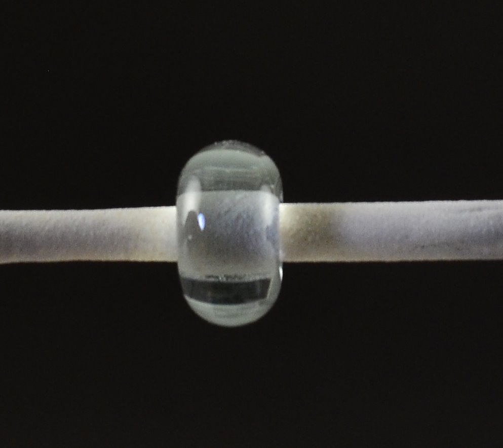


 CiM Emperor is not a "what you see is what you get" glass. For starters - the product code gives away that CiM does not consider this to be a pink (as the pinks are all 900 series numbers.)


 CiM Lady bug reminds me very much of CiM Bing - which is one of my favourite reds. It is a vibrant red - technically - I think it is a transparent, which means it is stiffer than an opaque, but you'd have to put it over clear to get it to function as a transparent.
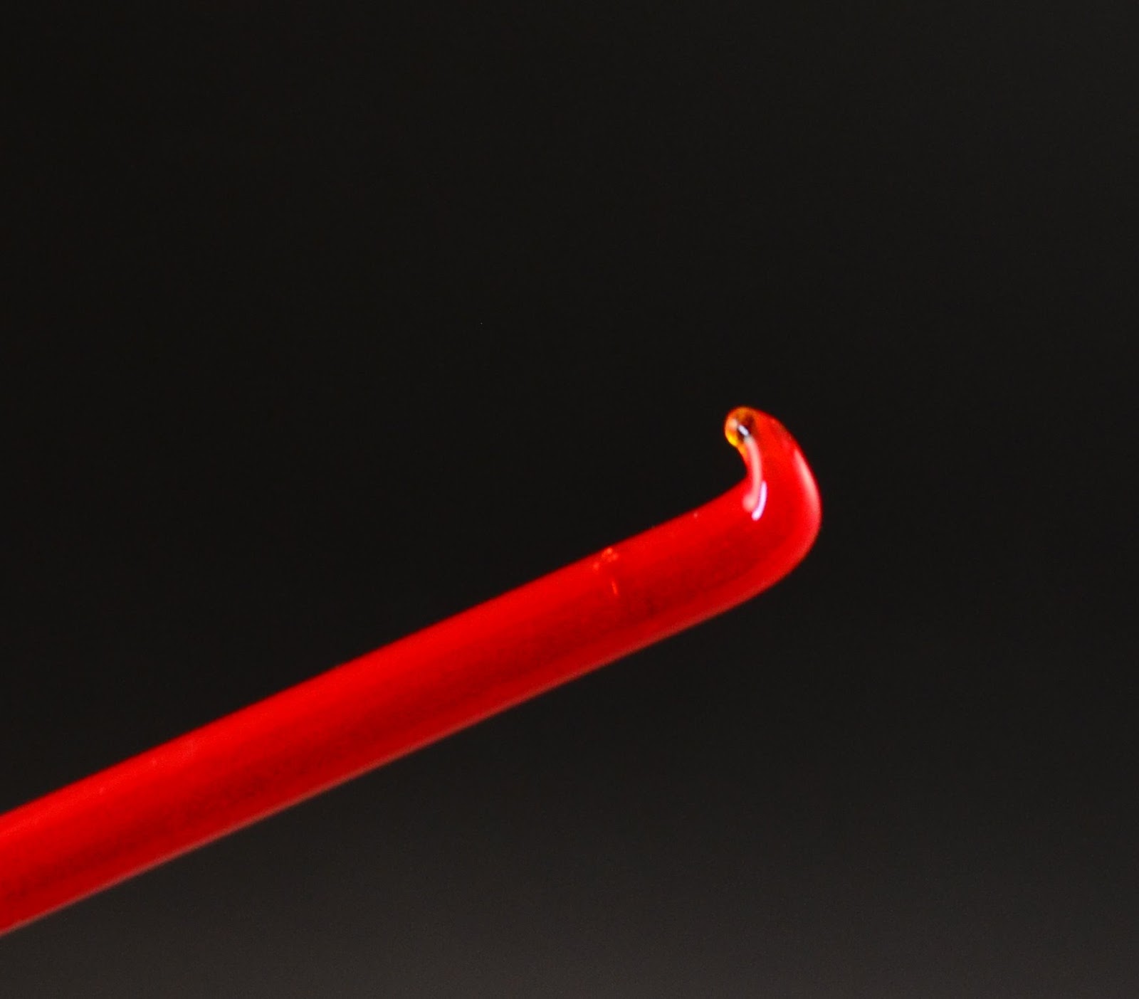


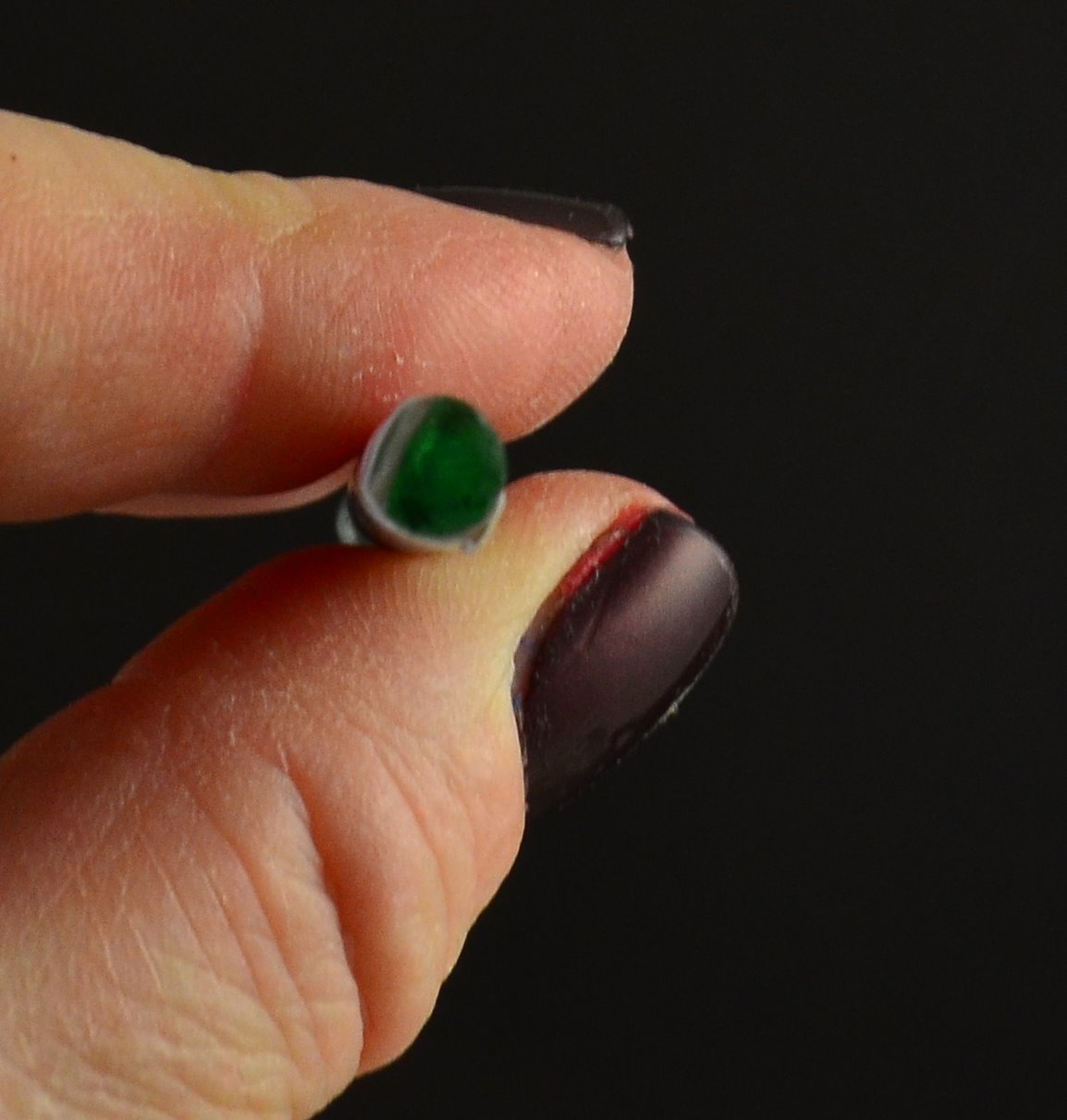
 Creation is Messy has a number of new earth tones out - including 3 opaque greens and 2 opaque browns.
