
This was for a project. We were trying to find just exactly the right shade of pink and green. And a little purple.
Some of these colours were very similar, so I thought you would like to see them side by side.
I had a big time constraint - so the photos are just whacked off on my phone in the kitchen with the notes I made as the background, as I pulled the beads - but whatever. The info is there - just not gussied up.
The Greens
The goal - a nice mint green.
Effetre 763 Laurel
CiM 462 Chrysalis - not translucent once it comes out of the kiln, btw.
Effetre 265 Pastel Uranium Yellow
CiM 458 Apple Pie
CiM 425 Mint Chip
CiM 437 Primavera
CiM 428 It ain't Easy Being Green
and all together now ...
I think the Mint Chip and the Apple Pie nearly indistinguishable.
The Pinks and Purples
CiM 622 Byzantium
Reichenbach 104 L23207 Iris Violet. Reduces - goes metallic brown. Should try a horse bead in this.
CiM 645 Heffalump. Like anyone needs any encouragement to use this lovely colour.
Old stash Vetro 956 Pink Dark Pastel
Vetro 960 Pink Light Pastel. Personally - I would say that the Dark Pink (above) is lighter than the Light Pink below.
Effetre 746 Petal Pink.
Effetre 255 Silver Pink
A really fleshy colour - the silver pink. Note to self - try for sculptural bead, i.e. goddess bead if looking for a natural colour.
Unlabeled ASK Pink.
All together now ... The two vetros are pretty similar, and the Silver Pink doesn't even count as pink in this context.
And just for fun - Bullseye. Pink 2010, Green 0112, Purple 0303, Turquoise 0016

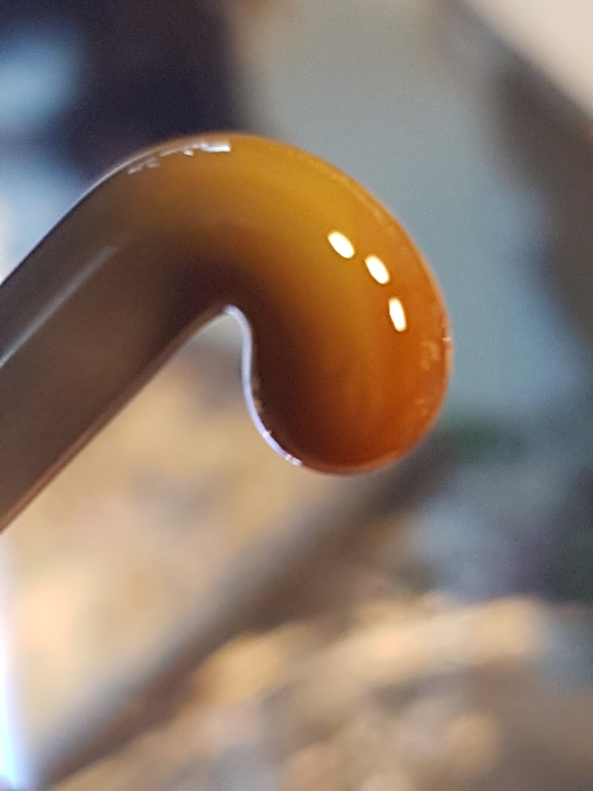
 Vetro 939 - a truly delicious translucent orange. Very nice to work.
 It has a coloured core - so I think it comes out streakier when made into a bead.


 This was for a project. We were trying to find just exactly the right shade of pink and green. And a little purple.


 Lilac is a word that makes you think of big bushy tree-like shrubs loaded with sweet-smelling purple flowers and buzzing with bees. To that end, lilac should not be used for colours that are vaguely-in-the-purplish family.




 Vetro 807 Frog Pond - 10 years ago I reviewed it. And that's how long this glass has been lying around, waiting to be used. Feeling a little old, right about now.


