Don't know how I managed to overlook this colour - this is not a new colour - but one of the older ones. Simply Berry is a dark transparent amethyst - with a bit more "oomph" than the Effetre Med. Transparent Purple.
Here we have, Simply Berry on the left, and Eff Med Transp Purple (042) on the right. In real life - the Simply Berry looks more saturated in colour, and less like "just really dark."
This is a very thin layer of Simply Berry over clear. It holds up well.
Simply Berry, encased. Very nice.
Simply Berry dots on Effetre Periwinkle (220).
And, Simply Berry dots on White.
A nice, intense red-purple - holds up well when used thin.
Wednesday, November 02, 2011
Thursday, October 20, 2011
More on Reichenbach104 L 6206: Multi Dark
As promised, more on the Reichenbach Multi - Dark. Haven't tried the light yet.
This was a Transparent, Dark Amethyst Base, Dots of Multi Dark - and marvered, and kilned. It looked like it was blues and greens when I put it in the kiln, and it has come out with some pretty spectacular blues. Unfortunately - because I marvered it and put it directly in the kiln, it is not fire polished - and I really hate beads that are not fire polished.

I spent a LOT of time on this one, and for not very spectacular results - compared to the amount of time spent. This is a base of clear, dots of Multi Dark. Then I plunged in the center of them, and encased, and then I hated the shape, so I heated it and drooped it down into a cone, built it up, screwed around, added a twisty at the big end - that really doesn't go with anything else, ran out of mandrel to really fix the shape, struggled with the end, yada yada yada. It was really brown when I put it in to the kiln, so the reds and purples are a pleasant surprise, and sort of underwater anenome cup shapes that the dots developed is sort of interesting. The whole is definitely less than the sum of the parts, however.
Multi Dark on EDP. Kinda cool. In an ugly sort of way.

I really like the colours on the marvered and not fire polished bead. Wonder if I can get away with a little firepolishing.
This was a Transparent, Dark Amethyst Base, Dots of Multi Dark - and marvered, and kilned. It looked like it was blues and greens when I put it in the kiln, and it has come out with some pretty spectacular blues. Unfortunately - because I marvered it and put it directly in the kiln, it is not fire polished - and I really hate beads that are not fire polished.
I spent a LOT of time on this one, and for not very spectacular results - compared to the amount of time spent. This is a base of clear, dots of Multi Dark. Then I plunged in the center of them, and encased, and then I hated the shape, so I heated it and drooped it down into a cone, built it up, screwed around, added a twisty at the big end - that really doesn't go with anything else, ran out of mandrel to really fix the shape, struggled with the end, yada yada yada. It was really brown when I put it in to the kiln, so the reds and purples are a pleasant surprise, and sort of underwater anenome cup shapes that the dots developed is sort of interesting. The whole is definitely less than the sum of the parts, however.
I really like the colours on the marvered and not fire polished bead. Wonder if I can get away with a little firepolishing.
Monday, October 17, 2011
Lampworker's Get Together
Anyone is welcome! Forwarding this on behalf of Catherine "Sailorgirl" Winter
Subject: Re: [torontolampworkers] Next Lampworker's Get Together
Reply-To: torontolampworkers@yahoogroups.com
Hey all!
Time to get together and talk glass. Wednesday evening, October 19 at my studio.
535A Danforth Ave. 2nd floor. If you're coming by subway I am between Chester and Pape
stations. Any time after 5:30. We'll go for dinner at 7:30 then back for more chats and desserts.
Sweet contributions are welcome as is the beverage of your choice.
For those of us who took the Leah Fairbanks class bring what you've made so far. Show and tell
is so much fun!!!
Looking forward to seeing everyone!
Catherine Winter
Sailorgirl Jewelry
www.sailorgirl.com
catherine@sailorgirl.com
Saturday, October 15, 2011
Reichenbach104 L 6206: Multi Dark
Another from the Reichenbach 104 COE line up. I've been told that the 96 COE Reichenbach Multi Dark is much more reactive, but so far - I'm not seeing that result. I am getting some very striking colours - and I mean that in the sense of dramatic, not "our" sense of the word striking.
This bead is a base of Multi Dark 104, heat the glass to clear hot, heating low in the flame. Make bead and shape. Encase in clear. Mash. Firepolish it. It was very dark going in.
Other side of the same bead.

This was also a base bead, superheated to clear, and encased.

This one was just worked normally - a little on the cool side, and then encased.

This one was reduced, and then encased.

This one is the 96 COE Reichenbach Multi Dark.

Here they are side by side - the top one is the 104, the bottom is the 96 COE. Pretty similar, really.

More results to come.
This bead is a base of Multi Dark 104, heat the glass to clear hot, heating low in the flame. Make bead and shape. Encase in clear. Mash. Firepolish it. It was very dark going in.
This was also a base bead, superheated to clear, and encased.
This one was just worked normally - a little on the cool side, and then encased.
This one was reduced, and then encased.
This one is the 96 COE Reichenbach Multi Dark.
Here they are side by side - the top one is the 104, the bottom is the 96 COE. Pretty similar, really.
More results to come.
Tuesday, October 04, 2011
Beads from Leah Fairbanks class
When I take a class, I take a few things with me. I take my favourite tools, my magnifiers, and absolutely NO expectations about making anything in the class that I want to show off. It just gets in the way of learning.
However, some of the other students wanted to see what everyone else made, and because of annealing and schedules - did not get to see all the beads.
So, here are the beads that I made that are not too hideous, for those that I promised I would post them for. Those of you who did not take the class, feel free to skip the rest of this article. ;-)
Poor little fishy - I forgot to put the pupil on his eye!

This aquarium bead is, well, large. There are many things about this bead that I don't like, but it was a learning experience and sometimes it is a matter of readjusting your perspective. I can see the ways to make it better.
I am proud of this little piece of whimsy - ferns turned into peacocks.

This is the only floral that is not too hideous to show. Me and flowers - just no natural empathy there.
The Singing Mermaid - The Diva of the Deep! Yes - she survived. Yes, she is HUGE. (Someone looked over at me working on her and squealed - "OMIGAWD - you're making a statue!")

It was a great class, lots of fun, learned lots, and more importantly - shifted perspective on a few techniques. Four days torching with no interruptions - that's my idea of a vacation!
However, some of the other students wanted to see what everyone else made, and because of annealing and schedules - did not get to see all the beads.
So, here are the beads that I made that are not too hideous, for those that I promised I would post them for. Those of you who did not take the class, feel free to skip the rest of this article. ;-)
Poor little fishy - I forgot to put the pupil on his eye!
This aquarium bead is, well, large. There are many things about this bead that I don't like, but it was a learning experience and sometimes it is a matter of readjusting your perspective. I can see the ways to make it better.
It was a great class, lots of fun, learned lots, and more importantly - shifted perspective on a few techniques. Four days torching with no interruptions - that's my idea of a vacation!
Sunday, October 02, 2011
Fire Lotus Frit
Saturday, October 01, 2011
White-Cored Cane: CiM Leaky Pen and CiM Slytherin
Sometimes I will talk about a colour being so dark, or so intense, that it needs to be "diluted." By this, I usually mean that it really only shows it's colour when laid down thin over clear or a light opaque.
It also means that it works well in White-Cored cane. To make white-cored cane, take your colour and encase the end inch of a rod of white (generally, around-the-world encasing), and then punty onto it and pull it out into a fat stringer.
The recent classes that I took with Leah Fairbanks - who uses a LOT of cane and twisties, got me thinking about some of these colours again.
Here we have, from the top, CiM Leaky Pen, the unworked rod, hand-pulled white-cored cane, and on the left, a white bead with the white-cored cane applied and melted in.
From the bottom, we have CiM Slytherin, the cane, and on the right, the bead.

These two nearly black colours have been transformed into a lovely denim and forest colours.
It also means that it works well in White-Cored cane. To make white-cored cane, take your colour and encase the end inch of a rod of white (generally, around-the-world encasing), and then punty onto it and pull it out into a fat stringer.
The recent classes that I took with Leah Fairbanks - who uses a LOT of cane and twisties, got me thinking about some of these colours again.
Here we have, from the top, CiM Leaky Pen, the unworked rod, hand-pulled white-cored cane, and on the left, a white bead with the white-cored cane applied and melted in.
From the bottom, we have CiM Slytherin, the cane, and on the right, the bead.
These two nearly black colours have been transformed into a lovely denim and forest colours.
Friday, September 30, 2011
Student Rocked the Eyes
Sunday, September 18, 2011
Best Stealable Phrase
On day 3 of 4 days of classes with Leah Fairbanks. My head is stuffed too full of ideas and I am too tired to think - but just wanted to share this.
Best Steal-able Phrase to describe a really shocky rod of glass:
Frit on a Stick.
;-)
Best Steal-able Phrase to describe a really shocky rod of glass:
Frit on a Stick.
;-)
Friday, September 16, 2011
Small Razor Tool
Not sure what this nifty little tool is actually called. It's a really narrow razor tool.
Or a really narrow exacto knife.
The blade is narrow, sharp(ish) and thin, and it's good for getting into tight places, tucking glass back where it is supposed to be, and helping with sculptural shaping.
It's hard to show you what it does, because it's the sort of thing that you use to tidy up and clean up and shape, not really to make textures.
Well - actually - I can. I used it on this eye to make the texture. I think of it as the "Cactus Dragon Eye."
Wednesday, September 14, 2011
Mixing Colours
Of course - I chose Cobalt blue - a colour which simply will not reproduce on the screen. Sigh.
However, I was really pleased with the result. The Cirrus lightened up the cobalt enough that it really is a wonderful blue in real life - a real "Noxema jar" blue.
It is encouraging enough that I'm going to try more of it.
If you want to mix your own colours - you can mix just enough for a single bead by starting as if you are making a twisty - layering one colour on another - without having to be particularly neat about it. Use the second colour rod as a handle - and heat the mass of glass - just like a twisty - but not quite as hot and soupy. Hot enough to move the glass though. Then start twisting, but NOT pulling, just twist it in the flame. If it gets saggy and drippy - take it out of the flame, double it back onto itself, and keep twisting and folding it. If you blend this a lot, you get a very homogenous colour - if you don't blend as long, you get a more streaky colour. You can see from the bead above - this was very close to being completely blended. You can then pull it out into a fat stringer for later use, or, my preferred method, disconnect one rod, grab a mandrel and wind the mass of molten, variegated, glass onto the mandrel - and shape from there.
This is especially good for those uber-dark colours, Rubino Oro, Leaky Pen, Black Currant, that don't display well on their own.
Monday, September 12, 2011
Reichenbach 6221 Lilac
Reichenbach Lilac - a dense, opaque purple that immediately had me thinking of how it would compare to Effetre EDP.
From the left, Lilac, with EDP dots, Lilac with Ivory Dots, and self-coloured Lilac.
You can see the Ivory has reacted very strongly with the Lilac.
Here a closer look at the EDP dots - the colour of the Lilac is not quite the same, but it showed absolutely no inclination to devit, like the EDP does. The EDP did do an interesting little separation thing though - sorry about the reflections - makes it a bit hard to see.
From the left, Lilac, with EDP dots, Lilac with Ivory Dots, and self-coloured Lilac.
You can see the Ivory has reacted very strongly with the Lilac.
Here a closer look at the EDP dots - the colour of the Lilac is not quite the same, but it showed absolutely no inclination to devit, like the EDP does. The EDP did do an interesting little separation thing though - sorry about the reflections - makes it a bit hard to see.
Friday, September 09, 2011
Reichenbach104 9203: Deep Black on Ivory
Silly me - I totally forgot to test RB Deep Black on Ivory to see if it webbed or not!
Here you go, on Eff. Ivory (Light and Dark, I was using up ends). Got it hot enough to swirl a little - so a little bleeding into the ivory - but that is a function of the heat, I think. No webbing, crawling, or effects. (Bear in mind, I really like those effects - but it's so nice to have options!)
So, like the Belladonna Black Diamond - here we have another black that can be used as a black without thinking about odd reactions.
I think that the Reichenbach might be a little blacker when used very thin - but both are completely excellent!

Here you go, on Eff. Ivory (Light and Dark, I was using up ends). Got it hot enough to swirl a little - so a little bleeding into the ivory - but that is a function of the heat, I think. No webbing, crawling, or effects. (Bear in mind, I really like those effects - but it's so nice to have options!)
So, like the Belladonna Black Diamond - here we have another black that can be used as a black without thinking about odd reactions.
I think that the Reichenbach might be a little blacker when used very thin - but both are completely excellent!
Tuesday, September 06, 2011
Reichenbach104 Iris Orange
RB 104 - Iris Orange. Iris Orange as a 104 COE glass - in a rod. Woohoo! I am not one of those people that seems to be able to pull blues and purples out of Iris Orange, so I can't comment on that - but I have to say - I was quite pleased with the whole desert sunset look of the bead.
From the left, we have Iris Orange dots on Ivory (very strong reaction with the ivory), on Black (nice colours) and a self coloured spacer on the right. Caramel, brown, some sagey green and some blue grey and navy blue.
That single colour spacer is quite nice - and I can see that certainly develop a very earthy, organic colour line of beads with this.
I like it. Cuz, after all - we know what a big fan of Frit I am. Freedom from frit!
From the left, we have Iris Orange dots on Ivory (very strong reaction with the ivory), on Black (nice colours) and a self coloured spacer on the right. Caramel, brown, some sagey green and some blue grey and navy blue.
That single colour spacer is quite nice - and I can see that certainly develop a very earthy, organic colour line of beads with this.
I like it. Cuz, after all - we know what a big fan of Frit I am. Freedom from frit!
Sunday, September 04, 2011
Reichenbach104 9203: Deep Black
I picked up a sample pack of the Reichenbach 104 COE line of glasses. Reichenbach, apart from the Falls which was the location of Sherlock Holmes's death scene - is a company known for it's furnace glass and has been in use as intensely coloured frit by lampworkers for some time. Most of their offerings have been 96 COE - and so I was really interested to see that they were bringing some 104 COE rods to market. Woohoo.
Coincidentally - a reader (yes - this blog has readers. Well, two anyway - you and someone else) - said that he had tried a bead with the RB104 Black and has gotten some unusual results - devitrification on the surrounding bead.
So I decided to start with the black. The black I used was Deep Black - and it is a wonderful, inky black.
Here it is, hair fine stringer on Tag Clarity (Clear).
I did not have any devitrification, but it appears that Reichenbach has more than one black, and one of them reduces to silver - like Effetre Metallic Black and CiM Gunmetal.
And to compare head to head - here is the fine stringer Belladonna Black Diamond on Effetre clear bead from the other day, (top bead) with the Reichenbach Deep Black on TAG Clarity clear (bottom bead.) The RB Deep Black is, in fact, an inkier, blacker black. And, fwiw - the Clarity is a heck of a lot clearer too.
Friday, September 02, 2011
More on Belladonna Black Diamond
The thicker black lines, above, you can see them on the side of the bead closest to you, were from stringer about 1.5 - 2 mm thick.
These thinner lines were from stringer that is literally thinner than a hair - whippy, bendy thin. To pull these, melt your gather of glass, not a very big one, and then pull very fast. Careful where you put them down. If you put them down directly on the bench, you may not be able to see them, or even to pick them up again.
Anyhow, you can see - the stringer has remained black, although a little less saturated in a couple of them - but no hint of purple.
Wednesday, August 31, 2011
Another Yellow Comparison
Orangey yellows - or yellowy oranges. CiM Marigold vs Eff 408 Med Lemon Yellow. Both look very similar as rods.
On the left, Eff 408, on the right, CiM Marigold. The 408 is definitely orangier and a little streakier. The Marigold is a beautiful egg yolk colour - the 408 is more like butter with some marmalade stuck to it.
Monday, August 29, 2011
CiM Unique vs Ltd Run
Some of you are a little confused by Creation is Messy's use of the term "Uniques" vs "Limited Runs." I've gleaned this from their website and from emails.
CiM is discontinuing using the term "Uniques" - as nobody really understood what it meant. They are now using the designation "Limited Run" - which opens the door to new possibilities in terms of making one-off runs of a colour for a specific need. Uniques sound like the colour was made by accident, and Limited Runs sound deliberate - so I think that it is a very smart move on their part.
The CiM colour palette currently stands at over 60 colours (woohoo - I remember when it was about 5!). They can add colours ad nauseum - but some colours are more in demand than others, and not everyone wants every colour. (I like to collect the whole set - but we know I'm crazy and obsessed.)
Limited Runs can be made to accommodate requests for a specific colour, and can be made again in the future, but will also let you know that it is outside the regular colour palette - so if you love it, buy a lot of it or request that it be added to the regular colour line-up. (Which they might well do!)
They have also discontinued some slow sellers, colours that are really close to other colours in either the CiM line up or duplicate a Effetre/Vetro colour, and/or pricier or just plain hard-to-make-consistently colours.
These are the discontinued colours:
So now you know. ;-)
CiM is discontinuing using the term "Uniques" - as nobody really understood what it meant. They are now using the designation "Limited Run" - which opens the door to new possibilities in terms of making one-off runs of a colour for a specific need. Uniques sound like the colour was made by accident, and Limited Runs sound deliberate - so I think that it is a very smart move on their part.
The CiM colour palette currently stands at over 60 colours (woohoo - I remember when it was about 5!). They can add colours ad nauseum - but some colours are more in demand than others, and not everyone wants every colour. (I like to collect the whole set - but we know I'm crazy and obsessed.)
Limited Runs can be made to accommodate requests for a specific colour, and can be made again in the future, but will also let you know that it is outside the regular colour palette - so if you love it, buy a lot of it or request that it be added to the regular colour line-up. (Which they might well do!)
They have also discontinued some slow sellers, colours that are really close to other colours in either the CiM line up or duplicate a Effetre/Vetro colour, and/or pricier or just plain hard-to-make-consistently colours.
These are the discontinued colours:
140 Lipstick
223 Pumpkin
479 Soylent
505 French Blue
512 Halong Bay (OK - I know I will be buying up every stick of this I can find!)
571 Cornflower
652 Count von Count
653 Larkspur
703 Butter Pecan - will probably continue to be available occasionally as a Ltd Run.
717 Khaki
ALL stringers with the exception of Hades, Tuxedo, Clear, & Peace.
So now you know. ;-)
Saturday, August 27, 2011
CiM 803 Twilight
If there is a Midnight - stands to reason there is a Twilight.
CiM Twilight is a darkish grey - it looks very neutral - and it builds up intensity fast as it gets thicker.
On the left, white with Twilight dots - very pale. But in the center and on the right, these two self-coloured spacers are quite dark.
I find it hard to get excited about grey for it's own sake - but I've come to appreciate a nice grey - it can really make the other colours sing.
Thursday, August 25, 2011
CiM 501: Caribbean Ltd Run
CiM 501 - Caribbean - What a pretty shade of blue!
Oh yeah - this is a must have. This is a denim blue - that smokey Montana Blue Sapphire colour that has been missing from the colour palette.
It looks like medium sapphire in these photo to me, on my monitor - so I'm not sure what it will look like to you, but in real life, it looks darker and more muted - like denim!
On the left, over white (I let the bead get off centre, and in heating it up enough to round it and get it back on centre, it when from blue over white to blue and white swirled). On the right, self-coloured spacer.
If you are a fan of blue - you'll love this colour!
Monday, August 22, 2011
Cim 502: Midnight Ltd Run
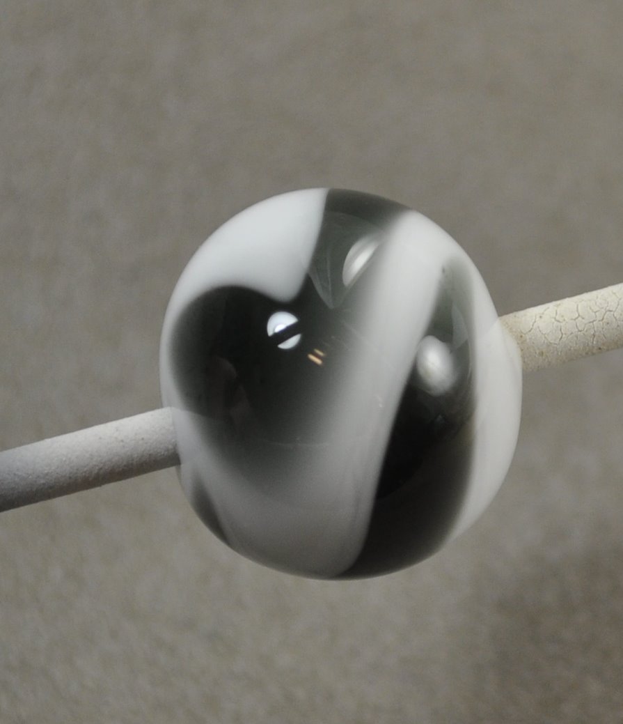
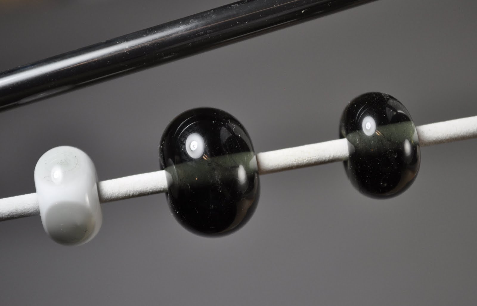
This is CiM Midnight - a very, very, very dark transparent grey.
You can, if you hold it up to a light, see that it is dark grey, but just laying around on the desk - it looks like a black.
Here, on the left, is a clear bead with very thin trails of Midnight, melted in - and it has come out as a very pale grey. On the right, a self-coloured spacer.
Which does open some interesting possibilities. I wonder if it is reactive? It might be another way to get a true black as opposed to a purple- or blue-black. Hmmm.
Interestingly enough - the CiM website says that this colour shifts between Navy Blue and Purple - depending on the lighting. I don't see any of this at all. Curious.
Subscribe to:
Posts (Atom)