Friday, July 25, 2008

Lauscha: Fuchsia

Lauscha is famous for it's pinks - lovely pinks, reds and purples. This particular pink is called Fuchsia - although I would say it's a little pale for fuchsia, myself.

The instructions say it will go darker the more you work it. I actually haven't found that. It gets more intense as it gets thicker, of course, but I don't find it getting that much darker.


It shows a light goldy shadow in the glass - especially in these small spacers, that I'm not sure if I like or not. I could probably convince myself that I liked it. I wouldn't miss it if it wasn't there!

In fact, it has gone away in this large (1.25 inch) pink ring. Why did I make a large, single colour, transparent pink ring? I don't know either.

Interestingly - this colour is also much more vibrant under the lights of my photography set up - see 1st picture of ring.

And paler in the light of a regular bulb, over by the monitor - see second pic, desaturated to show it's true color in most light.


Interestingly - I ran out of the rod before this was quite finished, and I filled in with a little amethyst and some clear. It's not obvious to casual, or even informed inspection. But when I was cleaning it, and it was underwater - it was very obvious.

Pretty shade of pink, pale rose colour or fuchsia - depending on the lighting. I wonder what other interesting tricks it has up it's sleeve?

Lauscha: Thüringen Salmon

So, having run out of new Vetro and Moretti colours to test - I thought I would (somewhat) systematically work through some of the new, and new to me, Lauscha colours.

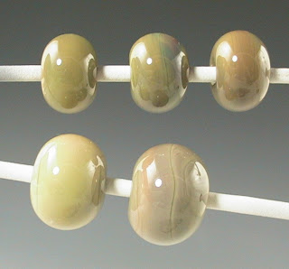
This creamy colour is Thüringen Salmon. Thüringen for a region in Germany where Lauscha is located. What an education in geography glass can be, eh? If the salmon there are this colour, they are some mighty unhealthy salmon, IMHO - growing up, as I did, on the west coast where the colour of a salmon gives a mango a run for it's money.

This is a nice, slightly streaky, pale cream with a hint of brown and pinkish undertones. While I use the term too much - a soft cafe au lait - if you add enough cream. Which I do. Lots of cream.

This would be a great goddess colour, or angels, or any natural pale blonde Caucasian skin colour.
Like some other Lauscha colours, it goes tranlucent when heated and cooled without annealing, but annealing strikes it opaque. Annoying, as the translucent quality has so much potential.

Thursday, July 24, 2008

Double Helix - Nyx

I think I might be finally getting a handle on this glass. Nyx is one of the uber expensive and ultra silver saturated glasses from Double Helix - But DaMn - do I ever like it! And, after some significant practice - I am starting to get reproducible results.

In the rod - the glass appears almost black - hold it up to the light and you will see a hint of violet purple. I find it helpful to label the rods. A lot of these silver-saturated glasses look black at casual glance, and without labelling - you soon have a work area full of black glass and no idea what is which.

These three little spacers are a core of Nyx. The two on the left are reduced, and then encased. I like to get all the glass for the encased melted into a gather and encase all at once - this stops the reduction from being reversed while encasing - I keep the bead out of the flame from reduction to encasing. The one on the right is encased without reducing. The deep blue colour develops in the kiln. The instructions for Nyx tell you that you can vary the shade of blue by lengthening the holding period before annealing. I have held from 0 minutes to up to 8 hours and gotten the same colour - so I must be missing something.


This bicone is black and ivory base, with Nyx and Aion trails. The Nyx is the blue trails. Notice that despite the pale transparent look of the Aion - it looks amazing over black! (click on the picture for a better view.)


This is Nyx, reduced, and under a very deep layer of clear. (It's a drawer pull.) The longer you work it and the deeper you encase it - the more you tend to get a lovely gold shimmer. Check out this lentil - showing the same mirror-bright gold shimmer - quite extraordinary.


This big hole dragon is made entirely of Nyx - such extravagance - there is 2 and a half rods in there! I reduced each section as I finished it. The reduction was remarkably hardy, and was not negated by regular heating for temperature maintenance. Spot heating to a glow would revert it to it's dark colour. This piece has an extraordinary range of teals and blues. Note, the inside of the hole is the dark blue. (no reduction there!)


And finally - the tablet beads are Mor 438 with trails of Nyx, reduced.


My personal preference runs to glasses that give surprising results - and this one is champion!

CIM Canyon de Chelly - 022


Named for the Canyon de Chelly National Monument (presumably) - you would expect this glass to be streaky and rock-like - and indeed, it is.

The latest batch to arrive is significantly grayer in the rod than the last batch (see pic - new batch is the top paddle). Generally, when there is a big difference in the CIM glass - they designate it as a "unique" - same as the Moretti and Vetro Odd-Lots, and add a -x to the product code. But, this one came with no such notation. The factory applied code is the same.

So, a little comparison was in order. The top mandrel is the new version, the bottom mandrel is the old version.

I would say that the new version gives more intense colours, and develops colour more quickly and easily. The bottom mandrel (old version), the bead on the left was not struck - in went into the kiln virtually white, and the colour that shows developed in the kiln. The bead on the right was struck.

The top mandrel - the bead on the left was not deliberately struck, but it developed colour just by proximity to the flame from striking the next two beads.


This picture is a little underexposed, but shows better the variability and a lot of the subtle colours in the glass. Interestingly, they look almost pink when they go in the kiln, but the end result is more a cafe au lait.

I personally think the new version is more interesting - but if you have a production bead that counts on the colour staying light - you might want to hunt down the old version and stash it.

Monday, July 14, 2008

Fusion Bead Separator - and not much about Krag Mud Separator

A reader wrote: (yes - I have a reader! Woohoo!)

Hi!
I follow your glass review blog obsessively, and just wondered if you have ever tried Fusion bead release or KRAG Mudd. Both are supposed to be excellent, but I, like you, use Dip 'n' Go right now and I'm hesitant to change. Thanks!


Thank you - it's nice to hear that someone checks it out - let alone reads it obsessively!

I use the Fusion bead release ALL the time at the studio where I teach - it's the bead release of choice there. Which is why I use the Dip 'n' Go at home . Fusion is a nice, inexpensive middle of the road release. It's fine for experienced bead makers - who don't abuse the bead release, and those who don't push the envelope by making big complex beads. I find that it can be hard to get the beads off - students struggle with it and frequently get "pot stickers," "plant friends," "cake testers," and other permanently welded-onto-the-mandrel objects.

I like a bead release that releases more easily, and hangs on better after an hour of working. I find the Fusion, if you touch it just a little with a marver while working, breaks up, usually flaking and sticking to the bead - and sticking the bead to the mandrel. And once it starts to go - you're screwed. (Unlike Foster Fire, which can break loose from the mandrel, but remain intact under the glass. I have worked over huge cracks in Foster Fire and still gotten the bead off. And just the other day - I made a bead on a curved mandrel dipped in Foster Fire that I swear, I must have dipped over a year ago! The bead release was sliding off the end by the time I was done - but the bead came off the mandrel just fine!)

And for beads that are worked hard, like the Smircich gravity wave and intense black webbing effect - where you really cook the bead - getting these off the mandrel with the Fusion is a b-----.

It really does need some drying time too - 20 mins or so - before hitting it with the flame.

On the plus side, it's inexpensive and comes in a huge bottle so you can really get a nice long dip - great for mandrels where you are making 10 beads at a time.

It's not a bad choice for a production studio environment, and it is fairly thin - which means it doesn't make the bead hole significantly larger.

It is tougher to get the beads off - the gal at the studio that pulls the beads has had significant issues with carpal tunnel and this may well have been a contributing factor.

I had a sample of the Krag Mudd when it first came out - a minuscule sample - and a set of instructions that seemed to indicate that it should be applied over a previous dip of another bead release - which confused the heck out of me. I think I tried it once - and the sample was so small that was about it - the jar was too short to dip. So it's fair to say that I haven't really tried it.

Really - bead release needs to be packaged in taaaaaall, skinny jars.

Monday, July 07, 2008

Smooth and Tuff - Not!

Oh dear. Another bead release that I don't like. I am sooooo sorry, but the new "Smooth and Tuff" - I have never met a more inappropriately named product. This stuff is neither smooth, nor tough. It's texture is like it has grit dumped into it - bigger than sand, smaller than pebbles - mostly. Have you ever worked with clay that has ground fired clay mixed into it for strength and texture? This is exactly what this is like - lumpy and gritty. And the lumps show on the dipped mandrels - smooth? Ha! This is soooo not smooth!

As for tough! The stuff flakes and peels and breaks off the mandrel before you've finished winding the glass! Argh.

I try to be fair, so maybe this is a bad batch that got cooked in transit. No, wait, mine was hand-delivered direct from a show. Maybe it doesn't like flying. Anyway - I'm going back to my old favourite - Dip 'n' go.