Y'all might want to read this posting from Frantz Art Glass on the Perfect Clear. They are suggesting pickling the glass to get it really clean.
Haven't tried this yet, but it's an interesting thought. I have noticed that the formula in household glass cleaners has changed in the past year, making them so that they actually make the glass worse. I think it'd the swithch to the "green" cleaning ingredients.
Could it be that simple? Will resellers offer pre-pickled glass?
Would just soaking in vinegar do it?
Worth trying anyway. Hmmm - now to chase down some pickle.
Thursday, December 30, 2010
Wednesday, December 22, 2010
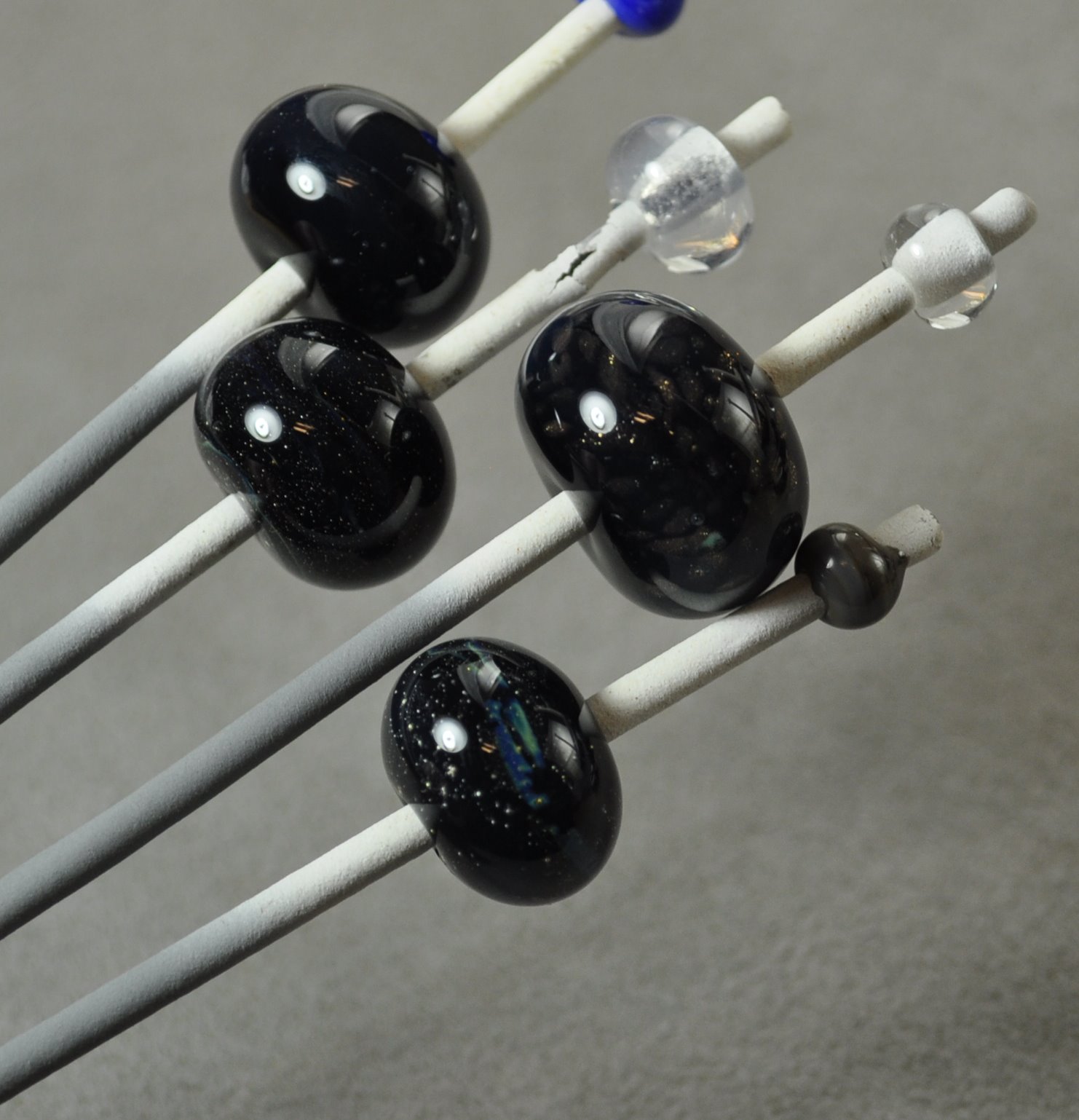
In search of Greatness

Meh - I thought I was onto something great - and then it fizzled.
I really liked the look of this when it was hot, but like so many beads - when it came out of the kiln - meh - not so much. Now it just seems busy and overworked. And where the heck did that scum come from? Bleh.
I was so taken with that misty part - that I made a bunch of follow up test beads to confirm the colours and make sure it worked with other colours.
And what did I get? Well - if you put on Murphy's hat and guessed "nothing," you'd be dead right.
 Mostly nothing, anyway.
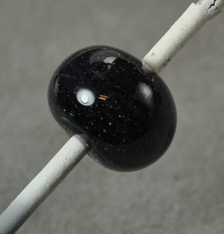
What gave me the misty look in the big bead was black, with a layer of silver foil melted in, then a layer of CiM Cirrus, and encased. There were some stringers of Kronos and Terra Nova, encased, in the mix too, and little goldstone. But it was the Cirrus that looked misty, and that makes sense - that's what it does.
So this test bead is black + silver foiled melted in + Cirrus encased. Might as well be clear.
 Same again. There is a nice little strip of colour in the middle, but I think the bead or the rod or something got contaminated with a bit of the Kronos/Terra Nova stringer.
This is just Cirrus, over black.

So where did my mistiness go? Either the Cirrus needs critical mass - i.e. a thin encasement just doesn't show any colour, like a very pale transparent, or a lot of working, heating and cooling, emphasizes it's mistiness.
Or maybe the scraps and trails of string play a bigger part - in that it reflects the colours internally and takes on the colours of the stuff around it.
What ever it was, matching spacers did not happen.
Disappointing. Oh well - try something else.
Thursday, December 16, 2010
Effetre 730: Chocolate Noir
 Effetre 730 - Chocolate Noir. More Noir than Chocolate - these creamy, opaque slate colour is hugely fun to use!
This is a dark grey slate - reminds me of CiM Admantium actually - and you can see the layers in the cross section.

It works out to be a rich, dark streaky slate colour with a hint of warmth to it.
 A simple wound bead doesn't show the streakiness much.
 But beads made using the "full gather" method show much more streakiness - almost as good as using a cane or twisty.
This bead is a base of Chocolate Noir, with ivory dots, and more Chocolate Noir on top. The Chocolate Noir is breaking up and spreading in a most satisfactory manner.

This bead is:
- clear base (more stable)
- encased in ivory
- trails of Chocolate Noir
- heated significantly
- mashed
 Definitely looking forward to using this more!
Tuesday, December 14, 2010
Vetro 903: Striking Rainbow Red
Vetro Striking Rainbow Red - an odd-lot glass. This is a transparent red - the rods are translucent, but it I think this might be called "Rainbow" because you can get quite a large range of colours out of it by selectively striking it.
Here we see a pair of beads. The one on the left was struck before kilning, the one on the right was not - it came out of the kiln looking exactly the way it went in - so this red does not appear to kiln-strike - giving you lots of control.
 The unheated rods look very different in fluorescent light, although the finished beads are not too different. In this photo, they are seen in my photography set up lighting - the background is it's correct neutral grey. The rods are a rather dark and murky colour.
 Under a 60 watt incandescent bulb, the unworked rod is a much livelier colour. (In both cases, ignore the mandrel with the apparently black bead on it. It's from a different test set - not the same colour actually.)
 You can see quite a bit of colour range in the red over white dots in the bead on the left.
 And finally - this heart - red over clear over dichro - cracked - although I suspect that was just me, letting one of the lobes get too cool. (Yeah - these are crappy photos. Thank you. I know that.)
Like a lot of transparent reds, this one looks like it will go cloudy if worked a lot, but I do like a red that can be struck with a lot of control. However - this one doesn't seem to bring anything particularly new to the table.
Sunday, December 12, 2010
Double Helix: Olympia Rain
The problem with testing the silver saturated "special colours," like that glass from Double Helix, is that some of them just don't shine as a colour just by themselves. It's when you start using them as part of an over all scheme that some of them are truly stunning. And often, the variables there are so complex that you can be hard pressed to say just exactly which caused what.
Here we have Olympia Rain. Double Helix notes on their website that they improved this colour and created Aion - but have made a batch of Olympia Rain due to popular demand. With the caveat to not whine about seed bubbles and over striking, because that's why they made Aion. Fair enough.
By itself, it's a fairly nice misty amber colour. I kind of like the seed bubbles - seems to me that you could do a nice 3-d sculptural piece and nail the look of amber.
The colour seemed to develop with striking. The darker bead on the top mandrel was struck and reduced - not convinced that the reducing made it darker - I suspect it was just a longer striking process.
 However, here, it developed a wonderful blue iridescence that ripples and glows as the bead is moved. You can actually see it in this photo.
This bead was:
- base of clear (stiffer, easier to control, uses up odds and ends)
- encase w black
- encase Olympia Rain
- mashed it
- noticed it was getting sort of muddy coloured in the middle. Guess that is the over striking.
- Added the stringer decoration - left over from the dragon eyes - so this is ... who knows what. Nyx or Kronos encased in clear is my best guess
- reduced
- encased in clear.
- Mashed really thin. The muddy effect is not nearly as pronounced now.
You know - it really pays to take notes. If this blog has taught me anything, it is that the steps that seem obvious when I do them will have blended into the background noise by morning.
Tuesday, December 07, 2010
EFF-653: Red Flint
Effetre (Moretti) 653 - Red Flint. A streaky, dark red - you'd think I'd be more excited about this one. I mean - just look at this in cross section - looks yummy, yes?

It does come out streaky. Pretty dark, but streaky. I like streaky, mostly.
 Unfortunately - this is one of those red glasses that looks brownish in fluorescent light. I've been meaning to take another pic to show it in incandescent light, but haven't been able to get it done.
 So, you may find yourself frustrated by trying to get accurate photos of your work. If you sell at indoor shows, then lighting becomes an issue.
So showing this to it's best advantage could be a problem.
Monday, December 06, 2010
Comparison: Vetro 058 Transparent Intense Dark Blue and Effetre 057 Transparent Intense Blue
 I decided to compare Vetro 058 Transparent Intense Dark Blue and Effetre 057 Transparent Intense Blue - even though the numbers are one different - they look the same.
And, in fact, the short answer is - they are the same. I can't find a difference. At all. Call 'em functionally the same.
The two rods in front, the one in the very front is the Effetre. The one behind is the Vetro.

Leftmost/Top - Vetro. Bottommost/Right - Effetre.

Vetro on the left, Effetre on the right.

Same thing, base of Vetro on the left, Effetre on the right. White dots - Effetre dots on the left, Vetro on the right.

That said - I think it is one of the most beautiful colours. Ever. I love this colour - this is the perfect transparent blue, as far as I'm concerned. Cobalt is generally too dark, Eff 054 Med Blue a little wishy-washy, and 056 not much better, and frequently, not much different. Hmm - maybe I need to blog that to prove the point.
This is an awesome rockin' color - feel free to buy the Eff or Vetro version - whichever is cheaper.
Subscribe to:
Posts (Atom)