Thursday, November 26, 2009

Beautiful Pinks - CiM 907 Rose Quartz, CiM 921 Blush, CiM 904 Gelly's Sty


Creation is Messy makes wonderful pinks. Just wonderful. That's what first drew me to the CiM glass - and I'll bet the same applies to many others. I used to get a lot of students that wanted to learn to make glass beads because they couldn't buy nice pink beads - so they thought they would make their own. Until CiM came along - they were in for a rude awakening. There were no nice pink beads because there was no nice pink glass.

But now we have - and I can't believe I hadn't already blogged these! - these three wonderful pinks from CiM - Rose Quartz - a delightful translucent pink, Blush - a transparent, and Gelly's Sty - an opaque. They all appear to be the same shade and hue - just transparent, opaque and translucent. All colours should come this way! They are all wonderfully easy to work too.

This is CiM 921 - Blush


This is CiM 904 Gelly's Sty.


And this is CiM 907 Rose Quartz. Better colour than most of the afforable Rose Quartz stone out there.


On white. Dots, from the left are: Rose Quartz, Blush, Gelly's Sty. The Rose Quartz and the Blush have sunk into the white - the Gelly's Sty sits on the surface.

Pretty, pretty colours. For some folks, the reason to make beads. My students are drawn to these like moths to the flame. Lots of them pick one of these to be in their starter set of colours.

Wednesday, November 25, 2009

Troll/Pandora etc. - style Beads -- Update

Hot tip on making the Pandora style beads on the pre-formed cores!

Instead of putting them onto a mandrel with wet bead release - waiting overnight for it to dry, and then dealing with the bead release that got into the wrong place . . . .


Take a stainless steel chopstick - many of you will already have them as they make excellent punties - and push the insert on at the small end. Because the chopstick is tapered - they will wedge - and you can then wind your bead.

Then just put the whole thing in the kiln.


Or - let the bead cool enough to not be sticky - and push the bead off the mandrel into the kiln (use a tool!!! Not your fingers!) and re-use the mandrel.

Hot d4mn! This is waaaaaay easier!

Tuesday, November 24, 2009

Effetre 058 - Ink Blue, Ink Blue Pale, Ink Blue Violet

Meet the Ink Blue family.

From the top, we have Ink Blue Violet, in the center, Ink Blue Pale, and on the bottom, Ink Blue.

The difference in the rods seems quite extreme - but end results are a little closer in colour than the rods seem to indicate.


I've fiddled with the colour to better represent the actual colour of the beads for this second photo - but they are still darker and more violet than this actually shows.

From the left, Ink Blue, Ink Blue Pale, and Ink Blue Violet. The Ink Blue is a violet- a transparent reddish purple. The Ink Blue Pale is a little lighter, leans to the true balanced purple, neither reddish nor blueish. The Ink Blue Violet is definitely darker, and has more of the reddish overtones, like the Ink Blue.


These three have white dots with the transparent colour on top. Diluted and spread thin like this - the colour difference is less evident. They are again, from left to right, Ink Blue, Ink Blue Pale, and Ink Blue Violet.

Overall - a really pretty colour - and one that I used to turn to the Lauscha colour palette for.

Monday, November 23, 2009

Effetre 062 - Blue Rose


Well - what's all the fuss about Blue Rose? I see listings for it on ebay at mega prices - like it was some sort of silver loaded colour. I found that I had a pack - unopened - so what's the big deal?

It appears black actually - it's a very intense blue. Like a cobalt blue - but so dark that it will hold up no matter how you dilute it. These three spacers are, from the left, over clear, over white and self-coloured. Notice this last one might as well be black.

Here's a close up of the Blue Rose over clear. Pretty intense. This would be awesome in a twisty or stringer.

You can see in the third pic that even when pulled into a stringer - the colour is still very dark and intense.

So - not a reactive colour - but still - if you want a deep blue - as I seem to be on a blues kick right now - and you intend to drag the colour out thin - this may be what you are looking for.

Postscript. I have tried it on some flowers and it does look awesome. They are still at the store - so I'll have to bring them home and shoot them for you so you can see.

Saturday, November 21, 2009

Blues Brothers and the Battle of the Blues


So - she says to me, waving two packages of glass, one in each hand. "Which of these CiM colours do I buy - Cornflower or Ming? And how are these different from Effetre Lapis anyway?" I peered at her - looked at the colours and said: "They are blue. There are no choices. Buy them all. Because they are bloooooooooo."

However, not everyone shares my extreme prejudice for the colour blue, so here is my head to head comparison of CiM 571 Cornflower, CiM 562 Ming, and Effetre (Moretti) 242 Medium Lapis.


First up - the picture below is CiM 571 - Cornflower. What a stunning shade of blue. I should mention that these three blues are more like a cobalt blue - a dark, rich shade that the camera can't really capture accurately.

Anyhoo, that is Cornflower. It is slightly streaky, very, very soft, and kept popping the end of the rod off. Gorgeous colour.

Next up is Ming - also a gorgeous colour - less streaky and variable. Slightly stiffer too. Slightly translucent - but in a self coloured bead - you don't really notice it too much. Ming is a little darker than Cornflower.


And below is Effetre Medium Lapis. This is a still darker shade of blue, a little darker than Ming.

This colour is all three - side by side. From the left, Cornflower, Ming and Lapis.


And this is a Cornflower base on the left and Ming base on the right, with Ming dots on the left and Cornflower dots on the right. Notice the Cornflower has done some wonderful things in terms of separating and showing patterns. Kewel, eh?

Again, Cornflower on the base on the left, and Ming on the base on the right, with Ivory dots. No reaction.


And finally - from the top left, clockwise: Ming, Cornflower, and Lapis - all rolled in white frit.


So which would I pick? I thought I made that clear - they are blue - I would pick them all. But I am very intriqued by the potential for interesting effects with the Cornflower ... But the slight translucency of the Ming is always appealing. And the Effetre Lapis is darker - more Lapis like. I think I would mix them altogether in one bead!

Wednesday, November 18, 2009

Hanging Extra Long Beads ... Without Extra Long Headpins

I am having so much trouble making it to the torch this week and last. Just insanely busy. And then there was Monday. If Monday's bead was a fish - I'd have thrown it back. Yep - bead in the singular. Two hours on a single bead and it was ghastly. That is a process I like to call "polishing the turd" - when nothing you do makes it any better. We've all been there.

However, I did learn that if you fume gold over blue (encased opaque blue) - the pink tinge added to the clear by the fuming actually makes the blue appear purple - so not entirely a loss.

On an entirely different note - I do have this nifty tip for those of you who, like me, tend to make really loooooong beads - much longer than can be hung by any commercial headpin.

First of all - as you build your collection of long beads - you figure out that you can use wire, make a loop in the end, and string your bead like that. No brainer. You can even add a decorative doo-dad. No problem.

Then you toy with the other wiring options, make spirals in the end, wire wrap around the bead, yada, yada, yada. Fine.

Then you learn to make your own headpins - woohoo - you already have a torch, and you sit down with a stack of pieces of cut wire and melt up the ends. Ah ha!

But somewhere, way down in the back of your brain, is still the nagging thought - what if I wanted to use a regular headpin?


Well - try this. Take your regular headpin, add your bead cap or whatever, and make a small, wrapped loop, a short way up the head pin. Doesn't have to be too neat, should be as small a loop as you can manage.

Then, loop some of your wire onto the loop in the headpin, and make a twist - so the two are attached.


Now thread THAT into the bead.

You may have to use your pliers to mash the loops down into ovals to fit into your bead - and this probably won't work for beads with a 1/16 hole - but if you are making mega long beads (over 3 inches) - you probably aren't doing it on a skinny 1/16 mandrel. Just a hunch. ;-)


Voila - as long a headpin as you want - with a nice, neat end.


You can now finish this off however you please. (Check out my how-to on Modern Modularity jewelry over on the beadFX site for ideas on swapping your beads on and off chains, accessorizing them, and etc.) (Modern Modularity - Chains)


And the unexpected benefit is that it will be a tightish fit (pull through and snug up with pliers if need be) - so that your bead will not swivel around on the head pin and display - inevitably - the wrong side.


Cheers!

Monday, November 16, 2009

Paragon Kiln Manual/Documentation

I just had to go looking for this - and you know - next time I want it - I'll have to hunt for it again.

The manual for the Paragon Kilns using the version 4.0 Sentry Xpress digital controller is here, on the paragon website. (opens in new window/tab)

Cheers.

Friday, November 13, 2009

CiM 351 Stone Ground vs. Effetre 266 Opal Yellow


CiM Stone Ground was designed to be an equivalent to the Effetre Opal Yellow. How does it stack up in head-to-head testing?

Well - the unworked rods look a little different from each other. That's the CiM on the left and the Opal Yellow on the right. Opal Yellow is something of a misnomer, btw - if you are looking for a yellow glass - it is more of dark ivory colour. It has varied quite a bit from batch to batch over the years - this particular lot is thicker and has very definite layers on the cut ends. The Stone Ground also displays rings, like growth rings in a tree. Some of the rods are a slightly different shade - but just laying there, cold - the Stone Ground looks stonier, and and slightly greyer and greener.

So - do they work the same? I would say: "pretty darn similar!"


Here we have the Stone Ground on the left in the smaller bead, and the Opal Yellow on the right in the slightly larger bead. It appears lighter in colour, but I'm not altogether convinced that is not the result of it being heated last and not striking as long. The decorative blobs are Double Helix Triton, which were then reduced. It does seem to have reacted to a darker line on the Opal Yellow.


This bead is a base bead of CiM Stone Ground on the left - to the middle, and Opal Yellow on the right.

The bead was rolled in silver foil, melted in, reduced. Dots of light ivory. Then mashed. Then oxidized. That's when the little white dots appear on the larger, light ivory dots.

The two rows of dots on the right end of the bead appear quite different - more of a copper green colour - but I'm reasonably sure that the row of dots next to it is still on the Opal Yellow.

The other side is a little more varied in pattern The whitish rings pop up on the light ivory dots on top of melted in silver when you turn UP the oxygen (or the gas down). It takes awhile - 2-3 minutes, of gentle surface heat for them to happen (which is why they are only partially formed - I got bored. )

The Opal Yellow is softer than the Stone Ground - tends to lose it's shape more. I spent more time re-shaping the Opal Yellow side of the bead.


This bead with the pinkish spots is a base of clear (simply to conserve the more expensive glass). There is the Stone Ground encased onto the clear on the left, and Opal Yellow on the right. I did large dots of EDP (Evil Devitrifying Purple, Effetre 254 - Purple), alternated with small dots of Copper Green. Both colours of dots got small dots of Light Turquoise on top. The EDP bleeds out into the Stone Ground and the Opal Yellow in a most satisfactory manner. The Copper Green and EDP have pushed the Opal Yellow around like crazy - forming excellent lines of delineation. The de-vit from the EDP seems to have spread to the Stone Ground a bit more than the Opal Yellow.

This final bead is a base of clear (for economic reasons), encased with Copper Green, rolled in silver foil, melted in. The dots on the RIGHT this time are the Stone Ground, and the dots on the left are the Opal Yellow. Both dots have EDP dots on top. Again, the Opal Yellow looks a little lighter.

BTW - that copper green with the foil looks awesome!

It might be a fair generalization to say that the Opal Yellow tends to look a little lighter. In terms of reactivity and "cool effects" - both of them react strongly - the Stone Ground possibly more so - perhaps just as it is a little darker.

I'd say they are pretty comparable.

Vetro 058 - Intense Blue


Well - the number may be different - but I would say - for all intents and purposes - as far as I can tell - Effetre 057 Intense Blue and Vetro 058 Intense Blue are equivalent. They may not have the same numbers - but they are pretty indistinguishable.

Even the rods look fundamentally the same. That the Effetre at the top of the pic on the left, and the Vetro at the bottom.

Both are truly beautiful. That stunning Noxema jar shade of blue. Sure - the transparent cobalt blue is gorgeous - but can be a bit dark. This intense blue can be made up into self-coloured spacers without the need dilute it over clear or white.


Although it does look wonderful over white.

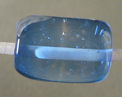
And here it is, in a rectangular tablet - over clear (Lauscha clear). This bead is half and half - Vetro 058 on the left and Effetre 057 on the right.


And here they are again - it's the Vetro on the left and the Effetre on the right.

Truly beautiful blue. I'll be buying this by the pound!

Saturday, November 07, 2009

Cool Link on Bottle Glass and Colours

It's not beads - but it's an interesting read on commercial glass and how the colours are made. Beer bottles, wine bottles and the like. You might find some useful information if you are recycling bottles into beads - but mostly - I just think it's really cool.

Glass Packaging Institute - Raw Materials

Thursday, November 05, 2009

CiM Properties Chart

Just found this awesome chart of CiM colours and their properties, reactions, etc. Check it out at Fritipedia (For when the Frit hits the Fan.)

Way cool.

Wednesday, November 04, 2009

Effetre 057 - Intense Blue


Effetre makes an Intense Blue - so does Vetro. But Effetre is 057 and Vetro is 058. Is this significant? Generally - if the numbers match - the colours are more or less equivalent.

This is one of my favorite shades of blue - just love this colour.


Here we have two self-coloured spacers - just a wonderful colour!


And - over white. Again - you can see I'm working too hot and starting to burn the glass. Or maybe it's just the white that keeps burning on me?


Heard a lovely story last night from one of my students. She was telling me that she took one of her first lampwork beads home to her six-year-old daughter - who was overjoyed with it. It was, as all our first beads are - a little wonky and, in this case, she had smoked the glass. But her daughter loved it. She tried to tell her that is really wasn't that great a bead - that she had burned the glass and that was why it looked like there was smoke in it.

Then she overheard her daughter telling a friend, in great tones of awe, "My mommy made this bead - and she even burned it."

It's all in the perspective. Repeat after me - "I meant to do that."

This particular colour falls into the colour range - the cobalts - that the electronic camera is - for want of a better term - slightly blind to, and does not reproduce well. It tends to look a little lighter and greener in photos than it really is. Below is an un-retouched photo - this is what the camera saw. I have tweaked the photos above to better match reality - on my monitors, anyway. Your mileage may vary. ;-)

Tuesday, November 03, 2009

CiM 413 - Peacock Green


I'm now working my way back through older CiM colours - colours that I have recently discovered that I haven't blogged. I started testing colours before I was blogging them. In fact, I started blogging them so there would be a record that I could go and look up - as I was losing track. The blog is proving to be an excellent resource for me - and I do get some feedback that others find it useful too.

Anyway - Peacock Green is one of my first loves in CiM - that and Halong Bay - I think. This colour is just soooooo gorgeous. It is an almost transparent, translucent glass in a soft mist green. This not quite transparent is referred to as milky, opal, moonshine, eggwhite - depending on the source and language of origin. Whatever you call it - it is lovely! I'm a fan. It is transparent enough that you can encase with it, and it just adds a hint of colour. Or - just roll the beads directly in this colour for a lovely misty green bead.

Here's three self-coloured spacers. Mighty fine beads.


And two, pale - over white. And cooked 'em, I might add. Notice the white is NOT smooth.


And this is where Peacock Green shines, in a larger bead - where the colour becomes more intense, but you get to see through the glass as well.


This bead is decorated with Metallic Black - which is looking nicely gold, when the angle is right (i.e. none of the photos I took.)

I've been loving this glass for a long time - apols for taking so long to share it w you. Oh well, all the more for me!