I apparently can't let this one go - although I am starting to suspect that some rods are more inclined to do funky things than others.
To recap - this is a new colour that the colour paddle on the Frantz website indicates should look like this:
And I tend to get results more like this. I love the streakiness - but I want that ^. Big patches of turquoise.
These two - I tried reducing. Meh. I did switch to the Mega for a more focused flame.
Aha! Much more interesting. This is a hollow - built the disks up slowly - then pushed them together using the star mashers. Very effective way to make a hollow quickly, btw. Much faster than building up over the centre.
OK - I cheated - the ivory makes a really strong reaction that is amazing and awesome.
Check out that dragonfly green on the end - that's Triton, reduced. Never had it go that colour before.
This is a cabochon - Earth and White, encased.
And again, on ivory. I like the one with the ivory on top better.
So Earth is very, very reactive with Ivory. It must have a lot of copper in it. It seems to react better to a smaller, focused flame.
I'll get it yet!
Wednesday, December 14, 2011
Tuesday, December 13, 2011
Comparison, CiM Seafoam, Kryptonite, Mint Lozenge
Head to head comparison of the three sea foam / Amazonite colours from CiM.
From the left, we have Seafoam, Kryptonite, and the new, Mint Lozenge.
The Mint Lozenge is a little bluer, the Seafoam is a little deeper (and possibly more translucent), but really close to Kryptonite.
From the left, we have Seafoam, Kryptonite, and the new, Mint Lozenge.
The Mint Lozenge is a little bluer, the Seafoam is a little deeper (and possibly more translucent), but really close to Kryptonite.
Friday, December 09, 2011
Comparison: Lapis, Earth, Blue Suede Shoes
With all these wonderful, deep, dark opaque cobalt-like blues, a head-to-head comparison is in order!
Here we have, from left to right, Effetre 242 Medium Lapis, Effetre 240 Light Lapis, Effetre Earth, and CiM Blue Suede Shoes.
In this photo, on my monitor - and take my word for it when I say that this dark blue is exceedingly hard to photograph and reproduce faithfully - the Light Lapis and the Blue Suede Shoes look like a near match - but in real life - the better match is Medium Lapis and Blue Suede Shoes. The three Effetre Lapis's - Light, Medium and Dark (not shown) tend to very in colour from batch to batch so what is a good match now, may not be true for next year.
Here's a close up of Earth - looking streaky and w/o the colour separation that makes this colour so intriguing.
This is Blue Suede Shoes, up close, and a little streaky.
And finally - the two Lapis's - Med and Light. The Light is showing some streakiness too. Well - so is the Medium, but it's more obvious on the light.
It's blue - you can't go wrong with bluuuuuuue.
Here we have, from left to right, Effetre 242 Medium Lapis, Effetre 240 Light Lapis, Effetre Earth, and CiM Blue Suede Shoes.
In this photo, on my monitor - and take my word for it when I say that this dark blue is exceedingly hard to photograph and reproduce faithfully - the Light Lapis and the Blue Suede Shoes look like a near match - but in real life - the better match is Medium Lapis and Blue Suede Shoes. The three Effetre Lapis's - Light, Medium and Dark (not shown) tend to very in colour from batch to batch so what is a good match now, may not be true for next year.
Here's a close up of Earth - looking streaky and w/o the colour separation that makes this colour so intriguing.
This is Blue Suede Shoes, up close, and a little streaky.
And finally - the two Lapis's - Med and Light. The Light is showing some streakiness too. Well - so is the Medium, but it's more obvious on the light.
It's blue - you can't go wrong with bluuuuuuue.
Thursday, December 08, 2011
CiM 702 Marachino
CiM has released a quartet of new reds - Maraschino, Valentine, Crimson, and Ruby Slippers. There's Auburn too - but CiM has put that with the Browns (700 series).(I'll be review the other 3 shortly.)
Of these new reds - Maraschino is the big winner. Maraschino is a bright, happy transparent red, with a tendency to opacify as it is worked (common in transparent reds) and no sign of "liveriness" - or browning as it is worked. Worked thin, it shows a slight orangey-ness. I prefer my reds a little on the blue side - (think raspberries vs strawberries) but I'll take a slightly orange red over a liver-red any day.
It also stays red in fluorescent lighting. The other three, and Auburn too, look distinctly more brownish in fluorescent lighting.
Here we have - two self coloured spacers. Notice the first one made (on the right), is almost opaque at the core, looking like a red encased over red. (More reheating - as it is kept warm while making the next beads). The one on the left had developed clouds too - not as much yet.
This is a clear core, and an encasing of Maraschino. Even so, some clouds have appeared.
Dots on white. Where it has thinned at the edge - you can definitely see the orangey-ness of this.
And here it is in a feather - with some clear. Mostly, it has opacified, but is still a brilliant and beautiful red.
Maraschino for the Win!
Of these new reds - Maraschino is the big winner. Maraschino is a bright, happy transparent red, with a tendency to opacify as it is worked (common in transparent reds) and no sign of "liveriness" - or browning as it is worked. Worked thin, it shows a slight orangey-ness. I prefer my reds a little on the blue side - (think raspberries vs strawberries) but I'll take a slightly orange red over a liver-red any day.
It also stays red in fluorescent lighting. The other three, and Auburn too, look distinctly more brownish in fluorescent lighting.
Here we have - two self coloured spacers. Notice the first one made (on the right), is almost opaque at the core, looking like a red encased over red. (More reheating - as it is kept warm while making the next beads). The one on the left had developed clouds too - not as much yet.
This is a clear core, and an encasing of Maraschino. Even so, some clouds have appeared.
Dots on white. Where it has thinned at the edge - you can definitely see the orangey-ness of this.
And here it is in a feather - with some clear. Mostly, it has opacified, but is still a brilliant and beautiful red.
Maraschino for the Win!
Wednesday, December 07, 2011
CiM 901 Cotton Candy - Revisited
Realizing that Cotton Candy is one of the Moonstone glasses, like Cirrus - oops! - I went back and tried it again.
When I first tried it - it had a vaguely milky appearance in the unworked rod, (which I can't show you, as I used all of mine up before I photo'd it.) I expected it to be a little cloudy, and I actually encased a black bead with it - which came out of the kiln looking - black - and left me wondering - wtf was I thinking? (A not uncommon occurrence, btw.)
So, when an astute and tactful reader said "Did you get the moonstone effect?" I was, "Huh?"
The key is you have to strike it for the cloudiness, or, you can work it quite cool, and it seems to develop quite subtly. You don't really see it happen, you notice that it HAS happened.
It is actually very pretty, a nice soft pink. If you get it very hot, you lose the cloudy effect, and you need to really let it cool and then strike it. Gentle reheating at the tip of the flame or just touching the underside edge of the flame. If I have to strike a glass, I generally work multiple beads at a time, so I have something to do while waiting for the glass to cool, and working four at a time was too much for this glass - it gets too cool and cracks - I had significant breakage while working, and had to keep reheating to heal the bead, and then lose the cloudiness and start all over again to strike it.
Here, however, it worked much nicer - this is a hollow, Cotton Candy on the left, a little clear, and the darker pink is CiM 907 Rose Quartz. This application worked much better, as the initial application of glass is fairly cool, and it isn't until you go to round the hollow that you lay the heat in.
It requires some attention to get the moonstone effect in this glass, but some bead shapes and types lend themselves to it better than others.
Anyway - Cotton Candy is a Moonstone, like Cirrus, Halong Bay, and Peacock Green.
When I first tried it - it had a vaguely milky appearance in the unworked rod, (which I can't show you, as I used all of mine up before I photo'd it.) I expected it to be a little cloudy, and I actually encased a black bead with it - which came out of the kiln looking - black - and left me wondering - wtf was I thinking? (A not uncommon occurrence, btw.)
So, when an astute and tactful reader said "Did you get the moonstone effect?" I was, "Huh?"
The key is you have to strike it for the cloudiness, or, you can work it quite cool, and it seems to develop quite subtly. You don't really see it happen, you notice that it HAS happened.
It is actually very pretty, a nice soft pink. If you get it very hot, you lose the cloudy effect, and you need to really let it cool and then strike it. Gentle reheating at the tip of the flame or just touching the underside edge of the flame. If I have to strike a glass, I generally work multiple beads at a time, so I have something to do while waiting for the glass to cool, and working four at a time was too much for this glass - it gets too cool and cracks - I had significant breakage while working, and had to keep reheating to heal the bead, and then lose the cloudiness and start all over again to strike it.
Here, however, it worked much nicer - this is a hollow, Cotton Candy on the left, a little clear, and the darker pink is CiM 907 Rose Quartz. This application worked much better, as the initial application of glass is fairly cool, and it isn't until you go to round the hollow that you lay the heat in.
It requires some attention to get the moonstone effect in this glass, but some bead shapes and types lend themselves to it better than others.
Anyway - Cotton Candy is a Moonstone, like Cirrus, Halong Bay, and Peacock Green.
Tuesday, December 06, 2011
CiM Obsidian Revisited
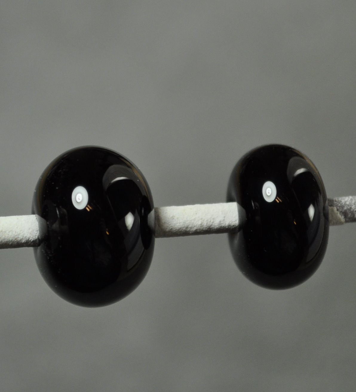
Tried the Obsidian with Triton, reduced and fumed a little.
Not sure that it is amazingly more effective than on anything else - but you can see that the bead triton is reflective enough to show the pink t-shirt I was wearing while shooting it!
Another reason why I generally wear black all the time - not so obvious in the reflections.
Not sure that it is amazingly more effective than on anything else - but you can see that the bead triton is reflective enough to show the pink t-shirt I was wearing while shooting it!
Another reason why I generally wear black all the time - not so obvious in the reflections.
A Little Eye Candy
Just for a change, a little eye candy.
Here's a big pile o' shiny, sassy beads - all headed out to beadFX to find new homes.
These are Fire Lotus - a core of clear, a really thin layer of Fire Lotus (because I was running out) - and encased in clear. Working 4 or more on a mandrel seems to work best for me, because it allows enough time for the first bead to cool enough to strike properly. So make a clear bead, put the fire lotus on, let it cool while going onto the next one. Clear core, Fire Lotus, if the first one has turned dark, encase it. Move on to the next. Otherwise, I just get bored waiting for the glass to cool and strike it too soon.
Multi Dark - which requires no such effort!
And something really large. This is a core of clear, encased in black - Hades, silver foil, Ivory and Kronos, goobered and swirled, fine silver wire. Reduced.
Did I mention it is LARGE? I call this "Star Nursery."
Cheers!
Here's a big pile o' shiny, sassy beads - all headed out to beadFX to find new homes.
These are Fire Lotus - a core of clear, a really thin layer of Fire Lotus (because I was running out) - and encased in clear. Working 4 or more on a mandrel seems to work best for me, because it allows enough time for the first bead to cool enough to strike properly. So make a clear bead, put the fire lotus on, let it cool while going onto the next one. Clear core, Fire Lotus, if the first one has turned dark, encase it. Move on to the next. Otherwise, I just get bored waiting for the glass to cool and strike it too soon.
Multi Dark - which requires no such effort!
And something really large. This is a core of clear, encased in black - Hades, silver foil, Ivory and Kronos, goobered and swirled, fine silver wire. Reduced.
Did I mention it is LARGE? I call this "Star Nursery."
Cheers!
Monday, December 05, 2011
CiM 805 Obsidian Ltd Run
CiM - Obsidian. I thought this was another black - mostly because I was prejudiced by the name. However, CiM calls it a "very dark grey."
When I test a glass - I usually test it without any prior knowledge of what it might do. This allows me to discover new things about a glass. Or, sometimes to completely miss the point. (See the recent posts about CiM Cotton Candy and Effetre Earth. Oh well.)
Anyway - this glass looks black to begin with, and, as you can see in these two self-coloured spacers - they look black.
But thin trails over clear show a dark, warm grey - with brownish overtones.
Same results on white - thin trails of a brownish grey. Although - when it is HOT and this thin - it looks purple. Have you noticed the transparent greys all look purple when hot. Sort of disappointing when they come out of the kiln.
And, here is Obsidian on Ivory. I gave this quite a lot of heat - to see if it would break up, crawl, web, or otherwise do something interesting. And, as a matter of fact - it did. (Three views of the same bead.)
According to the CiM website (which - now I can look at) - it is very nice with silver. Will have to try that next.
When I test a glass - I usually test it without any prior knowledge of what it might do. This allows me to discover new things about a glass. Or, sometimes to completely miss the point. (See the recent posts about CiM Cotton Candy and Effetre Earth. Oh well.)
Anyway - this glass looks black to begin with, and, as you can see in these two self-coloured spacers - they look black.
But thin trails over clear show a dark, warm grey - with brownish overtones.
Same results on white - thin trails of a brownish grey. Although - when it is HOT and this thin - it looks purple. Have you noticed the transparent greys all look purple when hot. Sort of disappointing when they come out of the kiln.
And, here is Obsidian on Ivory. I gave this quite a lot of heat - to see if it would break up, crawl, web, or otherwise do something interesting. And, as a matter of fact - it did. (Three views of the same bead.)
According to the CiM website (which - now I can look at) - it is very nice with silver. Will have to try that next.
Sunday, December 04, 2011
CiM 702: Auburn update
After playing with the CiM Auburn - I had a couple of questions about it still - so I went back to the torch to experiment with it some more.
One question I had was: How would it look as a white-cored cane; and the other was: How does it encase, because, once you've been lampworking awhile, you realize that opaque red has a tendency to be unhappy about being encased. You may remember that using Auburn thin enough does reveal it to be a transparent, but it is dense enough that it will read as an opaque. (Many of the "Hot" colours, opaque yellows, reds, oranges don't handle being encased well - and can crack. The usual fix for this is to make a clear core bead, encase it in a thin layer of the troublesome colour, and then encase in clear. This reduces the amount of iffy colour to a lower percentage of the glass and usually allows you to get away with it. Some of them look paler when encased - this does not, however, fix that.)
Here is the white cored cane.
And here is it used. It went on pretty dense and dark, but you can see the light and dark effect that I am coming to be very fond of. It reminds me of scribbles with a felt marker.
BTW - these pics were shot under a hot, incandescent light to show the red colour.
And here it is, Auburn encased. It is a little streaky - but no issues with cracking, and looks fine. It is, I will grant you, and stunningly bad example of encasing. Scum and bubbles and yuck.
I'm still trying to get around to trying the pickling technique for cleaning the clear glass. It's proving to be rather harder to find a container the right size than it is to get my hands on the pickle.
One question I had was: How would it look as a white-cored cane; and the other was: How does it encase, because, once you've been lampworking awhile, you realize that opaque red has a tendency to be unhappy about being encased. You may remember that using Auburn thin enough does reveal it to be a transparent, but it is dense enough that it will read as an opaque. (Many of the "Hot" colours, opaque yellows, reds, oranges don't handle being encased well - and can crack. The usual fix for this is to make a clear core bead, encase it in a thin layer of the troublesome colour, and then encase in clear. This reduces the amount of iffy colour to a lower percentage of the glass and usually allows you to get away with it. Some of them look paler when encased - this does not, however, fix that.)
Here is the white cored cane.
And here is it used. It went on pretty dense and dark, but you can see the light and dark effect that I am coming to be very fond of. It reminds me of scribbles with a felt marker.
BTW - these pics were shot under a hot, incandescent light to show the red colour.
And here it is, Auburn encased. It is a little streaky - but no issues with cracking, and looks fine. It is, I will grant you, and stunningly bad example of encasing. Scum and bubbles and yuck.
I'm still trying to get around to trying the pickling technique for cleaning the clear glass. It's proving to be rather harder to find a container the right size than it is to get my hands on the pickle.
Saturday, December 03, 2011
CiM 901 Cotton Candy
CiM Cotton Candy - a very, very pale and ethereal transparent pink. Notice, over the white on the left, it adds almost no colour.
Might be interesting to encase with this. I wonder what it does over silver?
Otherwise, it is very pale, and will probably appeal to some. Not really dramatic enough for me.
Might be interesting to encase with this. I wonder what it does over silver?
Otherwise, it is very pale, and will probably appeal to some. Not really dramatic enough for me.
Effetre 737 Golden Toffee Revisited
Friday, December 02, 2011
Effetre Earth Revisited
After my post about "Earth" - I got an email from Viviane at Pferdediebin - telling me I was apparently on some other planet on Earth. ;-)
The upshot is - that THIS is the beautiful effect she gets from Earth.
And this!
Hmmmph - a far cry from what I got.
She suggested that it was because she was using it larger and working quite hot - so I decided to take another run at it.
This is a clear core (because I just don't have much of the Earth - I didn't start with much, and I'm now running out! When it went into the kiln - I really thought I had it - beautiful streaky patterns. But coming out of the kiln - wow - it's really pretty - but not getting that turquoise and blue thing happening. I really did cook this - but admittedly - it is a thinnish layer of Earth.
Next bead - same thing - I like it - but not the same effect at all.
However, I did try reducing it - and wow! Look at these desert colours! Is this not totally awesome? Especially in contrast with the blue!
So anyway - I'm going to keep trying with the Earth until I get the turquoise and blue thing figured out. And if you want to see more of Pferdediebin's beads and glass tests - she too blogs on her tests of colours - check out her blog at http://pferdediebin.blogspot.com/. If you don't happen to read German - then open the site in the Opera browser, and let it translate for you automatically. She also has some cool murrini for sale on etsy.
Anyway - I'm thinking from her photo of the heart that maybe a slightly reducing flame is in order - but I'm out of the glass - so it's off to Nortel for me to get more of this intriguing colour!
The upshot is - that THIS is the beautiful effect she gets from Earth.
And this!
Hmmmph - a far cry from what I got.
She suggested that it was because she was using it larger and working quite hot - so I decided to take another run at it.
This is a clear core (because I just don't have much of the Earth - I didn't start with much, and I'm now running out! When it went into the kiln - I really thought I had it - beautiful streaky patterns. But coming out of the kiln - wow - it's really pretty - but not getting that turquoise and blue thing happening. I really did cook this - but admittedly - it is a thinnish layer of Earth.
Next bead - same thing - I like it - but not the same effect at all.
However, I did try reducing it - and wow! Look at these desert colours! Is this not totally awesome? Especially in contrast with the blue!
So anyway - I'm going to keep trying with the Earth until I get the turquoise and blue thing figured out. And if you want to see more of Pferdediebin's beads and glass tests - she too blogs on her tests of colours - check out her blog at http://pferdediebin.blogspot.com/. If you don't happen to read German - then open the site in the Opera browser, and let it translate for you automatically. She also has some cool murrini for sale on etsy.
Anyway - I'm thinking from her photo of the heart that maybe a slightly reducing flame is in order - but I'm out of the glass - so it's off to Nortel for me to get more of this intriguing colour!
Thursday, December 01, 2011
CiM 504: Blue Suede Shoes Ltd Run
Well, it's one for the money,
Two for the show,
Three to get ready,
Now go, cat, go.
But don't you step on my blue suede shoes.
You can do anything but lay off of my blue suede shoes.
Well - now that you have THAT stuck in your head - btw - do you know what it is called when you have song stuck in your head and you can't get rid of it - it's an "earworm." Although I think I would have spelled it earwyrm, for the annoyance of it.
Anyhoo - blue - blue is awesome, and this is the awesomest shade of blue.
Here is the stub end that I managed to save to photograph - because I wanted to keep going and use it all!
Here are two self-coloured spacers - and you can see - there is a little streakiness in the colours. Mmmmm. Blue AND streaky.
This is over a clear core - because I was starting to wonder if this was maybe a translucent colour - not a straight opaque.
I thought I would try making some white-cored cane - to see if it came out lighter. (White cored cane top, and rod below).
Here - you can see the white core. BSS (Blue Suede Shoes) definitely appears to be more complex than just a simple opaque glass.
Much to my surprise - the white cored cane broke up and bled and crawled on the white bead.
Although, when I tried it again, working cooler - it stayed intact. This is not actually melted in smooth. I think the high heat may have caused the interesting effect above.
And dots on white. A little bleeding around the edge.Well - more like "fuzzification."
And on ivory - where there is definitely some interesting stuff going on.
This bead is a clear core encased with BSS (because, at this point, I'm starting to run out!), marvered with a graphite marver. Effetre Lapis does not react well to marvering with a graphite marver - it often gets an unattractive smoky look, and I wanted to test for that. No sign of it here. The trails are CiM Creamsicle 2 - raked and marvered.
This "feather" is on the Sirius mandrel, and has bands of a transparent blue - possibly Effetre Intense Blue.
Over all - Blue Suede is on my must have list - because of the colour, translucency - and in the list of glasses that looks like it has some potentially interesting reactions. Blue Suede Shoes for the WIN!
Subscribe to:
Posts (Atom)