Wednesday, September 16, 2015

Effetre 291: Avorio Light Lapis

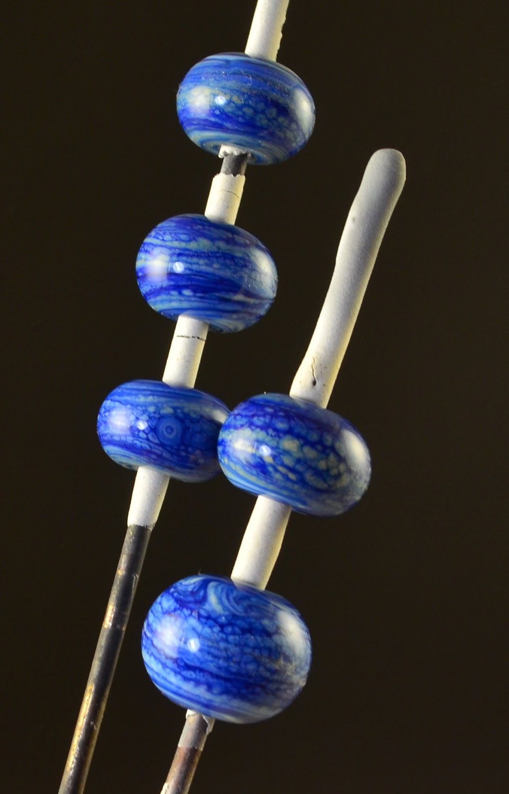
This is Avorio Light Lapis - which appears to be a blend of Ivory and Light Lapis. A couple of days ago - I reviewed Avorio Dark Lapis - and it is yummy yum yum. This is also nice, but not as dramatic.

I mean, if I didn't have the Avorio Dark Lapis to compare with - I would like it just fine, but in comparison ... well, it is much tamer.

But - not everyone like the colours as strong as I do, and sometimes they all over power each other, so I can see that this could be a winner for some! 

 Three self-coloured spacers.
 Same three - up close. Very nice patterning in the ivory.

And this cabochon. Again, more on these in another post.

Monday, September 14, 2015

New Favourite Glass - Effetre 293: Avorio Dark Lapis

This is my new favourite glass - not that I have fallen out of love with Dark Fossil or Raven Sky, but this is truly wonderful.

This is Effetre 293 - Avorio Dark Lapis. As you might guess, Avorio is Italian for Ivory, and this glass appears to be a streaky blend of Ivory and Lapis.

Oh myyyyyy.


 Above is the glass rods - and below - self coloured spacers. Yep - just wound off the rods - nothing else done to them. Aren't they gorgeous?
 Here in much stronger light.
 And with a contrasting background.
And two very yummy cabochons. (More on cabochons in upcoming posts.)


I have 4 Avorios to test - this is the first of them - and they appear to be a line of something plus ivory. I'm pretty excited to get to the rest of them as well.

I did experience a bit of shocking - but it wasn't extreme, and given the colours - worth it. 

Saturday, September 12, 2015

Eye Candy

A little eye candy for today.

A necklace - made with my Sundered Heart design, accompanied by a couple of chrysalis style beads, in a colour I call "Electric Lava." It is one of the Dichro on coloured glasses - on opaque red.

The sundered heart is not supported in the middle - symbolizing loss and the pain of saying goodbye.

The warmth of the gold plated chain and findings go so nicely with the vibrance of the colours.


Friday, August 28, 2015

Nessi, Intense heating

Here are a few more beads that use a lot of heat, making the glass very soft to move it around a lot and swirl it together. I was experimenting some more with getting Nessi to look as interesting as I thought it might look.

 Also included are Turquoise, white, and some of the Cottontail.


If you are not fond of "organic" - these won't appeal to you at all - but they are tremendously fun and very liberating to make.

Wednesday, August 26, 2015

CiM 610 Dark Velvet

I had high hopes for this glass -CiM Dark Velvet - a transparent dark purple that reads as black when just lying around on the bench.


Strongly backlit - it is a beautiful, intense, violet-purple.


However, it melts out as a more traditional dark amethyst berry juice colour.

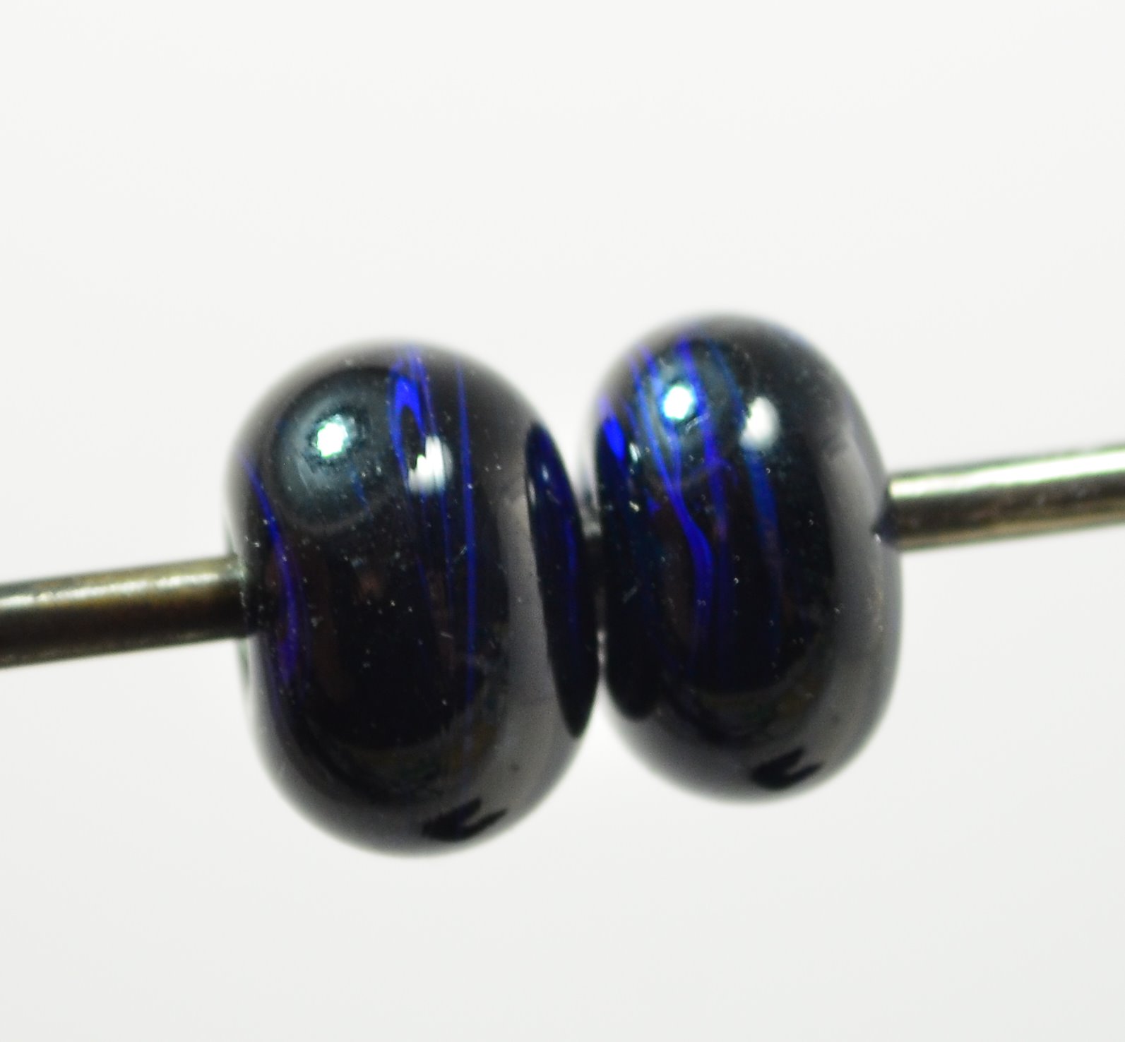
From the left, self coloured spacer, clear with trail of Dark Velvet, and white with dark velvet dots. The dots have bled into the white quite a bit, or maybe that was just me over heating it. 

Because it was so dark - I also made the gravity wave bead that winds up mixing stripes into the base colour. This requires a strong contrast in colours to work. However, the softness of the Dark Velvet - the way it bleeds - works against it here, and the patterns are not as  distinct and dramatic as one might hope for.


Based on the colour when back lit - I was hoping for something rather more violet in the end result. A tad disappointed in this one, which is somewhat unfair, as there is nothing wrong with it.

Monday, August 24, 2015

CiM 479 Soylent

I've review Soylent before, made the obligatory "Soylent Green is people" joke, noted that it is crazy reactive with ivory. But here it is again, anyway.

It is a soft, streaky green that is just fun to work.


It might look a little familiar, it is similar to Eff 216 Grass Green, ... (crossed rod)


And very close to Effetre 214 Nile Green (again, the crossed rod is the Soylent)


Soylent plus ivory frit.


Self coloured spacers. 

It's a bright, happy green, soft and easy to work, nice streakiness. You may have trouble finding it - I think it is one of the CiM retired colours (probably because of it's closeness to Effetre Nile Green).

Saturday, August 22, 2015

CiM 417 Sherbert

Hmmm - some nice cool Sherbert would go down well right about now. Three weeks of a "summer cold" and still a sore throat - leaves me with just one question. Why does the body's immune response have to be so damn unpleasant?


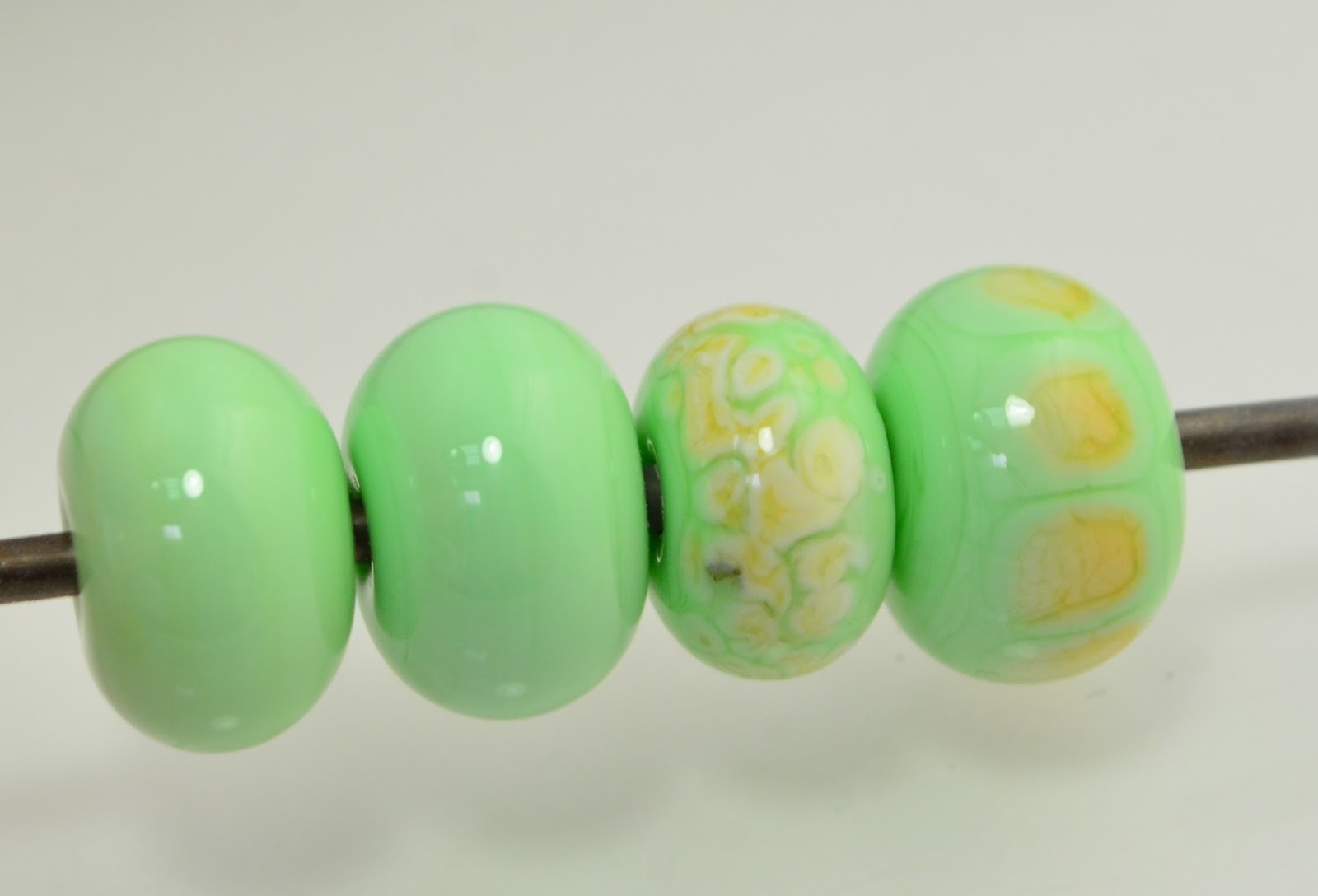
Sherbert is a pleasant, light green, reminiscent of  fresh green shoots, cool flavours and soft and gentle things (hence, the unlikeliness of every seeing it in my work.)

Below, we have, on the left, two self coloured spacers and two with ivory dots. Notice that the ivory has not reacted so much as just bled like crazy, curdled a bit and separated. Might be fun to explore this property a bit more.

Sherbert, a very pretty and soothing green.

Friday, July 31, 2015

Frit Implosions

Just some eye candy - frit makes lovely implosions ...

 For the two people that might see this blog that aren't flame workers - "implosion" is a technique - that gives the "explosion inside the glass effect" and "frit"  means crushed glass bits.


Wednesday, July 29, 2015

CiM 905 Cottontail - just one more

 Because Cottontail is somewhat ivory-like (it is peachier in real life than it looks on my monitor right now) - I thought I would try it with turquoise.

This turquoise frit has separated a bit, creating darker lines inside. There is no grey boundary, but a general darkening that I don't know is a result of the glass or the way it was worked.

Anyway - good to know.

Monday, July 13, 2015

Effetre 610 Nessi

Effetre Nessi  (Not to be confused with CiM 432 Loch Ness - which - although it came across my bench on the same day - is a completely different animal.)

Nessi is deep, dark, mysterious, and hard to understand. (And so is the legendary creature.)

And it's going to need a lot of water. (or - clear glass - to dilute it.)

Nessi looks at first glance like an opaque lapis - very dark. Then, you see some green transparent and you think - "Oh ho! Not quite as straight forward as that!"

 Crappy cell phone shot - with the glass backlit.


And here are the self-coloured spacers. Predictably - they are too dark to be very interesting.


Here is a tab with a clear core, with the Nessi encased over the top. Disappointingly - it is also really damn dark.

Here is the same bead, back lit and over-exposed. Now we're talking. This looks awesome. But unless you are working it into a stained glass window with full sun exposure - it's never going to look like that in real life.


 Over white - on the left - Nessi over a white core, and on the right, a paper-thin white core, clear, and Nessi on top. Somewhat more successful, but still ... .

More success here - but there is a lot more going on than just Nessi. This is an "end of day" bead (made with the left over scraps on the bench at the "end of the day." There is white, cottontail, clear, canyon, Nessi, and some of the yet-to-be-reviewed Loch Ness. This was superheated and melted and moved and blended - so it's pretty hard to tell what is what. But I think that this is pretty much what you are going to have to do with Nessi to make it shine.

Overall - Nessi appears to be streaky transparent very dark blue and green. The trick is lightening it up enough to not read as black.

Wednesday, July 08, 2015

Effetre 233: Canyon - Does the world need another turquoise?

Does the world need another turquoise - why - yes - Yes it does. Apparently.

Of course it does - it's TURQUOISE!

The latest batch of Effetre Light Turquoise 232 is quite greenish in the rod - but comes out pretty similar to it's old colour when worked.


My initial thought was that it looked like 236 Dark Turquoise,but no - it is lighter than that.

It does, in fact, fall smack between the two.


Like all the other copper based blues, it reacts with sulfur-based colour to produce a dark grey border like - or, to put it another way - it does the usual thing when you put ivory dots on it. 

And it did develop the steely gray haze. 


Here, on the left size, (with the black dot) - is Canyon, and on the right - Dark Turq. Ivory dots on both. 
 The blue dot is on the Canyon on the left, and the Light Turquoise is on the right.
 Again - the ivory dots.
 The three colours, side by side.
 And here - I've reduced the crap out of it. From the left, Canyon, Light Turq, and Dark Turq.
 I could only get the red reduction on the Light Turquoise. The Dark Turquoise has gone quite metallic.

Well - I didn't know I needed another turquoise, but apparently - I do. Yay, Turquoise!

Actually - I often turn to a Lauchsa turquoise for a bright, "Sleeping Beauty" turquoise - this might replace it.

Monday, July 06, 2015

CiM 905: Cottontail

Here comes Peter Cottontail, hoppin' down the bunny trail ... .

Cottontail is a stiff, translucent, slightly pinkish ivory, or slightly ivory-ish pink.

It is both stiff and creamy at the same time. I'm really impressed with it.

I'm trying to decide whether to think of it as an ivory or not. I should try some turquoise dots to see what happens.

You can see after heating here, it  retains it's translucent quality.


The tricky to exposure backlit shot. Shot on my phone, actually. 

Three self-coloured spacers - there is a difference in opacity - so I suspect the amount of working will make a difference. I unfortunately can't tell you which was done in which order. 
 Contrasting background.
 A little streakiness to them.
 And you can see - with the white background, a hint of peachiness to them.
 Over a back core.


Initially testing says that I really like this, more for the texture than the colour. I like the stiffness of it and that it doesn't go soupy. I got some more of it, and I want to try it out with some sculptural stuff - so we shall see.

PS - CiM calls it a pale opal peach, and the 9xx number - puts it in with the pinks.