Thursday, May 30, 2013

Flower Press: Part 2

Apparently - I should not speculate that something is a one-trick pony, because, dammit - it makes me go out and look for other uses.

What else could a Bell Flower be? How about a fairy skirt?

(Excuse the photos - I washed my photo cube today and it's still not set up again.)

 This lil' gal is a 3 bead person. The skirt is a bell flower headpin - the torso is it's own bead - strung on the headpin, and the head is also it's own bead.

I think she's pretty adorable. And I don't normally "do" adorable.  ;-)

Sunday, May 19, 2013

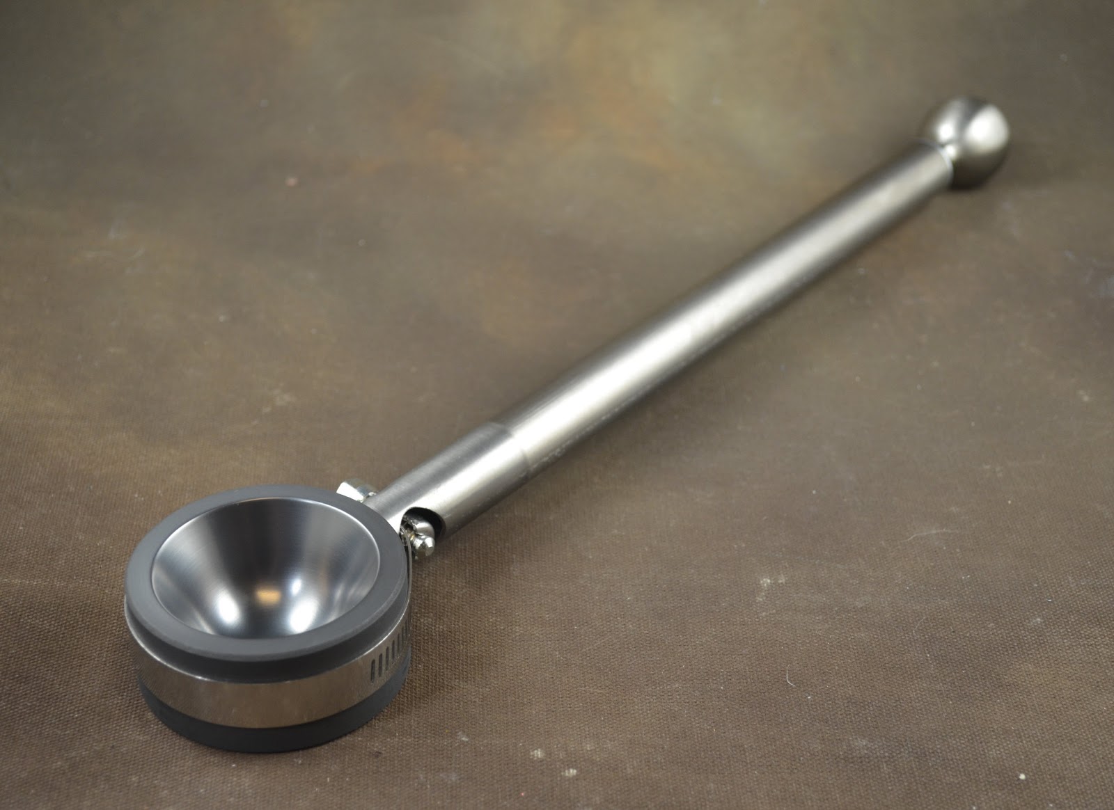
Fabulous New Toy: Carlo Dona Bead Press

Not getting as much torch time in as I would like, but here is a little indulgence I got myself.

Ta da!


What is it, you ask? Well - it makes these:


It is a flower press. A Carlo Dona flower press. Like all Carlo Dona tools, it is ridiculously well made, and ridiculously expensive. Expensive enough to make you feel like you really have to justify it. It's rather like buying a sports car. You have to come up with the damnedest reasons to justify it. 

 But it's sooooo beautiful. And it does what it is designed to do, beautifully.

It is something of a one-trick pony - it makes flowers on the end of wire. That's it. A flower on a  wire. At least until I think of some other creative way to use it. But it does it so well. Who would belittle a pony for having only one trick? It's like the story of the talking dog - "He ain't so special, he never did any of those things ... ."


In a nutshell, you get a blob of glass on the end of stainless steel wire (I've been using 18 gauge stainless steel wire made by Artistic Wire)


The press has a slit in the side, and hole at the bottom of the cup. Hang your molten gather of glass downward, slip it into the slot, with the wire emerging from the now-at-the-top hole, and press the

 inner part of the press into the outer shell.
 Et voila! A little firepolish - whack in a stamen, and you're good to go.
Rolling the gather of glass in frit (before pressing) is a super nice effect too. Woohoo - finally - a use for all that frit!

If that description doesn't help - try checking out Loribeads video on youtube. I find I have better luck keeping the flower from being lop-sided by hanging the drop down, raising the whole thing up, and peering up to check that it is centred.

This is the largest size I could find - the 6 petal press. You know me - go big or go home!

Anyhoo - spring flowers! Woohoo!

Because I know you will ask - I got it here:

BeadPress.com - Easy to order, easy to pay, shipping was fast and it came extremely well packaged. No fuss, no muss. Very satisfied.

Tuesday, April 16, 2013

Marbles

Marbles - that's what I've been working on lately. Soft glass marbles. Starting to get stuff that I don't hate.

Photographing them is a little trickier, however.


Tuesday, April 09, 2013

New Marble Mold

Indulged myself in a new marble mold. I made a large marble the other day that got away from me - it was actually too large for the molds that I have, so "aha," I thought - "That's an excuse to move up to a larger mold!"

I get my Marble molds from San Grumbling, who is the guy that Drew Fritts recommends in his book. I've had my other molds a few years, and I had forgotten how truly gorgeous they are when new.

These are just beautiful marble molds, beautifully made, and beautifully balanced. The graphite is silky smooth, fine-grained and highly polished.


Totally worth it - this is a tool for life!

Wednesday, March 20, 2013

Creation is Messy - Archived colours

In case you didn't know - Creation is Messy (CiM) listed their discontinued and out of stock colours in their colour archives, here. Useful to know if you are looking up a colour and can't find it.

Saturday, March 16, 2013

Effetre Streaky Pink

This is an Effetre streaky purple pink - that I do not seem to have a number for. It resembles EDP with a Rubino core.

It attempts to devitrify - like EDP - and is somewhat less streaky than one might think it is going to turn out.

The top mandrel is two self-coloured beads, and the bottom mandrel are four beads with a base of amethyst and a stripe of the Streaky Pink on top.


 It's handsome enough - I was expecting more dramatic results, I think.

Thursday, March 14, 2013

Comparison: Effetre Tawnys

All in the same picture - the tawny Effetre colours. From the top - with their rods below, Butterscotch, Honey Swirl, Tigereye, Amazon. (Weird name - Amazon, in the context of the others.)

My personal fave is the Tigereye.


Tuesday, March 12, 2013

Double Helix Notos

Well - you're definitely not going to get bored with this colour. If you can't get at least 4 different looks out of it - you're just not trying hard enough. 

 This is Notos, three beads, self-coloured, and reduced. The bead on the left was cooler when reducing - but they all came out pretty similar.


This bead is a base of Notos, cooled to not glowing, reduced, and encased.


On the left, a base of Notos, reduced while hot (kinda muddy) and encased. And on the right, a base of black, encased w Notos and reduced cold.


Reduce this one cool.

Sunday, March 10, 2013

Effetre 744 Amazon


This is another streaky colour - not as warm as Effetre Tigereye - more like a dark version of Effetre Butterscotch.


Both are self-coloured beads, but the one on the left has gone darker - so re-heating may make this colour go darker.


Friday, March 08, 2013

Effetre 660 Tigereye


Woohoo! Love this! Streaky and tiger-y. Very like the patterns in tigereye - without the chatoyancy, of course. It goes very red while hot, but cools to a tawny tiger colour, going quite a bit darker than the rod.

I like this one a LOT. 


Wednesday, March 06, 2013

Effetre 736 Honey Swirl

This is Effetre 736 - Honey Swirl. Also a yummy colour - a lighter version than the Effetre Butterscotch.

All three are self-coloured beads. It is a little streaky also. In the flame - it looked like it was devitrifying a little, but I can't really see it now. It does seem to have gone a little more opaque, like an opal would.


Monday, March 04, 2013

Effetre 732 Butterscotch

I've had this some time - finally got around to testing it.

 It really is a Werther's Butterscotch candy colour. Yum. It also goes a surprisingly bright cherry red in the flame.


Saturday, March 02, 2013

Comparison: Sherbert, Seashell, Oyster Mushroom

For comparison side by side, three of the new colours from CiM - from the top - 417 Sherbert (definitely green), 710 Seashell (close to ivory), 414 Oyster Mushroom (greenish).


Thursday, February 28, 2013

CiM 414 Oyster Mushroom Ltd Run

Well, CiM calls this "an opaque greenish ivory" - and puts it in with the greens. It is an opaque pale green. Perhaps a little on the greyish side.

From the left, a self-coloured bead, a base of Oyster Mushroom with a stripe of turquoise, and another self-coloured bead.


Tuesday, February 26, 2013

CiM 710 Seashell Ltd Run

CiM Seashell is a pale creamy colour that could be a slightly pinkish ivory. It is actually very close to my own skin tone - which really says more about how badly I burn in the sun than anything else.

I've been hoping that CiM would make an "ivory" for sometime - and this is the closest yet.

From the left - self-coloured, with turquoise dots, and with EDP dots.

While the turquoise has bled a little, and the EDP has broken up a bit - there is not an extreme level of reaction.

Promising, promising. It would be nice to do some sculptural figures and see how it works out. 


See - flesh coloured. My flesh, anyway.


Sunday, February 24, 2013

CiM 417 Sherbert

CiM Sherbert - Sherbert they called it - and Sherbert it is. A smooth cool, creamy green mint or maybe pistachio colour.

All three beads are self-coloured.

Friday, February 22, 2013

Cim 517 Breeze vs 516 Mediterranean

Just so you can see both Breeze and Mediterranean in the same picture - here they are together.

CiM tells me that Mediterranean may not be reproducible - so stock up if you love it. I do!

This is Breeze on the top, and Mediterranean on the bottom. 


Wednesday, February 20, 2013

CiM 516 Mediterranean Ltd Run

CiM Mediterranean - a transparent dark blue-green. This is another beautiful dark teal. It is quite dense - on left are two self coloured beads - the bead on the right is a base of clear, with the left side being Mediterranean and the right side being CiM Breeze. 

When diluted - Mediterranean and Breeze are quite similar, but Mediterranean is quite a bit darker. 


Monday, February 18, 2013

CiM 517 Breeze Ltd Run

 Ah - now we're talking. Breeze is a breezy dark aqua-teal, like a Blue Zircon colour. Very, very yummy. You could just crank out spacers in this and be happy.

It's a bit tough to photograph accurately though!

Breeze reminds me of some of the Bluedini Uniques that I loved so much. I'm gonna buy pounds of this one.