Saturday, April 18, 2015

CiM 532 Birthstone

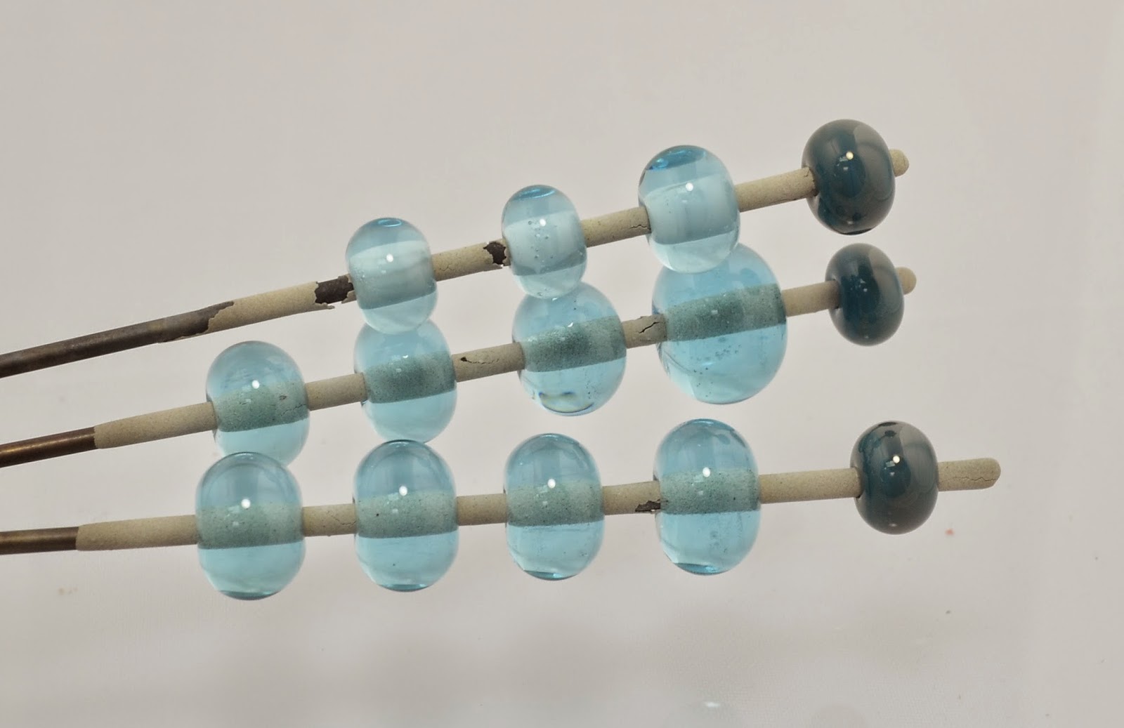
CiM Birthstone - a transparent aqua that is almost, but not quite, identical to Effetre 034 Light Transparent Aqua.

That's the Effetre on the top, and the Birthstone on the bottom.


 Basically - they look very similar, but the Birthstone is just slightly smokier in hue. Read on to see what I mean.

 These are 3 self coloured beads. The middle one has a sooty streak - which is not what I mean by smokier. But I did get that sooty smudge a couple of times which could mean that I did not clean the glass properly (or, truth be told, at all ... ) or that I did not have the oxygen / gas ratio perfectly in the zone (probably also true, as I turned it up several times while working - the oxygen, that  is. ) These are made on natural gas/ tanked oxy.
 And a nice little olive barrel bead - for a longer working time than just a spacer. I tried reducing this to see if made a difference - apparently not.
 This is over a core of white, and the left side is the Birthstone, and the right is the Effetre. Here is what I mean by "smokier" - the colour is ever-so-slightly grayer in hue.
 This - however - is another trail of soot. Only on the Birthstone side. And in this case, I honestly don't remember if I turned up the oxy again before proceeding. Sorry.
 Over white.
 Over Effetre Light Turquoise.
 Over ivory. Of course it reacts - but did you know that aqua over ivory gives you green? Yes it does!
And a family shot. You can see the subtle difference between the ends of the long barrel bead in the back.


Some people report a problem with transparent aquas, in general, "frying" when they work them, and so I should think their question is: "Does this glass fry?"

And I can't say that I saw that, but I don't generally have a problem with that anyway - so I think that must be a personal working style.

Are the streaks of soot a characteristic of this glass? I can't say for sure - I'd have to try more of it to find out.

Would I choose to use it over Eff Lt Aqua? I might, although for most people, I think that the subtle colour difference probably won't be enough to matter to them.


Monday, April 13, 2015

CiM 816 Nimbus


 CiM Nimbus - a very dark opaque blue grey. The rods are very dark - not quite dark enough to be mistaken for black, but certainly, they are quite dark.


 The beads themselves are somewhat more obviously grey, and have a bluish note to them.


 Dot of Nimbus on white bleed to a soft, fuzzy perimeter.


And just to test the opacity - this is Nimbus in a very thin layer over clear. It continues to hold up.

Interestingly - one of the beads cracked (my fault, not the glass) after it went into the kiln. The difference in colour inside the bead is intriguing. 

I really rather liked this glass. I'm not a big fan of grey, but I prefer the cool, blue greys and this is definitely one of them.

Friday, April 10, 2015

CiM 510 Goldenrod

CiM Goldenrod is a true, bright yellow - an acid, yellow's yellow.

In fact - the rod is very close in colour to Effetre 416 and Eff 404 Light Lemon Yellow (on the left, in the tubes). Goldenrod is on the left, apparently floating in mid-air.


These are 4 self-coloured spacers. Now, like most yellows, this colour will boil like crazy if you  concentrate the heat on it. Either work it cool, high in the flame, or keep it moving. If you keep the heat on one spot - it will go incandescent - white hot, boil, and the resulting area will be a little bit darker when the bead comes out of the kiln.
 Here's a closer look.

As to be expected, it reacts strongly with turquoise. 

And here it is, encased in clear. The two on the left are encased, and the one on the right is not. 
 There is no lightening or de-saturation due to encasing.


Goldenrod is a bright, happy, pure yellow that stays yellow and does not shift to orange when you work it. It is a completely acceptable alternate to Eff 404 (Glass not found). It is no better about boiling - but no worse either. Because it does not de-saturate (look lighter) when encased, you could stop the yellow/turquoise sulfur/copper reaction by putting a clear layer or dot under the turquoise.

Saturday, April 04, 2015

CiM 118 Caboose

This little red caboose is more of the colour of a dusty faded caboose that's been up and down the tracks a few times. In fact - this caboose is much more reminiscent of the Effetre corals.
 

 Ignore that super-fat rod, second from the bottom. Dunno what that was, but if you see a piece like that in your package, move on - cuz that was just odd. CiM glass is normally so well-behaved, I can't think what happened here. (This piece was so shocky, I couldn't get it to melt.)


This is a test paddle, and not annealed. You can see that the rapid cooling of mashing it did some interesting colour things. 

This is the other side of the same paddle - it got a little fire polishing.  Not sure if you can keep that fun orange blush of the picture above if you reheat or anneal.


Like the effetre corals (no two batches are ever the same, so I consider "Coral" to be a class of colours -  not a single colour!) - this colour reacts with turquoise. Here it is reacting quite strongly with the new batch of Effetre Light Turquoise that looks quite greenish in the rod. 
 Here it is with Ivory. These beads are ivory core and one side, and the Caboose applied to the other side - so all that streaking and bandking is coming from the glass reacting.
 Here is a "coral-shape" piece - just wound, smoothed a little, and a "branch" built up on one side. The glass has gone quite streaky.
 Self coloured spacers. The one on the right - worked a little hotter. I think this glass gets streakier the hotter, more aggressively you work it. If you want it to stay nice and plain, work it cooler and more gently.
 Close up with the Light Turquoise dots. Strong border reaction.
 Dots of clear. Most corals are significantly paler under clear - this is almost no difference.
 And the beads with the ivory again. I believe this was dark ivory, but I'm not 100% sure.


I'm not a huge fan of opaque oranges, or "corals" - but this definitely does some interesting things. If you miss the old Effetre coral glass from a few years back - this might be a good replacement for you.

Wednesday, April 01, 2015

Effetre 253: Striped Pink


Whoa - are those tubes?

Stopped me in my tracks, this glass did! Alas - they are NOT tubes, but boy, do they look like it!

What they are is apparently 254 EDP over a core of ... ?  Clear? Light pink?  The idea being that they will come out striped and streaky when you wind off a bead - much like Raven Sky or Ebony and Ivory, recent fabulous Effetre colours.


But the effect is rather subtle - given that EDP can be somewhat variable - these aren't much more exciting than just using EDP by itself - although, with a core of something not EDP, it should be cheaper than EDP alone.

 Just remember, EDP (Evil De-vitrifying purple, otherwise known as Orchid) will lose it's glossy, glassy look and go chalky if you keep gently warming it. The key to keeping it glossy is to heat it to a glow as the last step before it goes into the kiln. It should be glowing orange and hot, take it out of the flame, keep rolling, and let it cool without putting it back in the flame. Then off to the kiln to anneal. It's that reheating, flashing it in the flame to slow the cooling process that de-vitrifies it.


Sunday, March 29, 2015

Effetre 232 - Light Turquoise

I love turquoise - turquoise and ivory, black and clear - my four most used colours. So imagine my surprise when the latest batch of Light Turquoise comes in looking - well - Celadon-ish.


I mean, it's a cool colour and everthing, but whoa, dude, not so Light Turquoise.


However, in practice, it's not so very different. It does seem to be more inclined to haze up with the gray haze (soak in CLR to remove).

From the left, two self-coloured beads, one with ivory dots (very reactive) and a base of new Light Turquoise, with dots of the old batch light turquoise. Colour is pretty similar. But you can see that the primary difference is the grayish overcoat.

This may or may not have a bit impact on you. If you are doing production work with Light Turquoise, I suspect you may want to clarify which batch you are getting before ordering.

Friday, March 27, 2015

CiM 529: Frost

Oh my!

What a delightful colour! And soo nice and clear and yummy.

This is CiM Frost, and it is a lovely pale, icy aqua. It has a quality that makes you inspect it under different lighting conditions - in case it changes colour. ;-)

It works beautifully - oh my I wish clears were this nice, and  is just gorgeous.

It's not just me - all the other testers over on the Creation is Messy site love it too.
 These below are over a thin, thin white core.

And these are self-coloured spacers. 

I'm going to trying sandblasting these - I'll let you know how they turn out.

Wednesday, March 25, 2015

Ink Blue

Effetre's Ink Blue - nothing new here - just appreciation for what a really lovely colour it is.

Here is it - over white, laid down fairly thin, and melted out thinner. 


What a pretty shade of purple. Who says there is no pretty purple in the Effetre family?

This is what you usually think of - pardon the bead, but it was just to hold the bead release on after it broke. I didn't want the end bead to slide down to my hand. 

But that dark intense blue purple is more versatile than just a transparent. Layer it over white for a luminous, lavender effect.

Monday, March 23, 2015

Frit paddle follow up

Remember that frit paddle/tray that I mentioned? These are the beads ...


OK, it's a crappy photo - taken with my phone, but they turned out rather well. They are variously fire lotus frit on a background of some black, some dark silver plum, and some on ivory.

Maybe the key to frit is keeping it in a flat, even layer.

Won't that be a pisser if I've been doing it wrong all these years?  ;-)

Saturday, March 21, 2015

Terranova Inside Out

Check this out! This dragon eye cracked off part of it's eyelid (because I had it rattling around loose in my jewelry baggy when I went to Tucson. )  :-(

But check out the difference between the inside of the glass and the outside!


 The unexposed part of the glass is a deep brick red, and the outside is blues and purples!

Kewel, eh? Almost worth breaking for!

This was one of the Terranova - version 2.something I believe.


Thursday, March 19, 2015

CiM 428: It ain't easy being

You might think that a green called "It ain't easy being... " would be a deep, froggy, well, Kermit green. Instead - it is more of an frog underbelly green. It ain't even easy being a green called 'it ain't easy'.

Or maybe I'm leaping to conclusions here. Maybe it's not a reference to Kermit the Frog and the Rainbow Connection - maybe it's just a cry of existential Angst - a recognition that in general ... it ain't easy being ...


CiM 428 is a soft, mint ice cream colour. It is less greyish than CiM 425 Mint Chip, but similar in saturation.


Here we have, from the left, It Ain't Easy Being, self; as a core with ivory dots; and as a core with EDP dots.  Note the nice reactions with the ivory and the EDP.

It also reminded me of Copper Green, so this bead is It Ain't Easy Being on the left, and  Copper Green on the right. There are ivory dots at the ends, and EDP dots in between. You can see that the Copper Green is much more strongly reactive, especially with the EDP. But still - similar sort of reaction.
You can see the ivory dots much better on this side.


It's a soft, pretty green that I think has its uses - will appeal to people who like greens.

Monday, March 16, 2015

Video from Corning ... Glass Masters at Work: Lino Tagliapietra

Here's a cool, short video from Corning of one of the glass masters.

I love how glass turns men into poets that talk about glass as a living thing ...


There's some great stuff on youtube - watch a couple and then see all the suggestions start popping up in your feed. You'll be watching for days!