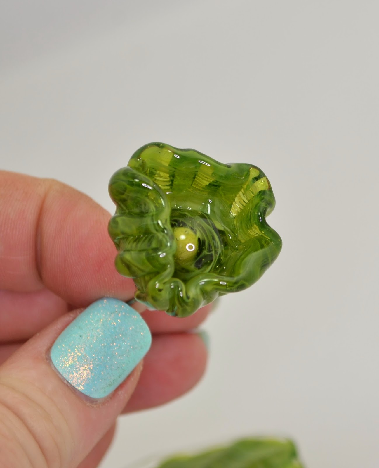
For contrast with Effetre's Dark Zucca - CiM's new Tiger Lily is almost the exact same colour, but the colour of the unworked rod is much truer to the end result - making this glass more "WYSIWYG."
Again - it is a super juicy intense orange that orange-lovers will love.
Saturday, November 29, 2014
Wednesday, November 26, 2014
Effetre 426 Dark Zucca
Effetre's new Dark Zucca is a dark orange that gets, like most of Effetre's yellow/orange/red palette, gets darker when worked.
The colour itself is juicy orange with dark orange overtones, quite a bit darker than the unworked rod.
If you love orange - you will swoon over this. As with other Effetre oranges, I suggest stocking up, as their "hot" palette of colours has significant variability from batch to batch, and there is much wandering the aisle of glass shoppes, with tiny stubbs of rod ends, wailing and gnashing of teeth - "It's different now ... I loved that colour ... ."
The colour itself is juicy orange with dark orange overtones, quite a bit darker than the unworked rod.
If you love orange - you will swoon over this. As with other Effetre oranges, I suggest stocking up, as their "hot" palette of colours has significant variability from batch to batch, and there is much wandering the aisle of glass shoppes, with tiny stubbs of rod ends, wailing and gnashing of teeth - "It's different now ... I loved that colour ... ."
Monday, November 24, 2014
Dragon Eye Cabochons - Frit
I use twisties a lot for the iris pattern of my Dragoneyes - but frit works just as well. I was taking a little trip through the packages of GOK frit that I have accumulated over the years. (GOK = God Only Knows.) When you first start lampworking - you tend to buy frits, not realizing how long they are going to last you. Years later - you still have them.
Knowing a bit more than I did when I acquired them, I even got some better results than in the past.
This was "Iris Blue Transparent" - an 104 COE frit with a product code of 346145-1 - over a base of ivory.
This was another 104 frit called "Copper Ruby," on ivory, with a product code of 346015-1.
This pair of very lizardy eyes are a Kugler frit - K-215 "Gold Brown" in size 00. I really like this finer grain of frit. Again, on ivory.
The top one is "Magic" (not Dark Magic) - on ivory, reduced and then unreduced, because I didn't like it. It went surprisingly pale under the encasing. The bottom two are Kugler Iris Gold (K-218) - size #1 - quite a bit larger than the #00.
All of these were labeled as reducing frits, but I didn't reduce them (except the one I then unreduced.) They were all layered over ivory, which has mostly reacted strongly with them to create interesting colours and to turn the ivory between the frit chunks a dark grey - almost black.
I particularly like the Kugler Gold Brown ones - not because they are a "pretty" colour (the Iris Blue Transparent was prettier) but because they are almost creepily convincing.
And when it comes to rendering dragon body parts - pretty doesn't really fit the mandate. ;-)
Knowing a bit more than I did when I acquired them, I even got some better results than in the past.
This was "Iris Blue Transparent" - an 104 COE frit with a product code of 346145-1 - over a base of ivory.
This was another 104 frit called "Copper Ruby," on ivory, with a product code of 346015-1.
This pair of very lizardy eyes are a Kugler frit - K-215 "Gold Brown" in size 00. I really like this finer grain of frit. Again, on ivory.
The top one is "Magic" (not Dark Magic) - on ivory, reduced and then unreduced, because I didn't like it. It went surprisingly pale under the encasing. The bottom two are Kugler Iris Gold (K-218) - size #1 - quite a bit larger than the #00.
All of these were labeled as reducing frits, but I didn't reduce them (except the one I then unreduced.) They were all layered over ivory, which has mostly reacted strongly with them to create interesting colours and to turn the ivory between the frit chunks a dark grey - almost black.
I particularly like the Kugler Gold Brown ones - not because they are a "pretty" colour (the Iris Blue Transparent was prettier) but because they are almost creepily convincing.
And when it comes to rendering dragon body parts - pretty doesn't really fit the mandate. ;-)
Saturday, November 22, 2014
Effetre 724 Buffy
You have to try this, I was told.The packet of glass was labelled "Buffy."
I have a dog named Buffy, you see. Although she is not this colour. She is mostly inky black with a sprinkling of sand in her fur and tan points.
However, the name was amusing. ;-)
When working it - it appears to get a layer of transparent topaz on the top.
In a spacer bead - this cools to a variable streakiness.
It appears to react nicely with silver - this has some trails of some random dark high silver glass on it - you can see the reaction at the sides of the marks, but I noticed someone else trying it with silver wire and getting a nice reaction - so definitely experiment with that.
It's variability serves it well in rapid cooling situations, i.e. in brass presses and molds, see the three faces in the top left.
Oh, and because you asked - this is the real Buffy.
Wednesday, November 19, 2014
Monday, November 17, 2014
Effetre Ebony & Ivory - new batch.
Boo hiss. Instead of being gorgeously, deliciously streaky and marbley like the last time I used it - this version is very, very, very shocky - and not very streaky.
OK - maybe I'm being unfair - because it is a pretty interesting ivory, ...
But the last time I used it - it looked like this. So, harrumph. Hope I stockpiled the old one.
Oh, and did I say shocky? Frit on a stick.
OK - maybe I'm being unfair - because it is a pretty interesting ivory, ...
But the last time I used it - it looked like this. So, harrumph. Hope I stockpiled the old one.
Oh, and did I say shocky? Frit on a stick.
Friday, November 14, 2014
No 4 in a 3-part Micro-Series
I've always wanted to say that - this is number four in a 3-part series.
BTW - I will be at the BeadFX studio tomorrow (Saturday, Nov 15), demonstrating lampworking - drop by if you are in the neighbourhood!
Monday, November 03, 2014
Effetre 620 Kiwi
Last time I reviewed Effetre 620 Kiwi was in 2008. You can see - it is a layered cane.
This is a new batch, and it appears pretty similar, but slightly less dense, slightly less streaky, and perhaps a little more acidic in colour.
On the left, a "bit" made with Kiwi and some clear. On the right made with clear and a rod of what I believe is the old kiwi.
If I was absolutely certain that this was the old Kiwi, I would be less wishy-washy, but I'm going on looks, and not labels.
This is a new batch, and it appears pretty similar, but slightly less dense, slightly less streaky, and perhaps a little more acidic in colour.
Above, from left to right, self-coloured, over clear, and over white.
On the left, a "bit" made with Kiwi and some clear. On the right made with clear and a rod of what I believe is the old kiwi.
If I was absolutely certain that this was the old Kiwi, I would be less wishy-washy, but I'm going on looks, and not labels.
Saturday, November 01, 2014
Triptych 3: Crone
Crone - there's a term with oodles of negative connotations. Maybe we should reclaim it? After Maiden, (youth, inexperience, enthusiasm, questionable judgement), and Mother (taking care of everyone else) - we have - Crone. The time of being yourself. An explosion of creativity. Experience plus opinions plus perspective. Time to get out there! Be yourself.
Friday, October 31, 2014
Triptych Part 2
This is the 2nd part of "Maiden, Mother, Crone." Motherhood is a time of sacrifice, nurturing, protecting, focus.
Thursday, October 30, 2014
Triptych Part 1
This is part 1 of a triptych I am currently working on, on the ageless theme of Maiden, Mother, Crone.
This is "Maiden" - carefree and chaotic youth, alive and young and vital and exploratory.
Wednesday, October 29, 2014
CiM Bing
CiM Bing, which I have written about before, is a lovely shade of red. Interestingly, however, here when it is blown out to be paper thin, it is more of a flaming bright orange.
A very intense orange, to be sure. But no longer red.
Monday, October 27, 2014
Gold Accents?
Fun? Gold accents? This is the Krylon 18 kt gold leafing pen - applied after the glass is out of the kiln and cold.
How durable is it? Withstands casual handling - determined effort will scratch it if you really try.
Could be a fun way to add a little gold accent. Why not? I think this is how a lot of ceramics and commercial stuff get their gold accents.
How durable is it? Withstands casual handling - determined effort will scratch it if you really try.
Could be a fun way to add a little gold accent. Why not? I think this is how a lot of ceramics and commercial stuff get their gold accents.
Thursday, October 23, 2014
Belladonna DragonScales - Follow Up
Disappointingly, reducing this while the glass was still glowing did not result in a lustre that came out of the kiln (see previous post). Instead, it resulted in a murky greyed out colour with just hints of blue.
This is why I usually let glass cool before reducing. Many of the reduction glasses will take on this muddy effect when reduced while the glass is still glowing hot.
Oh well, will try again.
This is why I usually let glass cool before reducing. Many of the reduction glasses will take on this muddy effect when reduced while the glass is still glowing hot.
Oh well, will try again.
Tuesday, October 21, 2014
Vetrofond: 987 Dark Lichen
Ha. Bet you would never guess that this:
turns into this!

Yes, that's right - what appears to be a black core with a topaz overlay in the first photo, works up to be a streaky dark ivory with lapis blue stripes.
The topaz lightens and becomes opaque, and the black is apparently a dark blue. The result is striking and definitely not "what you see is what you get." This is stash of Vetro glass - so this is it. You'll not see this again.
I got mine from Jean at Nortel, and I suggest you don't linger if you want any - because everyone I have shown these to is calling as we speak to order theirs.
turns into this!
Yes, that's right - what appears to be a black core with a topaz overlay in the first photo, works up to be a streaky dark ivory with lapis blue stripes.
The topaz lightens and becomes opaque, and the black is apparently a dark blue. The result is striking and definitely not "what you see is what you get." This is stash of Vetro glass - so this is it. You'll not see this again.
I got mine from Jean at Nortel, and I suggest you don't linger if you want any - because everyone I have shown these to is calling as we speak to order theirs.
Monday, October 20, 2014
Belladonna: Dragon Scales
This is Belladonna "Dragon Scales." Belladonna is a boutique glass from Arrow Springs with a small palette, but some cool stuff.
It is a deep emerald green transparent rod, and reduces easily. However, I had a high degree of metallic lustre on the items going into the kiln, most of which had disappeared when I took it out. The places that looked to be "over-reduced" when I put them into the kiln - with a milky aspect, were the only places that the reduction survived as the blue and aqua swirls, as shown here.
So definitely not what I was expecting - but attractive in their own right. Next time, I will reduce it longer, probably with the glass hotter (still glowing) and over all, more aggresively.
Saturday, October 18, 2014
Bubble Ring
Here's something kind of fun and experimental. This is a bubble ring, or a bunch o' grapes ring ... the bubbles are worked on a wire, and then the wire is coiled (after annealing and cooling), and attached to a cast ring base using jewelry grade epoxy clay.
Kind of fun. Wish I had not grabbed a ring size too small to be wearable by me ... . ;-)
Friday, October 03, 2014
Eye Candy
Tuesday, September 30, 2014
CiM 616 Coronation Day
CiM Coronation Day - a royal purple that is lighter and streakier than the rod itself.
The two beads on the left are self coloured, and the one on the right, I applied white dots and then super heated it and swirled them into the purple base.
I'd have to compare it head to head with Evil Queen or Thai Orchid to say which is darker.
The two beads on the left are self coloured, and the one on the right, I applied white dots and then super heated it and swirled them into the purple base.
I'd have to compare it head to head with Evil Queen or Thai Orchid to say which is darker.
Saturday, September 27, 2014
CiM 615 Bubble Bath
Bubble Bath is a pretty, pale pink translucent moonstone glass.
The two beads on the left are self coloured and the one on the right is over white.
Very ethereal.
The two beads on the left are self coloured and the one on the right is over white.
Very ethereal.
Wednesday, September 24, 2014
CiM 526: Ice Floe
I bet it would etch nicely too. The pale transparents usually do.
Friday, September 12, 2014
Dragon Eye Demo
Last week, at the Glass Gathering, at Sheridan College - I demonstrated making a Dragon's Eye.
Some of you who watched that wanted to see the final version - but it, of course, went into the kiln and who knows what will happen to it next.
Anyway - I made another the next day using the same glasses - and it came out pretty similar.
The iris is a twistie made with Khaos and Triton over ivory. The dichro is laid down after.
The lids are Terra Nova 2, with dots of something very similar to Triton, but has no label anymore, so that's just my best guess.
I embedded two rings for hanging/attaching - only one is visible in the picture.
Some of you who watched that wanted to see the final version - but it, of course, went into the kiln and who knows what will happen to it next.
Anyway - I made another the next day using the same glasses - and it came out pretty similar.
The iris is a twistie made with Khaos and Triton over ivory. The dichro is laid down after.
The lids are Terra Nova 2, with dots of something very similar to Triton, but has no label anymore, so that's just my best guess.
I embedded two rings for hanging/attaching - only one is visible in the picture.
Wednesday, September 03, 2014
A New Direction
| The Watcher from the Forest Floor. 18 cm long. |
I have come to that place where I do not want to make "beads" anymore - beads being uniform, smooth round objects with neat puckered holes and are destined to be strung onto personal adornment items.
It's not that I don't like beads any more - it has more to do with wanting to break free of the restrictions of making it wearable (glass is heavy, glass is sharp, glass can break), and wanting to move out and explore other aspects of the glass.
I recently had a few "aha" moments - that have opened up doors into new worlds of possibilities.
This is the beginning of what I hope will be a brand new exploration. A new direction in personal vision. ;-)
Saturday, August 30, 2014
TAG 104-15 Fire Lotus
The "word on the street" (ha ha) is that Fire Lotus is yummy and easy to use - easier than some of it's cousins.
I think I might have to concur with this as these did come out pretty nice. Some of these striking glasses look very nice when hot, and once they come out of the kiln, they look dark. Oh, if you get enough light on them, they can look ok in a photo, but they just look dark the rest of the time.
The bottom row is, left to right, encased with clear, partially encased, and self-coloured - struck once.
The top row is all three, un-encased, struck once. I like the encased and partially encased ones best. Looks like encasing is the way to go with this one.
I think I might have to concur with this as these did come out pretty nice. Some of these striking glasses look very nice when hot, and once they come out of the kiln, they look dark. Oh, if you get enough light on them, they can look ok in a photo, but they just look dark the rest of the time.
The bottom row is, left to right, encased with clear, partially encased, and self-coloured - struck once.
The top row is all three, un-encased, struck once. I like the encased and partially encased ones best. Looks like encasing is the way to go with this one.
Wednesday, August 27, 2014
CiM 813: Cobblestone
Cobblestone - nice colour for elephants. A nice warm shade of grey, tends to look different depending on the colours around it - see photos. The variability in the photos is not as evident in real life.
I think this would be a really nice colour in sculptural animals - like, elephants! Seals. Whales. Kittens.
Because ...
I think this would be a really nice colour in sculptural animals - like, elephants! Seals. Whales. Kittens.
Because ...
... all is vanity, all the way;
Twilight follows the brightest day,
And every cat in the twilight’s gray,
Every possible cat.
Subscribe to:
Posts (Atom)