Tuesday, March 25, 2014

Push Molds: Burgard - Cat and Face


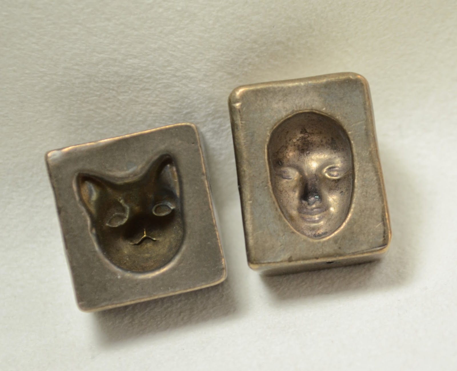
When I was down in Tucson - I picked up a couple of the old Burgard push molds. They were on the discontinued table of one of the big vendors. So far as I know - they are no longer being made. The backs of them are signed and dated, the cat is dated 1998 and the face is 1999.

These two are actually small enough for soft glass (most of the molds I see work better for boro and are huge). I'm sure many soft glass users are just baffled by them, however. "It's not a press and it doesn't have a mandrel slot."

I do want to give you a close look at these so you can see the scale of them, and understand that they are a concave mold - because the photos do that tricky thing where they seem to reverse themselves and appear to stand out, and then recede. 


 Go on - stare at those two faces - raised, inverted, raised, inverted.
 There - that makes it clear - it's a cavity.
 It's "Mc-Cavity - the mystery cat"
 This also makes the size of them clear too - the face mold is about an inch long for the entire mold - the face itself is 17 mm long and about 5 mm deep at the bridge of the nose. The cat is a little deeper.


 I just did a couple of quick ones to see how they worked - needed more glass here to fill up the ears. I just melted a gather of glass on the end of a rod and pushed it in. Make sure the mold is on the table by the way - it's going to get hot.
 Did a pick-up of frit on this gather first - and put the gather on the end of an old, bent mandrel.

If you don't firepolish the heck out of it - the detail is quite nice.

The picture is crap - but the faces came out quite nice - ready to be embellished or integrated into something else.

If nothing else, you could make some nice little cabochons with these.

If you see them languishing on a sale table somewhere - pick one or two up.

They are practically collector's items now!


Monday, March 24, 2014

CiM 410 Shrubbery

  HEAD KNIGHT:  The Knights Who Say Nee demand a sacrifice!
  ARTHUR:  Knights of Nee, we are but simple travelers who seek the
      enchanter who lives beyond these woods.
  HEAD KNIGHT:  Nee!  Nee!  Nee!  Nee!
  ARTHUR and PARTY:  Oh, ow!
  HEAD KNIGHT:  We shall say 'nee' again to you if you do not appease us.
  ARTHUR:  Well, what is it you want?
  HEAD KNIGHT:  We want... a shrubbery!
 If you now need to read the rest of the scene - I got it here. ;-)

CiM has delivered a Shrubbery - and in keeping with the criteria demanded by the Knights who say Nee, "looks nice and is not too expensive."


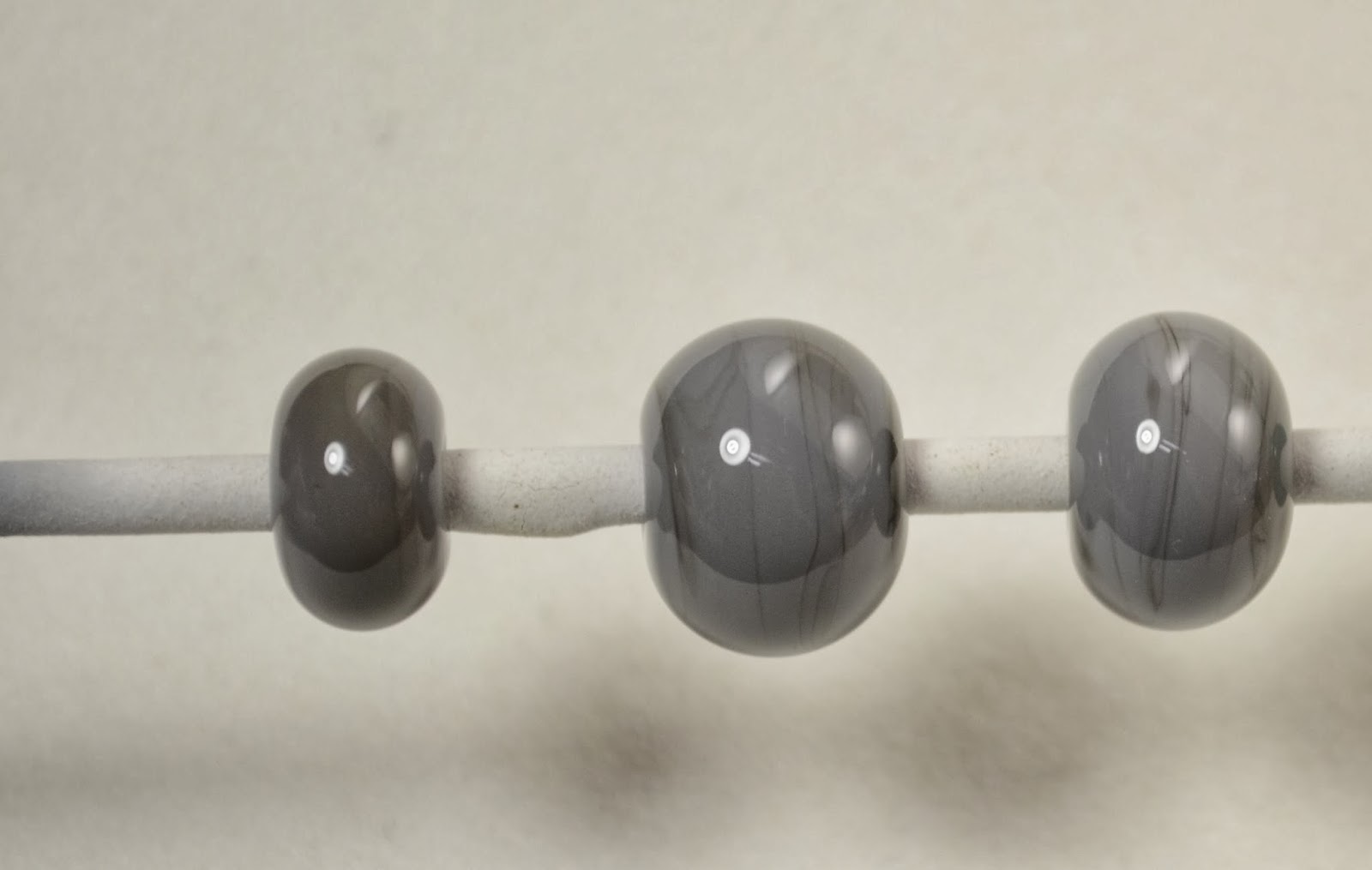
These are, from the left, two self-coloured and one with ivory dots. It's a little streaky, and the ivory has formed a nice line, which is, interestingly, not touching the ivory itself. Very tricksy.


Very shrubby. Nee. Nee. Nee.


Sunday, March 23, 2014

CiM 112: Radio Flyer

Hellooo Effetre. CiM really knows how to do red. Pay attention.

Here is another great red from CiM - Radio Flyer.

From the left - two self coloured beads - which functionally read as opaque, and on the far right, Radio Flyer over clear - which reads as a nice, bright transparent. Talk about having it all.

The third bead from the left is interesting. This is a core of Radio Flyer, with dots in Eff 260 Light Pink, and dots of Radio Flyer on top. I was expecting red dots that really pop - but there is something else going on in there. 


The dots seem to have separated and lifted or something. Here's a close up for more detail.


I only did two layers of dots, base, pink, radio flyer on top - but it looks like an extra layer in there - so I really don't know what is going on there.

But interesting, eh?

Now whether that is a property of Radio Flyer, or Eff Light Pink - I do not know.


Effetre 736 Honey Swirl


When I first reviewed Honey Swirl, I mentioned that I thought it looked like it was de-vitrifying when I worked it, but couldn't see any evidence of it once it was done.

Apparently  - it will devitrify, (lose the glossy look of glass and develop a chalky, matte look), it's all how you work it.

This little sculptural practice piece de-vit'ed like crazy.

The older, cooler areas are affected. the pieces worked last are not - so you would treat it the same as EDP - if you want it glossy - heat to glowing and let cool, and kiln without re-heating.

Wednesday, February 26, 2014

Effetre 684 Blueberry Marble

 Last time I had my hands on some of this Eff 684 - it was called Tuxedo Cool - and I commented that it was on the purplish side, and "Blackberry Swirl" would have been a better name.

It's apparently a new batch, and been renamed Blueberry Marble. And it is indeed, rather bluish.


The rods look grey - although you can see from the ends - there is a mix of colours in there.


When wound off into spacers - you get a nice streaky look, a soft blue and grey effect. 
 So I thought I'd try whipping off a horse bead. Haven't made one in  while, so I'm a little rusty, but managed to pull it off. The swirly colour looks good.
 The back looks awesome - great pattern. This particular bead calls for getting the glass very hot and fluid - which works very well for this layered, swirly glass, and brings out the best in it. I suggest working it hot and letting it droop and move a lot.


Monday, February 24, 2014

Effetre 746 Petal Pink

 This is Effetre Petal Pink - a soft, delicate pink that will appeal to people who like dainty and pretty colours. (Not me, obviously!)

However, even I can see that it has it's place.


Here is a trio of self coloured spacers. Surely these would make a good base bead for some rubino dots?


To keep it interesting - I then messed around with it a little.

This is a base of petal pink, followed by trails of ivory. I then rolled it in silver foil, and melted the foil in, and added more trails of ivory. I reduced it, encased it in clear, and added trails of black on top.
The petal pink base has gone a honey-colour where the silver was - the sagey colour in the middle is where the ivory was UNDER the silver. The silver has fumed the pink and changed it's colour.

Don't forget - if a color bores you - you can always try something different with it, instead of just putting it aside and letting it accumulate. After a few years - the stack of glass you don't like can get discouraging.

The alternate is to never try anything different - and you certainly won't learn anything that way!

Saturday, February 22, 2014

Effetre 441: Dark Matter

I've written about Dark Matter before - but I thought it was worth taking another look at it. Apparently - where it shines is not as a colour unto itself, but as a base for the high silver glasses.


This is a grouping of beads and the dark matter rods. This is the dark grey version - apparently there is a dark red version as well.


You can see a streakiness on the bead - it's very subtle and requires a lot of light to see it. When the bead is hot and goes into the kiln - it is actually quite interesting looking - purples. 
 OK - this bead is a base of dark matter, with a layer of (from the left) Zeus, Clio, and the frit is Reichenbach 198 Multi. The entire bead was encased in Zephyr and then heated and mashed.


This bead is a base of Dark Matter, rolled in silver foil, melted in, trails of ivory, encased Zephyr. 
 Same bead - other side. The greenish color is where the silver foil was - I didn't cover the entire bead.

Experiment with this with the silver colours - see what happens!


Thursday, February 20, 2014

Back from Tucson

Ok, I want to start out by saying first. NONE OF THIS WORK IS MINE.

No confusion - this is stuff I BOUGHT at Tucson.

Tucson is, every February, host to countless number of bead, gem, jewelry, mineral, and rock shows. Literally countless - they pop up like mushrooms. Or cactii, as they don't have enough water in Tucson to grow mushrooms, but you get the idea. More on the shows themselves in a later post.

I just wanted to show you some of the lampwork that I purchased there because it's really freaking fabulous.

This is the haul.


This Vortex marble - look at the depth in that! 
 and this silver and gold fumed mer-dragon are both from the torches of the Mazet brothers.

These pieces are both Boro. The marble has that incredible sense of depth that a vortex marble should have - you keep turning it over to try and figure out where the rest of it is. They appear to be ... wait for it ... "bigger on the inside." The merdragon (note the webbed feet) has a charming sense of whimsy to it (him) that I liked, above and beyond the gold-sparkliness of him.

(Their website appears to be not-working at the moment, their facebook page is clearly abandoned. However, if you google "eli josh tim mazet" you'll find lots of other people talking about them - all of it good.)


These "fire opal" pieces (the one on the left is a ring, on the right is a bead) are wonderful - the colour is absolutely as fabulous as it looks here. These are by Jenny Friske-Baer, of Divine Spark Designs. Her website does work!

And these breath-taking beauties are by  Joy Munshower - the Tile Goddess. (Her website also works!)  Really - nothing needs to be said about how awesome these are. Except that she has more stuff that is equally awesome and you should go buy your own.


Tuesday, February 18, 2014

Zeus over Raven Sky

 The only thing of real interest from the other day's kiln full of meh was this - TAG Zeus over Effetre Raven Sky.

Given that Raven Sky is black and white, this shouldn't be a surprise.


This is Zeus over black. We know that Zeus does this thing. 


It did come out extra streaky, however.

I wonder if it is the type of black, or the way it was worked more than just a spacer.

I'd hate to cover up Raven Sky if there is another alternative.

Of course, streaks of Zeus instead of full encasement might look good. Hmmm.


Sunday, February 16, 2014

Zeus over Clio

Experimenting with TAG Zeus layered over Double Helix Clio.

Still not quite what I was going for.

Not too bad, but not what I wanted.

Friday, February 14, 2014

TAG Juno

Self-coloured Juno.

Top row, lightly struck.

Bottom row, reduced, left reduced cool; right, reduced hot.

Note - top row - one has retained it's pinkiness w/o turning gold.

I thought I read that Juno moves to coppery when overheated, but now I can't find it again. Damn.

TAG's website suggests trying it over ivory, and to not encase it deeply.

Wednesday, February 12, 2014

Aion2 and Zeus

I include this, not because it has particular merit, but for my own reference, as I haven't included self coloured Zeus before.

Top row, Aion2, lightly reduced. Bottom row, Zeus, lightly reduced.


Zeus is usually layered over black, so you don't see it by itself much.

Zeus is from TAG, Aion 2 is from Double Helix.


Monday, February 10, 2014

Some days ... all you get is $@%#

Some days - all you get is crap. Five hours on the torch, and a kiln full of meh and "also ran."

Meh.

Oh well.

Clean 'em up, toss 'em in the orphan bowl and try again.


Saturday, February 08, 2014

CiM 412: Absinthe

Absinthe makes the heart grow fonder ... .

This is a slightly translucent, opaly green - very pretty.

According to CiM's website - this moonstone glass will develop wisps and turn opaque the more it is worked - which whacking off a few self-coloured spacers will not reveal.

I'll have to give this one another go. I love the misty, opaly colour.


Thursday, February 06, 2014

Eye Candy

 Just a little eye candy for a change. A variation on my "Sundered Heart" design.


Tuesday, February 04, 2014

Effetre 744 Amazon (again)

 I reviewed Effetre Amazon before, the darkest of Effetre's new tawny colours. I noted that it had the potential to go quite dark.

These are a good example of that - they all went quite dark - with the streakiness giving them a wood-grain look.

Wonder what they would look like etched?

Nice, eh?


Monday, February 03, 2014

CiM 418 Lichen


CiM Lichen - a soft, pale, sagey green - a little streaky.

On the left and right - two self coloured beads, but in the centre, we have the addition of ivory dots.

Mmmm - check this out - a light green halo and a dark line and almost cast shadow effect. Nice!

I'm "Lichen" it. ;-)


Saturday, February 01, 2014

Video: American Art Glass

Very, very cool video here - the work of Ro Purser, covers some of the history of the art glass movement, and some murrini making techniques that will blow your mind.

Totally worth 12 minutes of your life.


Thursday, January 30, 2014

Video: Glass Fish

This video is quite interesting. This is a British Museum video,  made at Corning. I would have liked it a little better if they had shown the original vessel that was being replicated.


For lampworkers, it's always interesting to watch glass blowers work, to see the differences, and the similarities in working techniques.

For instance - watch how he works the lips - even when the glass has lost it's glow - the clear is still hot enough to move. In general - the significant difference in thermal mass is what allows blowers to spend so long out of the furnace that I am sitting here thinking - "ahhh, it's gonna crack, warm that sucker back up ... . " You get kind of twitchy about that sort of thing as a lampworker, especially when you teach.

The technique for the clear fin is pretty cool too - the two ribbons of glass, and then tweeze into shape. We could do that.

The coolest part is at the end, clearing up the neck of the vessel. I haven't seen that method used for cracking glass before. Way cool. 

Another interesting thing is that this seems to be some sort of vessel or vase - but you couldn't stand it up on end - does it balance sitting on an angle on the lips and the fins? Is it a sort of decanter?

Anyway - cool stuff.

Tuesday, January 28, 2014

Random Eye Candy

 Sorry - don't remember how I made this - just sharing it because it is cool.

Lots of high-silver glass, I can tell you that.


Sunday, January 26, 2014

Effetre 757 Ka-Bluey

 Ka-Bluey - another in Effetre's new streaky blue offerings. This is a dark blue + grey - like storm clouds on a summer's day - ready to explode into durm and strang. Whether you get more or less of the blue or the grey depends, I think, the rod and where you are in it, rather than any particular working technique.

I really like this one. My kinda glass.

Friday, January 24, 2014

Comparison: CiM Aloe Juice and Green Lantern

Side by side - Green Lantern on the Left, Aloe Juice on the right.

See what I mean about Aloe Juice being a lighter version? Still had problems boiling it though.

Wednesday, January 22, 2014

CiM 425 Mint Chip

CiM Mint Chip - a fitting name - fresh and pale green like a mint ice cream. Bead on the left is self coloured, on the right, with ivory dots.

This glass goes very pale when hot - almost grey, but returns to a soft green colour when cool.


Monday, January 20, 2014

CiM 811 Weimaraner

CiM Weimaraner - why - yes it is. It is the colour of the grey ghosts themselves.

A streaky, neutral grey - just what the dog-tor ordered. The small spacer on the left does not look quite so much dramatically darker in real life as it does on my monitor - your monitor may differ, of course. It is a little darker - maybe because I got it hotter (less glass) or more heating and cooling cycles. Anyway - it real life -it's not that different.

Saturday, January 18, 2014

CiM 423 Green Lantern

In brightest day, in blackest night,
No evil shall escape my sight.
Let those who worship evil's might,
Beware my power, Green Lantern's light!!!

Fundamentally - this is a darker, more saturated version of Aloe Juice, but without the tendency to boil. A really pretty green, a little on the blue side - just a nice, comfortable colour.  I like it!

Thursday, January 16, 2014

CiM 422 Aloe Juice

 CiM's Aloe Juice is a pretty, light, transparent bluish-green.

I think it wants to be worked cool though - it boiled like crazy for me.

Both the left and right beads show the evidence of the boiling. The centre one came out ok though.

Probably fine for those of you that don't attack your glass with a monster flame like I do.

You know - I've review Aloe Juice before - and it wasn't this color. It was more of a peridot. Neither did it boil.  I wonder if I misread a label on the old one? This is a much better match for the CiM website listing.