Before I dive into each of these colours individually - I thought I would do a first-up head to head comparison.
The new selection from CiM this season contains a lot of new greens in some very juicy new shades. Let's look, shall we?
Top Mandrel, Two of each colour, self-coloured, from the left:
CiM 480 Anole, CiM 486 Elixir Sparkle, CiM 485 Elixir.
Middle mandrel (aqua marker) From the left, two each of:
CiM 473 Eclectus Parrot, CiM 474 Ectoplasm, CiM 477 Budgerigar.
Bottom mandrel, (mermaid marker) From the left, two each of:
CiM 472 Mantis, CiM 471 Wheatgrass, CiM 487 Poison Apple.
Same arrangement, but with flash and some backlighting.
I think at this point, I am most excited about Elixir and Eclectus Parrot and Budgerigar. And Mantis.
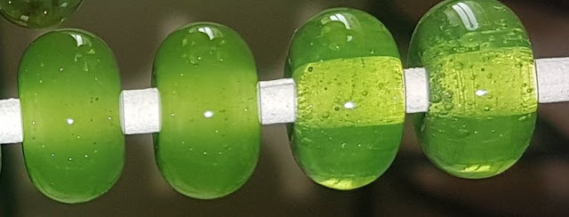
Poison Apple (right) has been re-formulated to stay translucent, and Wheatgrass (left) is the companion to match as opal version. Looks like Poison Apple definitely stayed translucent, but Wheatgrass came out pretty transparent for me. But the colour match is good.
Mantis and Eclectus Parrot (which gets my vote for the most-likely-to-be-misspelled) are another matching pair. The Mantis is the misty opal (bottom) and the E.Parrot is the translucent (top). Definitely a winner here.
Budgie (my vote for name-most-likely-to-be-shortened) (right) and Ectoplasm (left) are another matching pair, with Budgie being the misty opal (yes) and Ecto being the translucent (also yes.) And good colour match.
Anole (left) and Elixir (right) are another matching pair (I sliced up the photo to put them side by side), with Anole being the tranlucent opal and Elixir the misty opal. Colour match is also good.
And finally - Elixir Sparkle, which doesn't sparkle, or match Elixir, so not sure what to say about that. It's a pretty cool colour, actually, the poor thing just look drab in the company of all these other juicy greens. It's not easy being green. ;-)
The option to use various degrees of translucency looks like a lot of fun, and these bright happy greens are certainly a welcome addition to the palette - so yay for greens!
Wednesday, January 23, 2019
Monday, January 21, 2019
CiM 558 Troi and comparison CiM Mermaid
CiM Troi, a deep, opaque blue-green. It comes up very streaky, which I like, but may not be your cup of tea.
Three spacers in Troi, with the middle one with Eff 276 Dark Ivory dots. You can see there is a very pronounced reaction with the ivory, and the dots sunk into the Troi and got all malformed instead of staying round.
I thought it looked like an exact match for CiM 586 Mermaid, except the Mermaid is not so streaky. The malformed blob on the right is Mermaid.
Other folks however are reporting that it is more like Cotswold Blue and not this close to Mermaid. So, as always, your mileage may vary.
Does that phrase even mean anything to anyone any more?
Troi - streaky version of Mermaid in my books so far.
Saturday, January 19, 2019
CiM 688 Wisteria and comparison CiM 660 Crocus
 In the new run of colours from Creation is Messy is a shot at making colours that match but have different translucencies. So in the case of this new colour Wisteria, it was to be a more translucent version of 660 Crocus.
 I would say that they nailed it.
On the left (in both photos) is the Wisteria, on the right, the Crocus.
Four self coloured spacers from the left, in Wisteria, and one Crocus on the right. You can definitely see the crocus is translucent, while the Wisteria is little misty.
Same, shot with flash. On my phone.

Because my photo booth is back there somewhere ...
 and the other end of the office looks like this.
 Turns out, there was no insulation in the walls. The window has a better R factor than the walls. :-(
yay for 60's construction.
Anyway - Wisteria - super nice. Perfect match for Crocus.
Thursday, January 17, 2019
CiM 559 Cerulean and CiM 560 Cerulean Sparkle
 Creation is Messy's new colour line-up includes some "Sparkle" colours - colours with aventurine added for some sparkle. This is new for them, and I was very excited to get my hands on it.
Sadly, however, someone appears to have been a little conservative adding the sparkly stuff, and it is pretty much invisible.
:-(
I apologize for the photos. My photobooth is currently buried and filled with other stuff as I renovate my office. Feel my pain.
Anyway ... it is a super pretty transparent aqua - just about an exact match for the colour of Windex.
The picture below, the top mandrel (2 self-coloured spacers and colour over white) is the Cerulean Sparkle. And the bottom mandrel (over white and 2 self spacers), is the Cerulean.
Order reversed, bit of an angle. I found the Cerulean to be a little gassy, giving me some bubbles, and I definitely found the Sparkle to be stiffer.
Sparkle on the left, non- on the right.
Plain for the top one, sparkle for the bottom one.
It's a super pretty colour, but sadly, the sparkle is invisible. :-(
Tuesday, January 15, 2019
Val Cox Frit: Flora
Flora - new frit from Val Cox. This is a reduction frit, a mix of transparent green and aqua, but the green tends to overwhelm the aqua, especially when reduced.
The frit itself ... very pretty.
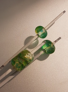
These are both a base of clear (Effetre), layer of frit, layer of clear, another layer of frit. Not reduced, but worked in a very slight reduction flame.
The barrel bead is a core of clear, a spiral (uneven) wrap of white, frit, reduce, spiral wrap of clear, so that some of the reduced is encased and some is not.
Here, the top and bottom are made with a gather of clear dipped in frit, and the middle two are the same, but reduced.
So, while if you look hard, you can see the influence of the aqua in little hints, the predominate effect is that of green, and with reduction, a sort of gold-y green.
It would make a nice base for something with flowers on top.
Subscribe to:
Comments (Atom)


