CiM Pixie. To me - this is almost indistinguishable from Celadon.
It's a little streaky, reacts with dark ivory and is a very pleasant turquoise green colour. Definitely a keeper!
Thursday, September 29, 2016
Tuesday, September 27, 2016
CiM Pollen 311
I thought for sure I had already mentioned this one - but apparently not. Unless I grievously misspelled it!
Other testers seem to have gotten a brighter, purer yellow. With this particular piece, which is just heat and cool, and not a lot of re-heating - the glass a really interesting streakiness from transparent to opaque.
It really is very reminiscent of yellow pollen on say, goldenrod. Which is another colour by CiM. Which is more an acidic, pure yellow.
If I had to say, I would say that Goldenrod the glass looks more like Broom the plant, and Pollen the glass resembles Goldenrod the plant. My perspective may have something to do with spending my weekends knee to waist deep in both of them with the dogs.
This colour is not from the yummy new line up I published a teaser of last night, but an older release - I just thought I would share it anyway.
Monday, September 26, 2016
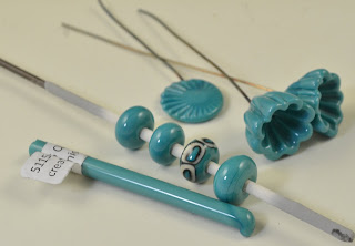
CiM 546 Quetzal
Here is a lovely colour to get excited about. Turquoise!
Quetzal is a slightly streaky, opaque turquoise blue. I forgot to try reducing it - so I can't speak to it's behaviour in a reduction flame. You can see that I had no issues with it going grey and leaden however.
It really is a beautiful, classic shade of turquoise.
This is 3 self-coloured spacers and one with Eff. Dark Ivory dots. The turquoise/ivory reaction is quite strong. But this was dark ivory.
Absolutely adding this to my colour palette!
Monday, September 12, 2016
Khaos
Double Helix Khaos. Looking over my past notes - my results have not been too spectacular. However, I found the "Striking Guide" on the Double Helix website, and applied it to the Khaos, even though it is not listed on the guide.
I have to admit - I don't actually remember the rods being this honey/amber colour before.
I remember it as being a dark brown. I could be wrong, or this could be a different batch.
However, by following the instructions, I did get much nicer results.
this is Khaos, struck following the instructions.
This has a little trail of Triton (I think) at the end - the dark blue.
They do look different depending on the lighting, back lit vs front lit.
Heat to translucent - not clear
cool to not glowing
strike at the tip to orange glow
fiddle with strike time or glow and strike a second time.
I like the first one with the blue haze better.
Honestly - I think the photos look better than real life though. You can see detail that you just don't notice otherwise.
Subscribe to:
Posts (Atom)