Saturday, October 31, 2009

CiM 519 - Glacier

When I pulled this glass out of the package - I was somehow under the impression that it was grey. Then, as I started to work it - I though "ooo, streaky." However, I'm wrong on both accounts.

It's actually blue, and I burnt the sh1t out of it.

:-P

Hence the weird, blue creature. Which was supposed to be a cat - then a bunny - then - GOK what. Asphyxia, the bunny rabbit. Flopsy, Mopsy and Asphyxia.

Upon closer inspection - I realized that the streakiness - behind the eyes - was actually from me working too hot.

I was burning the glass.

Bleh!

Once I figured this out, and turned down the flame - I was fine. I stopped getting smokey grey streaks.


Last time I did anything like that was the first time I sat down at a Barracuda (torch) (about 3 years ago!) - and I was using Effetre Periwinkle. I didn't even know that I could burn that colour. D4mn - was I out of control of that - I dripped more on the desk than I got on the mandrel.

I have better control now - but apparently - I can still burn opaque blue.

This glass is really, really, really soft, too. I'm tempted to say - softer than white. It literally took longer for the spacers to cool down and stop moving than it did to melt the gather and make the next one.


These are encased - came out a little lighter. These are encase in Lauscha clear, btw.

Please note that by then - I had the burning/smoking under control.

These are the unencased spacers, next to the unworked rods. They haven't changed colour much. Why I thought the glass was grey - who knows. Maybe because I was going to turn it grey with smoking it. Maybe my memory was working backwards - remembering the future.

Right.

Maybe I have a future writing about time travel. Or is that a history of writing it?

And here we have with black dots, and the Glacier dotted on top of the black. The


black and the Glacier have interacted - especially with the small, thin dots on top of the black. Notice the weird, creepy looking mouth that seems to have formed in the middle of the centre dot on the lower bead, with the dots on the upper bead have formed eyes.

Looks positively possessed.

It's a nice pastel shade of blue. I wouldn't say pass on it, just because my experience with it was odd!

It was, fair to say, perhaps not my best night at the torch?

Hey - if you are working on a small torch with a small flame - you'll probably love this glass!

Wednesday, October 28, 2009

More Effetre Lace Agate

Why am I posting about a glass that you can't get yet? That I have already posted about?

Because I have some and you don't? Because I'm mean? Because I'm a glass tease?

Yeah, all of the above. Bite me.


Lace Agate - thin encased over clear - coz I don't have that much of it either. ;-)


Above, Lace Agate + Silver Lake frit.


Lace Agate + Triton and Silver Lake Frit.


Lace Agate + Silver Foil - melted in.


Someday - this glass will arrive in quantity, and when it does - boy, will you be ready!

Monday, October 26, 2009

Effetre Opaque Red - Those Crazy Reds

By and large - soft glass is "what you see is what you get" with colours. Well - sorta - otherwise this blog wouldn't exist.

However - the Effetre Opaque Reds (and Oranges) always make beginners crazy. The conversations go something like this.

"I made this red bead and I really like it - but now I can't find the same red again."
"Did you write down what you used?"
"No."
"Do you have the end of the rod you used?"
"No - I used it up in the last bead."
"Well - good luck with that then."

So, here, side by side, for your enjoyment and education - a head-to-head comparison of Effetre Reds! Given that I have spent the last two weeks making these:


I can comfortably say that when I pick up a rod of red glass - I will have absolute confidence that I have only the roughest idea what colour it will come out of the kiln. ;-)


From Left to Right we have:

438 - Dark Purple Red - A very dark red - although I don't really see it as a purple red.
438 - Dark Purple Red (but significantly lighter and redder unworked rods). The main colour of the bead is the same - but it's more streaky and the steaky parts are lighter and more orange.
436 - Dark Red Marginally lighter than 438. In low light - can't tell 'em apart.
432 - Medium Red. Again, marginally different. In low light, without distinguishing dots - I defy you to tell these apart.
432 - Spec. Med. Red. This was an odd batch. This comes out lighter - and more orange.
428 - Light Red. I'd have called it orange. Maybe a blood orange. In fact - older colour charts do call it "Light Reddish Orange." (See chart on right, vs chart on left - which is newer.)
422 - Orange. This is, in fact, orange. But streaky - with redder orange streaks.

Sorry - no 424 in there.


Here - you can see the beads matched up with the unworked rods. The big discrepancy is the 432 - the regular batch - which looks like an orange - but goes dark red.


In warmer light, or strong light - the subtle differences are more noticeable. Barely.


Add to this that the camera (or your monitor) just doesn't do a good job with red.


So - 438 thru 432 for red - red - and 422 and 428 for orange - and the special batch of 432 for orange too. Now - to just find those red beads I made all that time ago and try and match them to one of these! ;-)

Saturday, October 24, 2009

Encased Silver Foil


Encased Silver Foil. The encasing - as you probably know, can make a huge difference to the colour of the foil.

The encasing colour on the left is Effetre Straw - a very pale amber - produces a rich, old gold effect. The encasing on the right is CiM Mojito - a pale green, which has produced a pale slightly greenish gold with some opalizing (cloudiness) and darker gold.

How awesome is that?

Friday, October 23, 2009

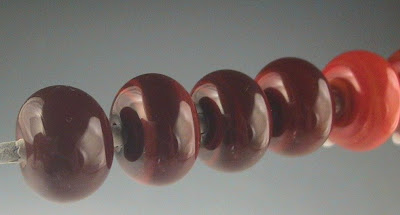
Vetro 951 - Red Candy Apple

How the heck did I miss this colour? I was rooting through my stack of glass - looking for reds - and found this pack labeled Vetro 951. So I looked it up online - Red Candy Apple. And apparently - I haven't blogged it.

What a NICE colour. Nice red! Whoohoo! Very dark transparent red.

It shows none of the livery brown tinge that I hate in transparent reds.

It is very dark. In the three spacers, the one on the right is self-coloured, the middle is the red, white dots, red on the dots, and the bead on the left is red over clear - which makes the nicest combo.

The second picture - the bead has a clear core - but the "wings" are pure red, and thin like that - you can see what a great colour it is.

It does strike - but very easily - you probably won't have to think about striking it too much. You can see one of the horns at the bottom of the second picture's bead is showing more amber than red - but basically - normal heat maintenance should strike it for you.

What a great find! Vetro Red Candy Apple! Yum!

Tuesday, October 20, 2009

Val Cox Frit - Silver Lake

The working notes say:

Opaque/Reactive. A reactive, velvety white frit that color-shifts to a dreamy blue. This dense white frit is best left melted on the surface, as when it's encased, the blue effect disappears to reveal simply white.


Well - you had me at "velvety." ;-)


Although, reactive might have done the trick too. Second pic is on light ivory - the bead on the left was super heated, the one on the right simply melted in. And - way cool - it does transform into blue!

This white cone is Marshmallow (CiM) with Silver Lake on it. I reduced one side (right) of the bead, and it went into the kiln nice and silvery - but it disappeared in the kiln. It did make for a nice white on white, though.

No blue, however. I think it might need the reactive colours to get it going.

So this in on orange et voila. Blue!

and on Copper Green.


No reaction.


And here it is on orange again, with partial encasing. And yes - some of the blue has gone back to white after encasing it.

These two are on black. The black on the left is CiM Tuxedo, the black on the right is CiM Hades.

and finally

this rather nice bicone which is:

  • Copper green
  • ivory, raked
  • silver lake
  • Partially encased
  • Hades stringer
  • silver lake (again)
  • marver into shape.
I definitely like the way the frit reacts and changes. This is an intiquing frit and I think that it has a lot of potential!

Monday, October 19, 2009

Collaborative Effort: The Eyes Have It.

Pretty cool cat, eh? This is Sitarchuk - made by Feltability - over on Etsy. We have been corresponding for quite some time, and I made her some eyes and sent them along for her to try in her wonderful felted creatures. I'm quite pleased that she saw fit to use some, and quite pleased with how they look - considered I didn't hold much hope for them when I sent them. You think it's tough to make spacers match for earrings? Eyes are way harder to match up!

And, while I say "collaborative" - the truth is, 99% of the work is hers. A pair of glass eyes vs an entire felted cat? Not even close to equivalent effort!

Saturday, October 17, 2009

Val Cox Frit Book: Frit Secrets: A Flameworker's Guide to using Reactive Glass Frits


I swear I have reviewed this before - but I simply can't find it.

Oh well.

Awesome book. Buy it.

Ok - I could go into more detail!

If you are expecting a series of pictures of beads and a series of procedures and recipes - this isn't that book.

What this is is a very careful explanation of frits, furnace glass, and how we can get a 96 CoE to work with a 104 in the right circumstances - that will allay the suspicions of those who have been avoiding the 96 Reactive frits because they couldn't see how it could work.

For those who like to test and experiment, like moi, then there are some very concrete suggestions as to how to go about it and make your own discoveries.

For those who are frustrated with frits and want to know how to get a specific colour or effect - there is a table for you too.

All in all - an excellent insight into Ms. Cox's journey of discovery into the world of frits, and a roadmap to your own discoveries as well.

Totally worth getting.

Thursday, October 15, 2009

Magic - Reichenbach 210


Magic - a Reichenbach glass - 104 CoE - with working properties similar to Iris Orange/Raku - namely - heat the snot out of it and then cool it rapidly by marvering.

These are dots of Magic on black (CiM Tuxedo) super heated, and mashed. Nice range of colours, and the speckly web pattern in the middle of the dots is interesting too.


This bead was rather more complicated, but here are the steps.

  • make a barrel-shaped bead in clear
  • encase in a thin layer of Magic
  • Mash
  • put a row of dots around the middle in ivory
  • then add dots in Magic
  • decide it's not working for you, add clear to the top of the dots
  • mash again
  • get frustrated because it still looks like heck
  • heat the snot out of it
  • roll back into shape, pressing too hard and wrecking the shape.
  • salvage the shape and even it up
  • encase it - because everything looks better encased
  • Mash it again
  • firepolish it
  • Give up on it and stick it in the kiln

Wednesday, October 14, 2009

Val Cox Frit - Winter Blues

A nice, calm, ocean set of colours. The working notes say: Opaque/Transparent. A timeless, no-fuss classic emerges from this quaint blending of blues in a cool-toned color range.

Which is not the most helpful - but does let you know not to expect too much reactive excitement. That said - if you notice in the pic on the right - there has been some separation around the colours. This is on white, specifically CiM Peace.


This third pic is on white, again CiM Peace, then clear, then frit. The layer of clear floats the frit and suspends it - allowing light to get through the transparent frits and reflect back off the white.


And this is frit on white (Peace) and encased. Hot encasing has smeared it - but it is a nice effect.


And the frit left standing. Some of those turquoise dots have started to separate already.

I really should have tried this on ivory.


And finally, clear dipped in frit, and wound, and shaped into a heart.


A nice happy blend. Stands alone or would make a nice background blend for a floral or aquarium bead.

Tuesday, October 13, 2009

Laucha 342 Yellow Orange


I said I thought Lauscha 342 Yellow Orange plus Lauscha Transparent Light Red would look good.

And, in fact - it's positively juicy. Now THAT'S a vibrant colour!

Monday, October 12, 2009

Val Cox Frit - California Poppies

California Poppies - a happy, happy blend of oranges.

The working notes say:

Opaque blend. A lively blend of 3 orange tones - from yellow orange to red-orange. Avoid using with silver - which can make it appear dark brown/black.

Seems pretty straight forward, and it turns out to be as advertised. A happy, pretty and easy to use blend of colours.


Cheerful on white. (CiM Peace)

On Lauscha Yellow Orange.


On black (CiM Tuxedo) - seems to lose some definition here. It might be opaque - but is not perhaps not as successful as one might hope for.


This is on Lauscha Light Transparent Red.


On clear, and encased.


And clear, dipped in frit and wound into a bead.


Happy, happy, pretty, pretty.