I love that the CiM clear comes completely wrapped in tissue paper to stop scratches developing in transit. I think that is a thoughtful touch - and illustrates an admirable level of concern that their product arrives in top condition at your torch.
But here's a thought. Take it out of the packaging before putting it down on your bench. I was being distracted by little flickering reflections last night while torching - to finally look over and realized - oops - put a rod down on the tissue paper and it was all merrily burning away. Had to huff and puff and blooow the glass out. ;-)
Just making mistakes so you don't have to.
Sunday, October 11, 2009


Saturday, October 10, 2009
Laucha 342 Yellow Orange

An absolutely scrumptious roasted corn colour. Slightly streaky, and totally, the perfect fall yellow.
Perfect for making squash beads for the fall fair. ;-)
Must try this encased with red.

Friday, October 09, 2009
Laucha 604 Wedgewood Blue

A truly beautiful colour - and tricky to photograph - the colour tends to come out bluer in pictures than it truly is.
First pic, on the left - an un-retouched photo of spacers - very nice colour. But they are slightly darker and lean a little more to the purple than a true blue.

Second photo, adjusted in Photoshop to more accurately represent the real colour - on my monitor anyway. Your mileage may vary.

And Wedgewood dots on Lauscha 342 Yellow Orange. The blue dots have fuzzed out and bled at the edges.
Thursday, October 08, 2009
CiM 859 Marshmallow vs. Effetre 312 White Alabastro

CiM Marshmallow was designed to be analogous to Effetre White Alabastro - so how do they compare?
In rod form - the Marshmallow appears slightly more translucent, and in fact - ends up being slightly more translucent. But both are still quite opaque.
This bead is Marshmallow on the left, and White Alabastro on the right (with the black dots.) The Alabastro has developed some sooty crazed pattern - if you look very closely, and is some what denser and whiter - you can just see the demarcation between the two colour.

When seen with a strong light behind, you can see that the Marshmallow is slightly more translucent.

These two spacers are Marshmallow. At this point, I found that as the rod heated, cooled, and reheated, it became shockier.
The spacer on the left is self-coloured. The spacer on the right is decorated with Double Helix Triton frit. You can see that the fuming from the silver in the Triton has dramatically changed the colour of the base glass from white to yellow-gold.

And these two spacers are Eff. White Alabastro. The spacer on the left is also decorated with Double Helix Triton frit, and it too has dramatically fumed to yellow-gold. (It doesn't look to be as complete a colour change - as there is less frit on it - I made another with more frit that changed colour just as much as the Marshmallow, but none of it's photos came out in focus. :-P )
But - what I principally use Effetre White Alabastro for - and for that matter, all of the Effetre
 Alabastros and Opalinos for - is for sculptural beads. I like their translucency and their tendency to look like carved gemstones, and that they are much stiffer than the regular opaque colours. While the CiM Marshmallow is stiffer than say, an opaque white, it is not as stiff as the White Alabastro, and I found that I kept loosing detail in finished areas with just the general "keeping the bead warm" process.
 I was trying for a carved "moonstone" look with this dragon bead. It was made with a clear core, a layer of dichro, and a thin layer of CiM Marshmallow on top. While it is slightly translucent, it does not show any of the blue shimmer of the dichro through the outer layer that I had hoped for. The softness of the glass made it harder to keep the sharper details that I like.
The pinky brown decoration is a dusting of enamel.

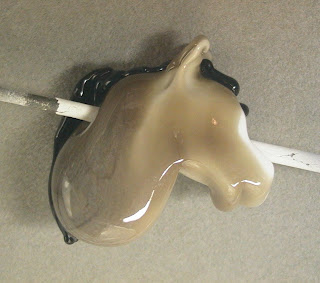
In contrast - this horse head, made with the Effetre 312 White Alabastro was easier to make, as the stiffer glass retained detail better.
It too was a clear core, and a layer of dichro with a thin encasing of White Alab. - and it too, does not show it at all. Meh.
I also had more trouble getting the enamel to stick to this glass. It has balled up and stood up on the surface more than I care for.
Marshmallow vs White Alabastro? I prefer the White Alabastro - but that is specifically for it's stiffness.
My intention is to etch both of these. I'll let you know how that works out.
Wednesday, October 07, 2009
Val Cox Frit - Raku Jitterbug
Raku Jitterbug - this is the frit that gets everyone hooked. It's unassumingly plain look - like a dish of cane sugar and sand - blossoms into a peacock range of colours. It's magic! It delights. It enchants. And after that - you go frit crazy - looking for the next hit with the stunning results. This is the crack cocaine of frits.
 The working notes say:
Opaque/Reactive. A complex glass frit which first appears dull, but from which the most intriquing shades of pink, violet, blue, and green can emerge. ... needs intense heat, then quick cooling - generally by marvering. (Hot head torches probably wont be hot enough ...). Use on any base, ... do not combine with silver foil. Use a neutral, hot flame.
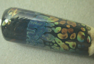
The first bead - is a black base on the left and an ivory base on the right. I fritted and super heated and then marvered - and it came up with the most beautiful bloom of blue/purple I have ever seen from this frit - or any of the Iris Orange frits (same category of frit - from other manufacturers). Firepolishing it, unfortunately, toned it down.
The black-charcoal grey around the frit spots is a reaction with the ivory - this glass is very reactive! It's actually not possible to see where the black base stops and the ivory base starts. The dramatic blues and purples do appear on both ends though.

Next up - on black, and again - very nice, strong reactions. Not so much of the deep blue, but definitely way cool.


Here it is on clear. Again - it lost colour when reheating to firepolish - but given that I can not stand chill marks ... . Maybe I should just blow on it?
This bead is quite striking in person. As you move it around - you see the frit from inside as well - a rich amber reflecting through from the other side of the bead. Makes a nice effect.

This cylinder is another half black, half ivory bead. This was marvered again after the firepolish. It got so hot and swirly that the frit has dragged out into long lines. Colour is good though.

This was a base of white, plus frit, encased, mashed. More frit, marvered, mashed, and then the black stringer, ridges and clear dots were added.
This frit is fun, and is one of the most popular frits around. The dramatic effects are rewarding - and it's fun to experiment with. This one is definitely a keeper!
 The working notes say:
Opaque/Reactive. A complex glass frit which first appears dull, but from which the most intriquing shades of pink, violet, blue, and green can emerge. ... needs intense heat, then quick cooling - generally by marvering. (Hot head torches probably wont be hot enough ...). Use on any base, ... do not combine with silver foil. Use a neutral, hot flame.
The first bead - is a black base on the left and an ivory base on the right. I fritted and super heated and then marvered - and it came up with the most beautiful bloom of blue/purple I have ever seen from this frit - or any of the Iris Orange frits (same category of frit - from other manufacturers). Firepolishing it, unfortunately, toned it down.
The black-charcoal grey around the frit spots is a reaction with the ivory - this glass is very reactive! It's actually not possible to see where the black base stops and the ivory base starts. The dramatic blues and purples do appear on both ends though.

Next up - on black, and again - very nice, strong reactions. Not so much of the deep blue, but definitely way cool.


Here it is on clear. Again - it lost colour when reheating to firepolish - but given that I can not stand chill marks ... . Maybe I should just blow on it?
This bead is quite striking in person. As you move it around - you see the frit from inside as well - a rich amber reflecting through from the other side of the bead. Makes a nice effect.

This cylinder is another half black, half ivory bead. This was marvered again after the firepolish. It got so hot and swirly that the frit has dragged out into long lines. Colour is good though.

This was a base of white, plus frit, encased, mashed. More frit, marvered, mashed, and then the black stringer, ridges and clear dots were added.
This frit is fun, and is one of the most popular frits around. The dramatic effects are rewarding - and it's fun to experiment with. This one is definitely a keeper!
Monday, October 05, 2009
Sorting and Displaying

Here's a cute idea for helping when sorting beads into sets - or for displaying at shows. The problem with spacers is that they lay on their sides, and don't display well. You can put them on rods or mandrels - but they can be a hassle to take off and inevitably - you'll need one from the middle.
These are trays I got from - where else? - the dollar store. They are ice cube trays - for making the skinny ice cubes that you can slide through the neck of a water bottle to chill your bottled water.
 They are a reasonable size for holding spacers, on their sides - without needing a rod through the middle. The white plastic shows them off well. Display them flat or on a slight angle.
And it sort of looks like an abacus. Not that you may necessarily consider that a plus - but there you go. ;-)
Sunday, October 04, 2009
CiM 788 Mink
CiM Mink - a translucent brown. Imagine my confusion when I misread th e label as "Mint"? What kind of deeply disturbed person thinks of "Mint" as brown? Maybe it goes green? Maybe it's Chocolate Mint? Maybe it changes colour like Alexandrite?

No - I just apparently can't read. S'alright - I can't read my handwriting either.
When built up into a solid, self-coloured spacer, it's quite dark - to retain the translucency, I would suggest working it over clear or white.

It's hard to say if it reacts with ivory, as the colour is dark enough to hide the colour of the reaction, but the edges of dots did go rather ragged.

It's a brown - guess I better make a horse bead!
The core of the bead is white, and the Mink goes on as a layer on top. From the back - you can see there is some white left showing for his blaze, and it is solid Mink at the back of his neck.
The shading from the translucency is quite nice. I like this a lot.

I don't use a lot of browns, but this is a nice one and works beautifully for the pony.
I did notice that, while it wasn't shocky to begin with, it became quite shocky after heating. Re-introducing it to the flame resulted in more shocking than usual.
 e label as "Mint"? What kind of deeply disturbed person thinks of "Mint" as brown? Maybe it goes green? Maybe it's Chocolate Mint? Maybe it changes colour like Alexandrite?
No - I just apparently can't read. S'alright - I can't read my handwriting either.
When built up into a solid, self-coloured spacer, it's quite dark - to retain the translucency, I would suggest working it over clear or white.

It's hard to say if it reacts with ivory, as the colour is dark enough to hide the colour of the reaction, but the edges of dots did go rather ragged.

It's a brown - guess I better make a horse bead!
The core of the bead is white, and the Mink goes on as a layer on top. From the back - you can see there is some white left showing for his blaze, and it is solid Mink at the back of his neck.
The shading from the translucency is quite nice. I like this a lot.

I don't use a lot of browns, but this is a nice one and works beautifully for the pony.
I did notice that, while it wasn't shocky to begin with, it became quite shocky after heating. Re-introducing it to the flame resulted in more shocking than usual.

Saturday, October 03, 2009
CiM 487 Poison Apple

CiM Poison Apple - a vibrant, sizzling green. Disappointingly, although it looks like a translucent colour - after kilning - it goes opaque.
(Paddle on the top - kiln annealed, rod on the bottom, not annealed.)

These are two self coloured spacers.

While these were encased, and seem to have retained a little of that translucency. In any case, they are very juicy looking.

The bead on the left is encased, rather messily, I'll admit, and the one on the right is a thin layer over clear.

On the left, a thin layer over white, and on the right, bicolour teamed up with Vetro Green Parrot.

And finally, with Ivory dots. No reaction.
I love the translucent glasses - so I'm disappointed that this loses it's transparency. It seems to stay a little darker and a little "juicier" in colour when encased.
Overall - a really nice, bright green.
Friday, October 02, 2009
CiM 586 Mermaid

Hot off the crucible - so to speak - a new colour from CiM and yes - it is a teal that does not duplicate any of the Effetre/Vetro colours. Mermaid falls between Dark Turquoise - being just a little greener, and not quite as green as Petroleum Green. (Click on the image to see the larger version - it's more obvious then).
 It does darken a little bit from the rod colour, and the rods that I have are a little thinner than usual. They have a nice shimmer that disappears with working - which I am now used to, but with every class - I always get students who are attracted to the shimmer of some of the rods and I have to break it to them that the glass doesn't retain that.
 Mermaid is streaky, which doesn't bother me at all - I like streaky glass.
It's crazy reactive with ivory. Look at that deep, dark web effect! The dots almost look like fried eggs!
 These spacers with Dk Turq and black dots and Ivory dots better illustrate the difference between the greener, tealier mermaid and the Dark Turquoise.
 It's really nice to see this hole in the colour palette filled in.
Here's one more gratuitous spacer shot, just because. ;-)

Thursday, October 01, 2009
Val Cox Frit - Lime Aventurine
 Sparkly green stuff. Green aventurine frit - but seems a little sparklier than stuff I have bought in the past.
The working notes say:
Opaque/Reactive - but the package says "Transparent." Deep, shimmering green with specks of goldstone ... encase or leave on the surface. Work in a neutral flame.
So the first thing I tried was dipping a gather in clear and winding off a bead. This resulted in a very pretty, sparkly green bead. A bit dark, mind you.

Next up, I tried it just on white - which was quite nice, and the green shows quite well - it's still really dark though in places.

Next I tried it on ivory - dark ivory - to see how reactive it is. Hoo boy - very reactive. The halo around the dot each dot of frit is as wide as the dot. Might look better on light ivory - but I think this is one of those reactions that is a little over the top, visually. If you manually placed (with tweezers) a few dots of frit - you might get an interesting effect - but for just rolling - too much reaction.

On clear, just rolled in the frit and melted in.

And a white core, and then clear, with frit on top. This gives a bright white background, but still with a layer of clear so that light can shine up through the frit. This resulted in the brightest appearance.

Intriqued by the package saying "transparent" and the notes saying "opaque" - I put the frit on black. It looks black - but you do still see some sparkle. Actually - I kind of like this for the subtle sparkle without the blotchiness of frit.
 This is a base of Effetre Pale Emerald - with a streak of Double Helix Triton, and reduced.
I thought the green on green might look more natural.
In fact - I think that is why I am not, generally speaking - a huge fan of frit. Blotchy and Patchy doesn't do it for me.

This is a Pale Emerald base, with White smeared on it, Silver Foil melted in, rolled in frit, encased in Pale Emerald, and mashed.

And finally - this is a base of clear, frit, encased in clear, heated and drooped, and then shaped, mashed and grooved.
The frit, being dark, holds up well to this sort of smearing and thinning.
Wednesday, September 30, 2009
Val Cox Frit - King's Robe

The working notes for this frit blend say:
Opaque/Transparent. Vibrant and dramatic, mix of purple, pink and violet ... . More fussy than other (blends) - but worth it. The opaque purple is multi-hued, but prone to devitrification, work the glass in a neutral flame and avoid excessive heating and cooling cycles as with marvering.
So - think Purple Rose or EDP.
The first bead was a gather of clear, dip, melt and wind off. It looked really boring going into the kiln, as it appeared almost clear, but came out as more of a black currant punch effect.

 These two happy little spacers are just white, rolled in the frit, melted in, and popped directly in the kiln, no additional heating, cooling, etc.
And this is a nice spacer in clear, and same thing, rolled in frit, melted in, and kilned without further ado. While not very remarkable by itself - I think a set of them would make up into a very nice necklace.
 And here on the right, we have the King's Robe frit on black, with a bit of swirling going on. A bit dark, but fairly handsome.
And finally, the same idea, but encased. Black base, frit, swirled, encased, mashed, and the encasing grooved for good measure.
Keep this on light colours I think.
Subscribe to:
Posts (Atom)