Wednesday, April 16, 2014

CiM 209 Alley Cat Again

I know I've reviewed Alley Cat (Alleycat? Allez cat!) before - it just surprises me with it's orange-ness.


A set of CiM Alley Cat with dots in Effetre 432 Medium Red - which, is an opaque - but doesn't look like an opaque here.


Monday, April 14, 2014

Comparison: CiM Reds

OK - time for a head to head comparison - these brilliant CiM transparent reds. They are yummy, yummy, yummy - but how different are they?


We're going to look at 4 reds: from the top, CiM  113 Rudolph, CiM 106 Firecracker, CiM 101 Marachino, CiM 111 Bing.

 And here is the other end of the same rods, in the same order. In real life, they are this similar too.

 Because they look diffent over clear, I tried them both way. The top is a clear cylinder, with stripes of (from the left), Rudolph, Firecracker, Marachino, Bing. And the con-joined bead on the bottom is the same order, from the left, Rudolph, Firecracker, Marachino, Bing.
  Close up, from the left, Rudolph, Firecracker, Marachino, Bing. The Marachino is slightly darker, the Bing appears to be slightly more orange. The firecracker looks slightly more streaky, but otherwise, the same colour as Rudolph.
 And again, a close up, over clear, from the left, Rudolph, Firecracker, Marachino, Bing.Functionally, no difference.
 And with a strong backlight - the Marachino bead is noticeably more opaque.


Damn. I just realized I left Radio Flyer out of this test. Poop.

All great reds - love 'em. Firecracker and Rudolph are pretty much interchangeable, I would say.

Saturday, April 12, 2014

CiM 113 Rudolph

had a very shiny nose ... here is that shiny, red nose.

CiM Rudolph, another bright happy red.

From the left - two self-coloured beads, and on the right, a clear core with Rudolph encasing.


The Rudolph also goes cloudy, and seems to opacify (is that a word?) more completely - but I can see "windows" of clear into it. The encased bead has stayed nicely clear though.

Another stunning shade of red. Starting to wonder how different these shades are, however.

Thursday, April 10, 2014

CiM 106 Firecracker

Speaking of firecrackers (last post was a wine glass and a firecracker), Firecracker is suddenly a HOT name in glass, with both a CiM Firecracker and an Effetre Firecracker landing on my bench last week. (The Effetre, I will get to later.)

The CiM Firecracker is a gorgeous, intense "power" red, a transparent that goes cloudy as you work it more. I have reviewed Firecracker in the past, but got different results, with it being slower to strike.

The top bead has solid ends, and a clear core, encased in Firecracker. 

The bottom row is two self coloured beads on the left, and a clear core encase in Firecracker on the right.


 Here are those two self-coloured beads. The first one made, on the left, is opaque, from the process of heating and cooling, and the next one is less opaque, it has been through fewer heating and cooling cycles.


Even with a clear core - some cloudiness has happened, due to keeping the other beads warm.

I started with two bead of solid Firecracker for the ends, and then in-filled with clear, and encased the clear with more firecracker. You can see the spiral of cloudiness from laying down the Firecracker and melting it in.


It's a super pretty, bright red, no traces of brown in it. If you don't mind the opacity - it's still a win!

Tuesday, April 08, 2014

Glass is so cool - slow motion glass + firecracker

But for all that ... it still doesn't break the goblet - just the stem ...


And that might have been a bad glass - do it again, I say!

Sunday, April 06, 2014

Soft Glass and Opals

You may have seen them yourself - floating in the middle of a marble - an opal.

Well - you know a thing or two about opals - it being your birthstone and all - and you know that a real, live, mined-out-of-the-ground opal would never survive the heat of being worked in glass - so ask - and it turns out to be a Gilson Created Opal - embedded in borosilicate glass.

And there it ended - because the word is that the Gilson Opal (artificial opal) is a close enough COE to the boro that you can include it.

Which would indicate that would not work in soft glass.

Well - that would be correct.


When I heard a rumor that you COULD put opals into soft glass - I was all over it like dog hair on a velvet couch.

But, sadly, the answer is, no, it's not compatible.

This is the remain of a marble and a bead. They blowed up good. 


I tried both the black opal and the white, in various sizes - even the utterly minuscule ones broke the glass. The shards of opal that fell back out of the glass retained their fire and brilliance (as you can see).

The original premise stands. Not compatible.

Sadness.

Friday, April 04, 2014

CiM 607 Vineyard

CiM Vineyard appears to be an opal - puts me in mind of "Eggplant."

It is a dark purple - mostly reads as opaque, but has a translucent quality to it.

From the left,  self-coloured, over clear, and self coloured. The rightmost bead (with less re-heating) - is quite a bit darker.


This rather handsome bead is a core of Vineyard, rolled silver foil and melted in, trailed with something that I'm not quite sure what it was - I thought it was ivory, but I may have picked up Desert Pink or Eff Petal Pink. Final step - encased in Zeus.


 And these I show just for the colour - the lids are made of Vineyard in both cases.

I am not happy with these - but it's not the fault of the glass. Please don't judge.


Wednesday, April 02, 2014

Comparison: Effetre 260 Light Pink; Eff 746 Petal Pink; Eff 261 Angel Pink

Side by side comparison - from the left, Effetre 260 Light Pink; Eff 746 Petal Pink; Eff 261 Angel Pink.

Petal Pink, in the centre, definitely lighter, and Light Pink and Angel Pink are similar, but Angel Pink is more variable.

Tuesday, April 01, 2014

What's on your pallet?

Do you have a glass palette? Or Pallet?

Dropped into Nortel Mfg last week. New glass shipment came in. Those are 22 lb bundles.

Mmmmm - ivory.


And more of it - not even undressed yet. 

There's some torchin' to be done!

Monday, March 31, 2014

Effetre 261 Angel Pink

Angel Pink is a pale rod that strikes up to a nice rose pink. It can be streaky - and it can also develop an odd grey blush.

On the face of it - it strikes quite nicely to a fairly rich pink. I didn't do anything particularly to strike these - and I have had trouble with this glass in the past, being hard, no, make that impossible, to strike. This, however, struck up nicely. 

The streakiness that you see on the right-most bead almost looks like a ribbon of transparent in the opaque - not particularly uncommon.


However, if you look at the bottom third of the middle bead in this picture - you can see a smokey, sooty looking patch.
 Here is the tail end of that patch.


 And again.


What the cause of this is, I don't know.

Overall - this is a pleasant shade of pink - but I would experiment with it before I committed to, say, a production run of pink-skinned angels - in case they came out with grey, smudgey cheeks. Now - if you were making little Victorian-era chimney sweeps and flower girls - it might be absolutely perfect - other than the whole complete-randomness factor. Or maybe you'd learn to control it?

Or pigs? With smudgy, muddy bits? Wilbur and Charlotte, anyone?

Saturday, March 29, 2014

Effetre 260 Light Pink

I mentioned using Eff 260 Light Pink the other day - and so you might want to see want it looks like.

Effetre Light Pink is a pale, dusty pink. In the photo here, it appears to be peachier than the rods - but that is an illusion - in life - it is pretty close to the unworked rod colour.

The two beads on the outside (not counting the transparent green marker bead - this is how I keep them identified after they come out of the kiln) are self-coloured. The middle bead is a core of Light Pink and has Ivory dots.

Light Pink is a good choice for all those angel and fairy beads. It is a nice, well-scrubbed, happy face colour.

Thursday, March 27, 2014

CiM 307: Cake Batter

This is a pale, pale greenish colour - the name "Cake Batter" baffles me - I must be missing something, as CiM is generally very clever with their colour names.

With the 3xx series number - we know that CiM intends this to be in the yellow series of colours - but not even looking at it  looking at it in different colours of light shifts the colour.

 You can see that the rod has changed colour with the heat - the tip is white, and the transition zone is more of a yellow - so it is possible that this colour is intended to strike to a yellow (which would be consistent with the name) - and I just didn't work it long enough, or at the right temperature.


From the left, two self coloured beads, and you can see a yellow dot on the middle one - which would be consistent with the striking theory. The third bead is a core of cake batter, dots of turquoise, and dots of cake batter on top. There is functionally no reaction between the two.


The rod does look "vanilla" when you are working it - but it cools naturally to a slight green. It would be worth trying to strike it to see if you can get a yellow out of it. Or possibly just work cooler than I do.  ;-)

Wednesday, March 26, 2014

Feet

Feet.

Hands and feet are hard. Ever notice how often they get hidden in drawings and paintings?

And with the sculptural stuff - I have a hard time boiling it down to the essence - simplifying. Because piling on the detail is what I do.

But, for sculptural flameworking - that just doesn't work.

So I've been doing the equivalent of "studies" - like an artist drawing hands, feet, and faces, over and over. Sketching in glass, so to speak.

Here are some feet that I don't hate.

Finally.


CiM 612 Frangipani

CiM Frangipani - a translucent, pale, misty pink. With the 6xx series number - we find that CiM considers it to be in the purple family, and calls "A very pale opal purple. Formerly Unique Crocus-2."

CiM has been re-naming it's Uniques as Limited Runs - which I think is a smart move. The original Crocus is a delight, definite purple - so yes, this totally deserved its own name.

I still don't see it as a purple, but there you go.

As an opal, it is translucent, and it is a very ethereal colour - getting more opaque the longer it is worked. All three of these beads are self-coloured, but the two on the left are more opacified as they have been heated and cooled more often. (I generally work from left to right on the mandrel - so that I don't block seeing what I am doing with the rod.)


 Same beads  - different colour background. Makes a difference, doesn't it?

It would be interesting to make something like a sculptural flower with this. In a very thin application, this might not read as well - but if you can pull it off - you might be able to make something with a very delicate, otherworldly look to it. Just have to find the right colours to go with it. Equally delicate colours.


Tuesday, March 25, 2014

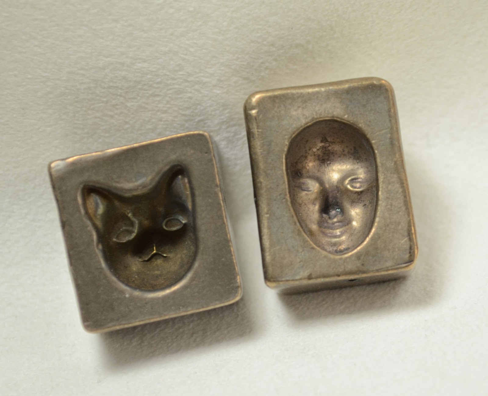
Push Molds: Burgard - Cat and Face


When I was down in Tucson - I picked up a couple of the old Burgard push molds. They were on the discontinued table of one of the big vendors. So far as I know - they are no longer being made. The backs of them are signed and dated, the cat is dated 1998 and the face is 1999.

These two are actually small enough for soft glass (most of the molds I see work better for boro and are huge). I'm sure many soft glass users are just baffled by them, however. "It's not a press and it doesn't have a mandrel slot."

I do want to give you a close look at these so you can see the scale of them, and understand that they are a concave mold - because the photos do that tricky thing where they seem to reverse themselves and appear to stand out, and then recede. 


 Go on - stare at those two faces - raised, inverted, raised, inverted.
 There - that makes it clear - it's a cavity.
 It's "Mc-Cavity - the mystery cat"
 This also makes the size of them clear too - the face mold is about an inch long for the entire mold - the face itself is 17 mm long and about 5 mm deep at the bridge of the nose. The cat is a little deeper.


 I just did a couple of quick ones to see how they worked - needed more glass here to fill up the ears. I just melted a gather of glass on the end of a rod and pushed it in. Make sure the mold is on the table by the way - it's going to get hot.
 Did a pick-up of frit on this gather first - and put the gather on the end of an old, bent mandrel.

If you don't firepolish the heck out of it - the detail is quite nice.

The picture is crap - but the faces came out quite nice - ready to be embellished or integrated into something else.

If nothing else, you could make some nice little cabochons with these.

If you see them languishing on a sale table somewhere - pick one or two up.

They are practically collector's items now!


Monday, March 24, 2014

CiM 410 Shrubbery

  HEAD KNIGHT:  The Knights Who Say Nee demand a sacrifice!
  ARTHUR:  Knights of Nee, we are but simple travelers who seek the
      enchanter who lives beyond these woods.
  HEAD KNIGHT:  Nee!  Nee!  Nee!  Nee!
  ARTHUR and PARTY:  Oh, ow!
  HEAD KNIGHT:  We shall say 'nee' again to you if you do not appease us.
  ARTHUR:  Well, what is it you want?
  HEAD KNIGHT:  We want... a shrubbery!
 If you now need to read the rest of the scene - I got it here. ;-)

CiM has delivered a Shrubbery - and in keeping with the criteria demanded by the Knights who say Nee, "looks nice and is not too expensive."


These are, from the left, two self-coloured and one with ivory dots. It's a little streaky, and the ivory has formed a nice line, which is, interestingly, not touching the ivory itself. Very tricksy.


Very shrubby. Nee. Nee. Nee.


Sunday, March 23, 2014

CiM 112: Radio Flyer

Hellooo Effetre. CiM really knows how to do red. Pay attention.

Here is another great red from CiM - Radio Flyer.

From the left - two self coloured beads - which functionally read as opaque, and on the far right, Radio Flyer over clear - which reads as a nice, bright transparent. Talk about having it all.

The third bead from the left is interesting. This is a core of Radio Flyer, with dots in Eff 260 Light Pink, and dots of Radio Flyer on top. I was expecting red dots that really pop - but there is something else going on in there. 


The dots seem to have separated and lifted or something. Here's a close up for more detail.


I only did two layers of dots, base, pink, radio flyer on top - but it looks like an extra layer in there - so I really don't know what is going on there.

But interesting, eh?

Now whether that is a property of Radio Flyer, or Eff Light Pink - I do not know.


Effetre 736 Honey Swirl


When I first reviewed Honey Swirl, I mentioned that I thought it looked like it was de-vitrifying when I worked it, but couldn't see any evidence of it once it was done.

Apparently  - it will devitrify, (lose the glossy look of glass and develop a chalky, matte look), it's all how you work it.

This little sculptural practice piece de-vit'ed like crazy.

The older, cooler areas are affected. the pieces worked last are not - so you would treat it the same as EDP - if you want it glossy - heat to glowing and let cool, and kiln without re-heating.