Moretti Super Clear. The very phrase is enough to get one all excited! And ai caramba - sight down the unmelted rod to check the true colour - and the light is white! Blinding.
Soooooo ... here it is. Wow. Sure is clear. Gosh. Lookit that clear bead. No colour whatsoever. I can tell. The massive quantity of bubbles are, in fact, showing up really well.
At least you can truly see the bubbles as bubbles. Here's another shot of the same bead - from the other side.
And here is a large-ish dichro lentil - encased with the same clear. Now really - like this - it doesn't look bad - and I was probably working a little cooler - which definitely helps. But there is still a lot of fog in there.
Good thing we don't have to count on Moretti/Effetre for our clear!
Or maybe we need to be more specific about the definition of clear. Not - "can see through it," - but "can't see anything in it." :-(
Monday, December 29, 2008
Friday, December 19, 2008
Vetro 917: Streaky Amber (Odd Lot)
Apparently - this was one of the first "Odd Lots" to come from Vetro - Odd Lots being limited production runs in marketing speak - and "oops" to the rest of us.
It is supposed to be streaky - but, as you can see, it didn't come out streaky for me.
Maybe with the rapid cooling of a mash, it might.
Wound into a spacer - it looks pretty much like a medium amber to me.
It certainly photographs beautifully!
It is supposed to be streaky - but, as you can see, it didn't come out streaky for me.
Maybe with the rapid cooling of a mash, it might.
Wound into a spacer - it looks pretty much like a medium amber to me.
It certainly photographs beautifully!
Vetro 956: Pink Dark Pastel (Odd Lot)
Thursday, December 18, 2008
CiM 656 - Black Current Unique
This is labeled Black Currant Unique - the "unique" identifying an "odd-lot" batch or single run colour. Usually - there is a -x number identifier - but I don't see one on this particular lot.
This is a very, very dark purple - almost black - and so rich in colourant - that you get some very interesting effects as the colour crawls and webs.
You can see - when the colour is stretched and thinned - you do get a very Black Current or berry juice colour.
The bead on the left is a self-solid, the one on the right, is Black Currant, white dots, and black current again. Notice how the dots have crawled and are unevenly coloured - giving them an almost inside out look.
This was superheated and worked very hot - to really give the Black Currant an opportunity to go crazy. See how it has webbed?
Again, Black Currant on white - and the edges of the dots are soft and fuzzy.
Pretty cool, eh? Wonder what else I can make it do?
CiM 563: Pulsar
Pulsar - Blue Pulsar - a very deep, intense, rich aqua.
Really, a lovely colour. Is it more intense than the Moretti or Vetro Dark aquas - dunno - I'll have to find some and try them side by side - I don't have any to hand.
The bubbles in the paddle are totally my fault - don't blame the glass for that!
Pulsar as a self-solid, and very thin - over white. It retains it's intensity very nicely.
This one was reduced - see the blush of red on the surface.
Overall - a really nice, rich, dark aqua colour.
Nyx: Reheated
Woohoo - lookie - it worked. The instructions for Nyx say that it will kiln strike, and repeated cycles in the kiln will intensify the colour. I've tried it in the past, and it has been my experience, that it doesn't change colour after going in the kiln. I've even tried running a rod through a full annealing cycle - came out as black as when it went it. Bah.
When these beads came out of the kiln as encased black, I was so frustrated, I tossed them back in and told them they could rot there until they changed colour.
The next time I unloaded the kiln - I had been trying new colours. What the heck are these? Oh, yeah - fat mandrel - the nyx! They did change colour! Wow!
So I tried running some of the rods through a full cycle. Woohoo - they changed too.
So I wonder what the heck I am doing different? It is my second batch of Nyx - so maybe it is a different lot? Whatever - I'm annealing the rods for a second time - to see if I get an even more different colour.
Woo hoo - I love glass. Everyday is an adventure!
Wednesday, December 17, 2008
CiM 864: Charcoal
You're going to want to label this - otherwise - you're going to get it mixed in with your black.
Not that, if you are making solid, self-coloured beads, you'd actually be able to tell the difference!
This is a very dark transparent grey, slightly streaky. You can see from this test paddle, I had to squish part of it with tweezers to get it thin enough to show that it is a transparent. (The thin part is 2.4 mm, the thicker part, by the rod, is 4 mm.)
It looks somewhat brownish when hot.
Here - a spacer made with the Charcoal - it looks black!
The two flanking spacers are both solid Charcoal - the one on the left was reduced, with no apparent effect.
The Charcoal on white shows it's true nature - when melted very thin, it show a very nice, pure grey, with no overtones of blue, purple, or anything else.
Closer examination shows that there has been some separation in the white, and that the Charcoal bleeds into the white.
Not what I'd call a hugely useful colour - as I am not a fan of grey (the whole point of glass is the colour!) - but it's very nice to know it's there if you want it!
CiM 667: Poi
Poi, named, I'm presuming, for the taro-root preparation, and not the Polynesian juggling. (Wikipedia - Poi) ;-)
A slightly streaky purple, that develops a brownish effect at the edges.
This effect shows strongly in this photo, although it's less obvious in real life.
These two beads show the streakiness - very nice.
The bead on the left is dotted with light sky blue, and the bead on the right is dotted with light ivory.
Notice the light sky blue has bled, but the ivory edges stay crisp.
This final bead was reduced, but it seems to have had no visible effect.
Another in the family of light, opaque lavendars. I'll have to put it beside some of the others to compare, again!
CiM 562 - Ming
You say "Ming" - and I tend to think of a pale green - but apparently - that's just me. Audi has been using "Ming Blue" for sometime.
And, quite frankly - if you were to show me a car this colour - I would probably stop at nothing to buy it. This is a truly beautiful colour.
This is a slightly translucent, bright, delirious, burning blue. It belongs more in the cobalt family than these initial pictures indicate - this is a shade of blue that the camera is just not happy about capturing - or the computer monitor is not so capable of rendering.
This is a little closer for accuracy - and you also start to see - a subtle crazing of the colour on the surface of the paddle (click on the image for the larger version for a closer look. Actually - this over-exposed version shows it better.)
Although this third pic looks dark - it is closer to the actual blueness of the blue.
And this spacer is Ming over clear.
And this final one is Ming over White.
This is a stunning shade of blue, and given that I am such a fan of blue, you can bet I'll be getting this one in quantity.
I also want to play around and see if this "crazing" can take me somewhere.
CiM 765 Chai
Resembling nothing quite so much as unshaped Barbie limbs - this new light coffee or extremely-milky-tea coloured CiM Chai looks promising as a nice fleshy colour for making angels, goddesses, and other assorted human-ish like figures.
In fact - from this set of 3 spacers - it appears that the colour gets a little darker and richer with heat - as the third went into the kiln without any re-heating, and is slightly paler than the others.
However - a caution. This glass - uncharacteristic of CiM - I might add - is UBER-SHOCKY. The slenderest of the rods (and that they are rods of different diameters in the pack is also uncharacteristic of CiM) - I did manage to make these beads from that. The rest - well - two of them turned themselves into frit. You can see from this photo - the end of the rod is blown off - not melted. I did toss them into the kiln after that to anneal them again - I'll have another go with them - see if it get's any better.
I suspect it is just part of the batch (Like the Desert Pink - CiM 957 - which is proving to have some rods that are extremely shocky and others that are fine.) - as opposed to all of it. It's just darn hard to get a gather going when the glass keeps blowing up!
This final bead is made with Dark Turquoise on Chai - and you can see there is a little bit of a reaction - not much, around the Dark Turquoise. The Dark Turquoise also appears to be floating on top of the Chai, instead of sinking in - that's sort of interesting.
This colour has real potential for a flesh colour - if it will just stop exploding. ;-)
UPDATE: Annealing the rods helped a lot - they became workable after annealing. Not shock-proof - but definitely more workable.
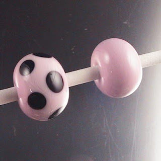
Vetro 932 Fish Pink is Salmon Grey
You know, it's sad. I keep holding out hope that I will somehow find a way to coax a pretty colour out of this glass - something that lives up to it's name. But what I seem to keep getting is mud. Wide, tidal-flats expanses of mud.
I tested two batches of this - one is distinctly grey - the other looks sort of translucent and pinky - but after working and annealing - they both come out looking like this. Bleh. (The bead on the right is the pinkier batch.)
There is a little hint of pink in it - but not so much that you could call it pink.
With these two spacers - the top one was made in a very oxidizing flame, and the bottom one in a very reducing flame. Notice that it has essentially gone charcoal coloured.
Now, here - with this wave bead - the obvious streak of pink in the middle of the wave - I added that with another colour of glass - that is actual pink glass.
But, if you examine it closely - you can see some blushes of pink in the main, core bead. Did I add that at the same time at the other stripe of pink? Possibly. But still - there's that sort of pinkish cast in the first pair of beads. Is this a striker that I just can't strike? Am I working it too hot?
Should I give up and move on? Is there a reason why this is called "fish pink?" Or should I just dub it "Salmon Grey" and get on with my life? ;-)
Monday, December 01, 2008
Vetro 236 - Equivalent to Moretti 236?
Yep - Vetro 236 is equivalent to the Moretti/Effetre 236 - Dark Turquoise. It reacts with Ivory to produce those lovely, dark lines, exactly the same way!
In the 2nd pic, these two beads are dotted with the Mor. "Curdled Ivory" (Dark Ivory).
In this 3rd pic, the bead on the left is dotted with Vetro Light Ivory, and the bead on the right is dotted with Vetro Dark Ivory.
This bicone is also made with Vetro 236 Dark Turq. - and the design is Vetro Dark Ivory.
The final pic is the beads cleaned and soaked in CLR to remove the dull grey metallic sheen that happens in the kiln (slight reduction) - to restore them to their lovely turquoise colour.
Double Helix - Aether - the joke's on me.
Damn - I could NOT get this glass to do anything - I struck it, I reduced it, I tried it on black - nada. Nothing. Zip-ola.
So I emailed Grace Edwards - where I generally get my Double Helix - What is this new colour "Aether" supposed to do?
Her response was:
And here's what Double Helix has to say about it:
Well - I can say with all confidence - it is clear, and it doesn't scum, boil, reduce, streak, burn or otherwise suffer from abuse - because I did everything to it to try and get it to change colour.
If and when I get some more - I'll let you know how it is for encasing!
The name, Aether, also "Ether," means "Air." Another clue. Ha!
So I emailed Grace Edwards - where I generally get my Double Helix - What is this new colour "Aether" supposed to do?
Her response was:
omg - I was sure I included the instructions with the sample. It is clear - the new clear from DH and it's so fabulous.
And here's what Double Helix has to say about it:
Aether is a colorless encasing glass designed for superb workability and enhancement of Double Helix colors, engineered to be resistant to boiling, free from seed bubbles, and handled with the utmost care to ensure freedom from scratches and dust. In other words, it is our "clear."
Well - I can say with all confidence - it is clear, and it doesn't scum, boil, reduce, streak, burn or otherwise suffer from abuse - because I did everything to it to try and get it to change colour.
If and when I get some more - I'll let you know how it is for encasing!
The name, Aether, also "Ether," means "Air." Another clue. Ha!
Subscribe to:
Posts (Atom)