Pages

Friday, September 29, 2017

Dichro on Color Glass - from Riley Designs

Once upon a time, I got my hands on some dichroic glass that was on coloured glass, instead of just clear or black. I loved it, but sadly - soon it was all gone.


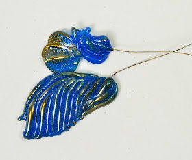
But now - Riley Dichro has made some  - and it is gorgeous! 


 Now, some people have said to me - what is the point? You can just make a bead in whatever colour and then put the dichro on clear on top. Well - yes - but it doesn't look the same. For one thing, there is a layer of clear in between. Or you put the colour on top, but that changes the dichro. Or you flip the dichro over, but that gives you a clear on the outside. It means bigger, more layers, less intensity. And completely eliminates some shapes because of having to build the layers and the encasing.

Oh, just try it and see what I mean.


Wednesday, September 27, 2017

Double Helix Thallo - Eye Candy

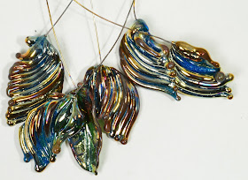
Just some eye candy. Off mandrel pendants made with Double Helix Thallo, reduced more or less.


Monday, September 25, 2017

Double Helix Keto revisited

Remember that I was somewhat disappointed with the Keto when it came out of the kiln? Well - yes, once again it was the result of my kiln "eating" the reduction.

Because this is what they looked like when I tried it again with the kiln at BeadFX.


 For comparison - the two on the left were annealed in my studio kiln, and the rest in the BeadFX studio kiln.

I'm going to try fiddling with the temperature I have my kiln set at. This is ridiculous.

Anyway - the Keto really is stunning, isn't it?

Accidentally snapped one, but you can see the inside - the colour is still the same, right down to the white speckles.  The reduction is sitting on the surface.


 The Double Helix site shows Keto reduced and encased, so I thought I would try that too.  
A spacer, encased in Zephyr. 


And a focal, Keto, reduced, encased with Zephyr, and the encasing textured with a blade. 


Saturday, September 23, 2017

CiM 626 Enchanted


CiM Enchanted is a colour shifter - a colour known as Alexandrite (after the stone) for those of you who are used to buying commercially-made beads like Czech Firepolish and Swarovski crystal. Enchanted was made to replace CiM Jellyfish - another colour-shifter, or to be like the Effetre 081. I don't have either lying around reliably labeled at the moment, so I can't speak to that.


I can say, however, that it has a definite colour-shift - depending on the lighting. IMHO - it is most beautiful in sunlight. Check out the videos to see the effect.

Just wandering around my studio - from the photography area - over to my desk, from expensive highly tuned compact fluorescents to LEDs to whatever.


And to outdoors in the sunlight - which I think is the loveliest.


I did see some scumming/small bubbles, but as I worked further down the rod, it seemed to be less of a problem, but you can see the results here.


Thursday, September 21, 2017

CiM 217 Harvest

CiM 217 Harvest is a streaky orange that goes grey when hot like most of the coral colours do.  It cools back down to orange, but is quite streaky and variable in colour.

Your mileage may vary - as you can see from the link to the other testers, they find it to be an even and consistent colour - so you need to remember that we all have our own variables and our own way of working. If you don't get the same results as someone else - it doesn't mean there is something wrong with you! 


Below, for comparison, we have Harvest on the left, waves and rod, wave and rod of Monarch in the centre, and mermaid tail and rod of Creamsicle on the right. With the strong studio lighting - Monarch and Creamsicle appear closer in colour than they are in real life.


Harvest is a nice organic orange, not a fluorescent or bright neon orange, and good for fruit and pumpkins and flowers, I think.

Tuesday, September 19, 2017

CiM 825 Spooky

CiM Spooky was  - according to the folks at Creation is Messy - an attempt to make an Amber Opal. They were disappointed to have the batch come out white, like Cirrus. According to the other testers - it is a lovely white.

However, what I got was ... well - more like an Amber Opal.

I started with two beads - self-coloured spacers, and I was working hot - on the big torch (Mid-range). Right away, I noticed streaks and trails of colour - but at that temperature, I wasn't sure what was going on, or if I had just burned the glass.

I switched to the Mega, and made my wave on a wire. It showed zero signs of streaks or color, and went into the kiln almost water clear. It was lovely. 


For comparison, I did a mermaid tail on wire in Cirrus - on the right in the photo above. 

Same glass - on a grey background to show it off better - Spooky on the left, Cirrus on the right.

I'm thinking it struck in the kiln. The leading edge of the wave always gets more heat, and there is more colour concentrated there, but there was no hint of colour when I kilned it. Maybe I just worked hotter than the other testers, and possibly my kiln runs hotter (maybe that's why I keep losing the metallic reduction on glasses like Thallo and Keto in my kiln?)

So - the Amber is in there - you just have to figure out how to coax it out of there.

Sunday, September 17, 2017

CiM 462 Chrysalis


CiM Chrysalis is a translucent seafoam/amazonite colour - although lighter than CiM Seafoam, like that odd batch of Effetre Light Turquoise that looks green - but then works up to be the right color when you heat it. It is lighter than the Kryptonite too.

The goal was for Chrysalis to be an opaque version of Kryptonite, in fact, and while it is more opaque - it is lighter in saturation and hue too.

It gets quite a bit lighter too went worked, and goes more opaque. It's not as translucent as the opals (i.e. Kryptonite), and mostly - it will function as an opaque if it is used, say, as the base of a bead. But if you use it thin, or so that light can shine through it, like a thin leaf or wing - then you can see the light shining through. So I'm not sure how it will fair as, say, small dots on a strongly coloured background. You might need to back it with white then.

This photo show Chrysalis at the top, and Kryptonite below. 

Friday, September 15, 2017

CiM 216 Monarch

CiM Monarch - named for the butterfly (presumably) - is a streaky, variable orange that is perfect for autumn. It is a little less saturated in hue and so not so much the tropical mango orange - more of a natural colour. 

 You can see from the end of the rod - that it changes a bit as it heats, and the over all effect is of streaky variability, which, of course, I like.
 For comparison, on the left is Monarch, and on the right is Creamsicle - which is a brighter, more orangey orange. If it is close to any other colour - I would say that it is more like Effetre 408 - the confusingly named Medium Lemon Yellow.

Wednesday, September 13, 2017

CiM 553 Poolside

CiM Poolside is like a refreshing splash of water, a like tropical aqua that is a little on the green size of true aqua, but not as dark as CiM Agean.

It does get pale when it gets thin.

This is from a different angle, with the lighting set up differently. However you shoot it - it is a super pretty colour and I think it will become rapidly very popular. I see it paired with pink or orange for super pretty or very tropical sets - the sorts of things of which I am completely incapable of making ... . ;-)

Monday, September 11, 2017

CiM 461 Jelly Bean

CiM Jelly Bean - a juicy, juicy green and another exciting addition to the soft glass colour palette!

But - the first thing that comes to mind is ... is this different from the CiM Chartreuse that came out with the last round of new colours?


 Well - yes - if you put them side by side, you can tell them apart - the middle segment here is Chartreuse and the outer segments are Jelly Bean. The Chartreuse is slightly more opaque, and slightly more yellow.
 But just hanging around randomly - I doubt most people will be able to tell the difference. Here, the piece on the left is Jelly Bean, and the leaf on the right is Chartreuse.

This is just Jelly Bean - with a lot of light. Neon is not dead yet. Any way - if you have a production line using Chartreuse - the Jelly Bean will probably make a totally adequate substitution. It is only marginally more blue than the Chartreuse and no where close to the much bluer Inchworm.


Unworked rods - Chartreuse on the left, Jelly Bean on the right.

Listen, I LOVE Chartreuse, and everyone I've showed it too, loves it too. Jelly Bean - just as good IMHO.

Saturday, September 09, 2017

CiM 926 Bone

Is CiM Bone the holy grail of non-reactive cream colours. Well - maybe, but there's a catch.


On close examination - this bead is CiM Bone on the outer two segments, and Effetre Light Ivory on the middle segment, with dots of Effetre Turquoise, and a dot of the base colour (Bone or Ivory) on top. Certainly - they is little in the way of classic sulfur/copper reaction. However, and this is a big however - it is quite difficult to stop this glass from smoking up.
From another angle - the middle section shows a warmish yellow tone, and strong reaction - but the outer sections show no reaction, but a random sooty appearance. 

Of these two in CiM Bone, the top one was deliberately reduced, making a warmer, more antiqued looking piece.
 And from this angle too - the lower piece, worked carefully with a lot of oxygen in the flame (just a little scorch at the base) is a very neutral colour - and the top piece, deliberately reduced - is warmer and more variable.


This glass will open doors for those looking for a non-reactive neutral cream color, I think, but will challenge a lot of people with it's tendency to change colour in a less than fully oxygenated flame. Some folks gonna love it - some gonna hate it.

Thursday, September 07, 2017

CiM 552 Tardis vs DH Keto

Weirdly - both of these colours landed on my workbench in the same week.

Double Helix Keto, and CiM 552 Tardis - which are very, very similar shades of blue.

The DK Keto has a speckle, and reduces, and the CiM Tardis is a translucent, but side by side - I mean - just look at them ... Keto on the left ...
 and again - Keto on the right.

Wild, huh?

Cheers!

Tuesday, September 05, 2017

CiM 552 Tardis

I've been super excited to see this colour since I first saw the name on the list of new colours coming out. Weirdly - when I expressed this enthusiasm to friends, I discovered that they had no idea what colour that would be.

 For those of you who have been living under a rock for the last 50+ years - the TARDIS is the time machine from Doctor Who - which is the longest running sci-fi series in the history of television, and has been going since before the series was in colour - so you seriously have to be out of the loop to have not heard of this.

Anyway - I think I was expecting a somewhat brighter blue than this slightly translucent and rich smokey blue. Is it like any other soft glass colour - well no, and sort of.

I do think that it is a very, very nice colour - a little more into the black than Electric Avenue. Richer than most of the sapphires. More translucent than the lapis analogues.

Here is it, posed on my TARDIS themed merchandise notebook. The colour is that of the British Police call box - which is not a phone box, btw. 


Is there another colour that is similar? Spoilers - sweetie - wait for the next post please!
In the mean time - a big thumbs up from me on this for pop-culture insider reference and bluuuuuue.

Sunday, September 03, 2017

Double Helix Keto


Keto is a new speckled lustre from Double Helix. In addition to reducing, these colours are often fun to use unreduced, as they actually retain their speckling after working.

It is a little reminiscent of that old blue enamel ware that you might remember from camping trips as a kid! 

Sigh. I shot these outside in the sun to show the lovely colour, then used both rods. Then I discovered that the photo was out of focus (the focus on the driveway is perfect!) - and so I have no clear photo of the unworked rods.

This whole one-handed phone photo thing has me baffled. The phone can take decent photos - but hanging on to the edges so as to not accidentally send it into some other mode - that makes me crazy.


I am a little disappointed with the results of the reduction - these went into the kiln far more metallic than they came out - so I think we have the situation again (like the DH Thallo) where my kiln is "eating" the reduction. I'll get some more and compare to the BeadFX studio environment and see what I get.


 But, in any case - the blue is pretty and the speckles are pretty, so I'd say it's a keeper.

Double Helix shows their sample encased for more of an overall lustre effect, so that would be worth trying too.