Pages

Sunday, November 27, 2016

CiM 309 Chamomile

 Well - here's some more for my "Dead Leaf" series - and I don't mean that in a disparaging way - I actually am working on a Dead Leaf thing - anyway - this is CiM Chamomile. You can see at CiM's site that other folks got different results, but, of course, they are not working the glass the same way.

Just as an aside - I hate this thing where everybody goes on about the plant Camomile (Chamomile - both spellings accepted) as if it were the most soothing, relaxing healthy thing ever. Camomile is a member of the Ragweed family, and if you have a horrendous ragweed allergy, you really want to avoid camomile. The plant, not the glass.Ok, rant ended.

Atypically for CiM - this is a layered glass - which is starting to be a thing that I look for in a glass - as I know I will get more interesting results.


Because once you start dragging the glass around, you get much more interesting results, like this:

 Or, same piece, backlit.
 Side lighting. Almost looks like there is some black in there ...

Aren't these grand?  Do these just not scream - "Hey - look at this cool dead leaf?"

Friday, November 25, 2016

Comparison Vetro 977 Parrot and Effetre 620 Pastel Kiwi and Effetre 620 Transparent Kiwi

Recently - I have been discussing the yellow-green hole in the soft-glass colour palette and the place occupied in it by the late, lamented Vetrofond's 976 Key Lime.

I thought I would see if there was anything similar to the also long-gone Vetro 977 Parrot.

Like the Key Lime - Parrot is (was) a layered rod. The piece I found actually had a label on it, so I could positively ID it. 


The only thing I could find that was even remotely similar was Effetre's 620 Pastel Kiwi.

But to confuse things, there is also an Effetre 620 Kiwi - without the pastel, that looks different, but I was told on strong authority (not good, just strong) - that the Pastel Kiwi and the Kiwi (Transparent) were the same.

Hogwash I said, and hogwash it is.

Here we have, from the front, with their matching beads - Vetro 977 Parrot, Eff 620 Pastel Kiwi, and Eff 620 Kiwi.

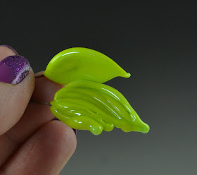
Here we have a leaf and a wave, in Parrot. If this is parrot - maybe that wave is a feather?

This is a wave made from Pastel Kiwi.
And this is a wave made from Kiwi (Transparent.)
That's dark - let's look at it back lit. Now that is wonderful! How juicy is that? This really looks like Kiwi - seeds and all!


Here we have the two rods of kiwi - also with layers.


And finally - for comparison - the leaf in the background is Vet 977 Parrot, and the broken leaf in the foreground is Vet 976 Key Lime. The Parrot is a little more to the green than the Key Lime. (The Key Lime leaf, btw, is broken because I dropped it and stepped on it beside the car, not because of any inherent flaw in the glass.)

Still a big hole in the yellow-green portion of the glass spectrum!

Wednesday, November 23, 2016

CiM 313 Painted Hills

Could it be - could it possibly be - the holy grail of glass (well - one of the holy grails) - a non-reactive ivory?

CiM themselves call it a soft, opaque yellow - and, quite frankly, before I declare this to be the winner in this year's glass of the year award, I'm going to want to try more than one single rod.

Garcon - bring me a pound, svp.

This glass is very soft when hot, like a white. Goes clear, then white as it cools, then the ivory comes in after. 

Here we have, left to right, self coloured Painted Hills, actual Effetre ivory, with turquoise dots, and Painted Hills, with the same turquoise dots. 

 Look ma - no reactive line around the dots!

Don't get me wrong - I love that reaction between ivory and the copper glasses - but even I can admit that there are times when you want it to not happen.

The end of the worked rod. 

And one of my waves - showing the colour variation. 


Is this a substitute for effetre Ivory. Possibly not. Are my results anomalous? Maybe. But it bears further investigation. This might be the non-reactive-ivory you have been looking for.


You will note that from reading the CiM page on Painted Hills, other testers got quite different results. I try not to  find out what the colour is supposed to do before I use it. Sometimes - the results are hilarious - other times, interesting.

Hilarious - like the time I tested "Aether." Could not get it to do anything. Didn't realize that it was a clear. ;-)

Monday, November 21, 2016

Comparison: Vetro 976 Key Lime, CiM 333 Sunshine Unique, Bullseye 0220 Sunflower Yellow Opalescent, Effetre 411 Apple Blush

I wrote about Vetro 976 Key Lime a while back, and it got me to thinking - there really is no other colour like it in the glass palette.

It really is a green, but when you put it next to a green - it looks yellow - that's how close to the edge of not being green it is. Next to a yellow - it looks green. I decided to try two really acidic yellows, as it was the closest I could find, wondering if maybe they would come close after heating.

But the verdict is, as yellowish as it is - it is still a green - and there is no other colour in the glass palette that I have access to that is the same.

I tried an old, old batch of a CiM Unique Sunshine (CiM 333) - so old it was before they started adding - 01 to the numbering, and now they don't use the term unique at all ... I even tried Bullseye 0220 Sunflower - which is an excellent match to the CiM Sunshine, btw; and I tried Effetre 411 Apple Blush, which I knew was going to be a swing and a miss. 

I think perhaps that one of the things that makes it different is that it appears to be made up of layers. It is a little streaky when worked, and you sometimes see the end of the heated rod is a transparent green - so the reason that it is unique might be that is a combination of transparent green and yellow. It is a much better blending than some of the colours - which are designed to look like streaky combos (which I love, btw), and this one just has minor colour streaks. 

 This conjoined bead is Key Lime on the Left and CiM Sunshine on the right. In real life, the key lime does look green - I don't know what your screen does to this picture.

Same bead - shot under different lighting. You can see the greenish tone on the left a little better. Maybe.

 When hot - the Key Lime is quite different. (Key Lime on the left).


 Here are the rods, laid out. From the back, Sunshine, Key Lime, Sunflower, Apple Blush.


First up - the CiM Sunshine. It's a bright, sunny colour - stays true to the rod, easy to work. 


 CiM Sunshine Unique


 Next up - Vetro Key Lime. There is just something about this colour - I'm not usually drawn to yellow greens - but this one is soooo punchy.


Here is the Bullseye Sunflower. You can see there is a bleached out (!) part where it went a little whiteish. Maybe too much heat there? 

But stays true to the rod colour. 

And finally - the Effetre Apple Blush. This colour is well named, like a green apple gets it's first streaks of ripeness - it is a yellow green with blushes of a light peachy colour.  It tends to vary a lot, this glass - some rods blush more than others, and some of them are so shocky they are "frit on a stick."


 Here - you can see them all together, from the left, Apple Blush, Sunflower, Key Lime, Sunshine.


While these photos may look like the difference is subtle - Key Lime is a definite green. Here I was hunting through all the colours at Nortel - the Key Lime leaf is laying on a pack of CiM Poison Apple, with the CiM Sunshine in the background.

Hmm - the quickie shot with my phone in bad lighting is a better representation of the colour than my expensive studio lights. Maybe I need to replace those!

Saturday, November 19, 2016

Holy ... Fishes.


Fish-Vittorio Costantini

Check out this Pinterest board by Mike Frantz - a collection of glass sea creatures by Vittorio Constantini.


Mike's Fishes


Oh.my.gawd.


They actually appear to be for sale too - if you click through on them.  Which could make them the ultimate gift for a fishing friend.

Wow.

Thursday, November 17, 2016

Effetre Opal Yellow and Lauscha 686 Comparison

Side by side, on the left, the Effetre Opal Yellow, on the right, the Lauscha 686. Similar hue, with more variation and a lighter overall appearance from the Opal Yellow. But certainly colours that will work well together as shades.


Tuesday, November 15, 2016

Lauscha 686

While I seem to be experimenting with dead leaf colours these days - I thought I would dig out some of my Lauscha that has been hanging around for a very long time.

You can see - I got some significant colour variation.

Unfortunately - I can't really point you to where to get this. I think I got it from glassdaddy.com, but they don't have anything like it on their site now.

I don't think it is caramello - you can see that the rod is a very dark brown. While working it - it goes transparent and translucent - it's truly stunning - and doesn't go back to solid opaque until it has been in the kiln for a little while. Sadly - it doesn't retain it's translucency.


These three developed some really interesting pink blush - but what about these was different, I'm not sure. The one on the far right got some significant heat and not a lot of reheating - so that might be the key - the amount of heat that it gets. 


I did switch to a more reducing flame than usual (like I did with the opal yellow) - but I can't see that has made the difference, or any difference.

Sunday, November 13, 2016

Effetre Opal Yellow

I think I mentioned something in passing the other day about Opal Yellow and getting some interesting results.

This is a series of piece worked in only Opal Yellow. That's the only glass here. I worked them in a slightly reducing flame, just a softer and bushier flame than I usually use, but by no means extreme.

The results are, however, pretty awesome!


Friday, November 11, 2016

Comparison: Ivory colours

Sigh. The perfect ivory. What do you want from your ivory?

I like variation, rich, interesting colour. Interesting patterns. Dark or light? I like them both - for different applications. 

I like the reactivity.

Ivory is one of my favourites. If I had to choose only a few colours, it would be ivory, black, cobalt and turquoise. I can go a long way with just those four.

Anyway - from the left, in this rather finial shape of conjoined beads, we have
Effetry 754 Ivoryish, Eff 285 Sandstone, Eff 259 Sand, and just for fun, Eff 266 Opal Yellow.


 The Ivoryish and the Sandstone - the cold rods look virtually identical in colour, but the ivoryish shows black in cross section - hinting at the streakiness to come.

Sand is a little darker. And Opal Yellow is yellowish and streaky. It's actually pretty cool, by itself. I'm not sure I've ever used it by itself, mostly just for the way you use it with other glasses!

I was so taken with the sandstone that I made another finial thingy. Love that crackle! 

This is scrumptious. Must.stock.up.