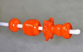
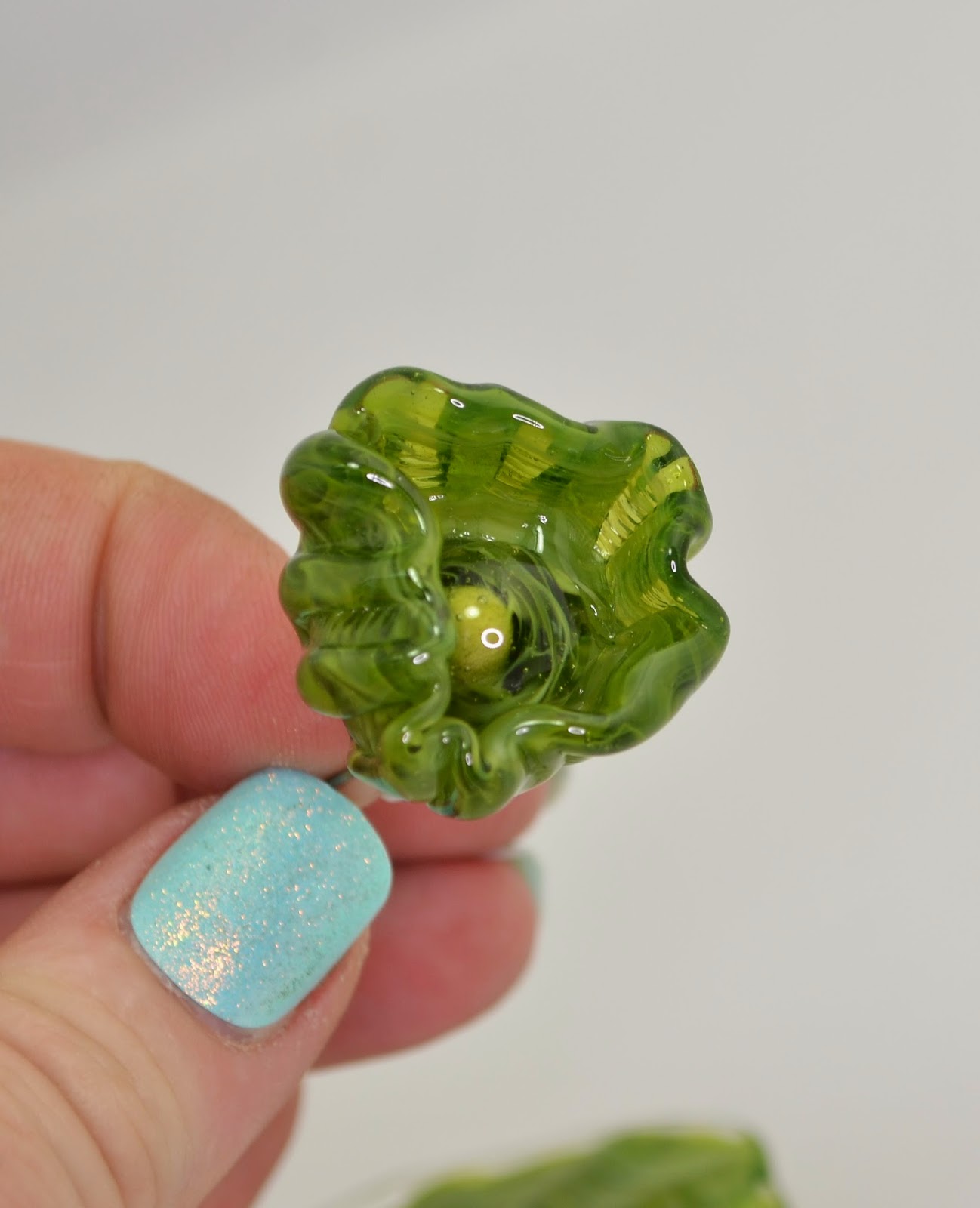
For ease of comparison, here is Effetre's Dark Zucca (foreground) shown with CiMs Tiger Lily.
The finished beads are virtually identical, but the unworked rods are quite distinct. Both seem to have a slight transparency in areas that have not been heated and cooled multiple times, which adds to the juiciness of the colour.
Barring unforseen reactions - I'd say these two colours can substitute for each other.
Pages
▼
Sunday, November 30, 2014
Saturday, November 29, 2014
CiM 212 Tiger Lily
For contrast with Effetre's Dark Zucca - CiM's new Tiger Lily is almost the exact same colour, but the colour of the unworked rod is much truer to the end result - making this glass more "WYSIWYG."
Again - it is a super juicy intense orange that orange-lovers will love.
Again - it is a super juicy intense orange that orange-lovers will love.
Wednesday, November 26, 2014
Effetre 426 Dark Zucca
Effetre's new Dark Zucca is a dark orange that gets, like most of Effetre's yellow/orange/red palette, gets darker when worked.
The colour itself is juicy orange with dark orange overtones, quite a bit darker than the unworked rod.
If you love orange - you will swoon over this. As with other Effetre oranges, I suggest stocking up, as their "hot" palette of colours has significant variability from batch to batch, and there is much wandering the aisle of glass shoppes, with tiny stubbs of rod ends, wailing and gnashing of teeth - "It's different now ... I loved that colour ... ."
Monday, November 24, 2014
Dragon Eye Cabochons - Frit
I use twisties a lot for the iris pattern of my Dragoneyes - but frit works just as well. I was taking a little trip through the packages of GOK frit that I have accumulated over the years. (GOK = God Only Knows.) When you first start lampworking - you tend to buy frits, not realizing how long they are going to last you. Years later - you still have them.
Knowing a bit more than I did when I acquired them, I even got some better results than in the past.
This was "Iris Blue Transparent" - an 104 COE frit with a product code of 346145-1 - over a base of ivory.
This was another 104 frit called "Copper Ruby," on ivory, with a product code of 346015-1.
This pair of very lizardy eyes are a Kugler frit - K-215 "Gold Brown" in size 00. I really like this finer grain of frit. Again, on ivory.
The top one is "Magic" (not Dark Magic) - on ivory, reduced and then unreduced, because I didn't like it. It went surprisingly pale under the encasing. The bottom two are Kugler Iris Gold (K-218) - size #1 - quite a bit larger than the #00.
All of these were labeled as reducing frits, but I didn't reduce them (except the one I then unreduced.) They were all layered over ivory, which has mostly reacted strongly with them to create interesting colours and to turn the ivory between the frit chunks a dark grey - almost black.
I particularly like the Kugler Gold Brown ones - not because they are a "pretty" colour (the Iris Blue Transparent was prettier) but because they are almost creepily convincing.
And when it comes to rendering dragon body parts - pretty doesn't really fit the mandate. ;-)
Saturday, November 22, 2014
Effetre 724 Buffy
 You have to try this, I was told.
The packet of glass was labelled "Buffy."
I have a dog named Buffy, you see. Although she is not this colour. She is mostly inky black with a sprinkling of sand in her fur and tan points.
However, the name was amusing. ;-)
When working it - it appears to get a layer of transparent topaz on the top.
In a spacer bead - this cools to a variable streakiness.
It appears to react nicely with silver - this has some trails of some random dark high silver glass on it - you can see the reaction at the sides of the marks, but I noticed someone else trying it with silver wire and getting a nice reaction - so definitely experiment with that.
It's variability serves it well in rapid cooling situations, i.e. in brass presses and molds, see the three faces in the top left.
Oh, and because you asked - this is the real Buffy.
Wednesday, November 19, 2014
Monday, November 17, 2014
Effetre Ebony & Ivory - new batch.
Boo hiss. Instead of being gorgeously, deliciously streaky and marbley like the last time I used it - this version is very, very, very shocky - and not very streaky.
OK - maybe I'm being unfair - because it is a pretty interesting ivory, ...
But the last time I used it - it looked like this. So, harrumph. Hope I stockpiled the old one.
Oh, and did I say shocky? Frit on a stick.
OK - maybe I'm being unfair - because it is a pretty interesting ivory, ...
But the last time I used it - it looked like this. So, harrumph. Hope I stockpiled the old one.
Oh, and did I say shocky? Frit on a stick.
Friday, November 14, 2014
No 4 in a 3-part Micro-Series
I've always wanted to say that - this is number four in a 3-part series.
BTW - I will be at the BeadFX studio tomorrow (Saturday, Nov 15), demonstrating lampworking - drop by if you are in the neighbourhood!
BTW - I will be at the BeadFX studio tomorrow (Saturday, Nov 15), demonstrating lampworking - drop by if you are in the neighbourhood!
Monday, November 03, 2014
Effetre 620 Kiwi
Last time I reviewed Effetre 620 Kiwi was in 2008. You can see - it is a layered cane.
This is a new batch, and it appears pretty similar, but slightly less dense, slightly less streaky, and perhaps a little more acidic in colour.
On the left, a "bit" made with Kiwi and some clear. On the right made with clear and a rod of what I believe is the old kiwi.
If I was absolutely certain that this was the old Kiwi, I would be less wishy-washy, but I'm going on looks, and not labels.
This is a new batch, and it appears pretty similar, but slightly less dense, slightly less streaky, and perhaps a little more acidic in colour.
Above, from left to right, self-coloured, over clear, and over white.
On the left, a "bit" made with Kiwi and some clear. On the right made with clear and a rod of what I believe is the old kiwi.
If I was absolutely certain that this was the old Kiwi, I would be less wishy-washy, but I'm going on looks, and not labels.
Saturday, November 01, 2014
Triptych 3: Crone
Crone - there's a term with oodles of negative connotations. Maybe we should reclaim it? After Maiden, (youth, inexperience, enthusiasm, questionable judgement), and Mother (taking care of everyone else) - we have - Crone. The time of being yourself. An explosion of creativity. Experience plus opinions plus perspective. Time to get out there! Be yourself.


