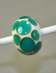
Ladies and Gentlemen - welcome to the squared circle. In tonight's competition, we have two well-matched contenders.
In one corner, direct from Italy - a veteran champion - I give you - Effetre 027 Dark Teal.
In the other corner, an up and coming new talent from the other side of the world, CiM 590 Great Bluedini.
Gentlemen - I want good, clean fight - go to your corners please!
*clang *clang *clang
The question is: how similar is Eff Dark Teal and CiM Great Bluedini (the original - not the uniques.) They look pretty similar - barring differences in rod thickness. So what about in actual use.
Here we have one long bead - that looks like spacers stuck together, as that is pretty much what it is. Starting from the right side, we have.
Bluedini self colour, Dark Teal self colour. Bluedini over clear, Dark Teal over clear. Bluedini over white, Dark Teal over white. (The Bluedini sections have clear dots on one side to help tell them apart as well.)
They sure look pretty dark similar.
Here's another view - strongly backlit. The solid Bluedini is slightly more blue than the Teal, which looks a little greener.
Over clear - they both look the same.
Over white, the Bluedini seems a little darker and richer (although it is possible I got a thicker layer on.)
Overall - I'd say - pretty dark similar! Either one is a fabulous colour.
Pages
▼
Saturday, June 26, 2010
Wednesday, June 23, 2010
Big Beads, Baby
Appropo. of absolutely nothing at all - I just thought I'd share these with you.
I felt like making something - large. With some heft to them. Like a bead you could hold in your hand and feel like you could throw it through a window.
Big.
These are on a base of clear - made on big mandrel - the hole is 5.5 mm. Great way to use up odds and ends of clear. Goober and glob ivory all over it and melt it in. A few light strings of Hades, some globs of Turquoise, Grass Green, Medium Lapis. A tiny bit of Psyche stringer too. Melt it all like crazy - get that Hades breaking up.
Refine and tweak the shape a bit.
Turn down the oxygen, get a little reduction coming up on the green.
There you go!
I made these on my Mid-Range - with two concentrators - a 5 lpm and a 9 lpm. They take about 45 minutes - I think. I find it very hard to keep track of time when I'm creating.
The slightly heartish shaped one (in the palm of my hand) is 57 x 55 x 18 mm. Or about 2 x 2 x .75 inches. It's the thickness of them that makes them seem so substantial, I think. The same one is 98 grams - about 3.5 ounces.
Tuesday, June 22, 2010
CiM 590-2 Great Bluedini Unique 2
Gosh - I hope CiM decides to keep these two uniques and add them to their line-up. I'll have to find some of the original Bluedini and compare to that as well.
Unique 1 was a Dark Aqua, but Unique 2 is more like a Columbian Emerald. Definitely green, but definitely a blue green.
Just a gorgeous shade of green, as a matter of fact.
In this second picture, from the right side, we have self-coloured solid, over white, and over clear.
You can see - by itself it is a pretty dark colour and needs diluting.
But a thin layer over clear! Just glows.
And over ivory - looks more green still, which is common in the aqua/teal transparents - as they interact with the ivory - much like opaque turquoise/greens do.
And here they are, head to head. Unique 1 on the left, Unique 2 on the right. You can just see using these two colours together to make something very oceany - right?
Monday, June 21, 2010
Effetre 230 - Neptune
Well - this IS an odd one. This is definitely different.
Put this glass in the same category as Eff. Dark Silver Plum and Metallic Black.
'Cause this one does the same sort of thing - goes metallic - sometimes matte metallic, sometimes shiny. But this dark green glass doesn't stay green.
Unless you put some clear on it.
So the tip I got for this glass was "Make a bead and scribble on it with some clear stringer."
So I did just that. As I didn't have that much of this glass - I made the core bead in clear, encased it in Neptune, and smoothed it out. As I encased it - I saw it going a very bright, silvery metallic. I scribbled on it with some clear stringer, and melted it in and smoothed it. And this is what I got - the greenish - a blue green like the Petroleum Green - showing through the clear, and the rest a very dark metallic steel look.
Interestingly how, if you google "moretti effetre neptune" you get a bunch of vendors - all using the same photo of the same bead to illustrate this glass - and theirs is turquoise. This is not turquoise - it is definitely a dark green. A blue green, to be sure - but so not turquoise.
In fact - this is almost like the silver grey you get on turquoise if you reduce it, but not so much that it turns red.
I never did get the super light silvery colour again that I had when I first laid the glass down - I wonder if that is because I work so hot?
Anyway - the instructions I see online elsewhere say to reduce the glass to get this effect - but I didn't have to - like Dark Silver Plum - it just does it. Either that or I had the torch set to a slight reduction atmosphere - but I tried deliberately reducing it, and it didn't change.
The glass is obviously hand-pulled. It is what I think of as "Bamboo" shape - the rods get thicker and thinner and have slightly bulging "joins" that remind me of bamboo. It has a slightly rough texture too.
Oh, and it is as shocky as h3ll too. Not so bad that it is completely unworkable - but definitely pushing into that category.
And here is a pair of spacers - Shiny in a spot - mostly matte.
And another pair - same idea - matte and shiny.
I may have to compare this head to head with Dark Silver Plum. Guess I should try writing on DSP with a clear stringer too, eh?
Saturday, June 19, 2010
Vetro 990: Honey Crunch
Vetro 990 Honeycrunch is a transparent amber with a white core.
I suppose you could slice it up for murrini if you wished.
I was hoping for extreme drama streakiness - maybe like a streaky ivory - but it actually looks pretty much exactly like what you'd expect from topaz over white. Although it does look more like topaz and ivory. It doesn't really show as white.
When making the beads - it certainly looked extremely streaky - huge contrasting streaks - but the beads that came out of the kiln seem less dramatic.
But still very nice.
I've seen some issues with some of these streaky odd lots and encasing - so I encased this spacer and it seems fine.
And finally, with Hades on top - super heated. Just because. ;-)
Pretty nice colour - bet I could make great horses with this.
Friday, June 18, 2010
Update on the Brass Handled Mandrels
Update - two more of them bent in the process of pulling beads - which makes them way too disposable.
I've gotten private feedback from others that they really did not have good success with these either. Umm - "hated them" might be more accurate. ;-)
Thursday, June 17, 2010
CiM 590-1 Unique Great Bluedini
CiM 590-1 Unique Great Bluedini. Of course the Great Bluedini was unique. ;-)
This appears to be a darker batch than the original Bluedini.
This is a dark teal green - so if it looks aqua on your monitor - it ain't right.
First up - the self coloured bead - well on it's way to appearing black.
Next, over white on the left and over clear on the right. Very pretty.
All three of them, side by side here.
Dots on Light Ivory.
And - just for fun, my Sundered Heart bead, with Bluedini-1 and some dichro. This is really nice - like this a lot.
Wednesday, June 16, 2010
Brass-Handled 1/16 Mandrels
Ok - I had to look these up to figure out what the heck they are supposed to do. Mostly, I just plunge right in, figuring that good design makes for obvious usage. However - I couldn't figure these out. Obviously they were mandrels, but uh, do I dip the brass side or the steel side?
And the reason that wasn't obvious to me is - geez - there's not much room to make beads on that short bit there.
The answer is, you dip the steel side, and the brass part is the handle. The brass tubing fit over the end and crimped into place makes the mandrel fatter and more comfortable to use.
Apparently, I never noticed that it is harder to hold a 1/16 mandrel. This would be because I hardly use them. Something about not making an elephant on a toothpick, I should think.
Ok.
- Yes, - they are nice and comfy in the hand. That's good.
- One of them bent in the flame. Ok, that's not actually that uncommon when I use 1/16 mandrels - usually doesn't happen with new ones, however. But I'm using a Mid-Range, so - lot's of heat.
- Two of them came out of the package bent. When I went to use them, slight wobble. Totally unacceptable.
- Two of them were slightly loose in the brass tubing - the rattle was really distracting - it sounds and feels like the glass cracking on the mandrel when the mandrel moves inside it's handle. Not liking at all.
- Lawdy - do NOT hit the brass handle with the flame - it heats up faster than a minivan in a mall parking lot.
- Just not enough room - lookitthat - Enough room for five beads. Maybe six if you are skilled. If I'm going to make these miserable tiny beads - I want to crank out ten at a time.
This is solving a problem that I didn't know I had, and now that I've thought about it - I still don't have it.
If you have found that your hand hurts when you make beads and you do enjoy tiny beads and prefer tiny holes - then, by all means try them. I think I would insist on buying them in person and taking them all out of the package for close inspection first.
I'll let you know how they survive having the beads pulled and re-using them.
For major production users, who would probably benefit most from the ergonomics involved - I suspect that the working area is too small. Maybe there is a 12 inch version? (These are 9 inches in total, 6 of which are handle.)
Tuesday, June 15, 2010
CiM Hades
The ever present search for the ultimate black. Black is that exception to the rules - one of the oddities that we all love to explain to beginners: "These are the transparent glasses, and these are the opaque glasses. Oh, except for black - it's actually a really dark transparent." There's a mind-warping fact. The darkest colour of all it actually a transparent.
Along with "Why does my black spots on white bead have purple rings around them?" "Black does that - it's really a very dark transparent purple. If you want to use a real black, you have to use Intense Black." And so then your beginner discovers just how much Effetre Intense Black costs. There's another shocker!
So we save our Intense Black for special occasions - dots that must not be purpley. And we experiment with other blacks. Vetro Black - holds up MUCH better than Effetre Black. CiM Tuxedo. Not bad. Lauscha Black - about the same at Effetre. Oh - how about black striped over a dark opaque like dark lapis to make a true black stringer? Yep - there's that one too.
So what about CiM Hades? CiM Hades is analogous to Effetre Intense Black - a true black, and, more expensive. But - Eff. Intense Black has some cool tricks up it's sleeve - that have not so much to do with colour as to do with the cool things you can make it do.
Intense Black bleeds and webs and melts out into fine tendrils - due to the high amount of colorant in the glass. To put it in technical terms: It goes all funky when you heat the snot out it.
And CiM Hades does the same. Maybe better.
These are three views of the same bead - this is very thin tendrils of CiM Hades on a very dark ivory (It might even be curdled ivory. So there. I still have some.)
Heat it until it is soupy hot - you will see the black start to spread and separate at the edges - the more it flows, the more it floats around - sending out tendrils.
Then just cool, shape, and do something with the ends - which are all pointy now that you have super-heated the bead. Instant Awesome! I totally adore this look!
OK - let's compare them head to head. Dark Ivory base - with a trail of Turquoise in the center (indicated in the image, as it reacted so strongly to the ivory it is hard to spot), and Hades on the left, and Intense Black on the right.
Equally cool, but noticeably different.
The Hades seems to have spawned more of the fine tendrils, but the Intense Black has pulled up more colour, separating the ivory out into light and dark, and rendering up a nice blue too.
I declare them equally awesome.
Just for fun - this is CiM Hades on Eff. Carnelian. I don't ever remember getting Carnelian to go this dark before - so did the more intense heat get it to strike darker, or did I burn it? Or is it a response to the black? I don't know. Especially as it is pinker in the middle.
The key to this black effect is heat. Give it lots of heat - you'll see it happen. Push the bead just a little farther than you intended and see what happens.
Monday, June 14, 2010
CiM 346-1 Ghee Unique
Ghee is clarified butter - you melt the butter, skim off the solids that float to the surface and it is used in cooking. Last time I melted butter in the skillet - I got side tracked and the butter burned.
This unique batch of Ghee accurately represents the colour of burned butter. :-P
The rod itself looks fine, not much different from the heated to the unheated - so the question is, did this strike in the kiln? Or did I burn the heck out of it? Hmmm?
Cuz you could not call this yellow. Dark brown, and not very translucent. Like - burned butter!
It starts out looking translucent when you make the bead, and appears to go brown - and when you pull it out of the kiln - Lo! It's brown.
Did I mention - it's brown?
The spacer withe dots is an ivory base, with 346-1, and intense black dots. You can hardly see them.
This might make an interesting horse or tree trunk colour - but - it's really dark.
I wonder if I really did burn it? I guess I should try again? Just to check.
Sunday, June 13, 2010
CiM 893 African Gray - Limited Run
This is a nice, creamy colour to work. Very soft.
It seems to end up being truer grey than the rod. The rod has an attractive shimmer to it that, strangely enough, is retained in the finished bead - although it is subtle - it has almost a cat's eye effect. (Mostly, those lovely rods that appear to have a silky look - it goes away - with the exception of shampoo glass which is a whole 'nother animal!)
Seriously - it is subtle, you have to be moving the bead and looking at it under strong light to notice it. Like a shadow of light racing over the surface of the bead. Or I'm hallucinating.
Anyway - it's a nice, streaky slate grey.
This one has dots, in Effetre Intense black.
Here they are again - such a handsome couple.
This one is a bit hard to see, this is a bead in CiM Hades, with African Gray dots, and Effetre Intense Black dots on top. Both the Hades and the Intense Black have bled into the African Gray, but in different ways. (Click on the pic for the full size version.)
Being a "Limited Run" - not sure how available this will be or how many places will carry it. I do like it, and I'm not a big fan of grey - but I can definitely see using this for horse and dogs and cats and elephants and seals and other organic things.
Thursday, June 10, 2010
CiM 492 Sherwood
Yeesh - it's taken me a week to get to this - and it's only because I'm posting it at 2:30 in the a.m. that it is getting done now!
As promised - this is CiM Sherwood. It is a nice streaky green - and it reminds me of something, but I'm not sure what. It is greener than CiM Celadon, and lighter than Effetre Petroleum Green.
Note the pronounced streaks in the spacers. The skinny one on the right was made with the build-up method, and the fat one on the left was made with the full gather method, but they are both dramatically streaky.
It does react with ivory - not an extreme reaction, just a nice little grey line to add interest.
And in this final bead, you can see that the colour has broken up quite a bit.
I'm still trying to figure out what glass I think it resembles. When I figure it out, I'll let you know.