Pages

Saturday, April 24, 2010

Dichro - Lovely, Lovely Dichro


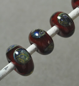
No particular point to this post, other than to share some pics of my recent dichro purchase. Dichro - ahhhh. Hard to photo, intimidatingly expensive, and requires some skill and practice to use well - although not as much as some people would have you believe. And completely addictive!

But just look it it - it's magic!

If you are at all intrigued by this rather fabulous stuff, I highly recommend "Dichroics: Art Glass All Dressed Up" by Jackie Paciello-Truty.

It's not a huge book, and doesn't go into techniques for lampworking. Instead, it is a rather quick read that tells you the history and the background of dichroic coatings and it's origins, and some background about how it is produced. (Hint - you are not going to be able to make it in your kitchen. Not unless you have a very specialized kitchen. With a vacuum chamber. And a laser.)

I found it totally worthwhile. Gives you a greater understanding of the stuff you work with.

Wednesday, April 14, 2010

Unfoiled again - Experimenting with Imitation Foils


Beginner student frequently ask me about the "foil" inside of beads - what is it, what can you use. So I explain that is pure silver, and that it is not sterling silver, and then go into the definition of sterling silver and why you can't use it.

And that the really cheap stuff from the craft store isn't going to work, neither will aluminum foil or the foil from cigarette packages, but "A" for creativity anyway.

Note to sellers - Folks don't know it is pure silver - you have to tell them. Then tell them how expensive it is and how hard it is to make it look nice. They don't know this.

So, I had a student that brought in some gilding material called "Art-Metall" - photo was taken with my phone, and is blurred a little by camera shake - my phone has a really slow shutter speed, for some reason.

It didn't look like the metalized mylar that some of the imitation stuff looks like - it looked and behaved like real metal leaf - and it was fabulous to look at - gold with ripples of blue - scrumptious!

Ok - let's try it. Nothing ventured, nothing gained.

I made a white cylinder bead, and rolled it on the foil.

As soon as the foil hit the surface of the bead, it went a dull grey. Stayed intact, but lost it's sheen and went dull and ancient looking.

I put dots of clear on it, and melted them in. The foil behind the dots disappeared, but the foil between the dots stayed a dull grey, and would not burn away, despite my attempts.

I left it out of the kiln to cool - so we could see it better.

As it cooled - we discovered it had gone a light aqua.

So - there has to be copper in that foil, I'm thinking.

A little reading online reveals that imitation foil for gilding can be "schlag" metal (Dutch Gold or imitation gold) - which is sometimes aluminum and can be heat treated to add colours. (Schlag also means "with whipped cream" in the context of food - I wonder if there is a connection between gilding and adding whipped cream - fancying it up with a wonderful but unnecessary extra?)

The Art-Metall came from Curry's - which does have a website, this is the closest on there that I found. Their website is painfully slow, doesn't list brand names, and doesn't have individual product photos - so it's safer to go into a store in person.

Monday, April 12, 2010

I Screwed Up: Aion vs Aurae - or - I still can't read my own handwriting


OK - I admit it. I effed this one up. I apparently suffered a blonde moment and a senior moment at the same time.

The combo that I read about on Patti Frantz's blog was Sangre + Aurae. I turned to my stash o' glass and pulled out, from the Double Helix section, a rod from the tube labeled "A - something something something" Short work, starts with "A" - must be Aurae, right?

Wrong. Clear rods. Aion. Aurae is a light purple in the rod. So, I forgot what Aurae looks like unworked, and I can't read my own handwriting.

So - all that stuff I wrote about Aurae is actually about Aion (and I will go and note that in the entry.)

So, trying that again:

Just a reminder, this one, from last week's post, is CiM Sangre + Aion. And I still like it.
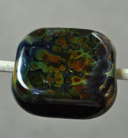


This is CiM Sangre + Double Helix Aurae


This is Sangre + Aurae, encased. And it's pretty darn cool too!


This, just as a refresher, is Aurae by itself in spacers. It reduces lightly.


And this is Aurae, encased with clear. You can see how this is a little confusing - but the Aurae is, I suspect, essentially fuming the clear and making it golden yellow. These were worked pretty hot. They looked blue when I put them into the kiln.


And this is Aurae + some other red that I had laying around, not Sangre. And it looks awful.


Aurae = not the same as Aion. Both are good. Aion works on other reds. Aurae does not - well - further testing would be required to double check all of them. Treat as potentially ugly and test before doing a production run.

Sorry about that folks!

Friday, April 09, 2010

Frantz Art Glass Blog

Aha - thank you! Yes - it was on the Frantz Art Glass Blog that I read about the Sangre + Aurae.


Definitely worth reading.

Wednesday, April 07, 2010

CiM Sangre and Double Helix Aurae Aion

Please note. I apparently can't read my own handwriting. This posting is supposed to illustrate using Double Helix Aurae over Sangre. The results are reported accurately - except that the glass I used was actually Aion, not Aurae. So this is what you get by using Aion over Sangre. See this post for Actually using Aurae over Sangre.

I can not take any credit for this colour combination - well, except that I did do something similar quite a while back, I have the beads on my watch still. Don't seem to be able to find the post though.

I was reading someone else's blog the other day - and they mention CiM Sangre + Double Helix Aurae. And the pics - blue on red. Kewel! (And - I can not remember, nor find, whose blog that was - so if you recognize the blog - or yourself - I apologize. Please let me know and I'll update this.)


Double Helix Aurae Aion trails over CiM Sangre. Hot d4mn - I like it!


Just for fun, Clio over Sangre. Interesting - not quite as dramatic.


Aurae Aion dots on Sangre, the dots on the left most bead have clear on top.


Clear base bead, encased Sangre (as I don't have that much of it laying around), Encased with Aurae Aion. I was expecting blue all over. Eww. Not so much. Added trails of ivory. Getting ugly. Haze developing. Ick, Ick, Ick. Hit it with reduction flame. Blue popped. Bead saved! Score!


Clear base, encased with Double Helix Clio. Dots in Aurae. Way cool!

Does it have to be CiM Sangre? This is Effetre 438 Opaque Dark Purple Red. Centre dots are Aurae Aion with clear, outer dots are Clio, with clear. Apparently - it just needs to be red.


Clear base, dots of 438, Aurae Aion dots on top, with some dots in between that are just Aurae Aion. Melt smooth.

Silver saturated glass + red glass = interesting effect.

Tuesday, April 06, 2010

Val Cox Frit: Tutti Frutti


Wop-bop-a-loom-a-blop-bam -boom. Tutti frutti, aw rutti, ...


And, in the spirit of that, I would have to say, this frit rocks!


It is a darker, and more pink than purple frit than the recently reviewed Mood Swings. (Tutti Frutti on the left, Mood Swings on the right.)


The Val Cox site says this:

A classic favorite of five transparents in pink and gold tones. Fuss free and wonderful with silver foil. Especially nice on a clear or pale base or a non-reactive white or pink.

Avoid Moretti Ivory with this blend, the base is too reactive and the frit colors will appear muddy.

You know, I really should read these before I use the frit. But where's the fun in that?


Here we have Tutti Frutti, on clear. I liked it so much, I made another.

And the second one. Finally taking my own advice, I started making these beads bigger - so there was more room for the excessive amount of frit that I was going to use anyway.


When that worked well, I tried it on white. Score - excellent again!


This is the ol' dip-n-wind technique.


And this is the disk-frit-encase-distort classic.


Eeehyuk. No kidding it over reacts with Ivory. This would be a swing and a miss.


Ooops - transparents on black. Seldom successful.


This is on Double Helix Psyche. It looked pretty cool in the flame, but realistically - it's too dark.


And, again, on Psyche - with the ends reduced this time. Again, realistically, too dark to really work.


Overall - Really liked Tutti Frutti. Glad I got a jar of this.

Monday, April 05, 2010

Effetre 250: Lover Boy


The rods sure look interesting - but the beads work out to be somewhat less interesting.

Unless you count the fact that they look completely different in different lights!

This is a streaky, opaque colour-shift - being blue in fluorescent light and pale pinky lavender in incandescent light. The rods are pale orange on one side, and that results in some orange streaks - but not enough to look deliberate - just enough to look like you messed up.

The Blue is kinda washed out, and the pink/lav is a nice enough colour if a bit pale, but with incandescent lights being taken off the market left, right and centre, unless you are stock-piling them, you're going to be living in a world lit by ghastly fluorescent light only soon anyway.

In the commercial bead world, we know this colour as Alexandrite.

Oh, and it doesn't appear to care for being encased - although one bead is hardly definitive. But still - we've seen other of these streaky odd lots that don't like to be encased either.

The verdict? Meh to Lover Boy. The existing Effetre 221 pastel Lavender is a much nicer glass to work and has the same colour shift.

Saturday, April 03, 2010

Effetre 340 Green Alabastro


Ah yes - the Effetre Alabastros. The glass everyone loves to fear. This is Effetre 340 Green Alabastro.

Beginners are attracted to the translucency of these glasses - not quite opaque - sort of like stone like quartz or fine jade. They may even pluck up the courage to spend the extra to buy them - and then some more experienced lampworker says "they're not really compatible, you know." And so - terrified to use them, they put them aside and those poor alabastros sit in a corner, getting dusty.

Which is a shame!

I personally love these, and the opalinos as well - because of their resemblance to gemmy stones.

First off - they tend to boil - so - if you see a lot of bubbles forming - cool down and use less heat. I remembered after making this bicone - you can see the bubbles in it.


The left-most spacer was made with too much heat still - the one on the right - much less - and while it has a few bubbles - there are fewer. Any less heat, however, and I would have lost interest - so for me, this was a good compromise between a few bubbles and nodding off at the torch.

But all of these are just a single colour, so - what about compatibility? I mean - I tend to use they by themselves, as I like to use them so that they resemble carved stone - but that's not everyone's schtick. So- let's try encasing them.

So - if I think I am pushing the borders of compatibility - I try to reduce the amount of one glass so that the percentage of the total in the bead is low. Say, I wanted to encase an opaque red (why would be the question, as it then looks lighter, but ... ) I would make a base in clear, encase it with the opaque red, and then encase in clear.

The other thing I would do is make sure that it is a nice long, slow anneal.

So - here we have two spacers, Green Alabastro - encased. Now, admittedly - the cores of these are fairly small - but I did not actually make a clear core and a thin layer of green, I just made a clear bead and encased in clear (Lauscha clear)

We are about a week later, and they are still intact.

That faint line you see in the right bead is a fold from getting the core too hot while encasing. I've looked at it every which way under magnification - it is not a crack.

I'll hang onto these two and keep you posted as to their durability.

Oh, and you notice they look lighter when encased too.

Cleaning Beads

You need to read this set of posts by Lori Greenberg on cleaning out your beads using a tumbler instead of doing by hand. I haven't tried this yet - gotta get me some shot - but if this works - this could be amazing.

Hands free bead cleaning.

Friday, April 02, 2010

Frantz Art Glass Blog

Great blog post from Patti on the Frantz Art Glass Blog - on using reactive silver glasses in twisties. Check it out.