Hey - I might finally be onto something with the frit. More results I like!
First up, the working notes say:
Violet Storm: Blend/Transparent
Vivid tone-on-tone mix of violet and purple ... deeply saturated red-violet to violet-blue ... fuss free blend. Combining wiht silver foil will produce a slight green tint.
Aha - silver reactive, eh?

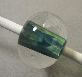
First up - let's just enjoy it for it natural colours - which are very pretty. Our first two samples are distortion beads - using the property of the clear - as it melts - to smear the colours underneath. The first bead is a small clear disk, rolled in frit, melt in the frit, and build up the disk with a layer of clear, then melt the whole thing down, keeping it balanced but letting it melt down into a more round shape. As the clear spreads - it takes the frit with it, and makes lovely stripes. I'm on a kick for this, apparently - so all these beads are some variation of this technique.
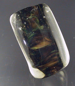
The second bead is made the same way - but the first disk - the core - is white.
The clear used is Lauscha, in about a 7 mm rod. The fatter rods do make this easier.

On the left here, we have clear, make a gather, dip in the frit, wind a bead, and encase and melt down.
On the right, a white core, Effetre Kelp, gather, dipped in frit, wound on, and encased in clear.
So - remember the line from the working notes about "silver foil." Well - rather than grab some foil, I grabbed a rod of Double Helix Triton - one of the Hi-Silver glasses.
A core of Triton, rolled in frit, melted in, and a fat layer of clear, melted down to stretch and distort the frit. Oh my! These are nice!

These rock, as far as I'm concerned! Yay! Finally - frit effects I like!


 First up - let's just enjoy it for it natural colours - which are very pretty. Our first two samples are distortion beads - using the property of the clear - as it melts - to smear the colours underneath. The first bead is a small clear disk, rolled in frit, melt in the frit, and build up the disk with a layer of clear, then melt the whole thing down, keeping it balanced but letting it melt down into a more round shape. As the clear spreads - it takes the frit with it, and makes lovely stripes. I'm on a kick for this, apparently - so all these beads are some variation of this technique.


 In this second pic - this was the same technique - but using Effetre 068 Transparent Pink (this is the one that goes more of a salmony colour and reacts with silver to produce a nice gold effect) instead of the Straw. I do not care for this one as much - too moody-broody for my taste.


 Elly suggested a blend of frits, but I just used the Ocelot Spots - as it was still on my bench.
 But please - let's not call it faux boro!
 See - here is more of why I suck at frit. I wanted to love this one. I really did. Others do such amazing stuff with it. Me - not so much.
 and here, over white. Again, very nice.


 Reduced. OK - no illusions. I knew I wasn't going to like this one.


... vivid display of richly saturated ruby, violet and aqua gem-tones - a luminous, no-fuss blend.
 - because I got a lot more light into it. In real life - it's pretty dark. But I do like the patterns of the frit better. And it has some nice depth. Maybe if I'd done some raking or twisting?
 New colour from CiM - and much speculating I did about the name - based on the hand-written label! The Great Bluedini is what it is!

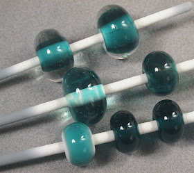
 My first impression was Effetre Transparent 027 Dark Teal. And here they are together - the CiM is the fat rod on the top, and the Effetre is the skinny rod on the bottom. Pretty darn close.
 On the left - over white. The two on the right - self-coloured. Fairly dark that way. Pretty on the white.

 But - I do like the visual of red berries on a green background - so - what the heck.
 Oz plus Sangre. Let's try a holly leaf and berries.
 The unworked rods are a pale, pale blushy pink - best viewed at an angle. The pink has a faint golden hue to it. Viewed side on - in strong light - the colour washes out and the rods appear almost clear. It has a quality to it that reminds me of the Veiled Rubino. This is behind a thicker veil, tho'. ;-)

 I thought it might do some interesting things over black - the raised pattern is reduced, and we just got a silvery effect (the black is CiM Hades).
 furnace - new colour from Creation is Messy. (Not even on their site yet!). This is a Baby Blue or Powder Blue called Zachary. My first thought was "Effetre 220 Periwinkle" - but it is actually a little lighter than Periwinkle.


