Pages

Saturday, January 31, 2009

Two Days of Demo'ing at Nortel Open House

Two days of demo'ing torches and talking about glass, torches, beads, tools and the joy of working with glass to any poor unsuspecting soul who wanders in off the street, enticed by the "free chili" sign.

I need a bit of time to organize my thoughts and impressions, but on Friday, I spent quite a bit of time using the Nortel Mid-range torch, and today, I was working on the Red Max - so I can now offer more informed opinions on these two torches. (I want a Mid-Range. The Red Max - really more for boro - that's the short version.)

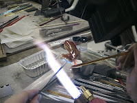
That's Amy in the first photo - on a Nortel Minor - working on a frog bead.

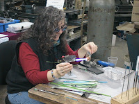
The second pic is Susan - look ma - both hands - one leg! She's using the top fire Mega, on a mid-range. That's the chaos of a real-life working machine shop in the background. That's where your torches are born!

And the third is me - my hands anyway - making a horse head and working on the Red Max. Big flame, baby!


Oh, and here's a very nicely lined bead - courtesy of Peter's new bead lining machine - which is just about ready for release. More on that later. But I can say - this machine has some significant usability improvements!

Friday, January 30, 2009

Vetro 255: Pink Flower Pastel


Vetro 255 - Pink Flower Pastel. Well - this is a nice, agreeable little pink. Not a super bright pink, just a nice soft, pastel, background kind of pink. Slightly, very slightly streaky.

Looks kind of dull in the rod, in places. Some rods are a little brighter than others. But you can see it's quite pleasing as an accent colour or base colour.

Not every colour is destined to reach out and grab you by the throat!

Tuesday, January 27, 2009

More Weird Stuff to Stick in Your Beads

As I was wandering through the aisles at Bancroft this summer (Bancroft Gemboree - Annual Gem and Mineral Show - Bancroft, ON, Canada) - I spotted a colourful display of tiny jars filled with brightly coloured powders. Striking up a conversation with the vendors, I learned that what I was looking at was ground turquoise, lapis and malachite. Their intended users were manuscript illuminators!!!! They were selling the ground stone that was to be mixed into a binder and used to decorate icons, manuscripts, and whatever else you might want to put a layer of turquoise, lapis lazuli, or malachite onto. Hmmmm, I thought. I wonder if I can use some of this in a bead. Selecting a tiny jar of the bright turquoise and lapis (and passing on the equally appealing malachite - see note at end of post) - I took my treasures home.

The powder is about the consistency of flour. Doesn't seem to have a dusty, drifting tendency. It tends to clump a little, but I put some in a frit tray and had a go.

I made a core bead of white at one end, and ivory at the other (ivory on the right, and white on the left), rolled it in the stone powder, and encased it. The one with the black ends is the Turquoise powder, and the blue ends is the lapis. They have both reacted strongly with the ivory - which is not a surprise for turquoise - given that it has copper in it, much like the glass does - but more of a surprise for the lapis. (Of course, it's entirely possible that the good gentlemen selling the product were pulling my leg, and it's all ground turquoise scrap. Except, the lapis powder was more expensive.)

You can see - there were a mess of bubbles created too. (Click on the image for a blown-up view.)


It is now some months later - and the beads appear to still be intact. Of course, as a percentage of the bead - the amount used was tiny - so I wasn't expecting compatibility issues.

This bead has some of the turquoise - you can see the streaky dots and uber-bubbles. Yeah, there's some dichro in there too.

Not necessarily stunningly lovely - but kinda cool. Neat to think you can include real, ground, coloured stones.


*NOTE* - I have no idea if this stuff is safe - so, as with anything else - if you are going to try this or anything else - use a healthy dose of common sense. For instance - I know that stone cutters avoid breathing in dust from malachite and that the dust from grinding malachite is considered toxic - so I passed on the ground malachite. I wouldn't mess around with ground pearls either, if the option came up. I reserve the right to do things like this. You may too. If it all goes horribly wrong - don't blame me. If it is fabulous - a little credit would be nice. ;-)

Monday, January 26, 2009

Mor 256 - Dark Rose

Lovely colour - and this is a lovely batch of it. Moretti 256 - Dark Rose (or Dark Pink).

Repeated light heating shifts it to a purple - reheat to molten to bring back to pink. The pink one, I had to reheat to flowing to get it round - I let it get off centre - see the colour difference?

Slightly reactive with turquoise - well, the term reactive is confusing. The turquoise reacts with ivory to form a line at the border (old news) - this is more of a separation - where it looks like a clear version of your opaque magically shows up in the centre. Try turquoise on EDP (Mor 254 - Purple, Orchid, or otherwise known as Evil Devitrifying Purple) to really see this effect in action.


Here's the same shot again, a little closer. Notice also how the ivory dots on the far right bead bled like crazy. (Got fuzzy around the edges.)


And the big lentil, the rapid cooling of mashing has given it some wonderful colour variations.

Really pretty, girly colours.

Oh, and Kung Hei Fat Choy! Wishing you a Happy and Prosperous Year of the Ox!

Sunday, January 25, 2009

Elusive Orange: A Comparison


Figures - I have a production order to fill - and I'm out of a required colour. Not only am I out of it, but everyone I know is out of it. :-(

The colour in question is Moretti 422 - called, imaginatively enough - "Orange." There is a batch of Moretti 424 floating around that in the rod, before working, looks exactly the same as the 422 - a nice bright orange. But once worked, it goes reddish. In the first pic - you can see the 422 on the left, and two of this lot that looks exactly like 422 before working. When you look at the rod in cross section - at the cut end - the 422 is almost completely uniform - the barest hint of being lighter in the centre. The odd lot has a distinctly lighter core.

So, I then when looking for anything that I thought might make a reasonable substitute.

Here, in the second pic, you can see the wide variety of choices, and the results. (The rod is behind the bead.)

From the bottom, we have a mandrel with known Mor 422 on the left.
Notice, even it will go dark red if over-heated. Next to it are two beads of CiM 241 Creamsicle. Reminds me of an HB pencil. Nice colour. Above that, we have Vetro 943 - Orange Sherbet. In real life, the rods lying with the other rods - all look orange - but in this picture, it looks more like a salmon pink. The finished bead is actually a nice flesh colour, if you are doing sculptural people. Mind you, I remember someone telling me about a glass that was a great colour for her angels, but would strike, with the repeated re-heating that goes with sculptural work, to a bright orange, making for a distinctly odd-looking angel - I wonder if this is it?

Next we have Vetro 944 - Tangerine Sparkle. It looks distinctly "sparkly" (shimmery inside) when you are working it - and for a change - this bead retains some of that once cool. It is semi-translucent. I bet this would make a nice "wave" bead - I guess it would be a flame bead at that point. Above that is Vetro 939 - Intense Tangerine. Slightly darker, a little redder, and more streaky transparent and opaque.


Then we have Vetro 805 - Orange Dreamsicle. (pic on right, bottom) When you look down this rod, the core is white, with an orange coating - just like those Orange Creamsicle/Dreamsicles we got as kids. Which probably taste better in memory than they did in real life. I was never a popsicle fan - Fudgesicles or Creamsicles - you could keep your Popsicles for my money. Anyway - this comes out really streaky. It's really pretty cool - but some rods are really, really shocky. The first one turned itself into frit, and the second rod worked ok. I'd be tempted to run all of them through the kiln for an annealing cycle - just cut down on the shocking.

And above that, decorated with silvered ivory, is the suspected 424 . I have all kinds of unlabeled orange that looks like it might be right. But isn't. Apparently.


And here they all are again, labeled, in case you are totally confused by now. The hand is for colour comparison.

Mid-tone non-red orange. As elusive as a beast as a "pretty pink" is. Was.
Saturday, January 24, 2009

Vetro Mystery Yellow: Vetro 949 Lemon Meringue

Mystery Yellow - Jean at Nortel Manufacturing (home of the torches - nothing to do with the telecommunications company - oh, and have I got a funny story about that!) handed me a sample of this glass when I was there the other day.

"I have a 22 pound bundle of this," she said, throwing her hands in the air, "and I have no bleeping idea what it is. Well - I know it's Vetro and I know it's 104. But other than that - no idea! I'm going to put it on sale! See if you can figure out what it is!"

This is where this blog comes in handy - cuz I know where to look up my results from my previous tests. ;-)

I believe it is Vetro 949 - Lemon Meringue. It is a very pure yellow, not biased to red at all. Can be a little streaky, needs a little striking time to show all yellow, otherwise, will be streaky yellow and white. Reacts with turquoise, much like ivory does. Tends to photo a little more greenish than it actually is.

So there you go. If you want it - call Nortel and ask for the "Mystery Yellow." ;-) Would make good daffodils. And, the way the snow is going - you might have to make your own if you ever want to see a daffodil again! :-P

Friday, January 23, 2009

CiM 413-3: Peacock Green Unique

Love the CiM Peacock Green - love the translucency - the "not quite a transparentness" of it! Big fave of mine - makes great hollows!

Anyway - this batch of -3 Unique, is a significantly more blue green than the original green - which is more of a juicy, fruity green. (Original Peacock Green is on the top of the pic to the left, and the new, -3 Unique is the bottom rods.)

Worked and annealed - it stays the same as the colour in the rod. You might argue that it is not quite as not transparent at the original, or less translucent and closer to transparent. But it is a really nice colour. I kinda hope that they keep it in the colour palette.

I definitely like the colour!

Thursday, January 22, 2009

Freaky Fish


Ok, so whaddya think? Are these fish cute, or too weird for words?

I set out to shoot pictures for a tutorial I was planning to do. I lined up the studio time, got someone else in to shoot the pictures and spent a day working the kinks out of it all, re: lighting and angles and etc. My plan is to do some tutorials, and I wanted to put together a very simple, free tutorial as an intro.

Fish, I thought, fun, and sort of "starter-sculpture." Except - what flowed out the of the torch that day was NOT like any fish I've ever made before - they look like they are half-way on their way to turning into butterflies. I wasn't going for realism, but really ....

Anyway - I can't tell if they are cute, or weird. I get mixed reactions from close friends. I'm guessing that there are certainly lots of people who don't need tutorials on fish, not these fish anyway (or can glance at these and figure them out) - but I know - or at least hope! - that beginners will find them interesting. (My beginner classes always like the fish - they are a pretty forgiving bead.)

The question remains - would anyone WANT to make these fish?

Wednesday, January 21, 2009

Upcoming Class: Lampworking 201

Well - while I'm promoting other folks, maybe I should take a minute to promote my own stuff! I know, it's a radical concept. ;-)

I have a Lampworking 201 class coming up. Lampworking 201 is an 8-week class, Thursday evenings, 2.5 hours, starting at 7 pm. It's for those who have some experience, but want to get a little more control over the glass, develop some new techniques, and enjoy getting together and torching once a week. It's not restricted to just students that have taken classes with me - but open to anyone with a little experience.

The curriculum is largely-driven by student interest. So far - we are looking to cover:

  • off-mandrel pendants
  • marbles
  • sculptural beads
  • my signature "wave" bead
  • 3-d florals
  • vessels and blown vessels
  • rings
  • shards
  • high-silver content glasses
  • fuming.
And - whatever anyone else in the class suggests that they'd like to learn.

Looks like a fairly full 8 weeks of discovery! There are still spaces left in the class - which runs from Feb 5 - Apr 2 (which is 9 weeks - but there is a 1 week gap - Feb 19 - in there - as I have to go out of town and won't make it back in time.)

This is taught at the beadFX lampwork studio, and if you want to sign up - you need to get in touch with the studio directly. If you have any questions about the class - feel free to email me directly!

And, if that doesn't fit in your schedule, I do private, one-on-one tutoring too. This is great if you want to tackle a specific area, i.e. encasing, sculptural shapes, reduction, using silver foil, successful stringer, or whatever you want. The rate is a very reasonable $40/hour (Cdn) and we can figure out a time frame that works around your schedule. Two to three hours is usually enough to tackle a topic or two or three or more - and includes a free card for additional studio practice time, and a discount in the beady portion of the store. Talk about a good deal, eh?

You can learn a lot from books, tutorials, videos, and especially from trial and error. But - oh, those sweet moments of ephiphany that you can get from watching someone else, live and in person. "Wait a minute - you can DO that?" "Oh, is that what that means!" "Holy ----, is that what that tool is for!" ;-)

Nortel Manufacturing - Open House

Just thought I would give anyone in the area (i.e. Southern Ontario) a heads up that Nortel Manufacturing - maker of the Minor Burner, the Mega Minor, Rocket, Red Max, and other torches, will be having an open house at the end of the month. They are the local wholesaler and distributor for not just torches, but also glass, tools, kilns, and etc.

The open house will be Jan 30 and 31. I (along with other artists) have been invited to come and demo - so if you have any questions, you can come down and ask in person. They will have a full range of torches set up, so if you want to try out a new one, this would be the time to do it! They will have specials on glass, and other artists - and if you want to bring some of your beads to sell, swap or just show off - please do.

The time and location info is on their site, (www.nortelglass) and if you are coming to sell or swap, it would probably be a good idea to call or email them to let them know you are coming. ;-) Bring your friends - this is open to the public. Bring your friends that have no idea what you do, and can't figure out why a single bead should be worth that much. We'll straighten them out on that!

Tuesday, January 20, 2009

Update on the UltraSonic

I was intrigued by my experience with using an ultrasonic for seriously stuck-on-the-mandrel beads. So I thought I would try it with just regular beads - not particularly stuck ones. I was hoping that they would slide off "jess like budd-ah."

So I rounded up a triple handful of bead-laden mandrels - that I was seriously NOT looking forward to pulling - and trotted off to the "friend with an ultrasonic." I let them soak for a 15 minute cycle, and they did seem to be easing off - but I thought they warranted another soak. So I gave them another 15 minutes, while I sorted said friend's glass. (Heaven forbid I should sort my own someday, however!)

After a good 30 minute run in the ultrasonic - they weren't exactly falling off - but they were significantly easier to remove - most of them just twisted off. I had a nice mix of relatively unused mandrels and seriously used mandrels. Naturally enough, the ones with the least use, certainly removed more easily - but the others were not bad. Easier on the hands, for sure.

Does using one make economic sense? In specialized situations - for sure. If you already own one, for instance - it will make pulling beads easier, and in a production environment where time and labour are critical - I think it might. (It won't be faster from start to finish, but it will be a shorter amount of labour) And, I'm sure you will find other uses for it too.

If you are pulling your own beads, and carpal tunnel syndrome is making it very painful - you might find this to be worthwhile too. I was using one that was probably at the top end, price-wise, for an ultrasonic - due to it's size. But the smaller ones would probably do the job just as well. (You can see what is available at Lacy's.)

So, anyway, I did get all those beads I wasn't looking forward to pulling, off the mandrels - and just in time, as I had pretty much run out of mandrels.

Now, I can just not look forward to cleaning 'em!

Tuesday, January 13, 2009

Embedded Stones: Lab Created Sapphires

I know you can embed cubic zirconias in lampwork beads - been doing that for years. BTW - a great source for cubic zirconias - www.pehnec.com - there stuff is fabulous and you won't beat the prices. Check out the close outs page - often great deals there. Oh, and yes - these work great in Metal Clay too.

Anyway, I've been using CZs for years - and mostly keeping them small. I was under the impression that you had to encase them to keep them there, but Deb Read changed my mind on that - she told me she doesn't bother and they are fine. So I've been doing both for the last while.

Anyway - I thought I'd try some of these lab-grown sapphires. For the first bead - I made it in nile opalino, added SIS (silvered ivory stringer) and then added the lab sapphire, and then a dot of clear on top. These are 3 mm sapphires.

I added these by leaving the gem, pointed or bottom-side (culet) side up, on my graphite marver, and pressing the hot bead down onto it. Unlike CZ's - no matter how hot or how long I held this - they did NOT want to stick in place. So I would up picking them up with tweezers and dropping them into the crater than the pressing process had created. At least they made very nice holes for themselves.

I dabbed some clear on top. You can see - the clear has cracked all to heck. I'm guessing - encasing is not making them happy.

In retrospect - using an opalino was probably not the best bet for this first test. Doh!


Embolden by the success of the first bead - well - I thought it was a success - the sapphire hadn't melted or blown up - I tried again. I had the - in retrospect - quaint idea that silver foil behind the sapphires would make them more luminous - they are a little darkish.

The bead is a core of CiM clear - silver foil, and encased in CiM clear. I'm rather intriqued by the hits of blue that developed. Gold - I pretty much always get - but there are some shimmers of blue, that show red at an angle. These are quite divine.

Again - pressing the glass down on the sapphires - the sapphires did not want to stick - only one stuck of it's own accord - the rest I had to place with tweezers.

I did push them down quite deeply into the glass - I wanted to push them in at least as deep as the girdle (the wide part of the stone.)

They seem to be quite secure - and so far, no cracks. I'll hang onto this bead for a while - just to make sure they don't develop later.

So far, I'm pleased with the results! I think another encasing experiment in a more normal colour than green opalino is in order, however.


Monday, January 12, 2009

TAG 104 - 14 Deep Purple

This does look like a deep, transparent purple in the rod, but looky what you get!

The working notes suggest reducing with little to no oxygen in the mix - for a super metallic effect - which I tried for the top left bead - and in deed - very metallic and shiny. In strong backlight - this actually still is a transparent purple!

The working notes also suggest that you can get a thicker, more opaque reduction film if reducing with some oxygen in the mix. For this second bead, I turned down the oxygen, so that I had about 4 inches of yellow in the middle of my flame, and reduced in the tip of the yellow. As you can see (lower right bead) - more blues and greens appeared, and the reduction layer is approaching opaque. However, a strong backlight again reveals a hint of a reddish-purple transparency. Cool!

The working notes also say that while it generally reduces to blues and greens, it can also create purples, pinks and even bronze-like tones. As it is very dense - they also suggest it can be used quite thin, i.e. stringers, encasing, etc.

So far - this one was easy to work and did exactly what it said it would. Very promising. I really want to try a nice thin encase over clear and see if I can get more the red-purple transparency effect to show along with the reduction.

Saturday, January 10, 2009

New Book - Glass Beads by Louise Mehaffey

A new lampworking book for beginners. This is an excellent beginner book - with one caveat. One massive caveat. Sorry - I'm probably going to make some enemies with this one.

Beautifully presented, and packed with ooodles of great pics - this is a hard cover book - spiral bound - so you can lay it out flat next to you, or stand it up, and refer to it while torching.

It starts out with an introduction to the author, and the obligatory "history of beads" - which is well done and well presented.

Setting up a studio is covered, torches, kilns, and basic tools are all covered. The detail is not excruciating, but just about right - so that you have enough info to get started - not so much that you feel overwhelmed.

Here are some photos of the book - see - nice, clear pictures.

Anything about the pictures make you feel like, well, you're looking in a mirror?

Way back in the intro - there is a tiny little paragraph that says "Warning - I'm left-handed - so that's what all my pictures show."

If you miss that, (and I asked someone else who had also looked at the book - they had missed it) and you are teaching yourself from scratch, and you are right-handed - you are likely to get all the way through the book - struggling - without realizing that you are doing it the hard way.

While I grant you that the artistic population probably contains more left-dominant-handed people than the general population - current statistics indicate that about 90% of the population is right-handed. To me - this just seems like a major oversight in publishing. Surely it would have opened up a bigger audience to flip the photos - and just make notes in the text to point out places where this was obvious - like when the knobs are on the wrong side of the torch. (Either that, or honkin' big warnings all the way through the book. )

I'm pretty sure, by now, all the left-handed people reading this are throwing rocks at me - to say nothing of the author. I'm sorry - but I calls 'em as I sees 'em.

Other than that - the book is great. It covers all the basics for getting started. You could learn from scratch from this book (but take a class too - lampwork instructors need your money - and you will learn stuff too. ;-) ).

If you are thinking of starting teaching - I would suggest this book as well - to remind you of all the items you need to cover.

Even if you have taken a class - you'll benefit from this book, as it will serve as a good reminder. It really is text-book quality. Except for the handedness thing.

Of course, if you are left-handed - you absolutely have to buy it. No question. Go. Run. Right now. ;-)

TAG 104 - 02 Zeus

Continuing my adventures with TAG - Trautman Art Glass - meet Zeus.

Zeus was waaaay easier and more gratifying than the Dalai Lama - which says something that I get along better with a mythological thunderbolt-tossing god-being than a real peace-loving symbol living in exile. What it says - I'm not sure - but it's probably not good. ;-)

Anyway - The handout says -


This glass appears crystal clear in the rod, but changes dramatically when reduced, then struck. Zeus turns amber by itself and over light colors. Over black, it's reduction film can be struck to a range from royal blue to turquoise to green. Can also be reduced further to amber brown opaques. Encases well, retains reaction under clear. Try over a transparent orange or Moretti Red Roof Tile for a great electric purple. On striking gold-ruby (Rubino), Zeus can make a peachy colour. It is Turquoise over purples, etc.


The website adds:

Remember, Zeus likes to be 'activated' by a light reduction before it will strike.


I found that this worked nicely with very little effort. I encased a thin layer over black, reduced it, and it struck immediately after that! Lovely rich blues, greens and turquoise. Mmmmm. Gotta get more of this!

BTW - I actually talked to the folks at Trautman today by phone - and got some tips for getting the best results out of yesterday's Dalai Lama. The technical term is "heat the snot out of it." ;-) I'll take another run at it and let you know how it turns out!

I also mentioned that the handout and the website don't completely agree with each other, and it turns out that is because the info is constantly being updated with more details, as more is learned about working with that colour - which is cool. I can live with that!

I can hardly wait to try some more of these glasses!

Friday, January 09, 2009

TAG 104 - 01 Dalai Lama


I just got my hands on a sample pack of the new TAG glass. This is a new 104 COE glass by Trautman Art Glass (taglass.com) - which have become well-known in the boro-world for introducing some very lovely and desireable colours (Elvis, for instance - a 2-die-4 red).

These new colours are more of the current trend in high-silver content glasses, similar to the Double Helix and the Precision 104 (formerly known as Rocio).

This glass comes with quite complete instructions, which is always appreciated. I notice now that the website and the included printed instructions actually differ slightly.

Melt in with a neutral flame, lightly reduce, and cool slightly. Then strike in a neutral-to-oxidizing flame for beautiful Painted Desert effects. Or reduce this glass for a different look. Colors range from tans and ambers (particularly when reduced) to blues and greens, and gorgeous pinks and purples when struck. This glass also encases well, and retains a reactive effect under clear. Some batches respond well to deep heating before striking.

Red - from website, not on handout
Blue - from handout, not website.

As you can see from reading this - you might be a little confused as to exactly what to do and when, for what effect. ;-) I know I was! Am I supposed to strike, then reduce? Or vice-versa?

The bead on the left, I made with clear, and encased with the Dalai Lama. (ok - that sentence reads weird - I know.) I attempted to strike - it didn't seem to strike for me.

The bead on the right, I made a base in white, and encased it with Dalai Lama, and reduced it.

I dunno - maybe not enough heat, or something. I'm certainly not getting the blues and purples that they show on their website - and I want those colours. Have to take another run at this one.

The beads are nice enough - I love the streaky effect. But I want those blues and purples!

Besides - isn't it bad karma to strike the Dalai Lama?

All of which puts me in mind of a poem from my favourite poet, Ogden Nash.

The one-l lama, he's a priest,
The two-l llama, he's a beast,
and I will bet a silk pajama,
there isn't any three-l lllama. *
* I have just been informed that there is a type of conflagration known as a 3-alarmer. Pfui.

Just don't create a 3-alarmer striking the Dalai Lama while making a llama bead. ;-)

Thursday, January 08, 2009

CiM 563: Pulsar - Further Thoughts


I wanted to compare the CiM Pulsar head to head with the Moretti Dark Aqua - to see if it really is more intense.

This bead is Cobalt blue, white, Pulsar, White, Mor. Dark Aqua, White. I wanted to flank the Aquas with white for maximum colour reflection. The cobalt end is so that I knew which end was which.

In short, the Pulsar is at the cobalt marked end of the bead - and in fact, does appear darker, more intense, and, dare I say it, slightly less greenish than the Mor. Dark Aqua. Not just in the photos, but in real life too.


Then, someone asked if the Pulsar scorched and developed smokey streaks, like the Mor. Dark Aqua is prone to do.

Well, naturally - when you are trying to mess up the glass ... it behaves perfectly well. For these bead - (with an ivory end - so I didn't mix it up with anything else) - I worked it in a Natural Gas flame (I have more trouble with Natural Gas and scorching than I do with Propane) - I worked too low - almost glomming onto the torch head. I turned the oxygen way down. You can see a smudge of red reduction on the surface of the bead, above the halfway point.

You can see on the other side of the bead, I did manage to get some grey marks happening. Whether that was as a result of the reduction, or working it abusively - I'm not sure.

Here's yet a third view. It doesn't show up much, but then again, the glass colour is quite dark. Whether it will show up if, say, used as a thin layer over white??? I guess I'll have to try it and find out!

Is it scorch proof? I don't think so - but I did have to work fairly hard to get this effect. Is it easier to work than the Mor. Dark Aqua? Can't say yet. Might be.


Wednesday, January 07, 2009

Really stuck beads

Oooops. I know better - those long, curved mandrels need to be dipped in Foster Fire bead release - if you ever want to get the bead off in one piece.

So, why did I dip them in something else? Who knows - blonde moment, apparently.

But that goof led to this discovery. Put the bead, mandrel and all, into an ultrasonic cleaner - let it run for 30-50 minutes. The bead slides off!

I had some chipping on some beads - but I think it was 'coz I didn't have the basket in - just tossed them in loose.

Hmmm - if it will get stuck beads off - I wonder what it will do with normal beads?

It bears further experimentation!

Monday, January 05, 2009

CiM 806 Cirrus and 806-1 Cirrus Unique - Cirrusly Different!

Whoa nelly! This Cirrus Unique is Cirrusly Different!

The bead on the left (one black dot) is the original CiM 806 Cirrus - a lovely wispy milky clear. I bought several pounds of Cirrus the other day to fill an order, and when I pulled out a new pack - the new rods were fatter.

And I didn't remember Cirrus looking yellowish when hot. Checked the package - and this was 806-1 - Cirrus Unique. Well - the cooling rod looked a little milkier - but still translucent. Ok-fine, I thought - I can live w that for this order.

Ehhhh! Wrong answer. Coz lookit what came out of the kiln! The bead on the right (2 black dots) is the Unique - and it, for all intents and purposes - has come out white.

Perhaps a little less brilliant white than white, maybe a little translucent - but not the milky Cirrus cloud effect I was expecting!

Good thing I also had a batch of white to do for above mentioned order - otherwise - that would be over a solid hour of beadmaking down the chute!

It does occur to me that it is pretty stiff, for a white. So there may be some sculptural possiblities here that are available with the regular white, as it is just too darn soft. Wonder if it reacts like the Anice White? Hmmmm.

Anyway - I am SOOOOO glad that Creation is Messy labels their non-standard batches. Can't blame them for my failure to double check the package!

Thursday, January 01, 2009

Marble Stock/Giant Twistie

Frantz calls it Marble Stock - I think of giant twisties. I did report on these back in May, and now you can get them.

This time - I got the plain pink. I was a little more careful this time, and was fairly successful in keeping the twisty nice and tight.

Looks pretty darn sharp in this big hole bead, eh?

The rods are about 6.5 - 7 mm - the ones I have are 6.7 mm actually.

Less shocky and easier to work than I would have suspected.

They are so pretty just by themselves too. And festive. Got me thinking about candy cane swizzle-sticks and other decorative items. Just love looking at that oh-so-regular spiral inside the smooth clear. Such fun.

And with this big hole bead - the pattern from the side is quite intriguing too. This is a style that lends itself well to the big hole. Lay down a core of clear, or a colour, then wind the twisty on top - three times around seems good, two side by side and a third on top in the center for added depth and interest.


BTW - if the Frantz site is coming up "temporarily unavailable or too busy" - just wait and try again. That's common for their site. Too many folks shopping for glass!