Pages

Wednesday, May 28, 2008

Must have colours of the season: Kiwi and Laguna Blue!

Two new MUST HAVE colours - boy are these fabulous! These are new colours from Moretti - not odd lots but regular, production colours.

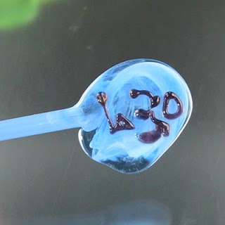
First Up - Laguna Blue - Mor630. This is a lovely streaky blue. It looks like a translucent as a rod, but works up to a transparent blue streaked with opaque blue. No effort required. This is delightful!


Next up - Kiwi - Mor620 - a name evoking the bright green flesh of the fruit of the Kiwi, as opposed to the hairy brown outer layer, or the beady-eyed, elusive and flightless bird of New Zealand (which also has a hairy brown outer layer.) ;-)

Bright transparent green streaked with opaque - a mouthwatering colour. Truly juicy.

Think backgrounds for florals. Maybe stringers for leaves - haven't tried that yet - not sure if the streakiness works in a stringer, will have to check. Think effortless interesting spacers! Definite recommended!

Thursday, May 22, 2008

Double Helix: Kronos and Luna

This vessel is made with a top of Kronos and the body in dark ivory trailed with Luna.

The Krono changes to a metallic blue green as it is worked, as in the top of the vessel. When it is first applied, as in the dots and the tip of the vessel, without heating and cooling, it is much darker and bluer, more like the colour that it is in the rod.

The Luna has reacted with the ivory to create a grey demarkation line and has also fumed the ivory, making it darker.

Sasha's Silver and Luna

Sash's silver is another high silver content glass, from Precision104 (you might remember it as one of the Rocio Bearer glasses.)

A lovely shade of blue, it is a different colour whether encased or not. The bicone was made with a core of clear. Trails of Sasha's Silver in the middle, and Luna (Double Helix) on the end. The whole bead was partially encased and shaped. Some fo the Sasha's Silver and some of the Luna is encased, some is not.


These lentils were made pretty much the same way, but the trails of glass are smaller and thinner, and are mingled together instead of staying discrete. Again, they are a clear core, and partially encased. Mashing them into a brass press cools them more rapidly and seems to affect the colours as well.

Wednesday, May 21, 2008

Double Helix: Khaos and Psyche

It takes much longer to get one's head around the complex colours of the Double Helix glass than it does an ordinary, non-reactive glass. With all the variabilities and possibilities, sometimes, I'm not sure at first what is making the difference. But here are some of the possibilities!

This vessel is made with the top made of Psyche - which looks black, until you hit it with a reducing flame.


The body of the vessel is made with Dark Ivory (Vetro), and striped with Khaos. The Khaos looks ivory when applied, after being cooled and reheated many times in the creation of the handles, it looks purple. It comes out of the kiln darker than when it went in.

Notice that the reducing stage appears to have fumed the ivory as the high silver content of the Double Helix has an effect on the ivory glass.


This bumpy bead is Opal Yellow, dotted with ivory, dotted with Psyche, and reduced.

Note the fine black line that formed around the Psyche dots.


And finally, this is a yellow opal base, with stripes of Psyche, raked, and reduced. Note each stripe looks like about 7 different stripes. The Psyche here is a less intense colour (less glass to begin with) and is more greenish.

The Opal Yellow appears to have fumed as well.

I love exploring and playing with these colours!

Friday, May 16, 2008

CIM 645 Heffalump

What a stunningly beautiful colour in the rod. What a b---- to photograph!

Heffalumps and woozles - anyone with kids knows the nightmarish heffalump, a soft purpley-elephantish beast. The rods of glass are a truly beautiful colour, exactly heffalump colour, but photographing them! Oh my! I'm no slouch in the photography department, but the first photo on the right is the best I can get, which is under pure incandescent light and grossly underexposed.


These next pictures (the wrap is EDP) shows how washed out the colour becomes. This glass does NOT show an obvious colour change to the human eye, unlike Alexandrite or the colour shift blue/lavendar of the Moretti colour palette. It is just exhibiting a colour that the CCD of the camera cannot capture.

Overall - a pretty colour, a soft, pale purple but those who make beads for sale online will curse it - as getting a good picture of it will be a challenge.


This last picture is CIM Sapphire over Heffalump. A pretty purple combination - I had to adjust it in Photoshop to get an accurate colour representation though.

CIM 543 Sapphire

CIM Sapphire, a transparent medium blue before heating, comes out of the kiln a much darker blue, and actually, more of a true gemstone sapphire colour, as opposed to the very blue sapphire colour that is usually indicated in the world of commercially made glass beads!

It's a very nice, sophisticated dark blue, with a hint of streakiness to it. Quite a surprise, really. I can see definite uses for this one!


CIM 644 Dusk and CIM 742 Sepia

Dusk and Sepia - sister colours with a secret! These two shocked me, as they are completely not the colour that they are in the rod before being worked!

Dusk and Sepia arrive as light transparent purple rods, Dusk reminding you of warm summer evenings at dark - in that special time I think of as "in between the can and the can't." Sepia just looks misnamed. I grew up with pen and ink drawings. I know what colour sepia is - purple it ain't!

However! Both colours come out of the kiln a transparent brown! Sepia is well named after all, and Dusk is the inappropriate name, unless we're thinking Dusk in some desert city with a sandstorm coming in!

Dusk is the darker of the two shades, but otherwise, they are very similar. Left, is Dusk over Heffalump (more on that in a bit) and on the right is dusk over ivory.

I was quite surprised at the colour change in these two, and I hear that one of them does interesting reactions - although I haven't tracked them down yet.


This vessel is sepia over silver foil, and has produced a nice rich antique gold look, much like the very expensive Moretti Straw colour.


Wednesday, May 14, 2008

CIM 346 Ghee

New colour from CIM - called Ghee. Ghee, as you may know if you indulge in eastern cooking, is clarified butter, and that is exactly what this looks like. Right down to the odd little streakiness that it has. Way cool!

It goes when hot, it turns white, and then strikes back to yellow. It can be struck more or less - the single bead was heated only on one side - so if you do nothing to strike it - it will go a light colour, like the rod, and if you work it longer, it will develop more colour. (Like the lower beads.)

This is a pretty cool colour - despite my not being a fan of yellow in general. I can definitely see a use for this in the earth tone palette and for those that love streaky glass. (That would be moi!)